NHL unveils 2015 Stadium Series game and logo

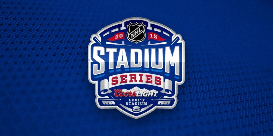
I've been working on the August edition of NHL JerseyWatch this week but had to take a break this morning to mention the NHL's announcement of the first 2015 NHL Stadium Series game.

The game will feature the San Jose Sharks and Stanley Cup champion Los Angeles Kings on Feb. 21 at Levi's Stadium, the new home of the NFL's San Francisco 49ers.

With the announcement of the event came the logo, of course, which has been updated for this season. Jerseys were not revealed, though you'll recall the "Chrome Collection" featured in the four outdoor games of the 2014 Stadium Series.

Apart from the Winter Classic in Washington, D.C., the league has yet to announce any other outdoor games for 2015, but you can't really call it a Stadium "Series" if there's only one. One big rumor out there has the Bruins hosting Montreal at Gillette Stadium.

For now, feel free to speculate on jersey design. I'm sure I'll have no shortage concepts to share in the coming weeks. The Sharks will have something new, but should the Kings bring back the greys?

Calgary Hitmen bringing back a classic pink jersey

Back in April, the WHL's Calgary Hitmen unveiled a new 20th anniversary jersey to be used next season. It was inspired by their original uniforms from 1995.

Yeah, I can't seem to escape the 1990s these days, so I've just decided to own it.

The franchise was named after co-founder and WWF wrestler Bret "The Hitman" Hart. They even wore his distinctive black and pink color scheme early on.

From the press release:

The limited edition throwback jersey, black with grey and pink, includes two shoulder patches; one that features Hart’s famous words, ‘The Best There Is, The Best There Was, The Best There Ever Will Be’, while the opposite shoulder is dressed with the historic Hitmen starburst logo.

In 1998, the pink was traded for a red and bronze look — think the late '90s Edmonton Oilers with black instead of navy blue. They've worn those colors ever since, breaking out the pink from time to time for throwback and cancer awareness nights.

The Hitmen were dreadful in those first couple of seasons while wearing pink. Of course, as soon as they dropped it, they won their first WHL championship in 1999. Go figure.

For more photos of the new retro sweater, click here

How the timeless Hartford Whalers logo came to be

A lot of you have been enjoying my series of NHL logo origin stories from the 1990s. Many of those designs were short-lived. Those that weren't are anything but uncontroversial today.

But roll back the clock and we find one of the most universally admired logos of all time.

In 1979, the WHA folded and the New England Whalers were one of only four teams absorbed into the NHL. The franchise was renamed and in need of a new logo. Peter Good was the designer hired to create a new identity for the Hartford Whalers.

On June 29, WFSB-TV in Hartford, Conn. aired an interview between Face the State host Dennis House and Good — from the Connecticut design firm Cummings & Good. During the 9-minute conversation, the two talked about the genesis of the logo and all things Whalers.

If you can't watch the video above, I've transcribed the good stuff below.

Things kicked off with an image of the old New England Whalers logo.

Peter Good: This was given to me as the starting point really. They wanted a new, fresh identity. They just moved to Hartford. There was a lot of excitement in the community. 
Like any project, I meet with them. In this case Howard Baldwin, Bill Barnes and I think Jack Kelly was the manager at that time.
Dennis House: And so you started sketching?
Still frame from WFSB-TV

Still frame from WFSB-TV

PG: This is where all design projects start. Those are the original designs that I presented not as a design solution but as a way of thinking about the identity.
Curiously, when I did these, Howard Baldwin actually said, "I like the lower right one." Shown here. With the trident. The trident was a reference to the harpoons.
I said, "Why do you like that one?" He said, "The 'H' is there." So I said, "Wait a minute, that was a not a requirement. It was just an idea that I had. But now that I know that it limits the field. So let me have another three or four days to play with it, to go back and rethink this given the idea it should have the 'H' integrated.
DH: And you came up with this?
Still frame from WFSB-TV

Still frame from WFSB-TV

PG: This is how it started. I was bothered by the idea of harpoons anyway because their mascot is a whale. So why would you have a symbol that suggests killing your mascot? That seems contradictory.
So I said, what do we have to work with? I have the letterforms 'W' and 'H' and I have a whale. And whales are kind of amorphous creatures. They're not like a tiger where you could characterize it very simply. But the whale's tail is very, very formally interesting. It's symmetrical. So you have three symmetrical elements to play with. This was a gift.
hfd79.jpg
PG: I call it a marriage of convenience between a whale's tail, a letterform 'W' and the offspring is essentially the negative 'H'.
DH: What was the public's reaction when it was first unveiled and first showed up on uniforms?
PG: They liked it. My wife Jan and I designed the first uniforms. There was overwhelming support. I think a lot of it had to do with the idea of Hartford having a professional team. 

From there, the two discussed the process of designing a logo in today's climate. The video on WFSB's website becomes choppy at this point, cutting out parts of the conversation. It's impossible to know what they were saying but it seemed insightful. There's mention of focus groups and other things that tend to water down great designs.

Peter Good, Cummings & Good // Still frame from WFSB-TV

Peter Good, Cummings & Good // Still frame from WFSB-TV

Then came the question a lot of fans are curious about.

DH: Who owns the rights to the logo?
PG: Aha, well. This has been controversial since a long time ago. The NHL is licensing it and it's really been a cash cow for them. They are making a profit. We have started doing some things of our own in that we never did sign the rights over. We were asked but we never signed the document. It was never work-for-hire. I still have the check for a dollar that I never cashed to make it legal.
DH: So where do we go from here? Can you sell items?
PG: We're doing some shirts. The products that we're doing are quite different from what I've seen in the marketplace. When we first started this, Jan and I designed a lot of items. It was called the Designer Series and we sold them through the Whalers shop and it was umbrellas and tote bags and shirts and aprons. But they were very sophisticated. Beautiful embroidery. Very subtle. And to tell you the truth, it wasn't successful because sports fans like it big and brassy.

In wrapping up the conversation, House and Good mused on the possibility of the NHL returning to Hartford and whether the name and logo could be resurrected.

DH: How would you feel if the team came back and they hired someone else to change the logo completely?
PG: Believe me, that's happened before. Logos are things that every designer likes to think are timeless and enduring but some that I thought would last for many, many years tend to change.
There's so many factors. The team starts losing games, everything's on the table. Change the uniforms, change the logo and so forth.

Good may be referencing the fact that for their final five years in Hartford, the Whalers used an altered version of his logo with grey added to the color scheme. That came about in 1992.

hfd92.jpg

Seriously, what is it about the '90s?

FURTHER READING: A Tail of a Whale · Aug 21, 2010

Designing the ’90s NHL, Part 4: To The Extreme

I thought this series would conclude with Part 3, but new stories of NHL logo design of 1990s seem to be coming out of the woodwork. Here in Part 4, a story of myth becomes real.

In Part 3, I lauded the Colorado Avalanche for having such an excellent logo. But things very nearly went in the opposite direction for this franchise.

The tale has long been told that in 1995 the Avs were originally supposed to be named the Rocky Mountain Extreme. I call it myth because it was a story that lacked any visual evidence.

Until now.

Rocky Mountain Extreme logos by Michael Beindorff via Mixbook

These stories work best when told from the beginning.

PLANNING FOR THE FUTURE

1995. That was a rough year for NHL fans. We lost half the season to a lockout. The Capitals and Islanders killed their 20-year-old identities with controversial new logos. And the famed Nordiques were mercilessly ripped away from the people of Quebec.

But let's back up for a second. Before the Nordiques were ripped away, they had no intention of leaving. In fact, management was planning for the future by rebranding the franchise with a new logo, uniforms, and new colors (with our '90s favorite, teal!).

Check out this article printed in The Hockey News in April 1995 for details:

Nordiques will have new look in 1996-97
Compiled by the THN Staff
The Quebec Nordiques don't have a new arena yet, but a new logo and colors are on the way.
When the Journal de Quebec published the Nordiques' new colors March 30, the team had no choice but to confirm the makeover.
The team's road jersey will be dark blue with a few lines of a teal-like green color, black, white, and silver. The crest has a large head of a husky dog with its teeth bared. They will sport their new colors in 1996-97 and not next season (1995-96) because they failed to meet the NHL's deadline for a logo change.

Strike one.

A ROCKY START

When the Nordiques owner was unable to keep the team in Quebec, it was sold to Denver-based COMSAT Entertainment Group. Apparently their instinct was to name it the Rocky Mountain Extreme. It even got as far as the logo design process.

Most fans have never seen these designs, despite the fact that they've been hiding on the Internet for more than three years. Graphic designer Michael Beindorff published the sketches in an ebook featuring samples of his work.

The "Extreme" name was leaked by Adrian Dater of the Denver Post, at which point Colorado hockey fans loudly objected. As any reasonable person would expect.

Strike two.

IN SEARCH OF AN IDENTITY

The new owners decided to do what they probably should've done in the first place. They invited fan input on the name. Among the options presented were Black Bears, Cougars, Outlaws, Rapids, Renegades, Storm, Wranglers, and of course, Avalanche.

Photo from Adam Jones via Photobucket

The photo above was uploaded without its source identified, but it could be an early Avalanche game program. I'd love any help from Avs fans.

Surprisingly, fan voting didn't yield the name we know today. Coloradans weren't initially interested in Avalanche. They wanted the Cougars, according to a book called History and Heroes: The Story of the Colorado Avalanche by Bill McAuliffe.

When the Quebec Nordiques were purchased by COMSAT Entertainment Group in 1995, it was clear that the team would need a new name. Nordiques means "Northerners," and that certainly didn't describe Denver.
At first, the new owners wanted to call the team the Rocky Mountain Extreme, but the Colorado public didn't like that. ... The owners set up a "feedback forum" in which fans could identify their preference for a new name. "Cougars" won out in the fan voting, but the owners had the final say and decided on "Avalanche."
The name was unique in all of professional sports, describing the dangerous snow slides that can occur in mountainous areas such as Colorado.

With the name settled, Beindorff — the team's in-house graphic designer — was called to action once again, under the guidance of creative director Dan Price — who now heads an agency called Adrenalin (responsible for the current Coyotes logo).

Again, Beindorff's ebook provides insight into the design process.

I'm always captivated by seeing a series of sketches that ultimately led to a great logo. Without these, we would not have the great icon we see today.

For more, we turn back to the publication that showed us the original team name options.

Photo from Adam Jones via Photobucket

If it helps in identifying the book, this photo is visibly credited to Cyrus McCrimmon, who currently works for the Denver Post.

Finally, on Aug. 10, 1995, the Colorado Avalanche were introduced to the world.

col95.jpg

From the SportsBusiness Daily report:

Colorado's new NHL team will be called the Colorado Avalanche and its logo will feature a color scheme of burgundy, silver, blue and black. ... The logo and colors were designed in partnership between the NHL's David Haney and COMSAT's Creative Dir. Dan Price, Sr. Art Dir. Michael Beindorff and Art Dir. Rick Pillmon. 

Home run. After averting two branding disasters, it's clear the third time was the charm for this franchise — named the Avalanche. The irony.

So what do you think of all that?

CONTINUE READING: Part 5: A History of Blue

Creating the St. John's IceCaps third jersey

A look at how the IceCaps third jersey came to be.

BEHIND THE SCENES

The AHL's St. John's IceCaps unveiled their third jersey last November, but last week they wanted to remind us how it came about by tweeting a past YouTube video.

We've been doing a lot of peeking behind the curtain around here lately so I thought it appropriate to mention this video.

The fact that the design was created by a fan who approached the team — and not the other way around — should give hope to our many talented concept artists.

Hopefully it sticks around beyond 2016 when the franchise is set to relocate to Thunder Bay.

In case you can't play the video above, here are some stills I grabbed. Because who doesn't love watching a graphic artist create a hockey sweater?