0240: Black, Red & Gold

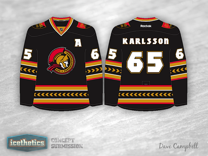
Here's a good reason for the Senators to go back to black. Dave Campbell's concept is unlike what we've seen before in both its striping and crest. The logo he's using is actually an official mark in Ottawa's arsenal, but I'll never understand why they haven't put it on a uniform yet. It's far superior to their current primary mark. Any thoughts on this?

0156: Affiliate Swap

This summer the AHL's Syracuse Crunch and Norfolk Admirals swapped NHL affiliates. So that's our theme for today's concept post. First, Dave Campbell put together a pair of jerseys for the Crunch, who recently unveiled a new logo after announcing a new agreement with the Tampa Bay Lightning. These blue and grey sweaters could work really well!

Meanwhile, the Admirals hooked up with the Anaheim Ducks in the aftermath. They've announced no intentions to redesign their logo or uniforms, but if they did, Justin Nahhas has a really neat look in mind. The only fault I can find is that the crest is almost unreadable. Could use a little more contrast. Otherwise, we have a couple of nice sets today.