Spotlight: tdog

Our third and final IceHL Artist Spotlight this weekend features tdog — a phenomenal designer with seven different finalist entries. Also known as Rik Oko, tdog has even seen two of his designs win their respective polls already — the Motorheads and Sentinels.

His logos for the Outlaws, Guardians and Scorpions were runners up but his Hellcats and Kodiaks logos remain in competition. The Edmonton Kodiaks poll goes live this week where he'll face Roccot and Sean Cox Tattoo.

In order to get a better idea about where Rik got some of his inspiration, I asked him to offer up some background on his finalists. Attached to each description is a small version of the logo being described. You can see the full versions in each team's logo poll.

I really am not one to talk (or write) about myself. I entered some art for the heck of it. I love hockey and I have always had a sick fascination with uniform design. I'm a big overall sports fan who secretly critiques uniforms and jerseys while watching games — occasionally doodling my version of what they should be wearing. I guess Icethetics gave me an opportunity to take it to a more final stage. It was fun to create some quickie art for the fictional IceHL.

As for the background, it has been a while but here goes...

Outlaws – I really didn't want to do the hat and scarf. So I decided on the horse. And eventually caved and put the hat and scarf on the rider as well as the shoulder patch. I found that the team name was the most tedious part of the design. It was hard in such little time not to make it look hokey. The majority of the time was spent designing the two logos. But I tried my best to make it all coordinate. I also tried to keep the colors to fewer than four on all designs — three if possible — and to match the colors to something related to the city. Too many colors on a logo for a sports team is overkill.

Motorheads – I would have liked to have taken more time on this one. But basically I wanted to do an amalgam of a face/head with an engine. I like setting the logo on a shape, usually a circle works best. It balances it a bit more for me. The side patch was an idea for the chest logo at first.

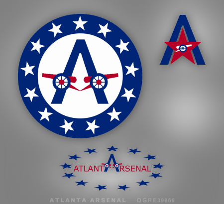
Sentinels – Kept it basic. Big W, silhouette guard. Tried my best not to get too detailed or busy. I think I modeled the colors similar to the previous Caps colors, even though I hated those jerseys. The flag logo — again pretty simple — similar in design to the Hurricanes' flag. I didn't want to overdo the patriotism here. I avoided stars until the last second addition in the script logo.

Kodiaks – This was a real quickie. My original submission had the Kodiaks letters on the chest front.  I wanted to convey ferocity and speed and have the head look like it was tearing at the edges but due to lack of time i played it safe and put it in a circle. Same with the bear claws.

Hellcats – I wanted a retro look to the plane and also a little hokiness so I based it on the Islanders logo. I hate the team but love the logo. The orange H in the background is supposed to be searchlights. Imagining the plane on a night time bombing mission ready to destroy the enemy — er, competition. I tried to change the "S" in the logo since it looked like a Nazi symbol. I was only able to change one and left the others since I ran out of time again.

Guardians – My fave to work on since I am a NYer. Just took the lion head from the statue in front of the Main library. What? It's a guardian... work with me here. The five stars represent the boroughs. And I think the color scheme I borrowed from the Tampa Bay Buccaneers. I like that pewter gray.

Scorpions – Utah color scheme, mountains, and a scorpion shaped like an S with a white "S" behind him. What more can you ask for?


As always, any questions or messages for Rik can be directed to him by writing a comment below. Approved comments should appear within 48 hours of submission.

The Spotlights will return next weekend after a final week of logo polls. That means the time for uniform design entries is just over the horizon!

Spotlight: Sean Cox Tattoo

Tonight's IceHL Artist Spotlight double-header begins with a prolific artist who has a unique style all his own. Sean Cox, of Sean Cox Tattoo, graced the project with three logo finalists — for the Kodiaks, Steelcats and Beasts.


Sean's Beasts logo was defeated and the Steelcats' logo will be revealed this week. He's hoping for victory this week when the Edmonton Kodiaks' poll is posted on Icethetics. In the meantime, I asked Sean to tell us about how he went about creating what would become his finalists.

The Edmonton Kodiaks was somewhat of a rush job. I had just discovered Icethetics a few days before the deadline so I took a drawing I already had and modified it. It's actually one of my tattoos, which was inspired by (among other things) a bear that attacked someone on the mountain I was camping on. (Bear #66, Banff National Park. She's dead now. Got hit by a train.) So really all I had to do was the wordmark — which I wanted to make look like a camp/park sign because one of my original ideas for the tattoo was to have this bear in a campground.

The Hamilton Steelcats concept was important to me because I grew up in Hamilton and a lot of my friends and family work in the steel mills. I don't know if it's obvious enough, but that's a bolt in the tiger's eye. A lot of Hamilton's sports teams have had the yellow and black so that was a no brainer. And a lot also have the tiger theme. The CFL's Ti-Cats actually used to have long skinny cages at the back of the end zones where a real tiger would pace back and forth the width of the field. They moved the tiger when the teams switched ends so it was always in the visiting team's end.

For the Boulder Beasts, I just liked the name Beasts. It made sense to have the beast made of stone (boulder). That idea made me think of Bronx from Gargoyles, so I modeled the animal after that.  The mountains in the back is an actual mountain range near the city. I think they're called the flat irons. And the secondary logo is a busted net. That was my wife's idea. There's always broken sticks or skates or pucks in logos. No one ever has a net. And nets are impossible to break so I thought that would show some balls.

www.seancoxtattoo.com

If you'd like to leave a message or question for Sean, please do so in the comments below.

We'll finish up tonight's two-parter in a little while with the artist known simply as tdog.

Spotlight: Eddie Ray Design

I'd love to be able to give you guys a glimpse into the worlds of all 25 IceHL artists, but unfortunately, only a fraction of our phenomenal designers have written in for their Artist Spotlight bios. That means I'll likely be wrapping it up next weekend (after the final week of logo voting).

However, tonight we go behind the scenes with Eddie Ray of Eddie Ray Design — responsible for logo finalists for four different teams. Despite his amazing work, his finalists were runners up. The competition in this project is stiff!


As you can see, Eddie put together some simple yet effective designs for the Lagers, Olympiques, Sharpshooters and Lumberjacks. I asked him to give us some background and talk about why he entered the IceHL competition.

Throughout my life I have loved two things consistently: being creative, and sports. As I got into art and different disciplines in high school I figured out that graphic design was the area for me.

Once attending college at Alfred University, I realized that combining my two loves would be the path to my dream job. I became interested in sports logos and the creative process behind branding, and never looked back.

I have graduated and I am working at a screen printing, embroidery, and engraving company in Maine where I am a graphic designer and digitizer. I am hoping to begin a big project soon centered around branding Maine high school athletic programs. I feel like the IceHL and Icethetics as a whole is a stepping stone to what I hope to do in the future.

The contest lets me flex my creative muscles while getting proper feedback from others in this field. I know it will be beneficial to me, as I hope to do this same sort of thing on a much bigger level (professional sports teams). In design and art I like to keep things simple, and the IceHL was no different. You won't see any gradients or intricate designs coming from me, just straightforward designs that (hopefully) get their message across.

Simple is always the way to go.

www.eddieraydesign.com

I'm sure we haven't seen the last of Eddie Ray's designs. If you have any questions or comments for him, leave it below.

To make up for last weekend's MIA Artist Spotlight, I'll be serving up a double-helping tomorrow. Get ready to meet the guys behind the pseudonyms Sean Cox Tattoo and tdog.

Spotlight: Joey Light

After taking a breather last weekend, the IceHL Artist Spotlight returns with a look at another artist with a pair of finalists. You know him as Joey Light and his Atlanta Arsenal and Baltimore Blue Crabs logos go up for a vote during the next set of polls.

I asked Joey to share with Icethetics readers his design process for the IceHL project.

For the Atlanta Arsenal logo, I researched a bit on the city and state. Found out that their state colour is green, so that was an easy base to start. Then once I had that to go off, I asked 10 people (friends, family, etc.) to play a word association game with me — I throw them a word and I wanted a quick response. The word was obviously "arsenal," and military was the majority answer. So from there I took the corporal rank (which makes up the A.A.) and placed that on the helmet with the Atlanta city skyline reflecting.

With the Baltimore Blue Crabs, I took a different approach. A little more self-evident. Wanted it to be symmetrical and simple, something that can be visible if it was a small print. And blue was the obvious choice. Much tougher decisions made in the atlanta logo.

You can leave questions or comments for Joey below. Another new Artist Spotlight will go live on Sunday.

Spotlight: Eric Poole

Tonight's IceHL Artist Spotlight centers on the designer who was the first to have a winning logo in this project. Eric Poole's creation for the Boston Colonials won the hearts and votes of Icethetics readers in the very first poll just a couple weeks ago.

Eric submitted logos for a total of four teams, but the only other finalist he had in the competition was the Boulder Beasts — which is now open for voting. His Winterhawks and Armada logos didn't make the Top 3 cut, but he's still flying high as the first artist with a winning design.

I asked Eric to talk a little about his background and inspiration for his finalist logos. This is what he said.

I am originally from Pittsburgh, and have been a die-hard Penguins fan for as long as I can remember. I have always loved drawing sports logos ever since I was a little kid, whether it be hockey, football, or baseball.

I did not go to school for graphic design, but got a job out of college at a T-shirt company that designed shirts for schools, so I kind of learned all the technical sides of graphics there. I moved from Pittsburgh to Kansas (a real hockey wasteland) and I currently work for a marketing company designing logos and such for companies and schools mainly around the Midwest. My favorite all time logos: New Jersey Devils, Seattle Seahawks, and Hartford Whalers.

For the Boston Colonials logo, the two big inspirations were the New England Patriots and the Robert Morris Colonials (a school in Pittsburgh). I like the the stylized look of the "Flying Elvii" logo, but I wanted to add more to it (like RMU's) — and not make it so generic — so I turned it 3/4 and added a scowling face. For the colors I picked blue and gold, because I figured red, white, and blue were too obvious.

The "Beast" was inspired by an enemy in Diablo II called a Brute. They are big upper-bodied creatures who only have their eyes showing through a bunch of hair. The hockey stick was added because I figured he need to be breaking something and a hockey stick made sense! The colors... no real reason for them. Just kind of wanted something that was a "Night of the Beast" motif.

As always, questions or comments for Eric can be left below. Approved comments will appear within 48 hours of submission.

The Artist Spotlight will be back next weekend after another week of IceHL logo polls. The Tampa Bay Barracudas will get us started first thing Monday morning.

Spotlight: Six Zero

The IceHL Artist Spotlight series continues this weekend with one of the project's most prolific artists — and as determined by a vote in today's Live Chat. Six Zero, known in the real world as Scott Robbins, had 13 logo sets become finalists. He submitted for many other teams beyond that.


Among his long list of finalists, seen above: the Cavalry, Hitmen, Outlaws, Hellcats, Gators, Nighthawks, Renegades, Scorpions, Sharpshooters, Barracudas, Winterhawks and two for the Sentinels. His instantly recognizable style has brought a level of professionalism to this project that is nearly unmatched.

I asked Scott to share his experience creating amazing logos for the IceHL project. Here's an excerpt of what he had to say.

I remember discovering the IceHL project long after it had already started. One of the other reasons I wanted to take part in the project was to gauge response. I know my own work and hold myself to very high standards, but this was a good venue to see how complete strangers might feel and react to my solutions.

Sports branding is about communicating a personality and identity for a team and not at all like an artist who's expressing himself in a painting. Therefore, these designs can never be about what I want solely; it has to be capable of attracting many people who are willing to wear and be emotionally invested in that identity.

I was most pleased of the Baltimore Blue Crabs crest and, of course, it didn’t make the cut. I also enjoyed doing my liederhosen-wearing Lagers character, which was later converted to a Leprechaun in a freelance poster design. Neither of these were chosen as an Icethetics finalist, but I am very proud of both.

As for background, I am a professional designer and have actually traded in my office chair for the classroom, where I teach Adobe products and design theory at the university level in the northeast. I once entertained the idea of writing up bids as my own sports branding firm, but at this stage of the game it probably doesn't make sense for me to scrap the security of my career to basically start over as a freelancer. Although, stranger things have happened — if a side door to the main stage ever opens, I will certainly be tempted to jump through it!

Your next opportunity to vote for one of Scott's logos will be on Monday when the Tampa Bay Barracudas kick off another week of IceHL logo voting.

If you have a question or comment for him, feel free to add it below. Approved comments will appear within 48 hours of submission. The Artist Spotlight series continues tomorrow. In the meantime, make sure you've gotten your votes in for our available polls before they close!

Spotlight: Ogre39666

The IceHL Artist Spotlight series continues today, filling the gap when we don't have new polls. We're profiling the talented artists whose work is the subject of this project so you can get a better idea of who they are.

Selected at random, our second artist of the series is Steve Pace, working under the pseudonym Ogre39666. Steve submitted artwork for several IceHL teams and his persistence paid off when his Atlanta Arsenal logos, submitted on November 16, were deemed by readers to be among the Top 3 in a group of seven.

I asked Steve to tell us about how he came up with his finalist set. Here's what he told me.

I tried keeping things simple and a bit classic looking. For inspiration, I looked at the Georgia state flag, and decided that the colors and star motif could be nice elements to include in a logo.

Personally, when I hear the word "arsenal" I tend to think of cannon, which in profile, are simple, strong, and easily recognizable. So I decided to use it as the cross-member of the "A" and encircle it with stars Ñ simple-looking, but I think the simplicity gives it a classic feel.

For the secondary, I felt I had strong elements, so all that was needed was some re-arranging. Instead of using the cannon as the cross-member, this time I used a star with an inset cannon to reinforce it and since the points of the star and "A" matched up, it worked well.

For the wordmark, since Atlanta ends with "A" and Arsenal starts with "A", I decided to use just one between the words. This allowed me to use the "A" from the primary and bring some continuity to the set. The use of a single "A" also meant there would be six letters on each side so balance wouldn't be a problem.

If you have a question or comment for Steve, feel free to add it below. Approved comments will appear within 48 hours of submission.

You'll be able to vote on the final Atlanta Arsenal logo on August 28. Tomorrow, we kick off another week of polls with the Winnipeg Winterhawks. Next weekend, we'll look at two more artists in the Spotlight. 

Spotlight: Nick Matarese

The IceHL took the day off yesterday but it's back this weekend to kick off the Artist Spotlight series. This series will fill the gap on days when we don't have new polls, profiling the talented artists whose work is the subject of this project. The order of this series has been chosen at random.

We begin with Nick Matarese, whose lone submission came to me on November 13 for the North Carolina Nighthawks of the Southeast Division. The following logos were rated by readers into the Top 3 of a class of 13 logos.

I asked Nick to talk about his artistic background and his inspiration for the Nighthawks logo. Here's what he had to say.

I am a graphic designer for Adidas. I graduated from the University of Delaware with a BFA in advertising/graphic design from the Visual Communications Department. While there I was also a four-year collegiate athlete with their ice hockey team (goalie) to which I am now an assistant coach.

I have designed other sports logos, including the Tatnall School's new hornet logo. I'm working on the Philadelphia Thunder (Junior A hockey team) and I redesigned the uniforms for the University of Delaware's ice hockey team — which the Long Island Gulls are also using as their third jersey this year.

Disappointingly, I got hooked onto Icethetics when the project was halfway over so I only had time to do logos for one team. When choosing the Nighthawks I wanted to design a logo in which the viewer was engulfed by the wings. I drew many designs and had research images of anything from birds to 3D models to X-Men characters to get the flow of the wings they way I wanted.

The tail and head were made as one with the body to give it an almost mythical feel, non-specific to any actual species (hence no feet). I liked having nothing but black and shades of grey to go with that dark mythical feel but it was missing something — that's where I added the lime green to make everything pop. For the secondary logo I wanted to make a profile of the beak and eye, yet still make an N.

mataresedesigns.com

If you have a question or comment for Nick, feel free to add it below. Approved comments will appear within 48 hours of submission.

The top three logos for the North Carolina Nighthawks go up for a vote this Tuesday. Tomorrow, the Spotlight will be on Ogre39666. New polls resume Monday with the Winnipeg Winterhawks.

IceHL Artist Spotlight

Our IceHL logo voting schedule says we're taking today off. But no new poll doesn't mean no new content. This afternoon I wanted to mention the people behind the amazing logos you're voting on. After all, they didn't just happen out of thin air. Twenty-five amazing logo designers put their time and talents into this project.

Throughout the next six weeks of the voting process, you'll be hearing from many of these designers — from their educational and professional backgrounds to their inspirations for their IceHL logo designs. On days when we don't have new polls, expect to see an Artist Spotlight.

We'll profile the first artist on Friday but today I'm offering an overview the entire group. Artists will be listed along with their finalist logos. (A quick disclaimer before we start, the Chris Smith listed here is NOT me.)

CHRIS SMITH

Blue Crabs Colonials Cavalry Wave Outlaws Motorheads
Steelcats Hellcats Mammoths Gators Pioneers Armada
Barracudas Lumberjacks

SIX ZERO


CRAIG C. WHEELER


ROCCOT


TDOG


EDDIE RAY DESIGN

JOHN WRISTON

SEAN COX TATTOO

TONE LOC PRODUCTIONS

JFRED

JOEY LIGHT

SHAWN STEADMAN

ERIC POOLE

EMILIS ACUS

SIGMA KAPPA

DAVE DELISLE

OGRE39666

LLP

SOUTHPAW DESIGN

NICK MATARESE

JASON NEW ERA USHER

DAN STOVER

TROZ32

PAPLOO

PHO3NIX

All 25 artists have done incredible work to be here at this point in the project. But only a third of the logos you see above will actually represent IceHL teams come September. Voting picks up again tomorrow with the New York Guardians — one of the toughest choices you'll have to make over the next six weeks.

We'll take a break this weekend (my brother's getting married) but I hope to have some Artist Spotlights ready that will auto-post. Then it's back to the voting grind on Monday morning.