Just To Freak You Out, Part 3 of 5
/So this week I'm running a series of crazy concept designs meant to freak you out a little bit. Let's get to it now.
I have to start with the colors we've all grown fond of this afternoon. Yes, you know the ones. But beware, you're about to see them on a jersey that will make you blink a few times and perhaps tap the side of your monitor. No need, though.
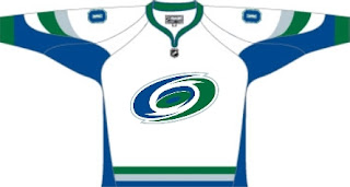
Being of generally slow wit, it took me a moment to realize that this Carolina Hurricanes jersey was being recolored based on the team it used to be. Yes, friends, the Hartford Whalers. But just look at that blue and green hurricane. Scary.
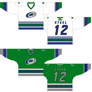
Somebody else had a similar idea. Look at that thing.
And then somebody with a twisted soul had an idea. Let's go all the way back to the New England Whalers... and kill Pucky... on a jersey... made by Reebok.
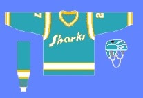
Yeah. And while we're on the topic of creatures of the deep, let's see what could've happened if certain fans had been asked to design the new uniforms and logo of the San Jose Sharks.
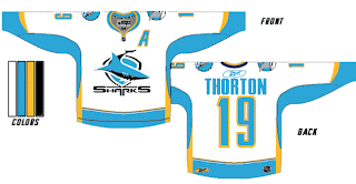
Huh? Wait, that one's actually kind of good. Dude, I like that logo. What is it doing here? Oh I remember. It's serving as a segue to this.
 I can hear the screaming all the way from here. But before you go all thinking this design is completely without merit, don't forget about our friendly California Seals. Yes, this design is based on that old '60s uniform.
Completely and utterly crazy if you ask me. And I know no one did, but I'm sharing my thoughts anyway.
Let's roll on, now. Because before I go, I need to show you this logo someone emailed me for the Dallas Stars. Yes, the Stars need a logo redesign, but is this really the answer?
There's only one way to find out. Comment now and come back tomorrow for Part 4.


