Lightning vs Bruins


vs
LIGHTNING
BRUINS
6-5
7-3

The Aesthetics
The Bruins have a logo that despite only minor changes, is significantly improved. The Lightning logo spells out the team name. And if the rumors of the new logo hold to be true, at least one of those words will be removed. Anyway, no point for the Bolts here.
Bruins

The Nickname
Not even a Bruin could withstand getting struck by a bolt of Lightning.
Lightning

The Analysis
At least there's a bolt of Lightning in that logo. There's no bear in the Bruins logo. But that can't be the only factor for this point. The Bruins logo is just much bolder. I think it makes a better logo. Maybe the Lightning can make an improvement when they unveil theirs later this month.
Bruins


WINNER
2-1


Mull Over These, Sens Fans

We've already seen the purported new Ottawa Senators logo yet we haven't heard word one from the team with regard to this matter. No worry, because where there's image manipulation software, there's hockey fans to use it. Enter this.

I'm sorry, but what a mish-mash. I applaud the effort but, um... yeah. There's sure a lot going on. And hey, they make use of that new logo we've been seeing. On the shoulder, though, this fan opted for the striped old-time Ottawa logo. Speaking of stripes, how about this puppy?

The vertical stripes make it look like a European soccer jersey to me. However, I do like what this designer chose to do with the logo. He dropped the black pointy things from behind the galea and gave the logo an overall 3D effect. For a look at a cleaner version, sans the stripes, see the image below.

Impressions, Sens fans? Do you guys like the potential new logo? Or do you prefer the proposed design in the bottom two concept sketches? Or would you rather not see it change at all?

Covered In Coyotes Concepts

I feel like I've been ignoring the Phoenix Coyotes fans out there. This is certainly not intentional. There just hasn't been a lot of news to post for them. Until today, that is. I've scoured the far corners of cyberspace for a few images you might find beautiful or repulsive — or something in between.

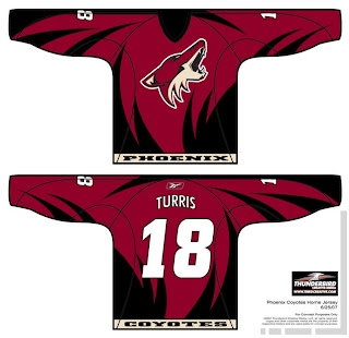
This design was created by someone who designs the outsides of racecars, I believe. Anyway, it's really quite — something. I couldn't see them wearing anything like this because the whole reason they changed their logo was that they wanted to go the classic route and simplify everything.

Well, to me, that was a sad thing. One fan designed this jersey set in memory of the old days when the Winnipeg Jets first arrived in the desert.

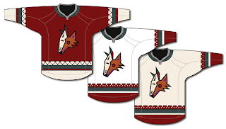
It's got that desert Indian look that was very cool. This design uses only the head of the original Coyote logo. It was first seen by itself on the green third jerseys they had for a short time. This is closer to what they actually wore in those days.

The big difference being that the Coyotes wore black dark jerseys, not maroon like they wear now.

I haven't seen any Rbk EDGE jersey concepts based on their current logo and uniform design, but haven't you heard, horizontal stripes are so out. Seriously though, don't be surprised if it comes out looking like the Capitals or Blue Jackets new jerseys.

It'd be nice if the league would unveil more of the new uniforms. Chances are we've still got another month ahead of us before we start to see the rest of the teams trickle out. Anyway, Coyotes fans and others alike, what do you all think of these designs?

Nothing Official From Canucks Today?

Damn. As it turns out, the Vancouver Canucks are supposedly having a private shoot today with the new Rbk EDGE jerseys. Yeah, not so much with the public unveiling thing. However, there's another alleged leak.

Saw it on the Canucks official message board. They're calling it a cell phone photo of the new jersey but you know how these things go. With it, one fan apparently finished off what could be the look which you can see in the graphic below.

I don't know now. I'm reading dates like mid to late August for the team's official announcement. I don't know if they team has said anything specific about a date, but I have seen August 29. I'm not holding my breath, though. So it probably won't be in the sidebar countdown — until we do get some sort of confirmation.

Shame about that. Though I can't say I'm surprised. The Canucks seem to be yanking their fans around quite a bit on this topic. I think they should just unveil the thing and be done with it.

Flyers vs Capitals


vs
FLYERS
CAPITALS
5-8
4-8

The Aesthetics
Hey, speaking of the Capitals. A dissenter (Pens fan) among you recently commented that I was a "bandwagon hockey fan" because my personal preferences lean away from liking his team's logo. He called me a Capitals fan. I'm sure he didn't mean any offense to Caps fans. Anyway, if you are one, don't be offended by my distaste for your team's logo. I like the new colors, but wordmarks don't work for me.
Flyers

The Nickname
You suppose some Flying creatures could attack a Capital city? It would be like a remake of the Alfred Hitchcock movie. (You come up with something better.)
Flyers

The Analysis
I like the three stars on the top of the Capitals logo but that's about its sole redeeming quality in my eyes. They're blurry. That's why I wear glasses. The "P" in the Flyers logo does a better job of subtly referencing its home city. And that I like. There are other things too that I've mentioned in past matches, but we'll leave that for now. It's the end of the tournament for the Flyers. They'll finish with a sweep.
Flyers


WINNER
3-0