Flames Go Retro for 30th!

This afternoon the Calgary Flames announced their 30th anniversary plans — which includes a special retro jersey to be worn during five regular season games in October, January and February.

First, the thing everybody wants to know about — the jersey!

Al MacInnisThe Flames will wear a vintage red jersey, modeled after what they wore for their inaugural season in Calgary — as seen on Al MacInnis in the picture to the right and Craig Conroy below.

The vintage sweater will be worn for five home games this season — once against each of Calgary's Canadian opponents, including opening night against the Canucks. See the complete schedule below.

  • Thurs., October 1 - vs Canucks
  • Tues., October 6 - vs Canadiens
  • Sat., January 2 - vs Maple Leafs
  • Sat., January 30 - vs Oilers
  • Thurs., March 11 - vs Senators

The game on January 30 would've been interesting to see if either the Flames or Oilers had a white throwback. Alberta hockey fans would've been transported back to the 1980s for a night.

You can read more about this retro sweater on the Flames' web site.

Jim Peplinski and Craig Conroy unveil 30th anniversary logo and retro jersey

Now the obligatory commentary. I think this throwback jersey is a good thing. It's always nice to see teams celebrate important anniversaries with classic uniforms — so far nobody's done it better than the Canadiens.

Based on comments I've read, it sounds like most of you will be thrilled by the lack of black in this uniform — assuming they lose the black pants for these five games. And unlike what others have suggested, I don't think this uniform is that ugly — it's just very '80s. It was a different time in terms of uniform design. Certainly a lot more colorful than it is today.

Flames' 30th anniversary logoBut wait, there's more. As part of their announcement today, the Flames officially unveiled their 30th anniversary logo. It's basically the same as the supposed "leak" from a couple weeks ago.

They've made a few changes to the lettering to make it appear a little less medieval and they've made some adjustments to the skyline. Barely noticeable unless you really study the two images.

Anyway, the worst part is that, as is typical, this anniversary logo will be painted onto center ice at the Saddledome and used as a patch on the jerseys.

Since I'm assuming the flags will stay on the shoulders, this logo will probably have to go on the front — on the opposite side from where you find the captain's letters, of course.

The Flames have said that more plans for their 30th anniversary celebration will be announced throughout the season. 

Ducks Finally Fixing the Logo?

Are the Anaheim Ducks finally fixing their logo? Several clues are leading me to think the "ucks" is out and the webbed "D" will finally stand alone!

I wrote a post like this a few weeks ago when I examined the possibility that the Florida Panthers are changing their logo. Unfortunately, the Panthers were the one team that didn't need it. The Ducks, however, are a different story.

From the day they introduced that wordmark trying to pass itself off as a logo three years ago, many of us have been annoyed. Looking back, I do understand the purpose. They were changing the name and marketing had a big role to play. They needed to let everyone know that the team was "Mighty" no more.

Still, from the beginning I said they should just go with the big webbed "D" on its own — especially on the jerseys. So it's encouraging to see the "ucks" starting to disappear. For instance, the Ducks recently launched their redesigned web site and the webbed "D" is by itself in the banner.

Even their Twitter page features the standalone "D."

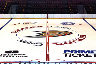
If the web change alone isn't enough to bring you some relief, Ducks PR guy Adam Brady wrote a new blog post yesterday with some pictures of the freshly painted ice at the Honda Center.

Anaheim Ducks' newly painted center ice

It still bugs me that the team's own public relations guy has a redundant logo at the top of his blog. But hopefully that will be fixed in time as well. These things don't happen overnight.

It's the Anaheim Ducks Ducks Blog. But I digress. Here's what he wrote about the newly painted center ice logo.

As a follow-up to yesterday's photos of the Honda Center ice being painted, here's a look at the completed project. Notice the new Ducks "D" at center ice, in addition to a slick new look for the red line. 

The "D" isn't new, the center ice design is. But we know what he meant. Still, as I said, it's encouraging to see these small but significant changes coming about. The next big change, which needs to happen sooner rather than later, is to have the webbed "D" get the star treatment on the front of those jerseys.

Only then can we truly be optimistic about the look of the Ducks.

Mixed Messages

The rumors have been flying the last few days over the status of the Calgary Flames' forthcoming third jersey. The main question now being: Will there even be a third jersey this year?

Obviously we're at a point in the summer where everything is speculation. The last official word we heard was a year ago when Ken King said it would be a black sweater with an entirely new logo. Now it seems that's changed and the Flames may be more likely to look backward for an alternate jersey — this being their 30th anniversary season.

More recently, I've started hearing from various retailers that a Calgary third jersey may be off the table completely for 2009. But those reports have mostly be unsubstantiated. What can I say? We live off of gossip around here at this time of year.

However, a little more evidence to support a throwback third popped up this morning on the Flames' official web site. (Thanks to Drew for the link!) As part of the 30th anniversary, the team will be giving away a $30,000 shopping spree at a local mall to a lucky fan. Many other prizes will also be available including one that caught Drew's eye.

Four (4) weekly qualifiers will be randomly selected from all eligible ballots and will receive a pair of tickets to the Flames Home Opener on October 1, 2009 as well as a Calgary Flames vintage jersey

This isn't proof that there will be a vintage third jersey — only that vintage jerseys will be available to fans this season. Having said that, it's not a huge leap to think the Flames have indeed decided on a more traditional-looking alternate sweater. I'm committing to nothing.

Anyway, just a little something to chew on as we wait for more official information on the subject. While we wait, why not hold a poll?

Should the Flames stick with that brand new black third jersey sans the Flaming C that Ken King talked about last year? Or should they go with a throwback from their earliest days in Calgary? And if you like the idea of a throwback, should it be red or white? Don't let logistics get in your way either. The Maple Leafs' white third works just fine. Go with your gut!

Cast your vote and we can get an idea of what Icethetics fans in general are hoping for.

The Lesser of Two Evils

With each passing season, I'm becoming more concerned over the unwritten rule that says minor league specialty jerseys have to make players look like clowns. I mean it couldn't be more literal than with the most recent entry into the club.

The Albany River Rats recently revealed the results of a poll allowing fans to choose which jersey design the team would wear for Ronald McDonald House Night. Perhaps it would be difficult to create a theme jersey around Ronald McDonald without looking clownish, but this is unbelievable.

Albany River Rats specialty jersey for 2009-10

I'm willing to look beyond this poorly made graphic (HOuse) but professional hockey players — grown men — will be wearing this outside the confines a McDonald's restaurant and without the security of identity-disguising make-up.

The winning design features a yellow body with white shoulders and red trim. Albany’s primary logo is emblazoned on the front of the sweater and Ronald McDonald House Charity patches are displayed on each shoulder. The jersey will be worn with red pants and with Ronald McDonald’s signature candy-cane sox.

All proceeds will benefit the Ronald McDonald House Charities of the Capital Region.

At this point you may be thinking, "Well, the fans made their own bed. They had an online vote and this is what they chose." But you don't have all the information. Why don't we take a look at their options?


As you can see, the fans clearly went with the lesser of two evils. "Classy" was not an option for the good people of Albany. On the second choice, I count 31 stripes! Seriously!

The first design was obviously created with Reebok Edge in mind while the other was not. Let's talk about that second one. Not only are stripes like that apt to induce seizures, but it inexplicably carries the storm flag stripe of their NHL parent team (the Hurricanes) across the mid-section. Relevance?

Given the choice of bad or indescribably bad, I would've voted the same was the River Rats' fans. But that doesn't make it right. We need to figure out a way to get minor league clubs to let Icethetics artists take a stab at these one-off sweaters if for no other reason than to avoid this kind of trainwreck on an annual basis.

We know specialty jerseys like this are a necessary evil in the minors. They don't have the kind of huge, established fan bases that NHL teams enjoy. For one thing, they tend to be in areas with smaller populations. To keep the team financially viable against those odds, they have to become a big part of the community. That means charity nights are important. 

But they don't have to look like this! This is where you guys come in. I'm challenging Icethetics readers to design a River Rats jersey with a Ronald McDonald House theme that doesn't look ridiculous. It'll be difficult, but it can be done. I'll post worthy concepts here.

Wild 3rd (Officially) Unveiled!

As promised, the Minnesota Wild officially unveiled their brand new third jersey today to fans at the State Fair. The sweater was first leaked by Icethetics on Tuesday.

The new official pictures from the Wild offer us a better look at the new crest. Elements from it — such as the new stylized "M" — are set to make their way onto a bunch of new merchandise this season.

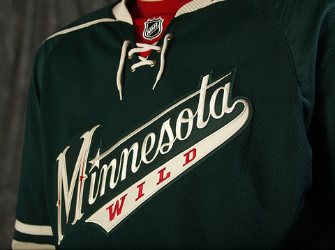
Here's a closer look at the front from the team's official photo gallery.

Minnesota Wild third jersey (photos by Bruce Kluckhohn)

In the previous leak, we never actually got to see what that "M" really looks like. Now that we have, I'm not so sure about it. It may grow on me but it just feels more Wild West than Minnesota hockey at the moment.

Back of new third jerseyThe new third makes use of the same numbering and lettering style seen on the red home jersey — the old third. You can see an example on jersey model Derek Boogaard here to the right.

This whole uniform very much lacks red — a plus, if I'm the one being asked. You see it very sparingly on the new crest and right at the collar behind the laces. Technically it's also on the gloves as well but that's just because players aren't going to get new gloves every time they wear a different jersey.

Even the socks are devoid of red, as you saw the in the leaked pictures this past week. The Wild's release had this to say about the new sweaters.

Based in the Wild’s Forest Green with Wheat trim and a hint of Iron Range Red, the jersey’s classic sports look was the overwhelming favorite of Wild fans surveyed during the summer of 2008. The jersey crest features a script “Minnesota” with “WILD” emblazoned below. The script look, including the classic “M”, harkens back to historic Minnesota teams of the past including Minneapolis and Saint Paul teams of the 1930s and 1940s. The familiar “north star” element, borrowed from the primary Wild logo, dots the “I” and adds a decorative detail to the stylized “M”.

“We wanted to provide our fans with a new look and feel for our third uniform that is uniquely Minnesota and true to our brand — authentic, classic, contemporary and truly worthy of The State of Hockey,” said John Maher, Vice President of Brand Marketing.

The new third jersey was designed by New York City-based SME and produced by Reebok, the exclusive provider of jerseys to all NHL clubs. SONY is proud to partner with the Wild for the introduction of the third jersey. Look for SONY high-definition displays throughout Xcel Energy Center beginning this fall.

Minnesota will debut the jerseys on Wednesday, Oct. 21 against the Colorado Avalanche on FOX Sports North and wear them 15 times this season (13 home games and two road contests). The Wild will continue to wear their original white jerseys for most road matches and their Iron Range Red jerseys for the remaining home games.

When/if the team releases a full third jersey schedule, look for it here on Icethetics.

Overall, it's an incredibly well-designed third uniform and should rank among the likes of the Penguins and Sabres in terms of current alternates. It may well rank among the best third jerseys in NHL history.

I'd like to do a complete ranking of all-time NHL third jerseys later this year after all of this year's new ones have been unveiled. Let THN try to stomp all over our turf, but nobody does logo/jersey tournaments better than Icethetics!