Because I'm pretty awful at keeping up with minor league news, things tend to pile up. When that happens, I usually end up with a patchwork post featuring a wide variety of items. Such as this one.
Everblades jersey history on a poster

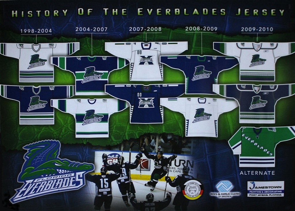
 Everblades jersey history posterWhile working an event today at Germain Arena, home of the ECHL's Florida Everblades, I noticed the team was handing out a neat new poster (right).
It's the History of the Everblades Jersey — not that it's a very long one. The Blades hit the ice in 1998 and only changed their uniform once in their first decade, after a run to the Kelly Cup Finals in 2004. They wore special 10th anniversary sweaters throughout the 2007-08 season, my first year living in Southwest Florida.
Since then, I haven't seen this team wear the same uniform for more than a single season. So it makes me wonder whether they'll bring back last season's sweaters for 2010-11 or come up with something new again and end up expanding this poster. I guess I'll let you know in October.
Crunch unveil new uniforms

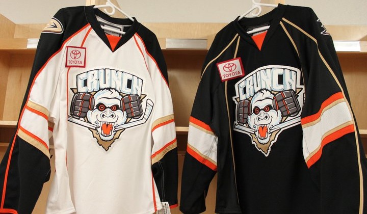
 Syracuse Crunch get new sweatersIn case you missed the mention on Twitter this week, the AHL's Syracuse Crunch unveiled their new uniforms for 2010-11 on Thursday. They now feature the team's new colors — those of their NHL parent club, the Anaheim Ducks.
The Crunch were previously linked up with the Blue Jackets and as such, wore their colors. This season they'll be orange, bronze and black. And the sweaters are pretty sharp, considering. All right, in all fairness I never thought the Ducks had a bad color scheme, just a bad logo.
 Which brings me to the shoulder patch on the new Crunch jerseys. It's just further evidence the webbed "D" is awesome on its own. No one likes the "UCKS" part anyway. Disney's out of the picture — no more "Mighty" — we get it!
Hopefully this is something the Ducks have realized and will take advantage of this season when they launch their new third jersey. Of course, it would also be nice to see an entirely new logo that a little more... ducky?
If you're craving more pictures of the new sweaters — including a juxtaposition with the Ducks' threads — and the ladies who modeled them, take a trip to the Crunch's Facebook page.
Fighting Falcons unveil new logo, take two
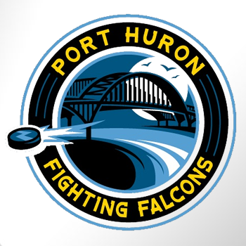
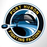 After enduring a haranguing from Icethetics readers, the NAHL's Port Huron Fighting Falcons thought it best to go in another direction with the branding of their team.
This new logo pays tribute more to the team's hometown than its moniker and is far more appropriate. It allows the nickname to be just that and instead celebrate Port Huron in its identity.
The mark appeared on the Fighting Falcons' website this week without a lot of fanfare. It doesn't specify who's behind the design. But it is a pretty solid one.
Thanks to Mike B. for the tip!
Remparts add third jersey?

 Remparts add a black sweaterThis one must've slipped under my radar. Back in June, the QMJHL's Quebec Remparts handed out a new jersey to their newest player at the draft.
It's essentially a Chicago Blackhawks' alternate with the Remparts' logo. For the record, the team previously had two jerseys — one red and the other beige.
While there's been nothing posted on their website about adding a third jersey for 2010-11, it seems there is one on the way for the Remparts, as seen on draft day.
Thanks to those loyal Icethetics readers who emailed in this info! (And sorry for the delay in getting it posted.)