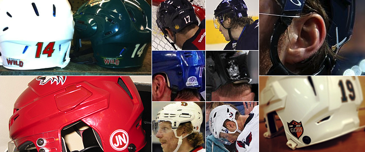
Yeah, this is gonna be a weird one. We're all aware how NHL uniforms are loaded down with various team insignia, but it's the helmet that's home to more logos than you may think. In fact, one team's helmet decal is getting a lot of attention in the early part of this season.
Buffalo Sabres introduce new version of primary logo
I've been surprised by the volume of tweets and emails I've received on this subject. Apparently, the Buffalo Sabres have introduced a decal on their helmets this season. It's not a new logo as much as a portion of the existing primary logo — the crossed swords.
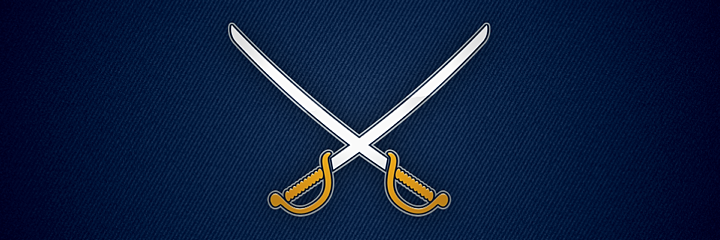
It wouldn't seem all that groundbreaking, but most readers are asking whether it could be a clue to the Sabres forthcoming third jersey in 2013-14. Personally, I don't see it. This doesn't make for a very strong standalone logo. As a decal on the back of a helmet, however, it's fine.
There's a lot of stuff on NHL player helmets
With the Sabres out of the way — and in the interest of balance — I decided to research the other 29 teams to see what kinds of decals they wear. For one thing, most teams wear big decals on each side of their helmets. The logos vary. Some are primaries, some secondaries — some are even wordmarks.
Then of course each player wears his sweater number on the front and back of his helmet for identification purposes. You'd think that would fill up the helmet, but there's actually room at the back across the bottom — on either side of the uniform number.
On the right side, every player wears the NHL shield. On the left side, it varies by team. Most teams feel like their helmets are cluttered enough. But a few have found room for one more decal — including the Sabres. So let's take a look at the rest of the league — specifically that back left side.

The Florida Panthers' back-of-helmet decal is the same logo found on their shoulders. It's the secondary logo that's been in use since the club's inception back in 1993.
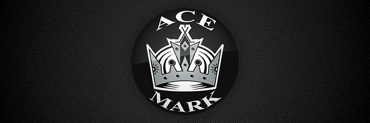
It's not uncommon to find memorial decals on players' helmets. The Los Angeles Kings use the black and silver version of their crown logo with the names ACE and MARK surrounding it. Garnet "Ace" Bailey and Mark Bavis were scouts for the Kings on their way back to Los Angeles from Boston on the morning of September 11, 2001. They were flying on United Airlines Flight 175 when it was hijacked and flown into the south tower of the World Trade Center.
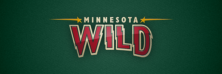
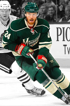
The logo found on the back of Minnesota Wild players' heads is their new wordmark — introduced alongside a new shoulder patch last season.
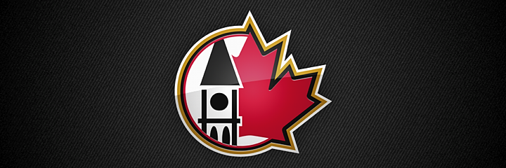
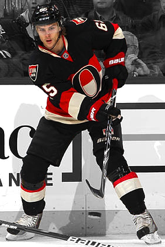
The Ottawa Senators used this mark on the shoulders of a third jersey they launched in 2000. It disappeared in 2007 when that sweater did — or so you might think. The logo, which depicts the Peace Tower and a red maple leaf — the universal symbol of Canada, can currently be found as a decal on the back of players' helmets.
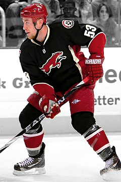
The Phoenix Coyotes are continuing to wear a decal in honor of team massage therapist Jukka Nieminen, who died in June 2010. It's been in use since the start of the 2010-11 season.
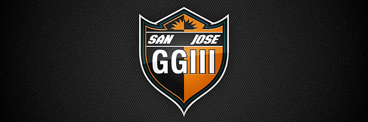
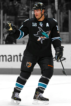
New this season, the San Jose Sharks have a memorial helmet decal to honor the team's original owner, George Gund III. Gund died Jan. 15. According to the Sharks, the helmet decal will be joined by a sweater patch — which the team wasn't wearing to open the season Sunday night (at least not that I could see). They did unveil the patch Saturday via Facebook.
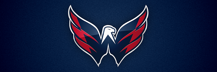
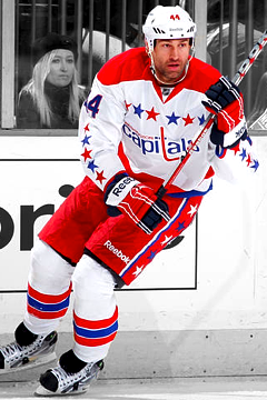
The Washington Capitals wear their famous Weagle logo on the backs of their helmets. The secondary mark also serves as a shoulder patch on the club's home and road uniforms. Double duty for the Weagle.

And the Winnipeg Jets continue to honor Rick Rypien, who died in the summer of 2011 before he ever had the chance to wear a Jets jersey. The memorial decal was also used last season.
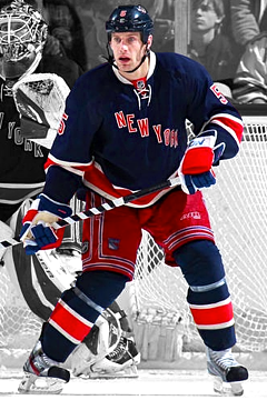
That doesn't quite wrap things up, however. The New York Rangers are wearing some kind of decal on the back of their helmets this season, though I haven't been able to identify it yet. If you can help, drop me a line. This collection feels incomplete without it — whatever it is.
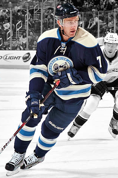
Also, I haven't yet been able to find a clear picture of the back of the Columbus Blue Jackets helmet to determine whether or not they are using a decal this season. Other than that, any team not mentioned in this post is confirmed to not be wearing a decal on the back left side of their helmets.
Anyway, hope this post offered some interesting insights. Helmet decals. What will they think of next?
Update on 2013-01-22 17:07 by Chris
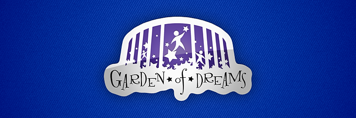
Rangers represent Garden of Dreams on helmet
Our collection is complete! Thanks to a few helpful readers and a continued search for photos, I can tell you that the New York Rangers wear their charity's logo on the back of their helmet. The Garden of Dreams Foundation is a non-profit that works with kids and has been partnered with the Rangers since its inception in 2006.
Additionally, I can now confirm — after watching last night's game — that the Columbus Blue Jackets do not have a decal on the back of their helmets.