Leafs Prepare Early for Centennial

Photo by Alan Hudes | Logo from Canadian Intellectual Property Office

First, apologies for the lack of blog updates recently. It's not that there's been nothing worth reporting. Just having difficulty finding the time these days. But I wanted to get this on the record.

Toronto already promoting 100th anniversary season

The Toronto Maple Leafs are wasting no time getting prepared for their upcoming 100th anniversary season — which is, you know, still four years away in 2017. Never too soon, right?

Icethetics reader Alan Hudes wrote in a couple weeks ago with the above photo of a trailer. Specifically, it's the Leafs Nation Mobile Fan Zone. Inside, it contains a replica of the team's dressing room which isn't weird or anything. But that's not important.

What we're interested in is its new look — which prominently features artwork related to that centennial I mentioned before. (The one that's still 52 months away. That's 52 months, not 52 weeks.) The "MFZ" — their acronym, not mine — currently features the previous Leafs logos, including those from before they adopted the Maple Leaf moniker, the Arenas and St. Pats. And there's also a rather boring 100th anniversary logo to top it all off.

Knowing the "creative" for that event is already underway, one might consider a quick trip to the Canadian Intellectual Property Office to turn up another centennial logo. And it's hardly an improvement over the trailer. That's what you see next to the photo. The trademark was filed last March — a year ago today, in fact.

Only 16 years between 75th and 100th anniversary logos

The funny part is that you may recall Toronto celebrating its 75th anniversary back in 2001. Quick math shows 2017 minus 2001 does not equal 25. So what's going on? Well apart from the obvious marketing ploy, the team was only counting its years as the "Maple Leafs" — which started only in 1927.

In 2017, the club will be marking the founding of the franchise in 1917 as the Toronto Arenas with the formation of the National Hockey League. (Next, I want to see the NHL's 100th anniversary logo. Think they'll make all the teams wear shoulder patches like they did with their 75th in 1992?)

I've spent far too long writing about this topic at this point. It could be the late hour or it could be me just trying to make up for my recent silence. If you guys have anything to add, feel free.

Sweaters Worth a Million Bucks

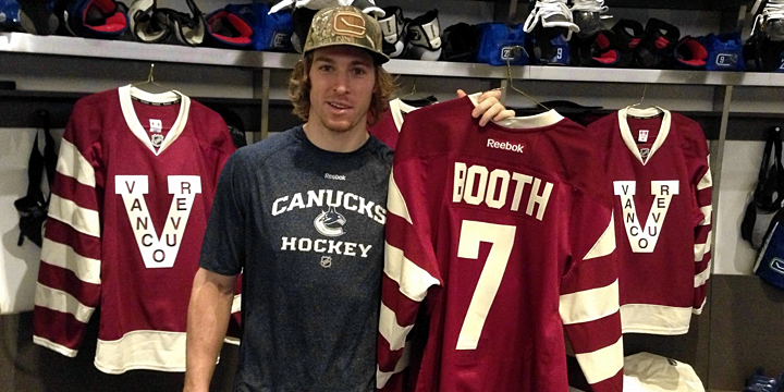
On Friday, it became official. After leaking out little teasers here and there, the Vancouver Canucks "officially" unveiled their spectacular Vancouver Millionaires jerseys as part of their celebration of A Century of Hockey in Vancouver. Check out David Booth in the locker room surrounded by maroon.

Photo from Vancouver Canucks (via Facebook)

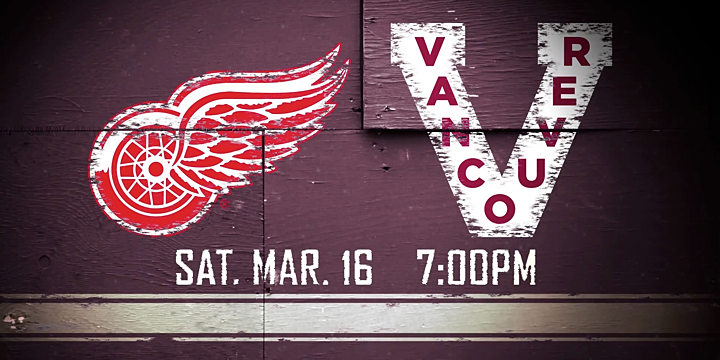
Along with the unveiling, the Canucks announced — as we suspected — that the special uniforms will be worn Sat., March 16 when the Detroit Red Wings pay a visit to Vancouver. If you need a reminder why the Wings are the perfect team to wear this jersey against, check out the previous blog post.

Image from Vancouver Canucks (via YouTube)

The Canucks also rolled out a new video that skims the surface of Vancouver's hockey history just enough for the average fan to understand why the team will be wearing such unusual looking jerseys.

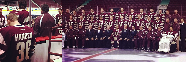
Photos from Vancouver Canucks (via Instagram)

If you're eager to see more photos of the new sweater, be sure to check out the Canucks' Instagram account. There's also a neat gallery of behind-the-scenes stills from the team photo shoot on The Province's website.

Now mark your calendars for March 16. It'll be quite a sight!

Second Chance at Lagers Jersey!

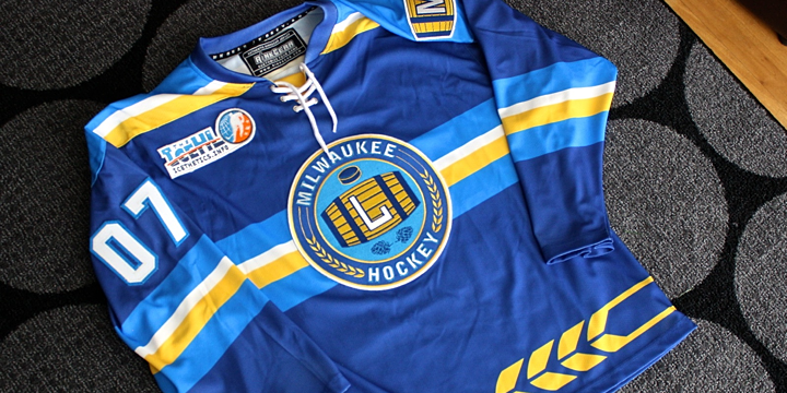
Lagers jersey on sale again until March 17

If you were one of the people who saw these pictures back in January and thought, "man, I wish I could've bought one of those Lagers jerseys," then your wish has come true!

For a limited time, from now until March 17, the IceHL's Milwaukee Lagers jersey will again be available to buy from the great people at RinkGear — through their Geeky Jerseys store. And just as before, it can be yours, fully embroidered and personally customized for just $95.

If you miss your chance to grab this Lagers jersey now, you'll have only yourself to blame.

The photos in this blog post are great, but I've posted dozens more high-resolution photos that really show off the quality of the jersey on the Icethetics Facebook page. Go check them out. And if there's something else you want to see, let me know and I'll break out my camera again.

For those unfamiliar with the Milwaukee Lagers or Icethetics' fantasy hockey league, the IceHL, check out the free IceHL 2012 Yearbook. It's a quick download and contains everything you could possibly want to know — and then some.

By the way, following this second window for the Lagers jersey, the Hartford Mariners jersey will be up for sale next. It won the last round of voting. So soon enough, you can have not one, but TWO IceHL jerseys in your collection!

Phantoms Sport the Retro and Ridiculous

Last week the AHL's Adirondack Phantoms busted out a couple of specialty jerseys. Nothing new in the minors. But these deserve a special look for two very different reasons.

AHL club returns to Philly in throwback threads

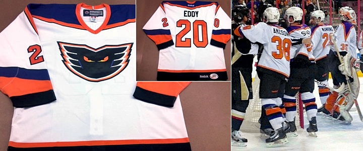
On Friday, Feb. 22 — for one night only — the Phantoms hit the ice at the Wells Fargo Center in Philadelphia — sporting retro purple-infused threads just like they did back when they called Philly home from 1996 to 2009. The club moved to upstate New York when their arena was taken down.

Photos from Adirondack Phantoms (via Facebook)

The Phantoms faced their former in-state rival, the Wilkes-Barre/Scranton Penguins in a game which drew one of the largest crowds to watch an AHL game indoors. Borrowing their NHL affiliate's arena was certainly helpful there. But the Phantoms ended up falling to the Penguins, 2-1.

It's always neat to see classic minor hockey sweater make a comeback — even if only for a night.

And then there's this disaster.

Phantoms celebrate mascot's birthday with silly sweater

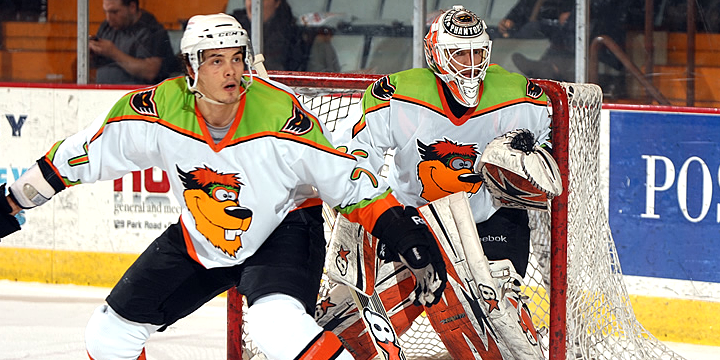
I guess this is a situation where the universe required balance. The only way to allow an awesome jersey to be worn is to follow it up with an awful one. The Phantoms returned home two days after their trip to Philly to celebrate the "birthday" of their mascot, Dax.

Photo from Adirondack Phantoms (official website)

Last Sunday, grown men — professional hockey players, no less — wore these silly numbers with Dax's cartoon head replacing the classic Phantom crest. If ever there was a specialty jersey squarely meant for the kids, folks, this is the one. It's incredibly dorky and yet somehow charming.

Surprisingly, the Phantoms won while wearing it. They beat the Binghamton Senators 2-1. Still, let this not be a common occurrence. Maybe next year you just get Dax a gift card or something.

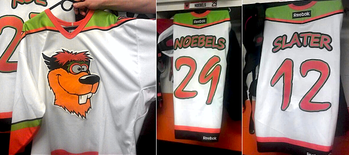
Photos from Adirondack Phantoms (via Facebook)

I'll leave you with these close-ups of the jersey. Recognize that awful number font? Remind you of something "Mighty" from way back when?

New NHL Draft Logo Emerges

New logo design officially appears on NHL.com

It was back in December that we thought we got our first look at the logo for the 2013 NHL Entry Draft. But that was evidently not an official version. This week, a new mark prominently featuring the outline of the state of New Jersey started appearing on NHL.com.

Personally, I like it better than what we saw a few months ago. The strange drawing of the Newark skyline was out of place. But this map-centric design makes me wonder if it'll set a new trend for future draft logos. Philadelphia hosts in 2014, so will that logo feature an outline of Pennsylvania?

Do you have an opinion on NHL Draft logos? Ever even thought about them before today?