
0194: Avalanche Re-Bourne
/
Andrew Bourne continues his NHL makeover series today with a look at the Avalanche.
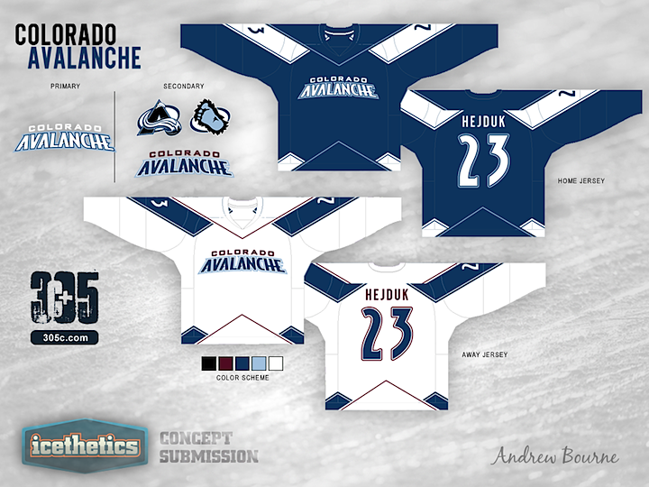
For the most part, Colorado's color scheme is right on the money. Their black, blue, burgundy, white and silver really remind me of Colorado. Cold and mountainous is the way to go. Having said that, I wanted to tweak those colors to give you more of a feel for the mountains and the snow.
Even though The Avalanche have the two best logos in the entire league, I decided to use them in the secondary role. The very modern look of the home and away jersey designs just didn't work with the rotated and angular A logo or the circular Sasquatch logo.
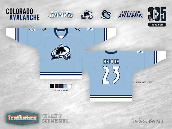
I also wanted to pay tribute to the Nordiques somehow in the third jersey. So, I took their simplistic style and added two stripes to symbolize, you guessed it, their two championships. The jersey is reminiscent of the Nordiques but still has a style that Colorado can call its own.