0062: Brand-Blending Philly and Ohio

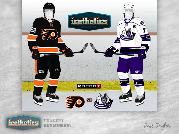
As promised, Ross Taylor is back on this Freak Out Friday with more of his brand-blending madness. This week he's tackling Pennsylvania and Ohio and not just crossing teams, but crossing leagues. On one side, we have a mix of the WHA's Philadelphia Blazers and the NHL's Flyers. The Philadelphia Flyzers, if you will. And on the other, it's the Cleveland Crusaders of the WHA and the NHL's Blue Jackets, which I'm choosing to call the Ohio Bluesaders. More logo-melding to come next Friday.

0061: The Final Word on LA

Listen up, LA. The Kings jerseys need fixing and this is really all you need to do win the game. Right here. Kudos to James Taylor for finding the sweet spot.

0060: Dark Dallas

I'm still getting Dallas Stars concepts on a regular basis, probably because this is one of the teams most in need of a new look and everybody has an idea on how to improve it. Bryan Dyck has some worthy ideas here, but unfortunately the logo is too dark and intricately detailed to work well for a professional sports franchise. That being said, the home jersey is green and that will always win me over.

0059: Making the Coyotes More Interesting

When the Phoenix Coyotes were rebranded in 2003, the simplistic design was a complete 180 from their original look. What Nick Burton seems to be doing here is trying to make the Coyotes look interesting again. He's brought back the old logo to use as an alternate and opted for the color palette of the team's current third jersey. It's not perfect, but I'd call it an upgrade.

0058: The Bruins at 90

Two years from now, the Boston Bruins will be celebrating their 90th anniversary. Justin Nahhas has taken the bold step of creating an anniversary jersey for the occasion. And it's definitely a winner in my book!