0183: San Francisco Sunday, Part 3

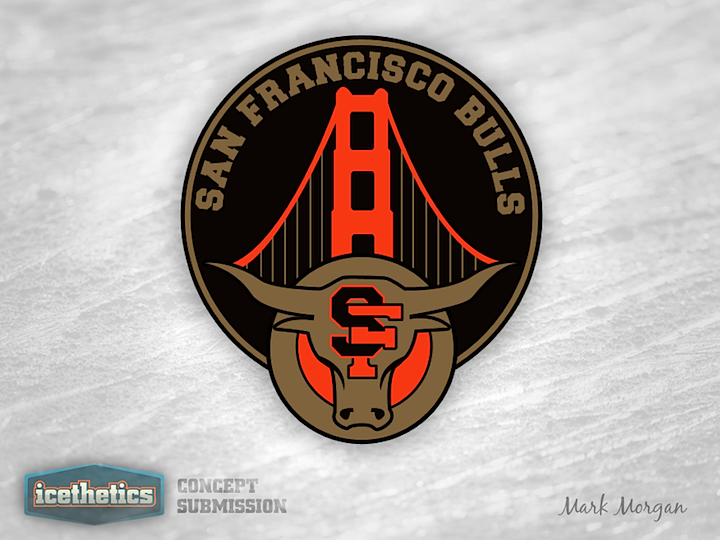
Mark Morgan was the most prolific designer to take a swing at designing a secondary logo for the ECHL's new San Francisco Bulls. So I'm giving him this San Francisco Sunday all to himself. The first design features a pretty straightforward look. It incorporates the primary logo, the intertwined SF and the Golden Gate Bridge.
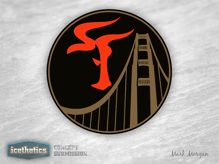
This next one is my personal favorite. At first glance, it looks like a weirdly-shaped SF. But look again. It's the head of a bull in profile! I didn't even know that was possible!
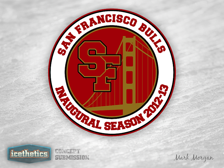
The last one doesn't quite use the right colors but it's still a solid and simple patch design. So which of Mark's three is your favorite?
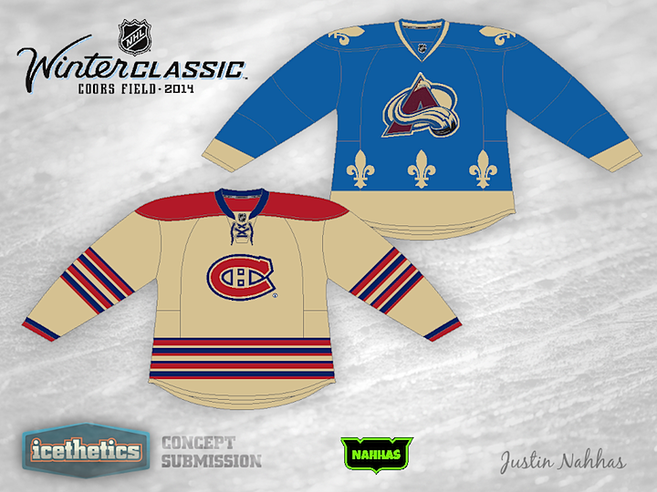
0182: Battle of Quebec 2014

This Winter Classic Saturday has Justin Nahhas imagining a possible Denver-hosted Classic in 2014. It's a play on the club's Quebec history as they would host their former rival, the Montreal Canadiens — who would be playing their third outdoor game in 11 years.

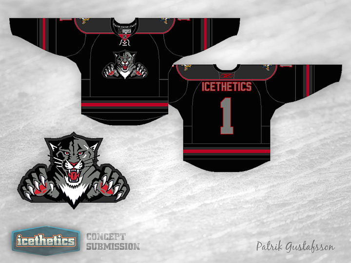
0181: The Panthers Go Dark

Freak Out Fridays are always good for posting something from out of left field. Patrik Gustafsson's Florida Panthers concept seems to fit that bill. Black, dark grey and some pops of red. That would definitely be something interesting to see on the ice.

0180: A Nod to Leafs History

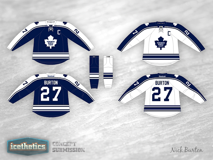
Any good reason why the Maple Leafs shouldn't use these as their home and road jerseys? It's a nod to history while still quite modern. Another bang-up job by Nick Burton.

0179: A Bruin That Shows Its Teeth

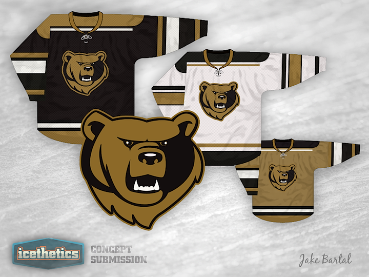
Boston Bruins logos have always been more influenced by their city that their team nickname. Here, Jake Bartal has put together a design with a few more teeth — literally.

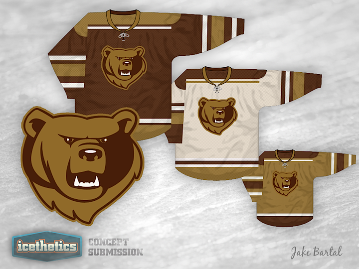
And if black and gold doesn't work for you, how about brown as another color option?