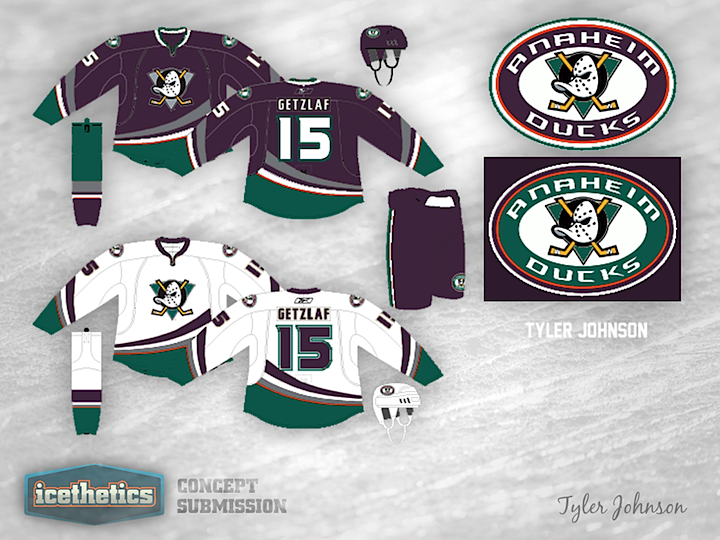
0243: Make Them Mighty Again

This is a classic merging of old and new. Tyler Johnson has given the Anaheim Ducks uniforms the retro treatment adding in old colors and logos. But one thing I really like about this one is the thin orange stripe. I won't go so far as to say it's good design, but it pops in a way I don't hate. What do you think? Should the Ducks have taken a similar route for their third jersey?
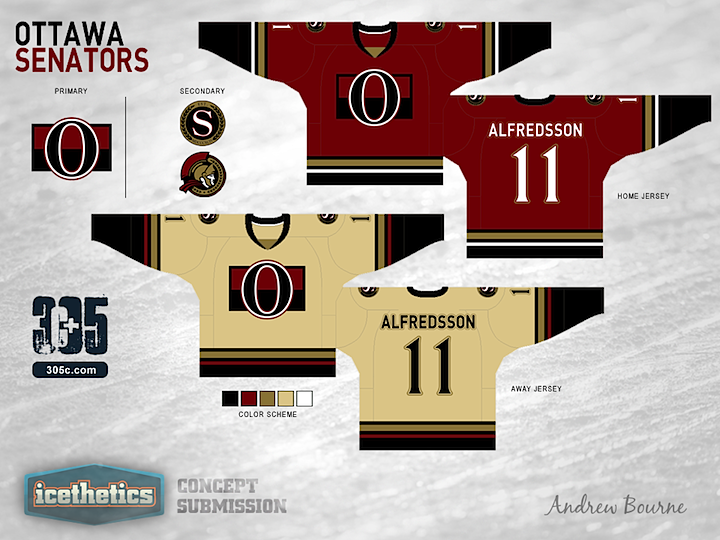
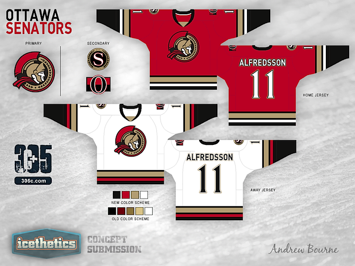
0242: Senators Re-Bourne

I know we just looked at a Senators concept the other day, but it's time for the next jersey set in Andrew Bourne's NHL makeover series. What do you think of his take on Ottawa's look?

0241: Blue & Silver

Here's a color scheme we haven't yet seen in a Lightning concept. I like the blue and silver a lot, actually. Any thoughts on Steven Grant's attempt.

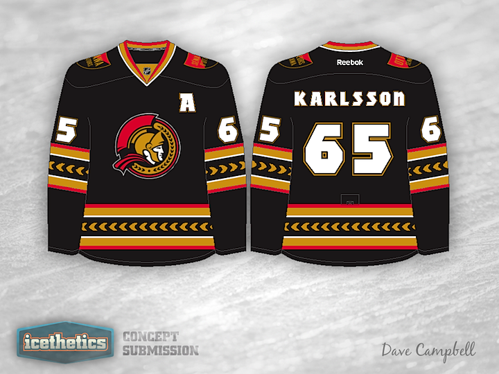
0240: Black, Red & Gold

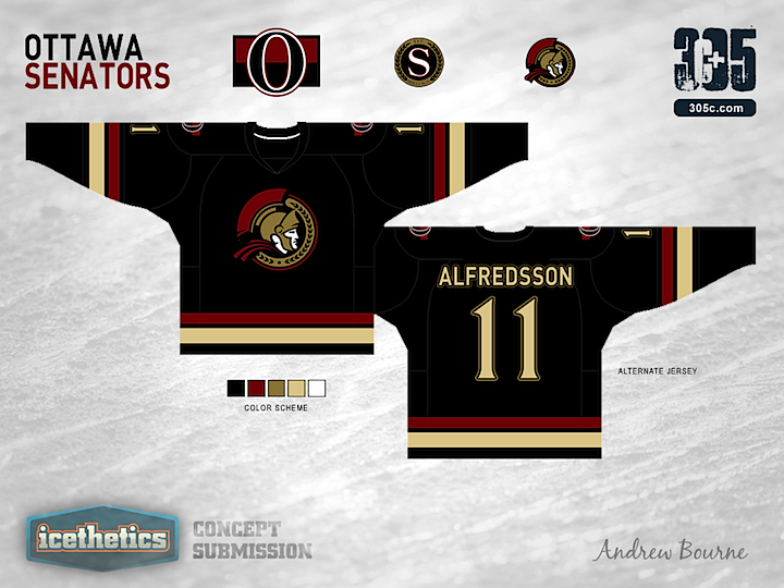
Here's a good reason for the Senators to go back to black. Dave Campbell's concept is unlike what we've seen before in both its striping and crest. The logo he's using is actually an official mark in Ottawa's arsenal, but I'll never understand why they haven't put it on a uniform yet. It's far superior to their current primary mark. Any thoughts on this?

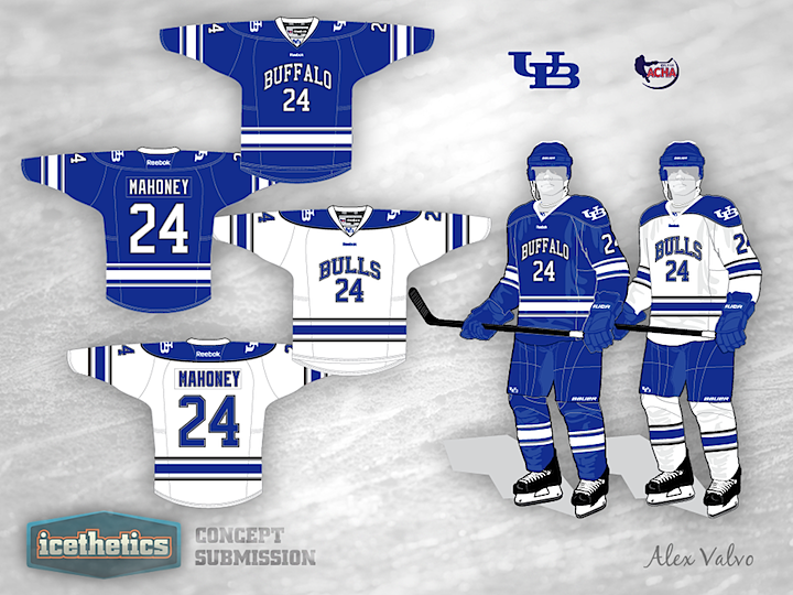
0239: Buffalo Bulls

The University at Buffalo is the subject of this week's University Sunday. Here we have Alex Valvo's take on the Bulls.