0250: Barons & Griffins

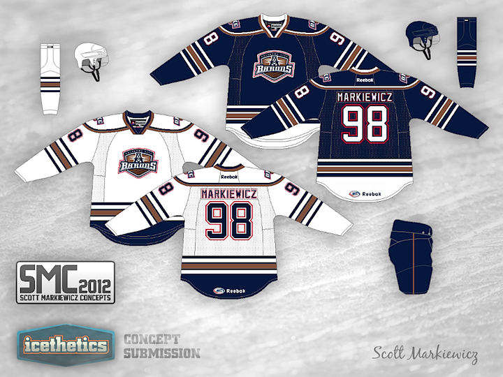
Scott Markiewicz is back with another AHL concept this week. His take on the Oklahoma City Barons has the club keeping its old Oilers color scheme but with a new striping pattern. It's not bad, but I'm definitely a fan of their new third jersey.
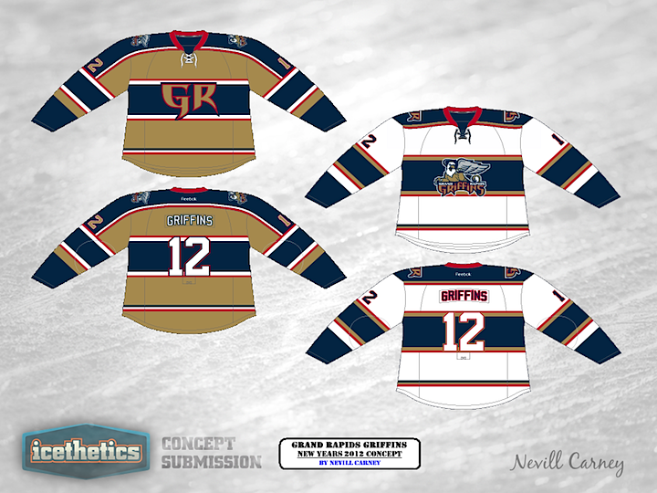

As an AHL Week bonus, we have this Grand Rapids Griffins concept from Nevill Carney. He originally created it last year as a New Year's 2012 proposal.

Now normally, I end theme weeks on Thursday so that we can properly observe Freak Out Friday. However, this week we do have an AHL-themed Freak Out so check back tomorrow for that.
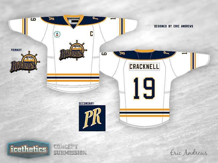
0249: Rollin' on the River

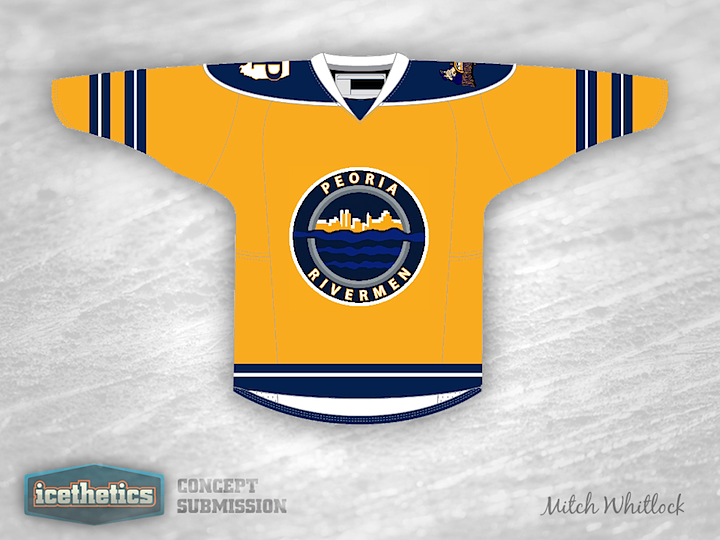
AHL Week keeps rolling today with the Peoria Rivermen. Last month, the Rivermen announced the winner of a fan-focused jersey design contest. Today we're taking a look at a couple of the entries that were also considered (and sent my way). Mitch Whitlock tried a Predators-style all gold sweater. But the P/Illionois shoulder patch is pretty cool.

And Eric Andrews went the way of the wordmark, which is starting to become more common than a lot of us would prefer. And it screams Buffalo Sabres. Not sure the Blues would dig that. But that's just my take. What do you think of these two?

0248: War Planes & Purple Lions

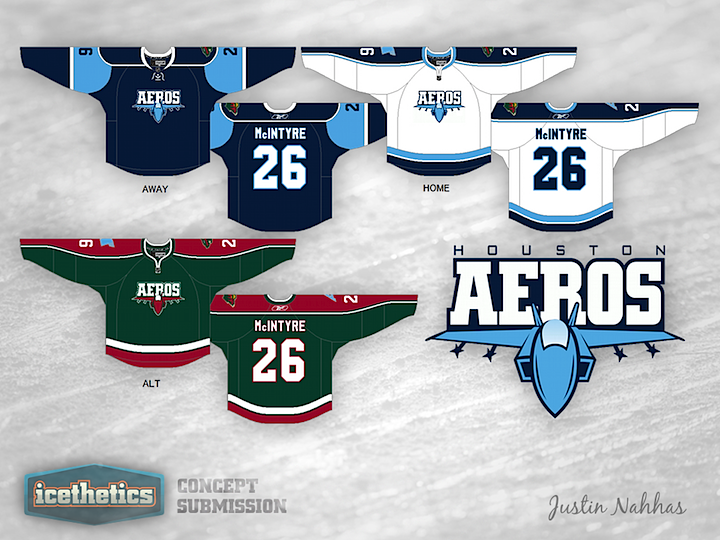
AHL Week continues today with a pair of concepts by regular contributor Justin Nahhas. His Houston Aeros design are inspired by both parent club Minnesota Wild and the team's own short-lived former logo — a sort of modernized war plane. It's not bad but you can't really beat their current logo.


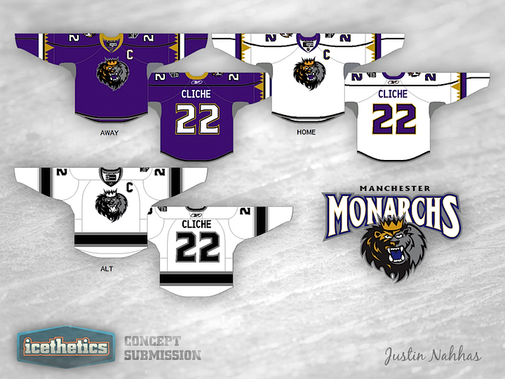
This Manchester Monarchs design also pays homage to the parent club, the Los Angeles Kings. Interestingly, their existing uniforms look a bit more like something from the Anaheim Ducks' closet. Think these are a step up?

0247: The Retro Whale

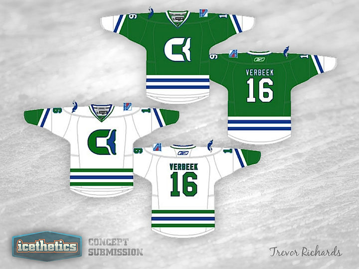
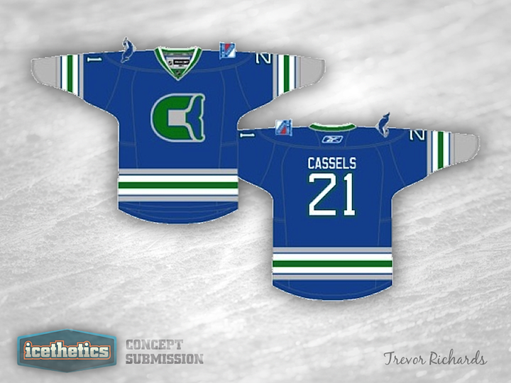
As we embark on another week without NHL hockey, I thought I'd turn the Concepts page's attention to the AHL this week. Plus, we haven't done a theme week in a while. Today, we get a couple of looks for the Connecticut Whale, starting with this Hartford-inspired throwback set from Trevor Richards.

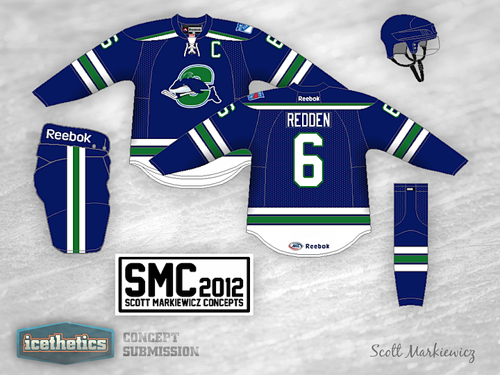
But since I don't see the Whale changing their logo anytime soon, what about this one from Scott Markiewicz?

0246: Miami RedHawks

Another University Sunday is upon us and this weekend we're looking at Ohio's Miami University (not be confused with Florida's University of Miami). Here's what designer Adam Hainsfurther has to say about the idea.

It's a take on a throwback design they're going to wear as an alternate this season with a couple of twists. I added the stripes at the bottom of the jersey and the colored nameplates. I also created a new secondary logo with the feathers that harkens back to the RedHawks' time as the Redskins prior to the name change in 1997.