Ladies' Day

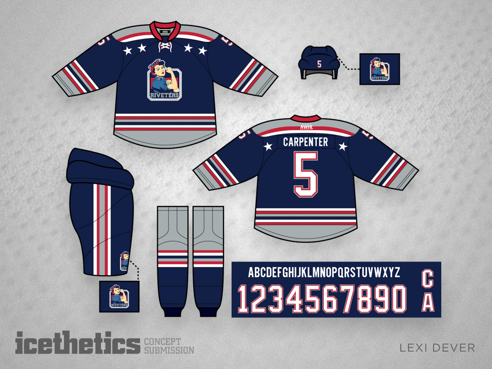
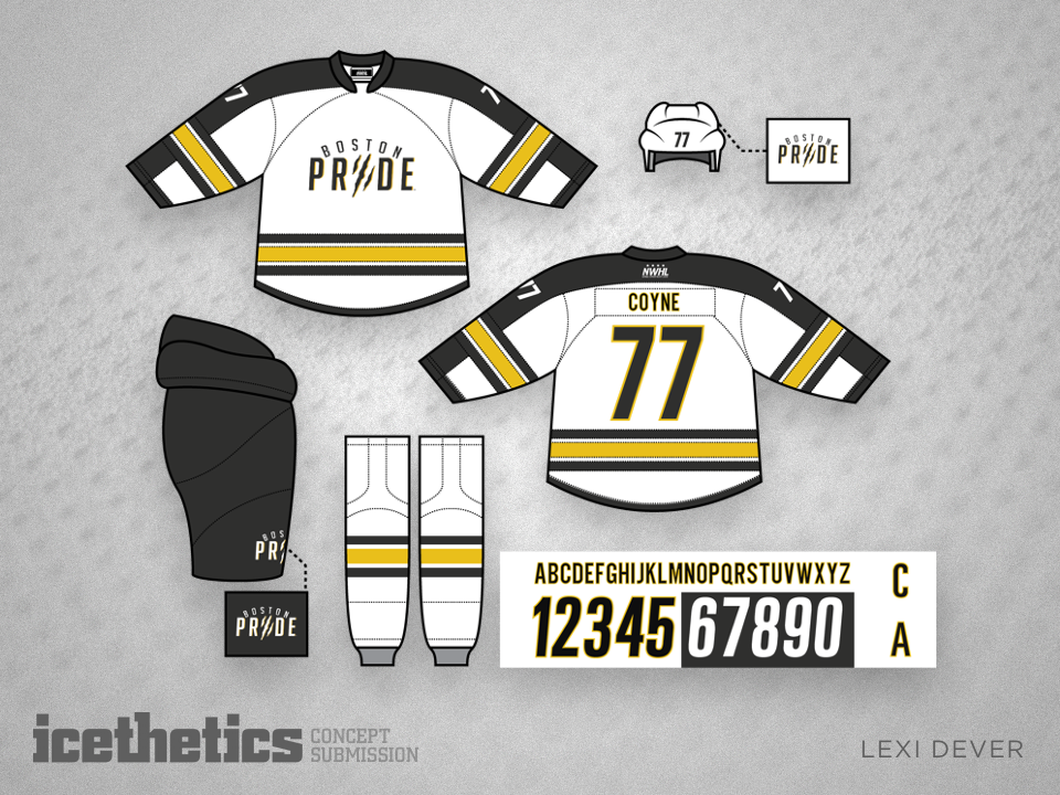
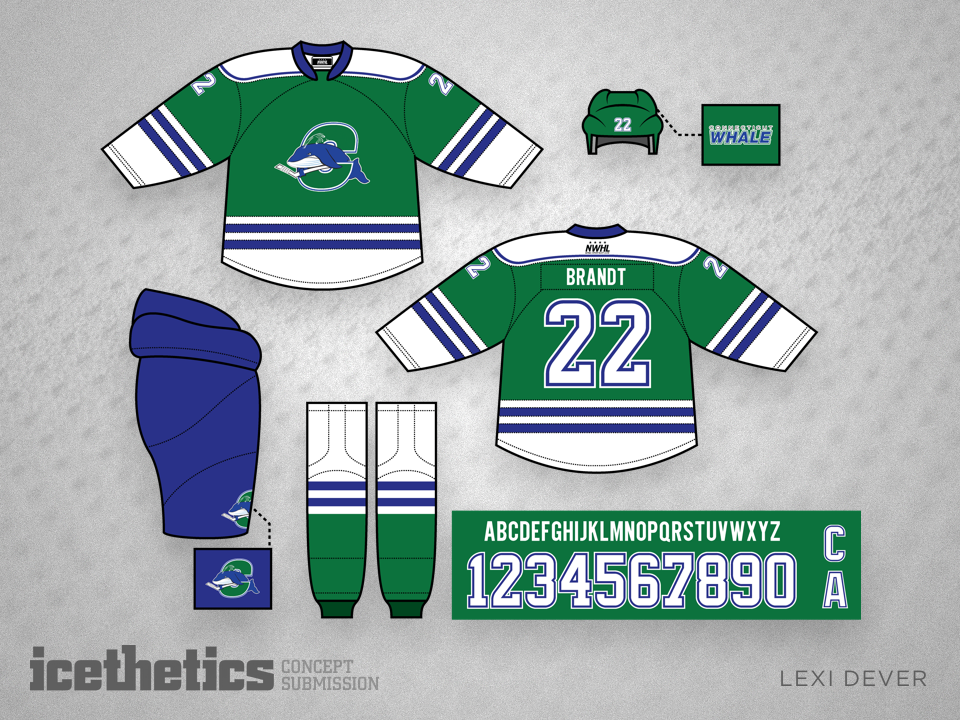
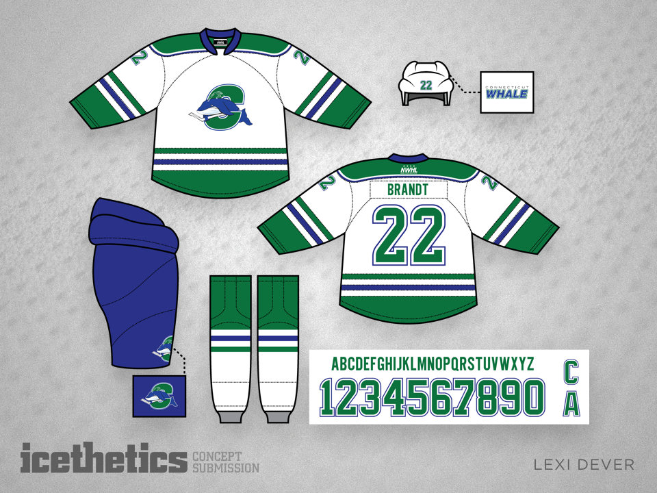
Female pro hockey players will take the ice this fall for the inaugural season of the National Women's Hockey League — or the NWHL. The league recently held a jersey design contest for its four teams, but there's no doubt they would've been better off just hiring Lexi Dever to handle them all. While the logos weren't much to work with, her take on the NWHL is absolutely striking!

0398: The Coconut Whale

This week's Freak Out Friday is brought to us by Ryan Yuck, who takes us to the American Hockey League for a change. I'll let him explain why.

This is probably the weirdest jersey I have ever done. It's not pretty, however, I find it rather hilarious. Introducing... The Coconut Whale. My inspiration stems from the article you posted surrounding the Connecticut Whale franchise. Basically, at first glance I read, "Coconut" instead of "Connecticut". I thought to myself "what the f***?" until of course, I re-read the title of the article.

I thought it was a comical name for a team so I went along with it and made a concept. Call it a freak out, heck, call it a funny Beer League team. Whatever it is, this jersey will never see the light of day. Haha.

0247: The Retro Whale

As we embark on another week without NHL hockey, I thought I'd turn the Concepts page's attention to the AHL this week. Plus, we haven't done a theme week in a while. Today, we get a couple of looks for the Connecticut Whale, starting with this Hartford-inspired throwback set from Trevor Richards.

But since I don't see the Whale changing their logo anytime soon, what about this one from Scott Markiewicz?

0044: Redeeming the Whale

Yesterday, we got a little taste. Today, the full meal. This morning's double-feature marks the start of Minor League Week. For the next few days we'll be enjoying concepts for minor pro teams, which often tend to get overshadowed by the NHL on this page.

As you can see, we're kicking things off with the Connecticut Whale, one of the teams most in need of a complete redesign. Their current look is an absolute joke and I cannot say it enough. And as jokes go, you realize just how not-funny it is when you see what Mike Ivall has come up with. His identity is the perfect mix between the old Hartford Whalers and the Whale's previous identity — the Wolf Pack. Overall, this is one of my all-time favorite concepts.


Now, then. I'm an adult and I realize it's unreasonable to think the Whale would simply scrap entirely the new brand they're trying to establish. Maybe something a little less dramatic would get the job done. To that end, may I recommend Ryan Haslett's concept? I can't say I'm a fan of the logo or the striping, but at least it aspires to better days in Hartford.