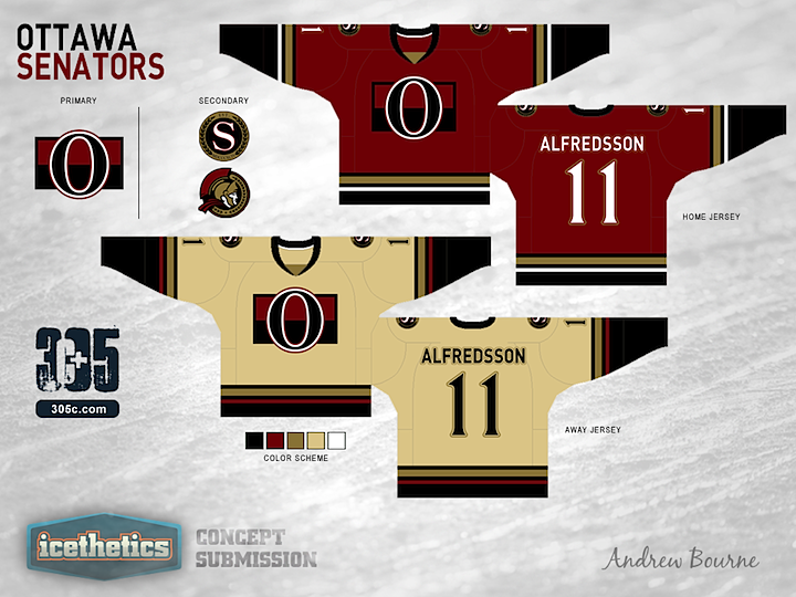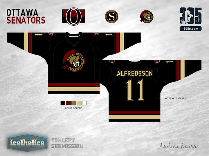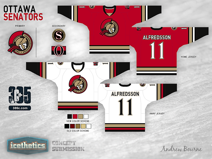
Andrew read through your comments and made some revisions to his Senators concept.
Colin M, Steve, Derek, Louie and Eaman12 either wanted to see brighter reds or a true white. So, here's both! Colin M, Derek, Garth, and Eaman12 didn't really like the use of the 'O' logo and I think I can see why. The circular Senator Head is much more strong and doesn't get mistaken for a Zero. I also thickened up my notoriously thin stripes and as for the lettering, I'm just using the Senators current font. Can't change that one... For those of you who embraced/defended the 'Ancient' golds (Jon93, Louie), Thank you! And to the rest, thanks for helping me try to fix the Sens!