0252: Vancouver's Winter Classic

Someday the Vancouver Canucks will have to figure into the NHL Winter Classic. And when they do, Colin May has a couple of uniform designs that could work quite well. I know we all like to mock the V jerseys (especially in those colors), but I think this blue and green look is pretty sharp. But if that's not your cup of tea, what about this one below?

0251: Monster Freak Out

We wrap up AHL Week on this Freak Out Friday with Brett Ireland's unique take on the Lake Erie Monsters. Here's how he describes it:

This jersey is a mashup of sorts, incorporating two of Cleveland's professional hockey teams. The yoke's a mix of the Crusader's black stripe down the center, and the dashes are lifted from the AHL Baron's old style. The football jersey style crest is also an element lifted from the AHL Barons, a design choice that's truly something from hockey past. The striping pattern is a mimic of the Ohio flag, and lastly I decided that a "faux olde time" choice would be the white nameplate much like the Sabres have.

0250: Barons & Griffins

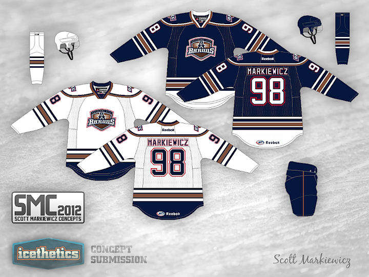
Scott Markiewicz is back with another AHL concept this week. His take on the Oklahoma City Barons has the club keeping its old Oilers color scheme but with a new striping pattern. It's not bad, but I'm definitely a fan of their new third jersey.


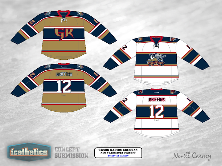
As an AHL Week bonus, we have this Grand Rapids Griffins concept from Nevill Carney. He originally created it last year as a New Year's 2012 proposal.

Now normally, I end theme weeks on Thursday so that we can properly observe Freak Out Friday. However, this week we do have an AHL-themed Freak Out so check back tomorrow for that.

0249: Rollin' on the River

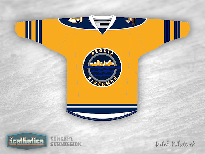
AHL Week keeps rolling today with the Peoria Rivermen. Last month, the Rivermen announced the winner of a fan-focused jersey design contest. Today we're taking a look at a couple of the entries that were also considered (and sent my way). Mitch Whitlock tried a Predators-style all gold sweater. But the P/Illionois shoulder patch is pretty cool.

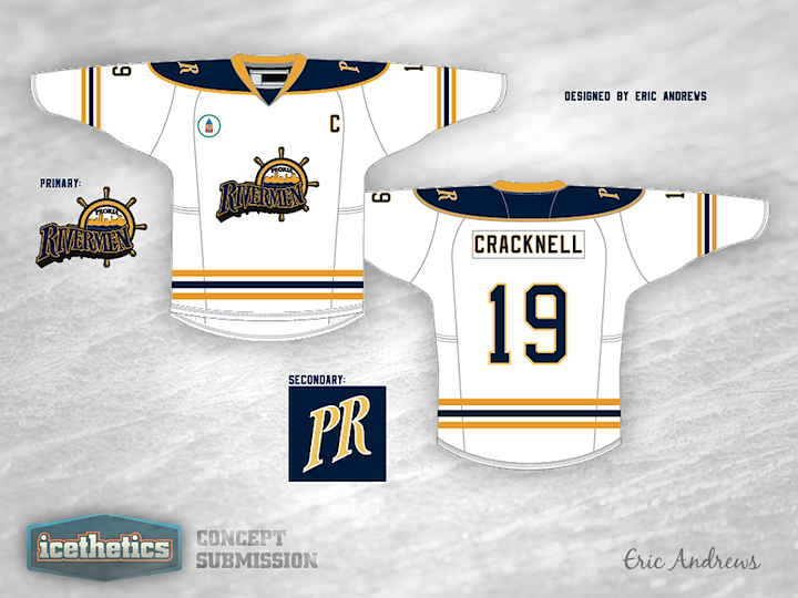
And Eric Andrews went the way of the wordmark, which is starting to become more common than a lot of us would prefer. And it screams Buffalo Sabres. Not sure the Blues would dig that. But that's just my take. What do you think of these two?

0248: War Planes & Purple Lions

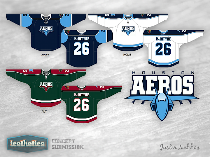
AHL Week continues today with a pair of concepts by regular contributor Justin Nahhas. His Houston Aeros design are inspired by both parent club Minnesota Wild and the team's own short-lived former logo — a sort of modernized war plane. It's not bad but you can't really beat their current logo.


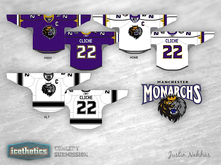
This Manchester Monarchs design also pays homage to the parent club, the Los Angeles Kings. Interestingly, their existing uniforms look a bit more like something from the Anaheim Ducks' closet. Think these are a step up?