Jets of Red

Still waiting on that third jersey from the Winnipeg Jets. I can't imagine them going this heavy with the red, but Tyler Allen sure can. He writes:

Basically, [this is] my take on what the Jets would look good in as a third jersey. I was never a fan of using the "two-tone blue" scheme, so I went back to the original red, blue and white.
The thin striping is meant to represent "jet streams" you see behind jets in the sky. As much as I do like the new Jets numbering lettering, I felt a more "traditional" fit the bill here and used the original Jets numbering.
The idea of the jersey is to look modern, with some retro-like aspects.

So there it is. What do you think?

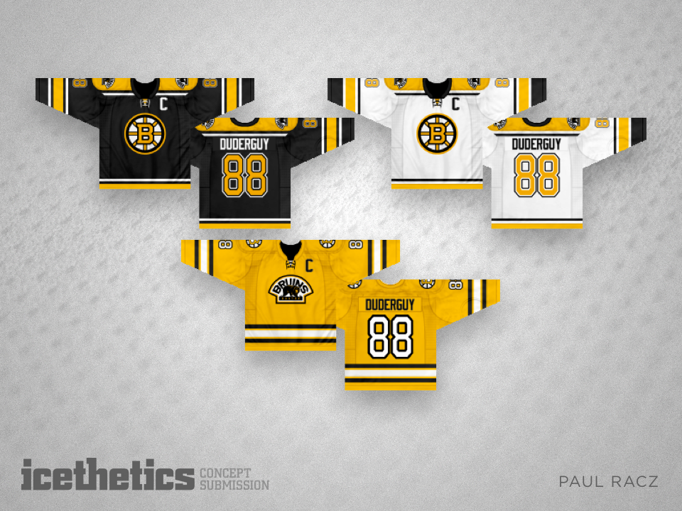
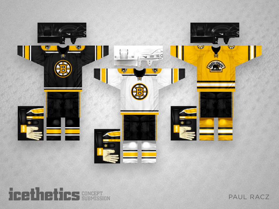
Boston's Golden 'B'

If you can believe it, this submission from Paul Racz has been sitting on my hard drive since July 2011. I have no idea what took me so long to get around to posting it. It's an intriguing design — particularly that spoked "B" in gold.

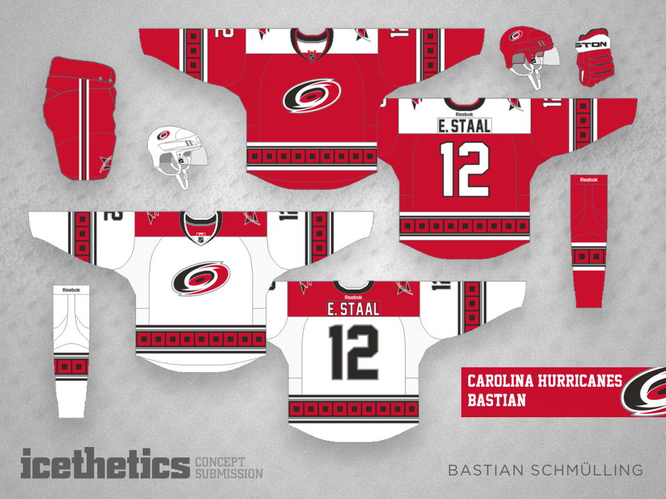
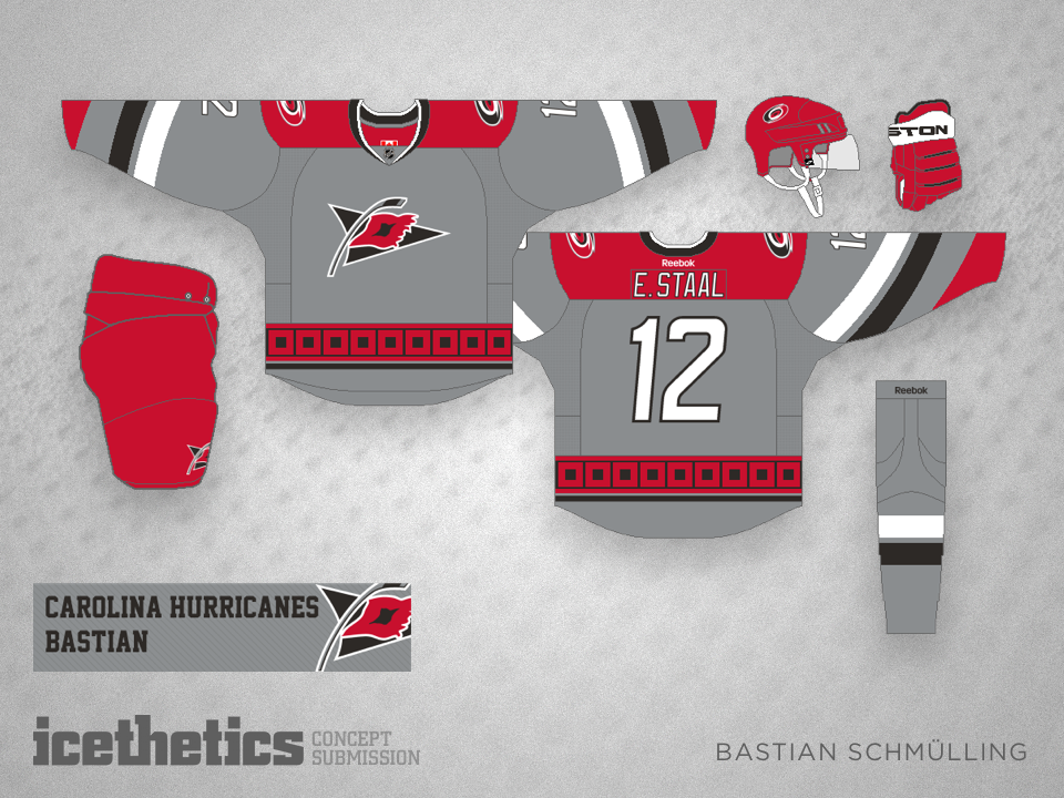
Hurricane Carolina

The talented and prolific Bastian Schmülling shares his improvements to the look of the Carolina Hurricanes. Gotta love that grey third jersey!

Washington Without Frills

What if the Washington Capitals wanted simpler, more traditional hockey sweaters? Just ask Brian Brideau. He has a pretty solid idea.

Retro Rochester

For this week's minor league offering, Dylan Nowak presents a retro kit for the AHL's Rochester Americans — famous, like Hershey, for their frequent use of specialty throwback jerseys.