Just Blues
/


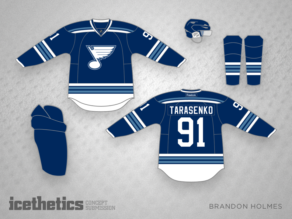
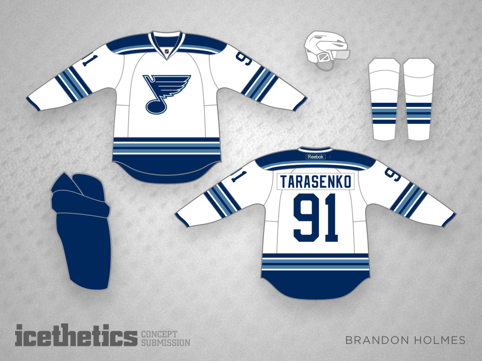
What if the St. Louis Blues were just blue? No gold. Brandon Holmes has an idea.
Tyler Gross thinks the new Manitoba Moose logo and uniforms could've been better. He submits this design, adding that "the little bit of red in the eye is supposed to be a maple leaf as an ode to Canada the the Jets logo."
All right the last three days have been given over to Canada here on the Concepts page, now it's time for the United States! Andrew Krause gives us his take on a national team uniform.
Here's a freaky idea for a Montreal Canadiens third jersey — just invert most of the colors on the uniform. That's what Aaron Bernardi did and it actually looks pretty cool.
Anyone tired of the flaming "C" getting all the glory? Want the old Flames colors back? Miss the fire breathing horse from the late '90s? If you answered yes to each of these questions, then John Elbertson has the perfect Calgary concept for you!