Olympic Spirit, Part III
/You guys are clearly loving this Olympic concept art, so here's even more!
 Glen Cuthbert Glen Cuthbert |
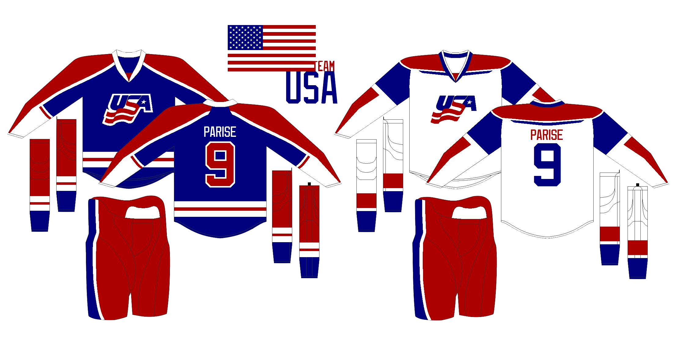
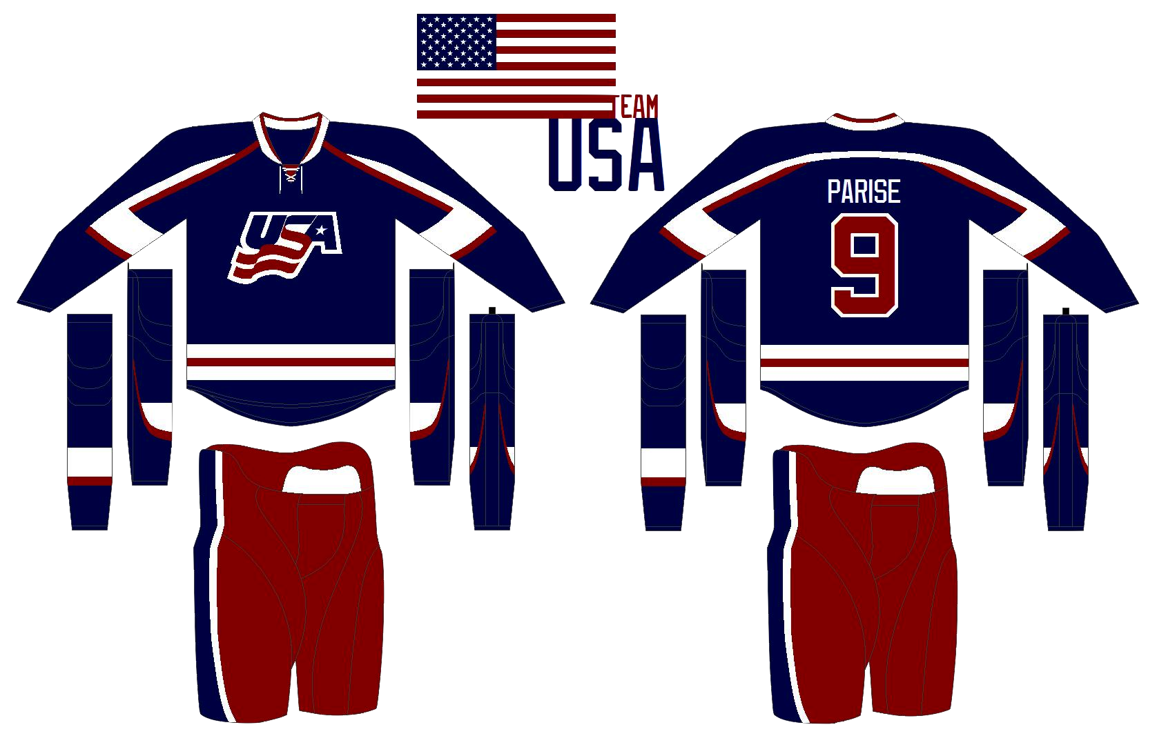
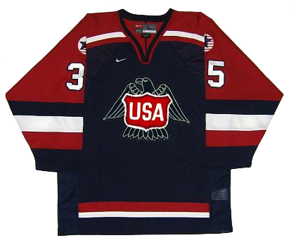
In the previous post, Glen had a very sharp white Team USA jersey. This is the blue one that completes the set. Not too bad. But I think with a crest that simple, the striping could be even simpler as well. |
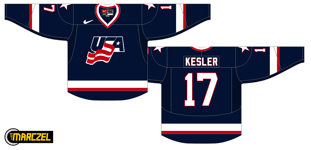
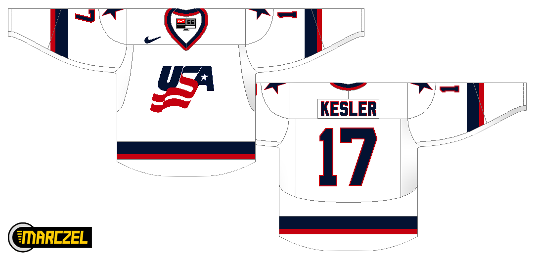
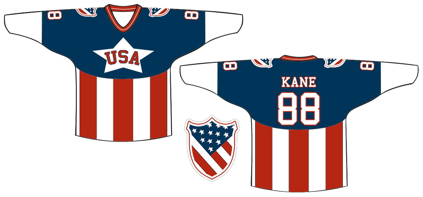
 Evan Maldonado Evan Maldonado |
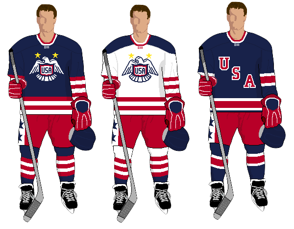
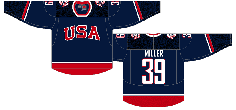
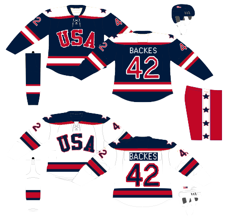
That brings us to Evan's Team USA concept, which employs the same ghosted effect seen on some of the jerseys in this year's tournament. I'm really liking the letters in red on this one. Seems way better than the current dark jersey, but not that much is really different. |
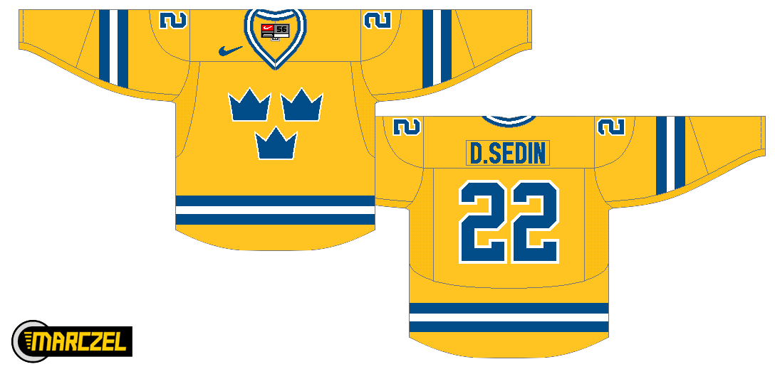
;) Matt Marczel Matt Marczel |
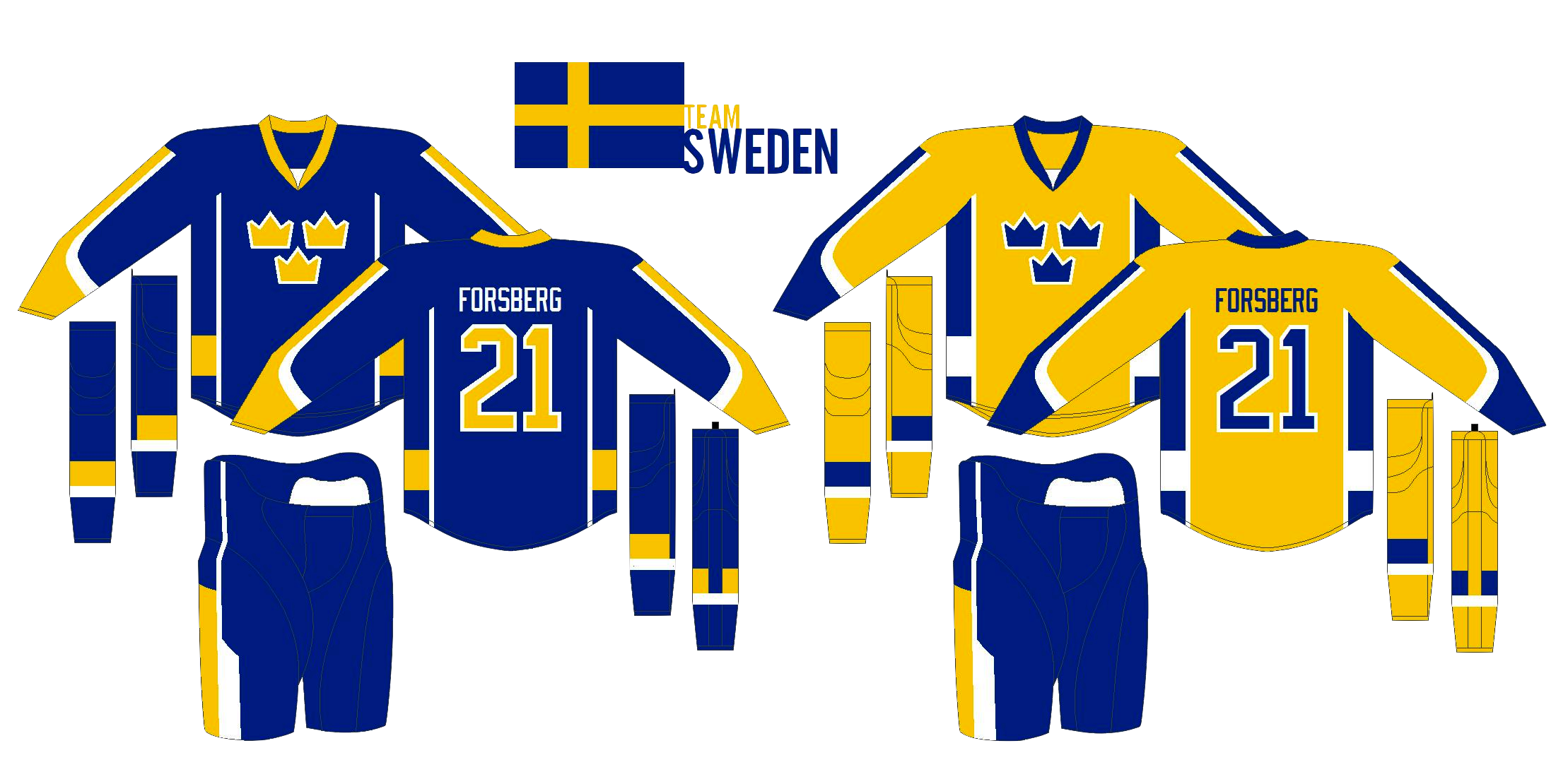
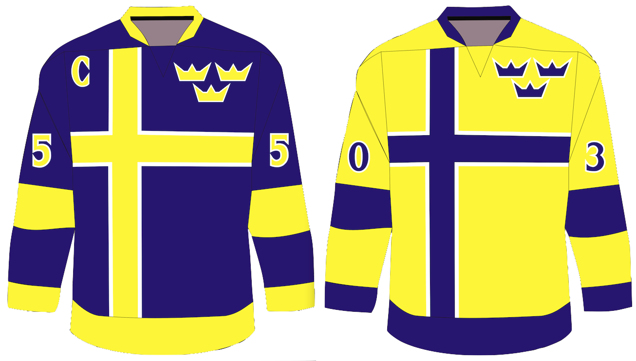
The rest of today's concepts take us to Scandinavia. Here, Matt simplifies Sweden's jerseys and gives them a white one for a change. But personally, I've always been more a fan of the blue jerseys. And technically, white isn't one of their colors. Still, a great effort. |
 Dallas Hicks Dallas Hicks |
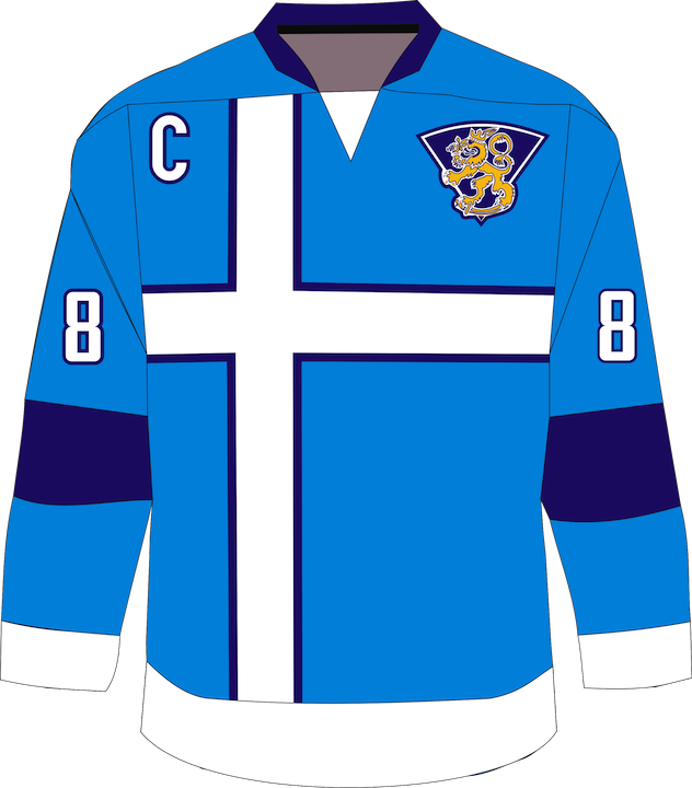
Dallas is trying something completely different with some of the teams that have simple flags. Here, he's adapted the cross on Finland's flag to stretch across the entire front of the jersey... |
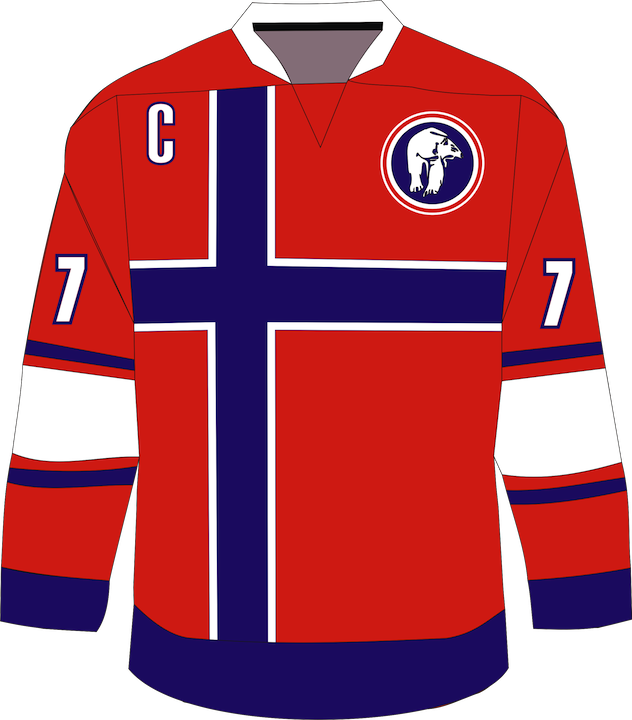 Dallas Hicks Dallas Hicks |
...and he's also done the same for Norway. Nice to see the polar bear make a return. What do you guys think of these? |
And as always, there's more art on tap. In the next day or so, look for more USA concepts plus one from a country that didn't even send a single athlete to Vancouver this year.
The international concepts are still flying in. If you haven't seen yours posted yet, don't worry, I'll get to it. Here are a few more.
 Jake Slavik Jake Slavik |
Jake Slavik calls this his Captain America concept. I think it's pretty clear why. The shield is kind of cool, but where this design falls down is the numbers on the back of the jersey. Too small. But vertical striping, that's not something you see very often on hockey jerseys. Way to step outside the box. |
 Mike Bell Mike Bell |
Mike Bell's submission is a throwback to the 1980 Miracle on Ice jerseys. Always a classic look. |
 Dallas Hicks Dallas Hicks |
In the original part of this post, the Norway and Finland concepts by Dallas Hicks were a huge hit. He also provided similar jerseys for Sweden. |
 Jake Niehl Jake Niehl |
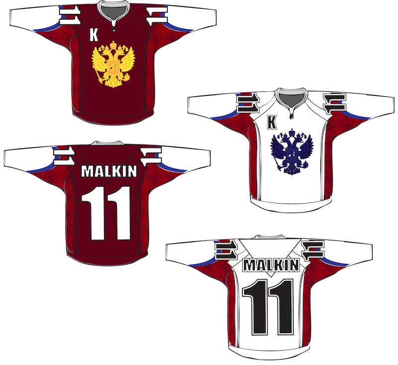
Jake Niehl sent in this rather unique Russian concept. However, it suffers from the opposite problem Jake Slavik had. Numbers are too big here. And on the shoulders, instead of being No. 11, Malkin would be No. 1111. But it's easy to nitpick. The fact is, this is a really eye-catching look for Russia, certainly unlike anything we've seen before. |
 Howie Crawford Howie Crawford |
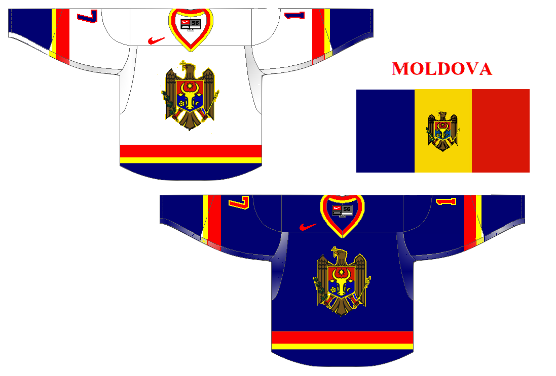
And finally, I promised concept art for a country that didn't send any athletes to the Vancouver Games. Howie Crawford thinks this is what Moldova should wear if they had good enough hockey players to field a team. Very clean, simple and patriotic. |
Expect part four of the Olympic Spirit series this weekend as the hockey tournament, and the Olympics in general, wraps up.