Olympic Spirit, Finale
/I promised one final Olympic concept post. I meant to have it ready Sunday, but as you can see time sort of got away from me. So here's some of the last of the international artwork series.
 John B. John B. |
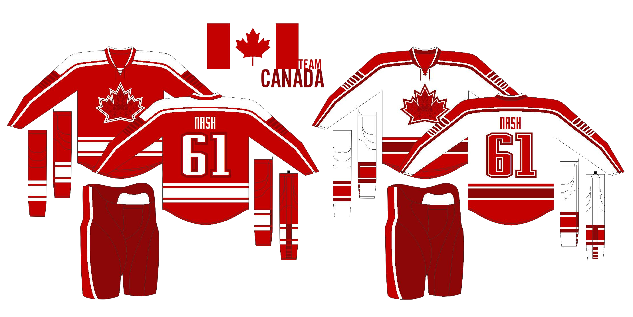
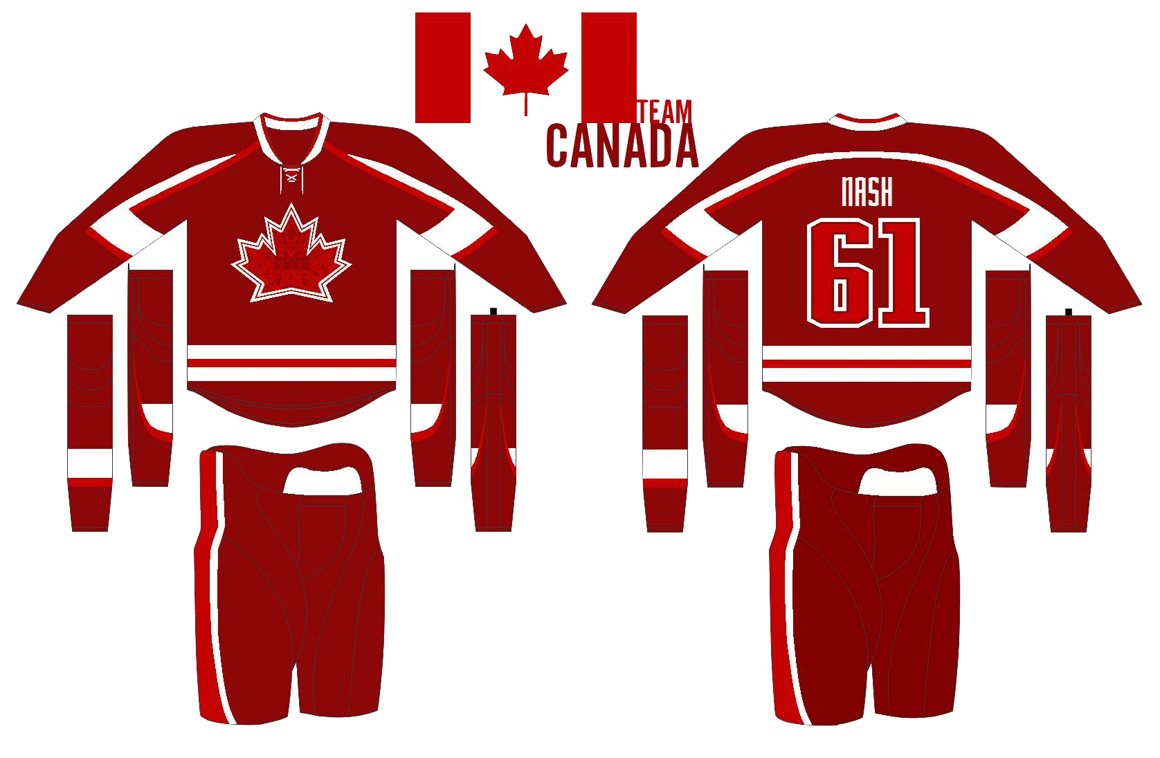
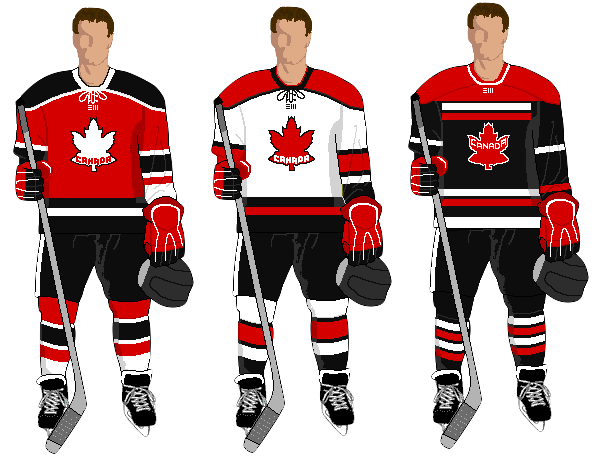
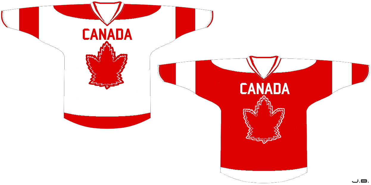
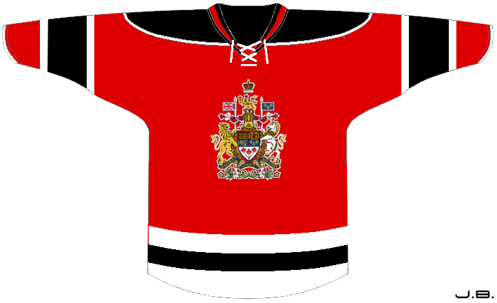
The last three Olympic Spirit posts have opened with a Team USA concept. That's not really fair is it? So here's John's attempt at jerseys for Canada. And yes, that is the Toronto maple leaf in red on the front of the home and road jerseys. The alternate design, which kind of makes me think of the Devils, features the Canadian coat of arms. A nice effort, but I think one of the keys to the maple leaf on the Canada jersey is that it keeps you from having to spell out Canada at the same time. |
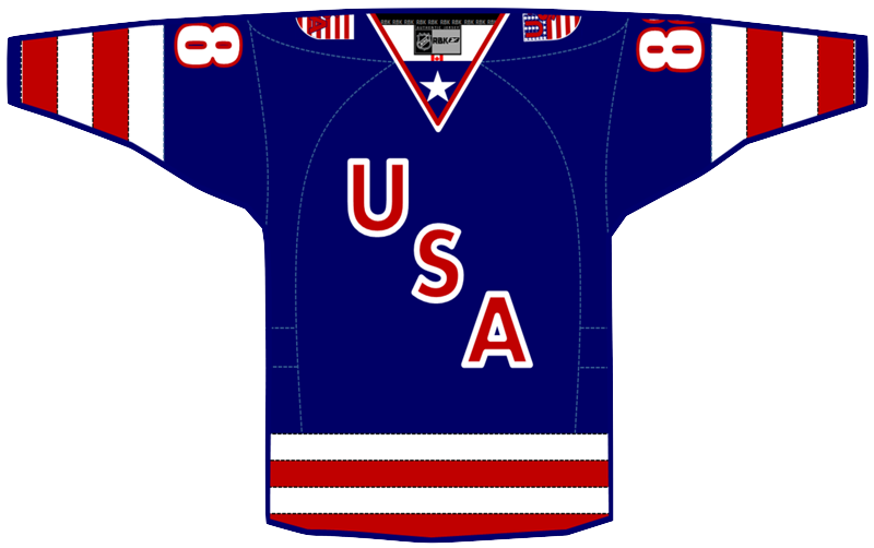
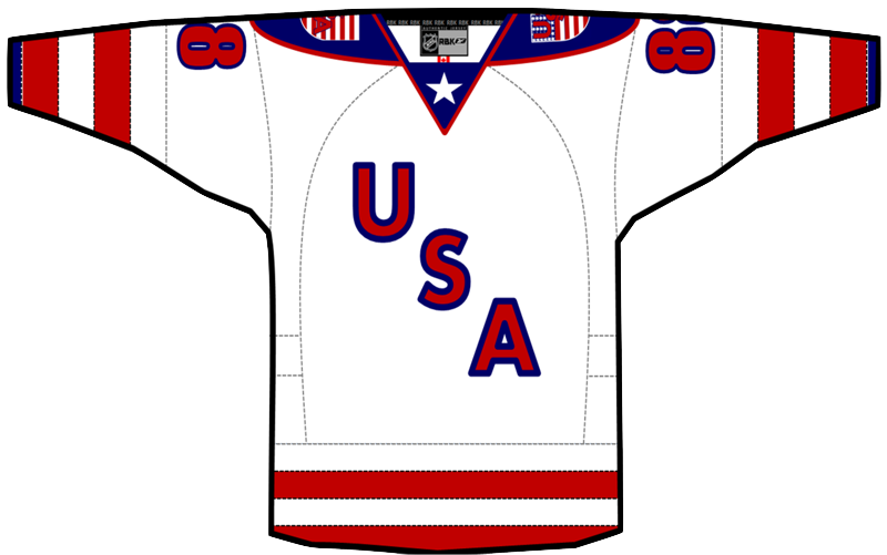 Jack Gambro Jack Gambro |
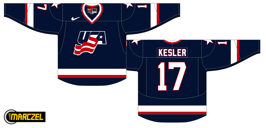
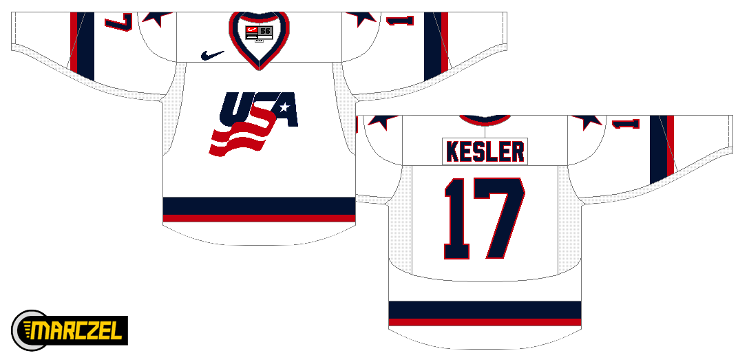
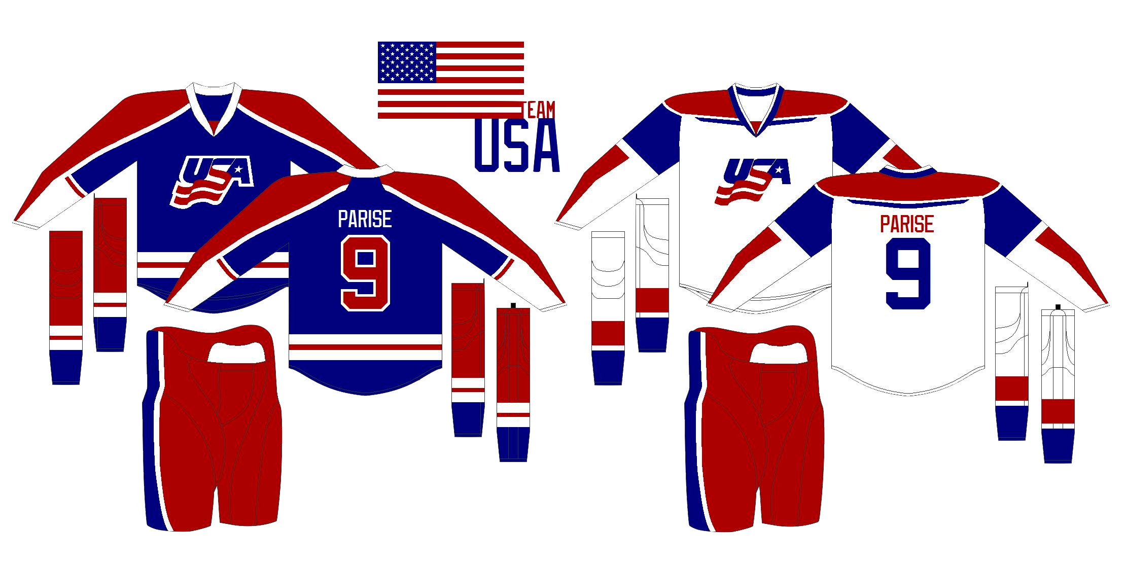
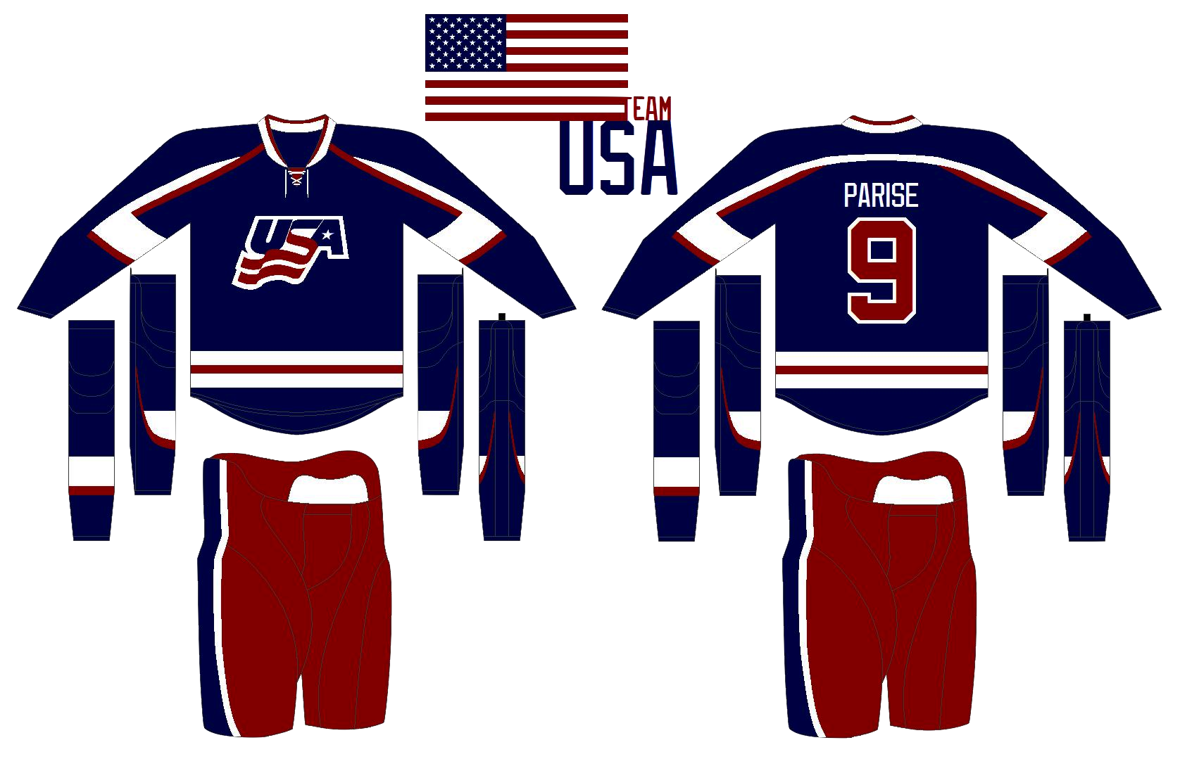
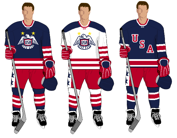
Now we can get to the United States. Jack put together these simple but bold sweaters. That is a lot striping going on there on the sleeves. Not bad at all. |
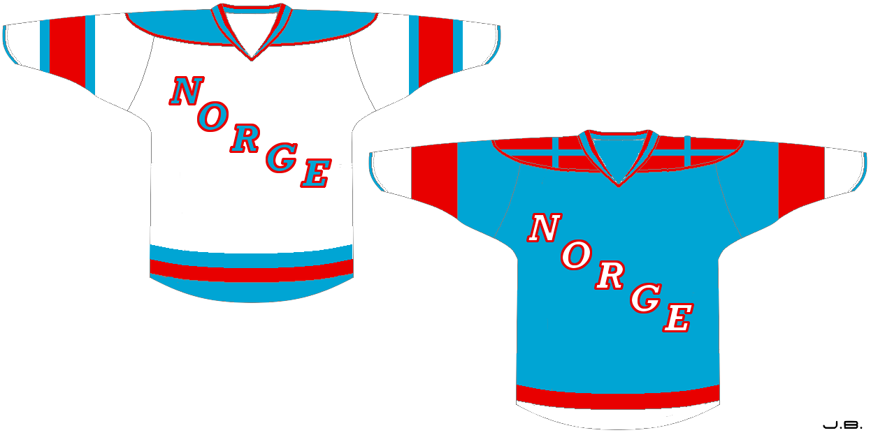 John B. John B. |
Here's a new look for Norway. John's replaced the traditional blue on the flag with a powder blue more reminiscent of the Penguins' throwback third. He's also got some interesting striping on the shoulders of that blue jersey. |
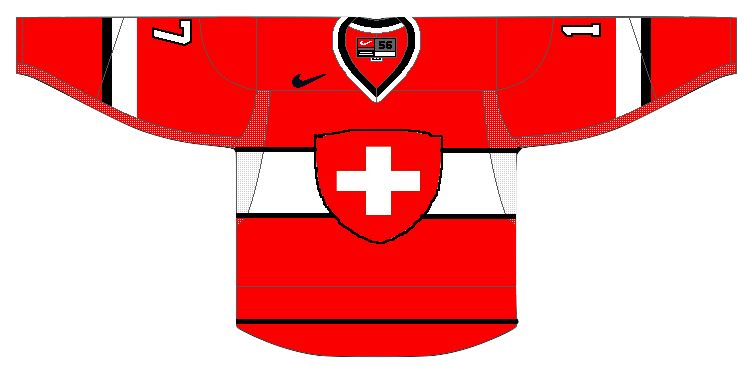 Howie Crawford Howie Crawford |
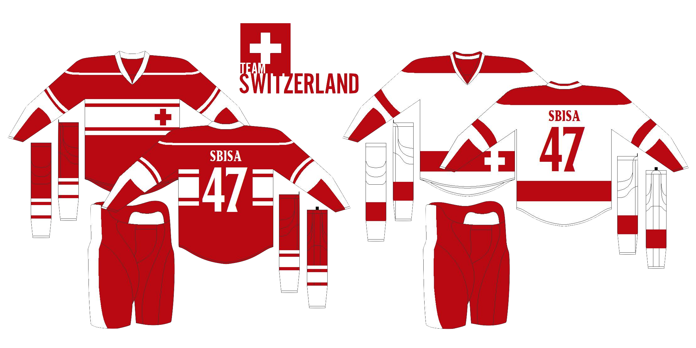
Howie's back with a new look for the Swiss. He's added black and put the white cross front and center. Too much? |
 John B. John B. |
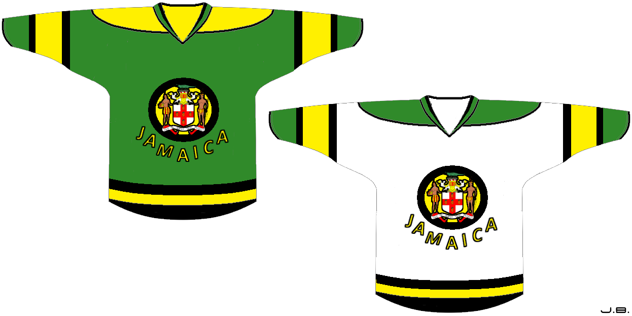
John has one more concept to share — for a nation that's never had an ice hockey team. Go Jamaica! |
It's not over yet. In the next update to this post, I'll add all of the remaining Olympic artwork for your enjoyment. Stay tuned for that.
Classic makes a comeback. 3.8.10