Post-Olympic Extras

Had a few leftovers from the Olympic Spirit series that ran during the Vancouver Games.
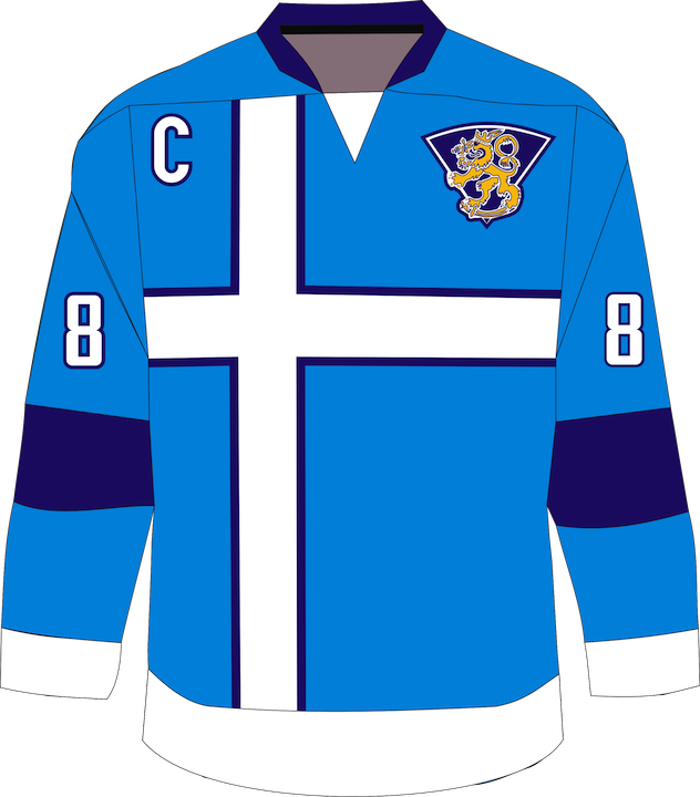
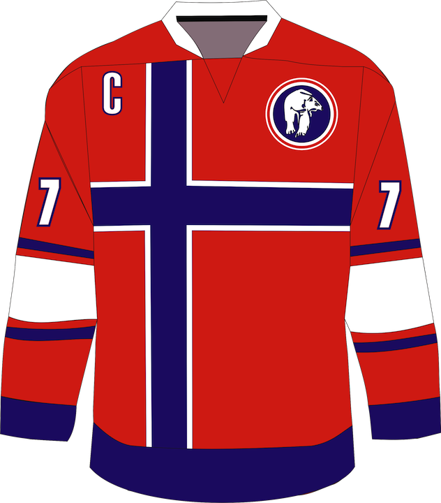
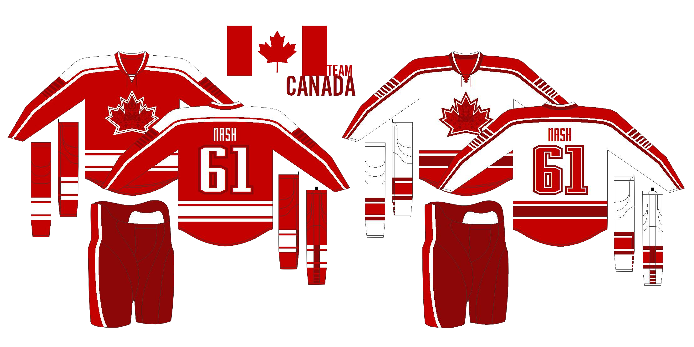
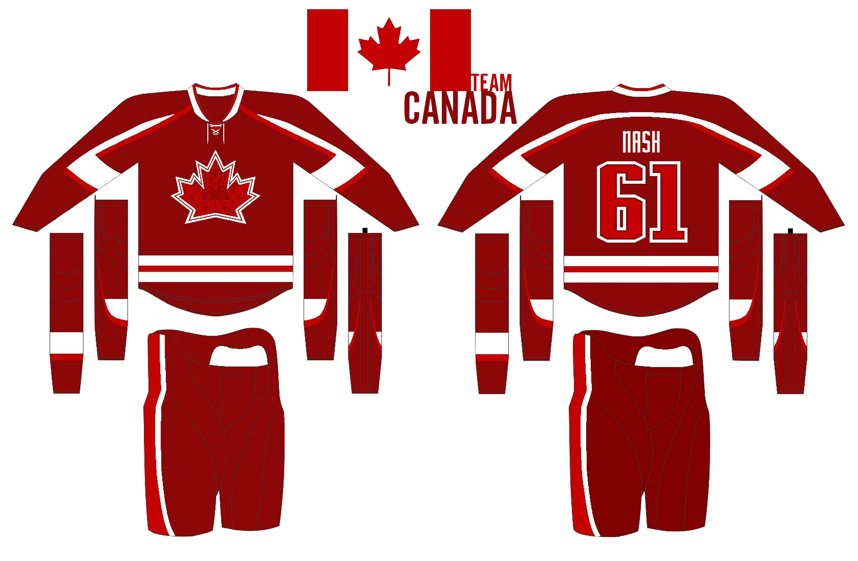
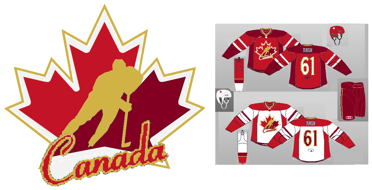
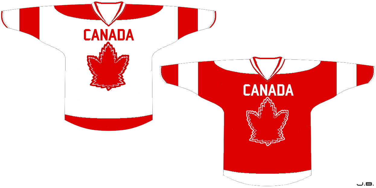
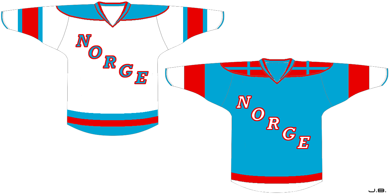

Dallas Hicks

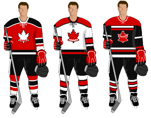
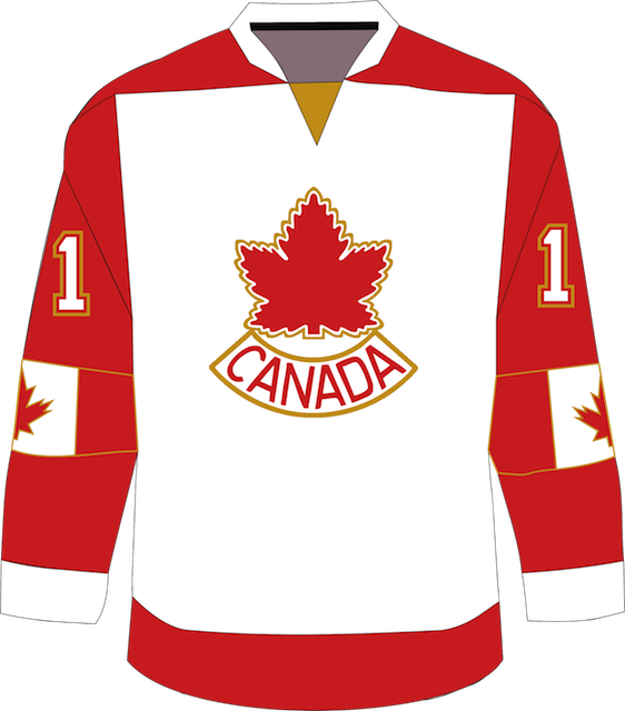
By far the most popular part of the series was Dallas' flag-based jersey concepts for Finland, Sweden and Norway. Now he's tackling Canada with the same principle in mind.

White in the middle with a red maple leaf (in the form of the classic Team Canada crest) and red sleeves to mimic the red stripes on either side. He's also put the Canadian flag itself on the sleeves.
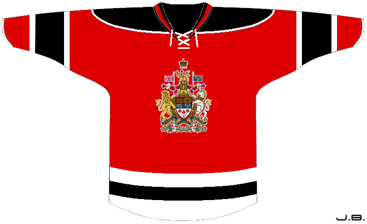
Connor Hanley

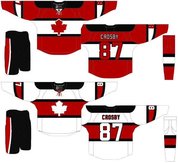
Here's another Canadian concept, this time from Connor. The first thing I noticed was the merging of two classic sweaters — those belonging to the oldest Canadian NHL franchises, the Canadiens and Maple Leafs.

Obviously, the maple leaf on the crest belongs to Toronto and the striping across the chest comes direct from Montreal. Aside from that, it's not a bad look. Just needs to be a little more original.

Jason Pires

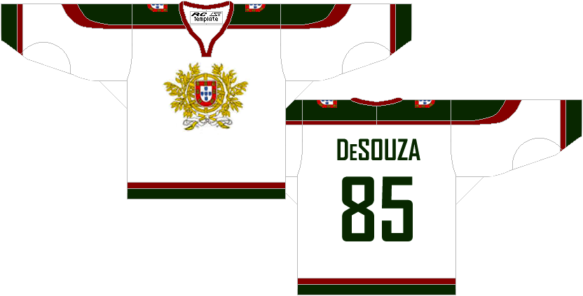
I don't know when was the last time Portugal sent a hockey team to the Olympics (if ever), but I'm sure it wasn't recently. Still, Jason has sent in this Portuguese sweater for our enjoyment.
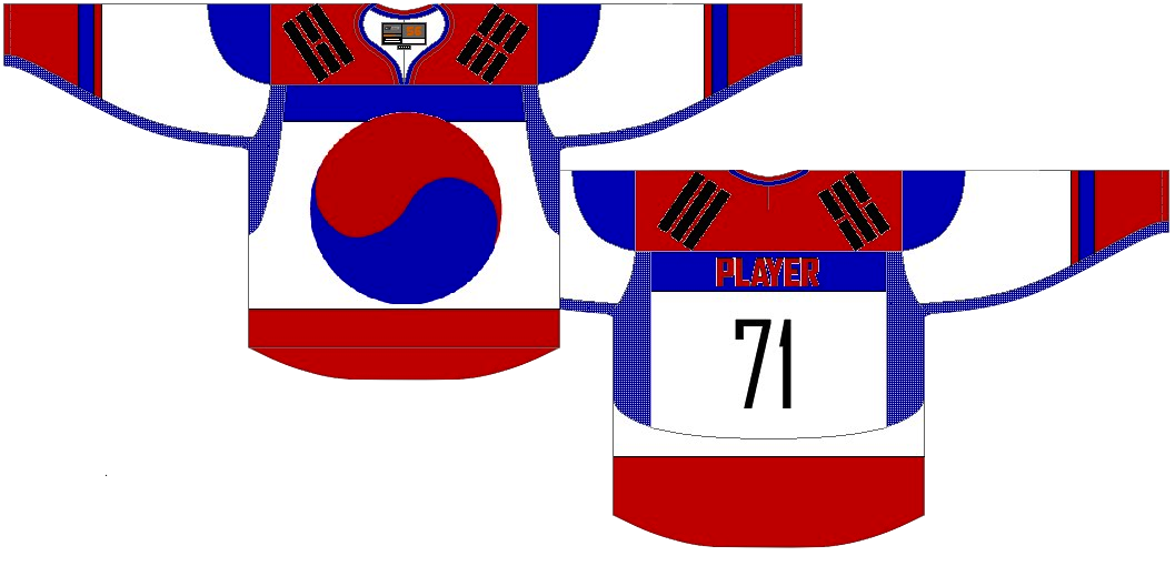
Ethan Proulx

Another nation not seeing ice hockey action in Vancouver was South Korea. But why should that stop Ethan? Here is his attempt. It's a little busy, but definitely one of a kind.
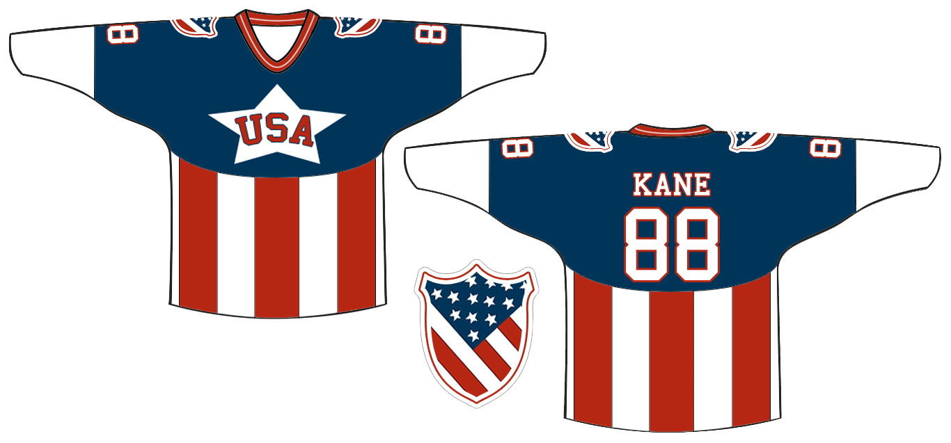
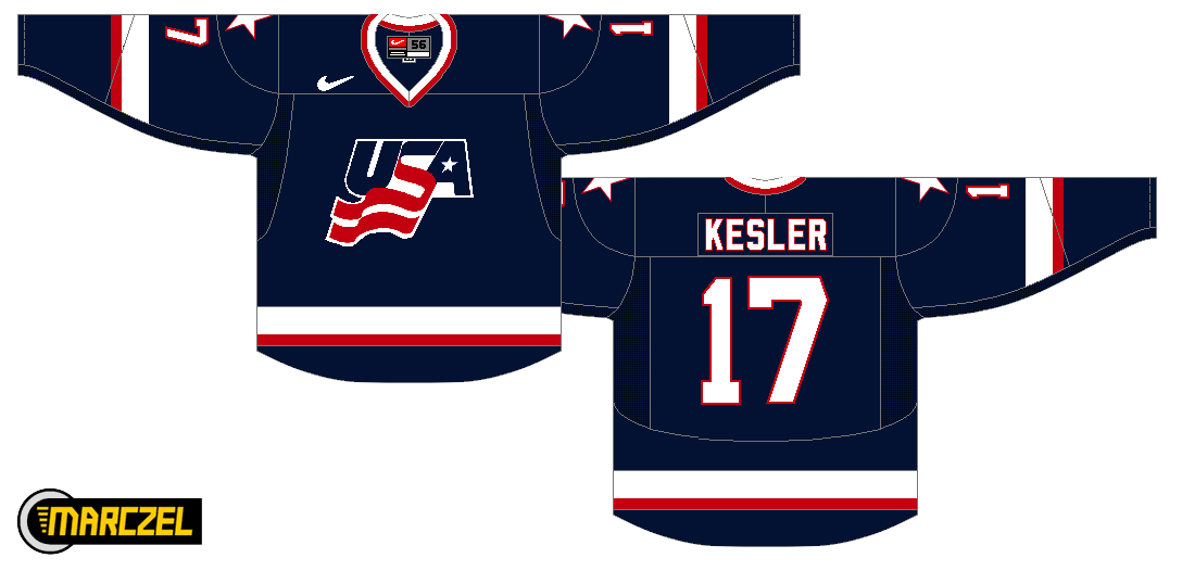
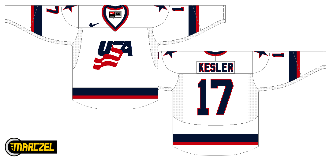
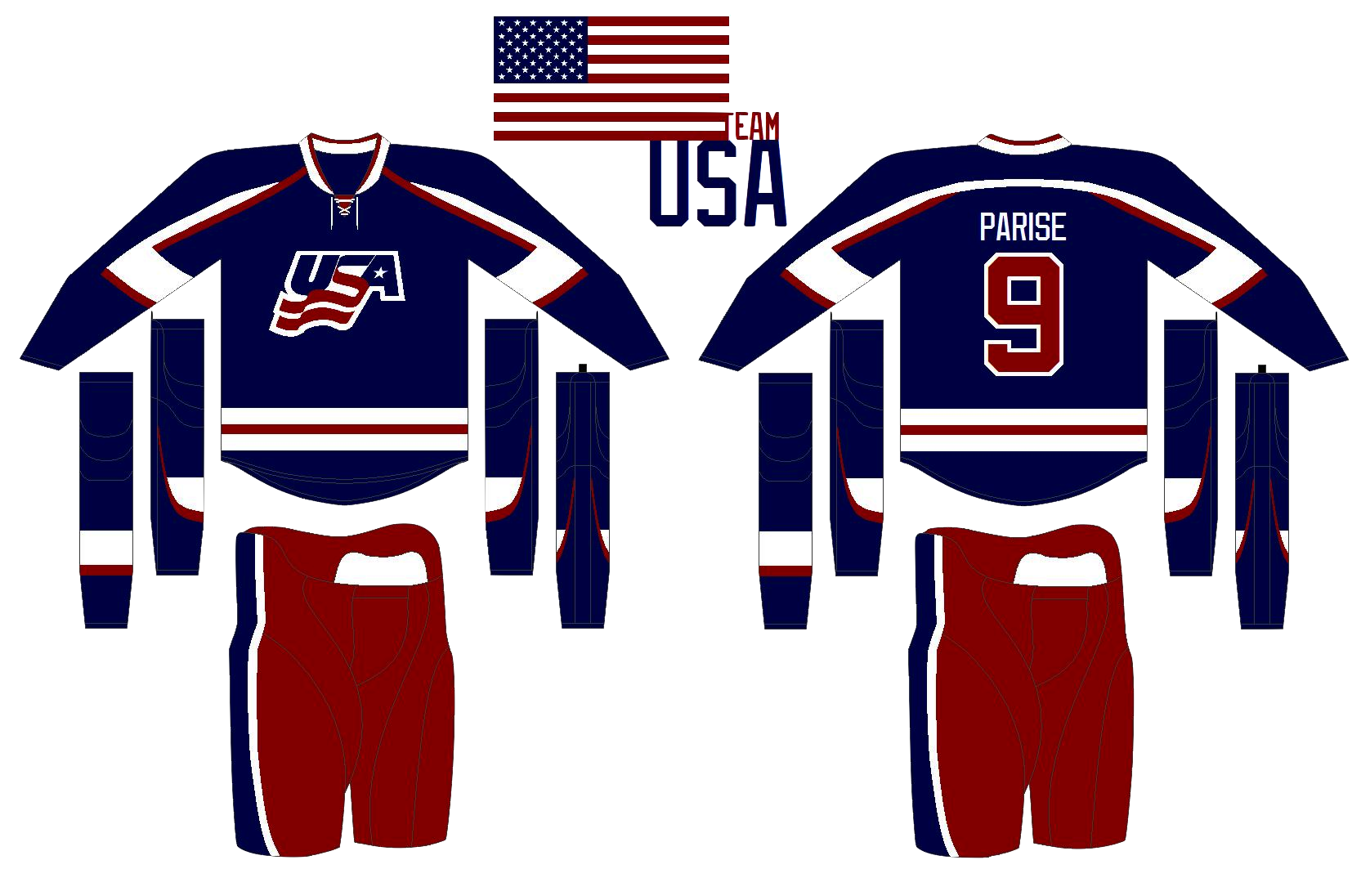
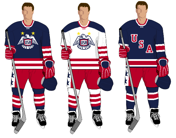
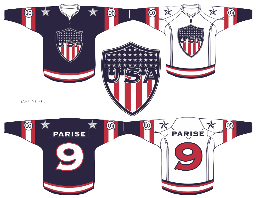
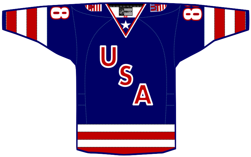
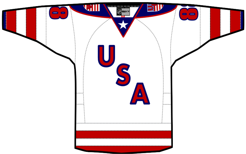
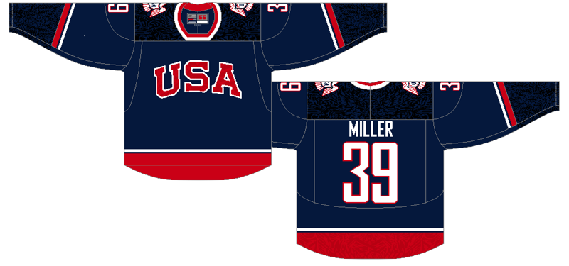
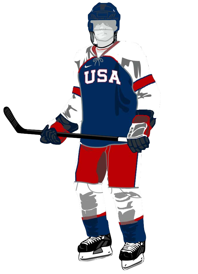
Matt McElroy

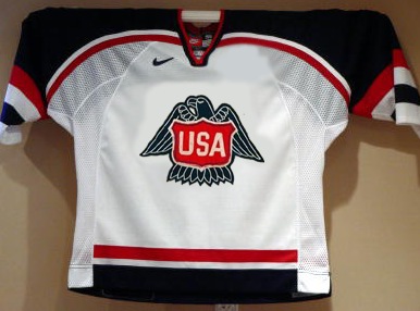
Now we finish where we started — Team USA. Matt submitted this concept. I actually like it better than the current blue United States jersey. That one's a little dark. At least this has a lot of white and red in it.

That wraps things up for the Olympic series. More in 2014!

Olympic Spirit, Finale

I promised one final Olympic concept post. I meant to have it ready Sunday, but as you can see time sort of got away from me. So here's some of the last of the international artwork series.


John B.

The last three Olympic Spirit posts have opened with a Team USA concept. That's not really fair is it? So here's John's attempt at jerseys for Canada. And yes, that is the Toronto maple leaf in red on the front of the home and road jerseys.

The alternate design, which kind of makes me think of the Devils, features the Canadian coat of arms. A nice effort, but I think one of the keys to the maple leaf on the Canada jersey is that it keeps you from having to spell out Canada at the same time.

Jack Gambro

Now we can get to the United States. Jack put together these simple but bold sweaters. That is a lot striping going on there on the sleeves. Not bad at all.

John B.

Here's a new look for Norway. John's replaced the traditional blue on the flag with a powder blue more reminiscent of the Penguins' throwback third. He's also got some interesting striping on the shoulders of that blue jersey.

Howie Crawford

Howie's back with a new look for the Swiss. He's added black and put the white cross front and center. Too much?

John B.

John has one more concept to share — for a nation that's never had an ice hockey team. Go Jamaica!

It's not over yet. In the next update to this post, I'll add all of the remaining Olympic artwork for your enjoyment. Stay tuned for that.


Classic makes a comeback. 3.8.10

Olympic Spirit, Part III

You guys are clearly loving this Olympic concept art, so here's even more!


Glen Cuthbert

In the previous post, Glen had a very sharp white Team USA jersey. This is the blue one that completes the set. Not too bad. But I think with a crest that simple, the striping could be even simpler as well.

Evan Maldonado

That brings us to Evan's Team USA concept, which employs the same ghosted effect seen on some of the jerseys in this year's tournament. I'm really liking the letters in red on this one. Seems way better than the current dark jersey, but not that much is really different.

Matt Marczel

The rest of today's concepts take us to Scandinavia. Here, Matt simplifies Sweden's jerseys and gives them a white one for a change. But personally, I've always been more a fan of the blue jerseys. And technically, white isn't one of their colors. Still, a great effort.

Dallas Hicks

Dallas is trying something completely different with some of the teams that have simple flags. Here, he's adapted the cross on Finland's flag to stretch across the entire front of the jersey...

Dallas Hicks

...and he's also done the same for Norway. Nice to see the polar bear make a return. What do you guys think of these?

And as always, there's more art on tap. In the next day or so, look for more USA concepts plus one from a country that didn't even send a single athlete to Vancouver this year.

Olympic Spirit, Part II

This is an extension of Thursday's post. Concept art has just been flying in over the last couple of days and some of it is pretty awesome!


Glen Cuthbert

Glen put together this blast from the past. Call me crazy, but this would be an awesome alternate jersey. Much better than the U.S.'s New York Rangers-based third. Plus, that's just a great all around crest. Where has it been all these years?

Matt Marczel

While we're on the United States, Matt is looking for a return to something a little more recent. Personally, I think USA Hockey needs a new logo.

Jared LeBlanc

Jared has put together concepts for several countries, including this Canadian one I really like. The black goes away, as it should, and another shade of red is added for contrast. I'm not sure so about the alternate jersey. May be a little too red. That's Russian territory, right?

Jared LeBlanc

Now, I take back what I said yesterday about Elias' Swiss design. Nothing against it, but this is just too cool. At first glance, it may seem plain — which is what I accused the current Swiss jerseys of being — but really take another look. That's just a really sharp design.

Jared LeBlanc

The only one of Jared's concepts I'm not crazy about is this one. Sweden arguably has the best jerseys in this year's tournament, but I feel like this re-imagining takes away from that.

I've still got more artwork waiting in the wings. Keep checking back for updates!

Olympic Spirit

We're now a few days into the 2010 Winter Olympics and Canada and the United States are off to decent starts but the real test will be Sunday when they face each other. In the spirit of the games, a few artists have submitted related concept art.


Jake Niehl

Jake has put together these sweater designs for Team USA. The shield is cool, if not reminiscent of the NFL shield. But I fear he hasn't fully thought through the size of his numbers. Double-digits would have a little trouble.

Jeff Kennedy

And Jeff has sent in this Team Canada concept. It's not so much an original design as it is a fusion of a few different ideas. But mainly, he's dropped the black in favor of gold.

I'm really hoping to add more of an international flavor this post, so if you've got any ideas for ways to improve upon Finland, Russia, Sweden or anything like that, send it along and I'll include it here!