Thrashers vs Senators


vs
THRASHERS
SENATORS
7-6
7-6

The Aesthetics
This match will serve as the finale for each of these teams. Is it weird they're both facing the same direction? I'm not bothered, I guess. What I am bothered by is the stick the bird is holding. Why? It's so unncessary. It's a cool-looking logo, but that stick takes a lot away in my eyes. Let's go with the Sens.
Senators

The Nickname
Senators set aside special reserve land decide whether or not the Thrasher is worth adding to the endangered list. So they've got some power over the little bird. And I think that's all the evidence I need.
Senators

The Analysis
Nothing about the Thrashers logo really says Atlanta to me and that's a shame because it could — and should. The Senators logo just about screams Ottawa and Canada. If you don't know what I'm talking about, check out a recent Sens match and you'll understand. Looks like we've got a sweep on our hands today.
Senators


WINNER
3-0


Coyotes vs Oilers


vs
COYOTES
OILERS
5-6
2-11

The Aesthetics
The howling coyote actually gives us something to look at. Is the oil drop at the top of circle meant to be the focal point of the Oilers logo? If not, all that's left is the text and you know how that irks me. Don't you? Notch another one for the desert dogs.
Coyotes

The Nickname
An Oiler is probably a rather rugged fellow. I don't he'd find any need to worry about a little Coyote. Face to face, I think he could take it. Don't ask me how.
Oilers

The Analysis
There are things that bother about the Coyotes logo, small things like the fact that the ear is seen more easily than the eye. The Oilers logo is strong, solid and classic. I imagine it will be one of those that sticks around forever despite the fact that I think it could use an upgrade or two. But who am I to say? It may come as a surprise to you all, but overall, I think it's better than the Coyotes. Oh, and that does it for the Oilers schedule. When next you see them, you'll be placing a vote.
Oilers


WINNER
2-1


Red Wings Unveil New Uniforms!

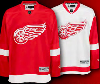
Giant tip of the hat to a reader for emailing in this information. There was no big fanfare or public unveiling event, but the Detroit Red Wings have officially unveiled their new Rbk EDGE uniforms. Check them out.

The Red Wings join the Flyers and Rangers as teams making the new jerseys available for pre-order on the web site. The graphic to the left can be found on the Wings' web site and it links to the order form. Detroit has separated itself from the Flyers and Rangers, however, by making images of the new jersey available.

Anyway, the Red Wings become the eighth team to unveil their Rbk EDGE jerseys and we eagerly await the rest of the league.

Amazing Ducks Concept Art

Earlier in the week I posted some awesome concept art that went over a storm with you guys. We saw designs for the Ottawa Senators and Boston Bruins as well as the New York Islanders and Atlanta Thrashers.

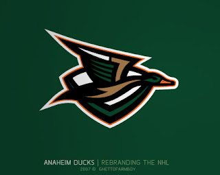
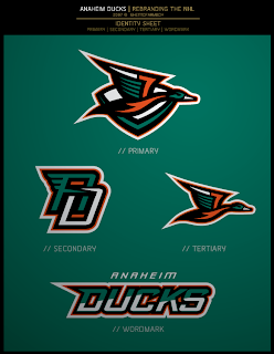
Today we're treated to some work on the Anaheim Ducks. These designs were based on concepts that "leaked" prior to the unveiling of the new Ducks logo last summer. Have a look and be impressed.

If you ask me, that's what the Anaheim Ducks should look like. And it couldn't be further away from the old Mighty Duck look. However, while the green is sharp, tan doesn't make for a vivid secondary color. So what about orange?

Our favorite designer upgraded his original logo with much more vivid colors. Can anyone deny this would be one killer logo package?

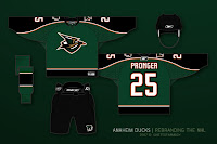
If the logos weren't enough for you, check out the uniform designs. Any NHL team would be lucky to look that good. How come this guy doesn't already work for the league?

Are there any Anaheim fans reading that would be repulsed by something like this? Would that even be possible?

Anyway, it's artwork like this that gets me so excited to do a blog like this. So what do you think? Am I going a little over the top with my glowing praise? Or are these designs really that good?

About The 'Canes

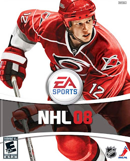
I've been getting a lot of emails lately about the Carolina Hurricanes. I recently added them to the sidebar countdown for a September 16 unveiling date. The issue some people have brought up is the fact that the Hurricanes' new uniforms have already been leaked via EA Sports' NHL08 video game.

Thing is, that's not really a photo of Eric Staal in the new Rbk EDGE uniform since no teams have played in them yet — all-star jerseys aside. The cover is an adapted photo of Staal in the old uniforms. Not that that matters that much. I post fan-created artwork all the time. No reason this shouldn't be considered.

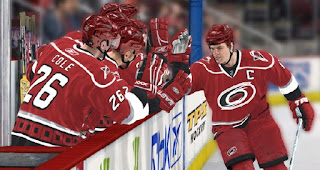
However, I won't call it an official unveiling by the Hurricanes because this isn't a picture of the actual jersey. If you look down my official list, all of those posts contain photos of the real uniforms. Still, screen grabs like the one below have been circulating for some time. I figured I'd at least post it but I'm not adding it to the officially unveiled list — yet.

If we see photos prior to the team's first preseason game, I'll be sure to post them.