 March Edition Still nothing on the Reebok front. I think they've wised up and decided to play their annual catalog closer to the vest. Either that, or now retailers are in the same boat as the rest of us, wondering what's changing in 2012.
Still, that doesn't mean we're entirely clueless. There are plenty of other sources of information out there. In last month's JerseyWatch, it was all about rumors. This time around, our details are a little more solid.
As always, nothing is official until the team or league makes such an announcement. Until then, feel free to add your speculation in the comments.
Buffalo Sabres
updated

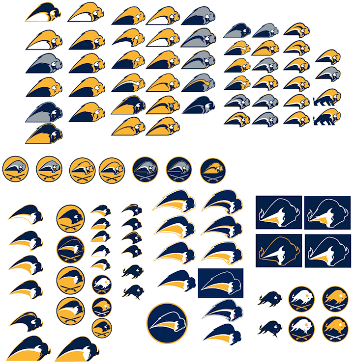
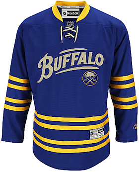 Sabres third jersey / NHL.comAlternate jersey retired The Sabres have sported an alternate jersey for the last time — at least for the foreseeable future.
Buffalo News beat writer Mike Harrington tweeted following the game on March 14 that the sweater, which debuted in 2010, was being permanently retired.
At 11:36 PM ET, Harrington wrote, "Alternate blue jerseys with 'Buffalo' script on the front were retired tonight. Won't be worn again."
He then replied to some reader queries, saying, "To all asking: Alternates are done forever, not just this year. Sabres spokesman said team has no plans for an alternate jersey next year."
That blows last month's rumor out of the water, which suggested the Sabres were contemplating a black third jersey for 2012. If they were contemplating it, they aren't anymore.
Harrington's final quote of interest to us read, "It's an anniversary jersey. You have to wear an alternate two years and they've gone their two years."
A little confusing, but what he meant to say was that the alternate uniform was launched as part of the Sabres' 40th anniversary celebration in 2010. And NHL regulations require a team to use the third jersey for at least two seasons before retiring it. (Though, last I heard it was three years. Maybe that's since changed.)
This team has had more than its share of identity troubles over the years. In the decade-and-a-half between 1995 and 2010, the Sabres wore four completely different uniform sets. Not the way to build a successful brand. So it makes sense that going forward, the Sabres will not have a third jersey.
Maybe a few years down the line, they'll have a change of heart. But for now, the rumors end.
Chicago Blackhawks

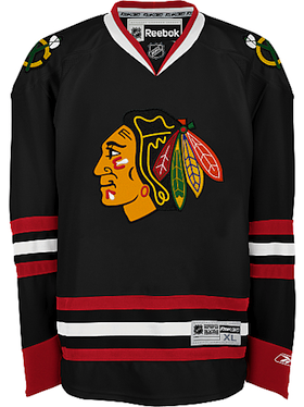 Blackhawks 2008 third jersey / NHL.comNew alternate jersey The Blackhawks have spent this season without a third jersey. But that could change next fall.
Chicago previously used their 2009 Winter Classic uniform as an alternate over the last two years. But it was apparently unpopular with club management — albeit loved by fans.
It sounds like they will have a third option next season, but they'll be resurrecting a classic rather than reinventing the wheel. It's been reported the black jersey from 2008 may return.
The design was first seen on the ice in 1996 when the NHL began its third jersey program and continued to be worn until the Reebok Edge overhaul in 2007-08. It was subsequently brought back the following season when the league began allowing alternate uniforms again.
It wouldn't surprise me in the least to see this jersey return. It was well loved by fans, and if I'm being honest, it looks great. Would be a winner.
Dallas Stars
updated
 No changes in 2012 In last year's JerseyWatch, we talked a lot about the Stars introducing a green alternate uniform. But the ownership issues and subsequent sale of the franchise shelved those plans.
Stars TV color analyst Daryl Reaugh went on the record via Twitter last July. He told fans: "[A] new third [jersey] was in the chamber but got shelved in deference to impending new ownership."
That was really a shame. We were all hoping the Stars would get the chance to add a little more color. But with the change in management, perhaps now is the time to reinvigorate the team's rather dull look. It happened in Tampa Bay last year.
On March 15, Dallas Morning News writer Mike Heika engaged readers in an online live chat. Someone asked, "any news or whispers about a new alternate jersey coming down the pipe?" To which Heika simply replied, "Nope. I think they will study a completely new uniform in the summer, and then we will see the results of that study with a whole new look in 2013-14."
So that's the end of that. For now. But suddenly I find myself very excited about 2013.
Detroit Red Wings

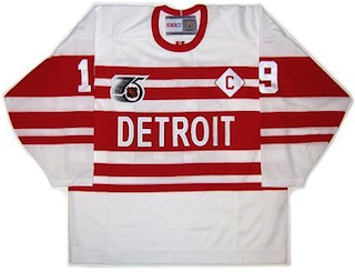 Red Wings 1992 retro jerseyNew Winter Classic jersey The Detroit Red Wings will host the next NHL Winter Classic in 2013. As such, they'll need a new sweater.
If the 2012 Winter Classic told us anything, it's that both teams involved will don special uniforms, even if they have only the slightest connection to the team's actual history. And for a team like the Red Wings, who haven't really changed their uniforms since 1934, theirs should prove especially hard to predict.
In 2009 when they played outdoors at Wrigley Field, the Wings wore replicas of a uniform used by the franchise when it was shiny and new — way back in 1926. Though then they were known as the Detroit Cougars. The Penguins and Flyers have both played in multiple Winter Classics but neither recycled a Winter Classic jersey.
During the NHL's 75th anniversary season in 1992, the Wings sported a throwback to the late 1920s with lots of red and white stripes — and DETROIT written across the front. If you want my best educated guess, they'll pull those suckers out again in 2013 when the host the Maple Leafs in the elements. If it's not that, I'm out of guesses.
Edmonton Oilers

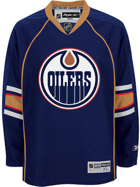 Oilers third jersey / NHLAlternate jersey retired Oilers fans were happy last summer to see the club add a new retro road jersey. Now it seems the last vestige of an awful uniform era will be disappearing.
In 2007, the Oilers were one of the hardest hit teams of the Reebok Edge era. Their home and road uniforms were plainly terrible and it didn't take long for the team to realize and set into motion some necessary changes.
In 2008, the Oilers launched their royal blue retro third jersey. In 2009, it became the home jersey, relegating the 2007 home jersey to alternate status. In 2010, status quo. In 2011, a white version of the blue jersey replaced the 2007 road uniform, but the navy alternate remained.
It seems that finally, in 2012, that jersey (right) will go away for good (until it becomes a hip retro jersey 40 years from now). In so doing, Edmonton will probably go without a third jersey at least a year or two — not that they'd need one anyway.
More than a few fans have called for a orange Alberta Oilers-inspired third — a throwback to the club's WHA era. I'm not sure the team is willing to go that far at this point. And for what it's worth, I really don't think they should. But only time will tell.
Florida Panthers
updated

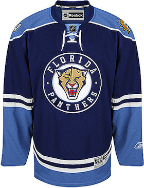 Panthers third jersey / NHLAlternate jersey retired It's no secret the Panthers brass have fallen out of love with their 2009-debuted "JetBlue" third jersey. And we'll see the last of it this season.
Not long after the Florida Panthers announced a partnership with the airline came a new alternate sweater bearing a color scheme that resembled a certain plane design more than the identity of the hockey club that was wearing it.
Fans didn't like it and lots of comparisons were drawn to the Pittsburgh Penguins' powder blue alternate jersey. But a commitment is a commitment. And after the three long seasons, the Cats are relegating this one to history.
In September 2011, Panthers assistant GM talked to Miami Herald writer George Richards about the sweater and didn't really have anything nice to say it. "As soon as we can rid ourselves of those things, we'll be a happier bunch," said Santos.
He went on to talk about how the Panthers were bringing back the red home uniforms for this season and how their successful years were highlighted by their red uniforms. That still seems to be the case, much to the chagrin of this Lightning fan.
Last week, Richards posted more on the subject as the Panthers officially announced this jersey will be retired on Sunday, March 25. The Cats will hold their "Shirts Off Our Backs" promotion that night to get rid of those sweaters once and for all.
Additionally, Richards says he's learned the team has absolutely no plans to launch a new third jersey next season. However, it's not out of the question for 2013-14. Jokingly (I hope), he writes, "Expect a dark blue jersey with a different Cat-in-a-Circle logo. Or perhaps the Sunshine/Palm Tree/Hockey Stick logo. Something."
Tampa Bay Lightning
 New alternate jersey This is one rumor I'm not ready to buy into yet, but some think the Lightning are on the verge of replacing their third jersey in 2012.
In fairness, for a team like the Lightning, it doesn't really make sense to have two blue jerseys. It works for Toronto (it's their only color) and the Blue Jackets (because a team called the "Blue" Jackets can't wear a red jersey). But Tampa Bay isn't yet ready to give up black as a part of the color scheme.
After getting feedback from fans on the new identity, Lightning CEO Tod Leiweke did say that black would be reincorporated into the team's look — though it was too late to substantially change the logo or home and road uniforms that were launched this season. It makes me think a black alternate sweater could be on the horizon here.
So though I'm not convinced it's a real likelihood for 2012-13, it does make sense in a lot of ways.
Toronto Maple Leafs
updated

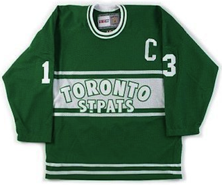 Maple Leafs 2002 retro jerseyNew Winter Classic jersey The Leafs just launched a new third jersey this season. But it was perhaps a year too soon as they'll need another one in January.
The Toronto Maple Leafs will be the Red Wings' opponent in the Michigan-based 2013 outdoor game. It will be the first interconference Winter Classic since the event began in 2008.
The third jersey Toronto added this year was inspired by a sweater worn in 1967. The one before that had been in use since 2000 (barring 2007-08) and was based on a much older jersey.
Looking back at their history, the Maple Leafs have a few more options than the Red Wings. But perhaps the most interesting would be their green Toronto St. Pats jersey (right) which was worn for a game in February 2002.
Because the Winter Classic is meant to draw a massive American TV crowd, iconic colors are important. So perhaps the Leafs in green wouldn't be the best of ideas. If you look at the late 1920s and '30s, it's clear the Leafs have some retro designs to work with. Therefore, like Detroit, it may be awfully hard to predict what they go with next winter.
Perhaps of note to concept lovers, the Toronto Star recently held a contest asking fans to submit their suggestions for a Maple Leafs Winter Classic jersey. Turned up some pretty ridiculous designs. I think whoever was in charge of assembling this gallery was just having a little fun with all of us.
Winnipeg Jets
 New alternate jersey It'll be only their second season in Winnipeg next fall, but can you really be surprised the Jets are already considering third jersey options? Of course not.
It might seem a little soon, but folks, there's money to be made on Jets jerseys in Winnipeg right now. Why shouldn't the team keep cashing in? And as cash cows go, could you imagine a better one than a retro sweater for this club?
A proposed design by Jacob Barrette was posted here on Icethetics a few months ago. It got mixed but generally positive reaction. And if I were to bet on it, I'd say the Jets go with something similar, if not an exact replica of what the old Jets wore in their earliest NHL days.
That is, obviously, assuming the team is ready to add a third uniform. They may not be. Again, we'll have to wait and see what happens.
NHL Special Events
The NHL All-Star Game will be hosted by the Columbus Blue Jackets for the first time in 2013. That was announced prior the 2012 event in Ottawa. Will the NHL recycle their all-star threads a third time or come up with something new? Guess it all depends on what Reebok wants to market.
Final Thoughts
Are you getting the feeling that 2012 will be a quiet year with regard to new NHL jerseys? A lot of this year's JerseyWatch is talking about what's going away, as opposed to what's on the way. I wish I had better news, but after five straight years of seemingly incessant uniform changes at the hands of Reebok, I think a bit of a lull is probably in order.
That being said, 2013 sounds like it could be a heck of a year on this front. Assuming the Mayans were wrong and we all survive to see it, we'll have a pair of new Winter Classic jerseys, and — if we're lucky — maybe even a new set of All-Star Game jerseys. On top of that, the autumn could bring us new home and roads for the Stars, new alternates for the Panthers and almost definitely the Lightning and Jets, if they don't both do that in 2012.
Finally, and this may just be wishful thinking, the Blues could make a push to give their third jersey the primary treatment. Perhaps even the Flames and Ducks could join that club. The Predators might add a third jersey, though it would be very soon after their rebranding this season. And I'm also keeping my fingers crossed for the Senators and Penguins, who I think could both use a complete uniform overhaul.
Before I go, I should point out I've heard rumblings about the possibility of the Ottawa Senators replacing their white road jersey. That could be baseless, but so could a lot of the aforementioned rumors. Just something to keep in the back of your mind. Though if they change one, they'd be apt to change both.
And that's the second edition of NHL JerseyWatch 2012. More updates should continue through the spring and over the summer. As always, keep an eye on the blog for the newest information.

 As Icethetics nears its fifth anniversary, it's time to take another step. This site is all about branding and yet nothing outside of cyberspace bears any Icethetics branding whatsoever. No coffee mugs, pens, mousepads... not even a T-shirt. But who would really buy any of those things? We're jersey nuts. We buy jerseys.