The Grey Kings

0225-bastianschmulling-lak.png

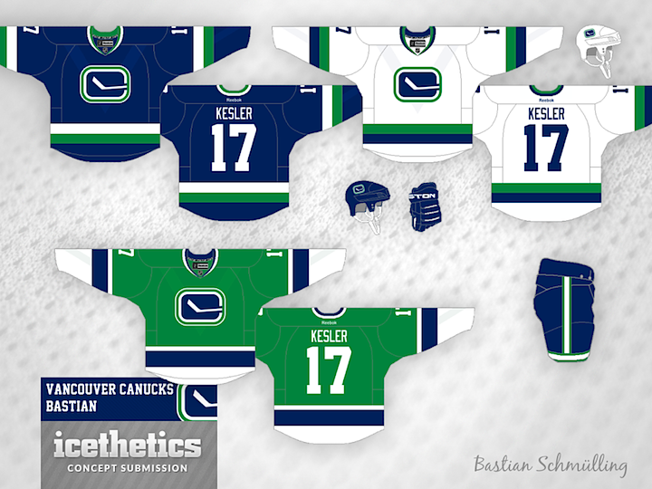
Bastian Schmülling never ceases to impress me with always eye-pleasing concepts. This one for the Kings is no exception. Grey doesn't stand out as a particularly good jersey color. But as we saw in the Stadium Series, it could make for a very nice alternate jersey if you do it right. In this case, I think it's definitely been done right.


Update

0225-bastianschmulling-lak-rev.png

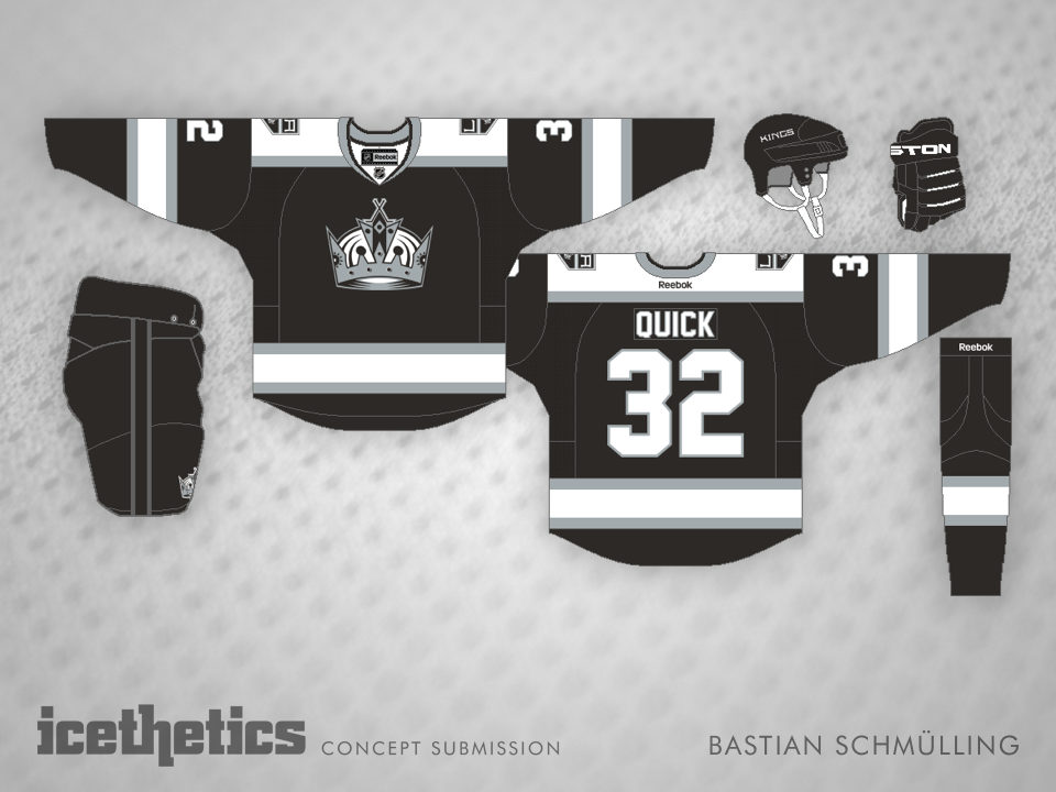
With his revised design, Bastian writes: "Inspired by Kris' comment about my silver Kings-jersey, I've created a matching black version. While he suggested use silver yokes/stripes and white accents, I prefer white as the secondary-color."

0683: The Stick in the Rink

We're riding out 2013 with the Canucks today as part of Tampa/Vancouver Week. The Lightning are in Vancouver tomorrow — one of only two games taking place in the NHL. (Any guesses what the other one is?) The theme today, as you may have guessed, is the Canuck's retro stick-in-the-rink logo. It's featured on every design today, including this one from Bastian Schmülling. I particularly like the green option.

Tex Fischer brings us a more subdued set. But I think that crest can make any sweater stand out.

Finally, Brendan Anderson envisions a minor tweak to the Canucks' existing third before making a home and road set out of it. All three designs have unique aspects and prove that this could be a great, timeless look for Vancouver.

0672: Minors Week Freak Out

Minor League Week wraps up up with a super-sized Freak Out Friday. First, Justin Nahhas offers his redesigned Chicago Wolves jerseys. The home and road options aren't too crazy — though they do follow the template used by the Penguins in their last Winter Classic appearance.

The alternate jersey is what should freak us out. To be fair, Justin submitted this concept almost two years ago when the Wolves were still affiliate with Vancouver, but could you imagine a Canucks logo on the jersey of a Chicago-area team? Of course, the subtle "C" in that stick-in-the-rink logo could stand for Chicago, right?

Another oldie I'm just getting around to posting is this one from Josh Olson. Last spring, in between learning the Houston Aeros were moving to Iowa and what the team's new name would be, Josh sent in this idea for a rebranding. He admits making up "CornHawks," but there's no reason it couldn't work as a team name. Do you prefer Des Moines CornHawks or Iowa Wild? (Both are a bit of a mouthful.)

The ever-creative Bastian Schmülling completes a run of being featured on this page for three straight days. Here, he's redesigned the look of the Bridgeport Sound Tigers — swapping Islanders blue for nice shade of black. What do you think of the striping style? I think it's a little out there.

And finally, Nick Burton brings a redesigned orange jersey for the ECHL's San Francisco Bulls. What freaks me out is the sunburned bull on the crest. Yikes! Nice jersey, otherwise.

Check back here tomorrow for a concept that previews Chicago's Stadium Series sweater!

0671: Minors That Might Have Been

Teams come and go so often in the minors, so today's theme within Minor League Week has to do clubs that no longer exist. Like yesterday, Bastian Schmülling kicks things off. The Omaha Ak-Sar-Ben Knights exist today as the AHL's Abbotsford Heat. But perhaps they could've donned red and grey if they stayed put.

The AHL's old Buffalo Bisons club hasn't been around for 43 years, but Dylan Wonka imagines a comeback, complete with that classic bottle cap crest.

Technically, the Peoria Rivermen still exist, but now as a member of the SPHL. The AHL club was relocated and became the Utica Comets this past summer. Maybe they'd have had more luck as less a riverboat captain and more a canoeist. (Is that a word?) You can tell Antonio Calisto had some fun with this one!

We'll wrap up on a team that's soon to be relocated. The AHL's Adirondack Phantoms will become the Lehigh Valley Phantoms next season. So while this jersey set is cool, the "A" wouldn't work anymore.

Check back tomorrow for some big time minor league Freak Outs!

0670: Around the Juniors

Minor League Week takes us around the Canadian Hockey League today. Junior teams are rarely featured here so this is a treat. The prolific and talented Bastian Schmülling gets us started with a pair. First, the QMJHL are represented by the Quebec Remparts. The Remparts have a history of great jersey designs. This one would not be a departure from that.

Moving to the OHL, Bastian tackles the Peterborough Petes. This team also lends itself well to great uniform designs. No surprise Bastian knocked this one out of the park too.

Another regular, Ryan Haslett, takes us to the WHL. He's created a new sweater for the Lethbridge Hurricanes which features a Hurricane (the plane) in the shape of a hurricane (the storm). Pretty clever.

Finally, Kurt Pittman brings us his rebranding of the Moose Jaw Warriors. He introduces some great new logos to go with his uniforms. I'm really impressed with this set!