0172: Inspired by the Shield

My job's easy today. Here's Rob Huck to tell you about his NHL All-Star uniforms:

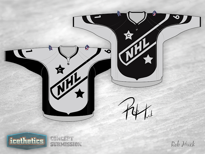
As you can see, these All Star jerseys take their cue from the NHL logo. I used to admire the All Star jerseys back in the 1980s when the colours reflected that of the old league logo, and I would love to see that reflected again.

I was also inspired by two of the recent concepts posted on Icethetics. The first is the "sash" concept used in Colin May's recent submissions. I tweaked it a bit to turn the sash into a one-sided shoulder yoke, which happily enough also creates the illusion of a hockey stick on the shoulder. (A high-sticking minor of course, but a hockey stick nonetheless.)

Second, I challenged myself to eliminate the use of white in my concept in the manner of Brian Brideau's Boston Bees jerseys. Yes, we all know how much you love the colour black, and the silver in my jerseys seems a little bland, but I think I met this challenge. In addition, the concept could potentially incorporate any two colours quite easily if one were so inclined.

0171: Taking Christmas Out of the Wild

Dave Chenard wrote me to say he's tired of watching the Minnesota Wild wear Christmas colors all season. So he gave them a new look free of red. And to simplify the color scheme even more, he mixed the wheat and gold to form a goldish-wheat color to go with the green. It sort of has that North Stars feel — not sure if that was intentional. I think it works. But then again, I've never had a problem with the so-called Christmas colors they currently wear.

0170: What If Nike Made a Pens Jersey?

That's kind of a preposterous question. For one thing, Reebok would never go for it. But moreover, this isn't what would happen if Nike designed the jersey. It's what happened when Matt McElroy designed one on a Nike template. I have to be honest. I love the color combination here and I think this would make for a really cool third jersey. But it sounds like most Pens fans here are tired of blue alternates.

0169: San Francisco Sunday, Part 1

Back in February, the ECHL expansion franchise San Francisco Bulls, told Icethetics they'd consider some user contributions for their secondary logo. Five months later, they've seen the submissions but have yet to make a final decision. So starting today, those logos will be posted here in a series called San Francisco Sundays.

First up is Rich Lunghino's excellent effort. In their guidelines, the Bulls asked for a secondary mark that included a unique intertwined "SF" and a POV perspective of the Golden Gate Bridge. Rich hits all the marks here and even offers a couple extra versions.

Pat Waller's design is such a simple idea that it's almost perfect. It doesn't reference the team's name, but as a secondary logo, it doesn't really have to. However, any structural engineer (or not) will tell you this is a bridge built to crumble. Perhaps not the greatest symbolism for a start-up hockey team.

No bridge here on Aaron Thompson's attempt but worthy nonetheless. I'm liking the horns. What do you think of these three? Do you have a favorite yet? Looking forward to next Sunday's group?

0168: If the Blues Were 40 Years Older...

Our Winter Classic Weekends series is returning to Saturdays starting with an interesting look for the St. Louis Blues from Chance Waddell. This one is styled after the super-stripey jerseys from the 1920s and '30s — despite the fact that the Blues weren't founded until 1967. Still, it's a neat design that absolutely screams Winter Classic. Maybe in 2014?