
0187: Hamilton Revisited
/

This week, we're looking back at teams that have disappeared from the NHL over the years. Nick Burton put together this concept for the Hamilton Tigers of yesteryear. It'd look like a team of golden refs!
This week, we're looking back at teams that have disappeared from the NHL over the years. Nick Burton put together this concept for the Hamilton Tigers of yesteryear. It'd look like a team of golden refs!

Anyone here remember the Cleveland Barons? Ryan Haslett offers up a modern take on the old club which, today, traces its lineage to the Dallas Stars.
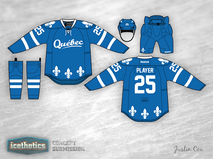
This week we're looking at concepts for teams that have disappeared from the NHL over the years. Today, Justin Cox brings us a new take on the Quebec Nordiques.
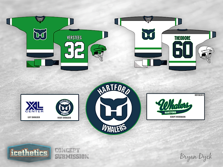
This week on the concepts page we're revisiting cities that once had NHL clubs, but no longer do. We're starting Hartford and Bryan Dyck's new look for the Whalers. Really liking that green jersey!
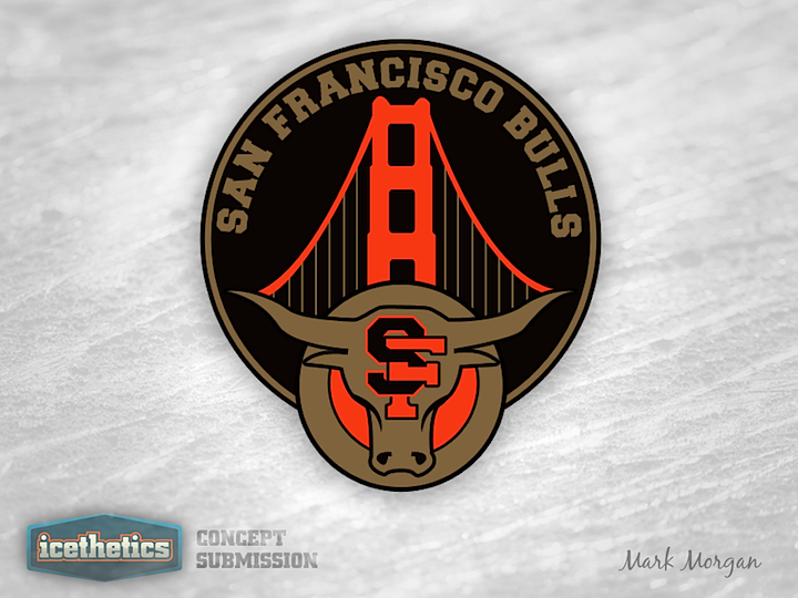
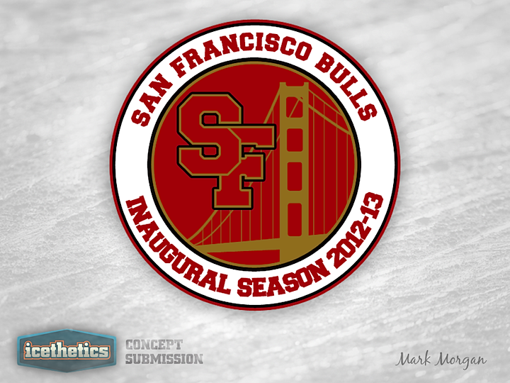
Mark Morgan was the most prolific designer to take a swing at designing a secondary logo for the ECHL's new San Francisco Bulls. So I'm giving him this San Francisco Sunday all to himself. The first design features a pretty straightforward look. It incorporates the primary logo, the intertwined SF and the Golden Gate Bridge.
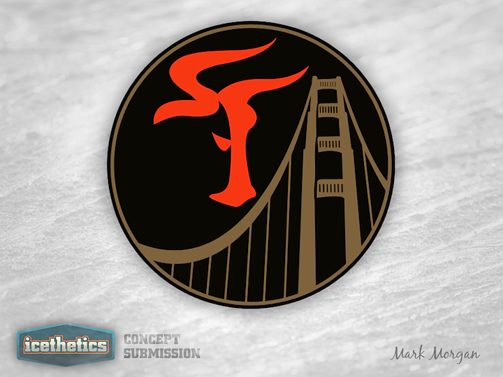
This next one is my personal favorite. At first glance, it looks like a weirdly-shaped SF. But look again. It's the head of a bull in profile! I didn't even know that was possible!
The last one doesn't quite use the right colors but it's still a solid and simple patch design. So which of Mark's three is your favorite?