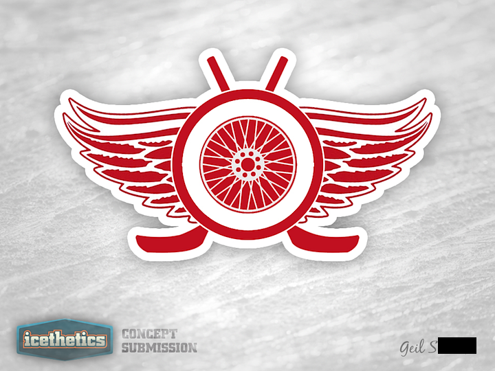
0223: Symmetrical Freak Out

It almost doesn't need words. Geil S. seems to be imagining what the Red Wings logo might look like if it sat next to a mirror. And being posted on a Freak Out Friday isn't to say this is a bad logo. Just very, very different.

0222: Blue Jackets and Gold

This week seems to be all about changing the color palettes of existing teams. So why not give it a shot in Columbus? If the Stars were to switch to red, white and blue, maybe the Blue Jackets could switch away from it. Justin Cox infuses some gold into a design inspired by the club's alternate jersey. It's a pretty sharp look and would certainly be unique in the NHL.

0221: Stars of Texas

Don't expect the Dallas Stars concepts to slow down anytime soon. It's almost all I'm seeing. With a rebrand in the works for 2013, everyone's throwing their hat in the ring. Here, Brian Brideau suggests a color palette more in line with that of the team's home state of Texas. Is red, white and blue the way to go? Or do we already have too much of it in the NHL?

0220: A New Twist for New Jersey

Michael Ozolnieks offers a new spin on the classic NJ logo used by the Devils.

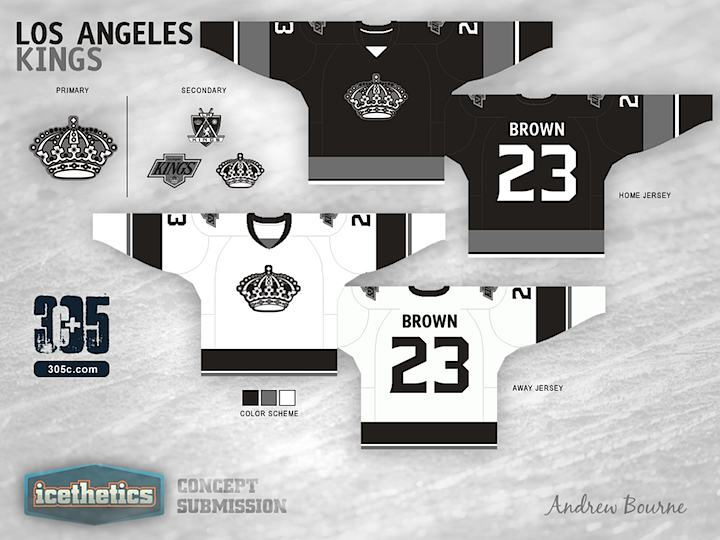
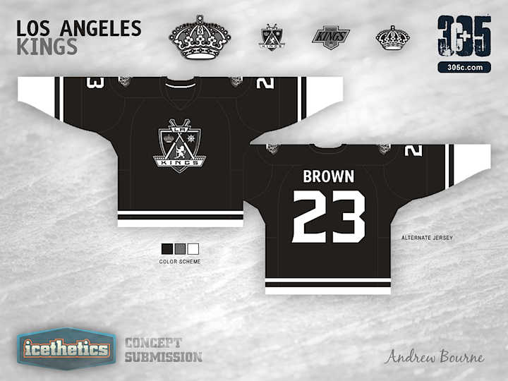
0219: Kings Re-Bourne

Andrew Bourne is back with the next team in his NHL makeover series. What are you thoughts on his monochromatic yet rather retro redo for the L.A. Kings?