0413: The Battle of PA

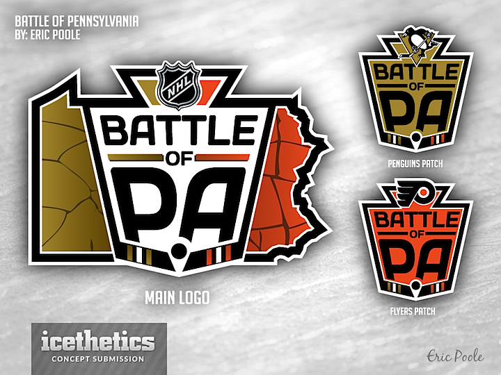
Eric Poole offers up his take on a future Winter Classic — otherwise known as the Battle of Pennsylvania — between the Pittsburgh Penguins and Philadelphia Flyers. Truthfully, it may work just as well outside the context of the outdoor event — just the regular season series between the two franchises. Neat logos either way.
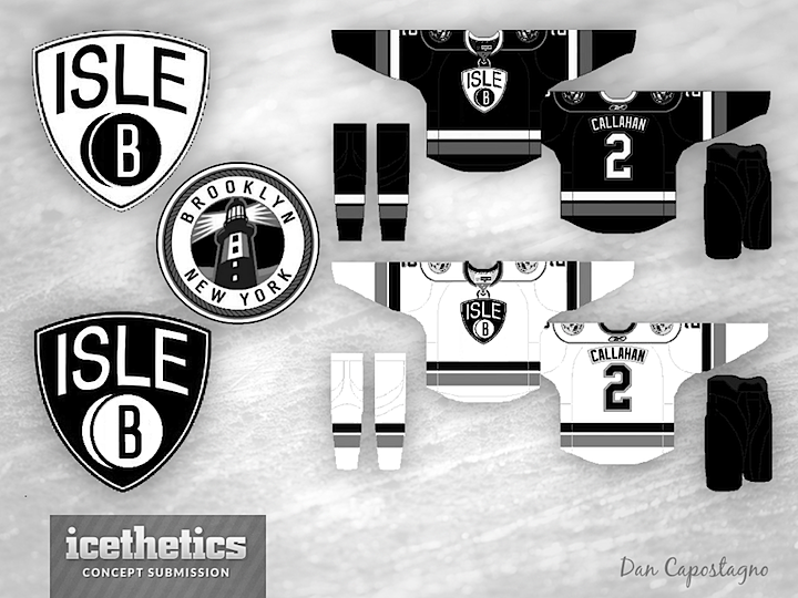
0412: Another Brooklyn Freak Out

Ever since the announcement that the Isles will play in Brooklyn in a few years, the concepts haven't stopped. Black and white. Brooklyn. But almost every look — despite ending up in a Freak Out Friday post — has been very interesting, including this one by Dan Capostagno. I'm not a fan of the lack of color, but there's got to be something here. Maybe a new third jersey a few seasons from now?

0411: Vancouver Mash-Up

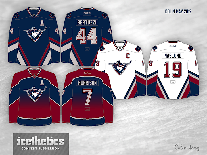
Today, Colin May has a jersey concept that merges the Canucks' late '90s look with that of Vancouver's WHL club — the Giants. It's not a bad look, but I can't say this was my favorite color scheme in Canucks history — and they have had more than a few.

0410: The Basics of Green and Gold

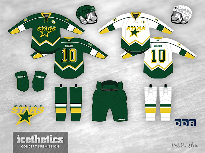
The Stars are getting a new look next fall. Pat Westin has an idea that involves simplifying everything. Though I can't help but wonder if the W-shaped stripes are anything other than the designer's signature hiding in plain sight. (By the way, this concept was obviously made prior to last week. Morrow won't get a chance to wear the new look — whatever it is.)

0409: Touching the Untouchable

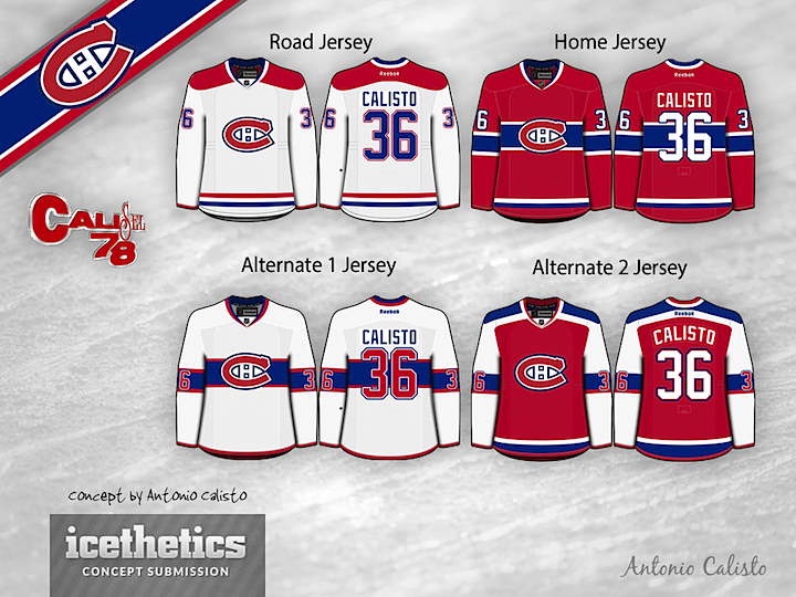
Here I believe is proof that messing with a classic doesn't always mean messing it up. Antonio Calisto came up with a couple of alternate sweaters for the Montreal Canadiens that are not replicas of anything they've worn in the past. And wouldn't you know it, they're actually pretty darn good.