
0417: Just Like the Old Days
/
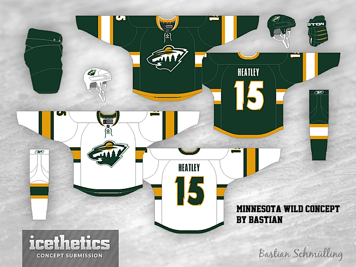
Today, we get a look at what the Wild could look like if they borrowed some colors from their state's predecessor — the North Stars. Bastian Schmülling shares a green and gold look for Minnesota this morning.
Today, we get a look at what the Wild could look like if they borrowed some colors from their state's predecessor — the North Stars. Bastian Schmülling shares a green and gold look for Minnesota this morning.
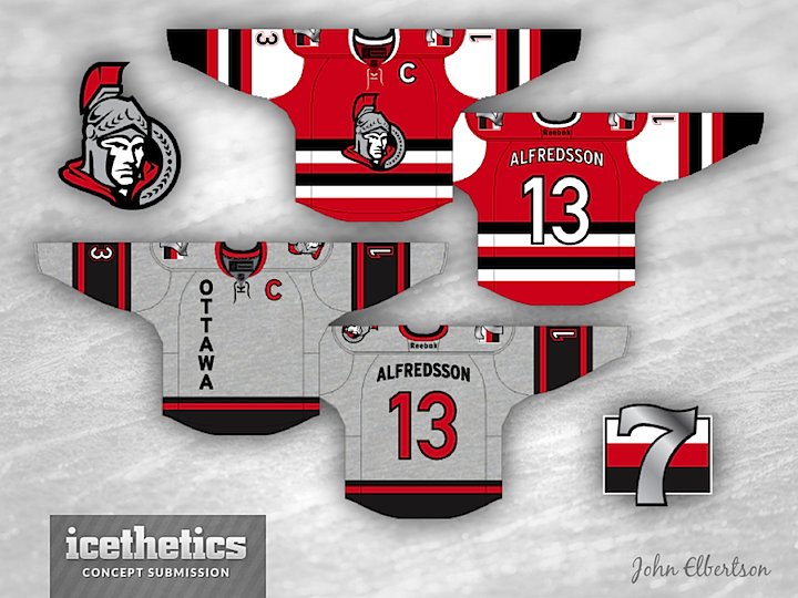
Anyone remember the old "Silver Seven" — the Ottawa Senators of olde? Of course not. You weren't born yet. But that hasn't stopped John Elbertson from created this tribute to the century-old club. I'm kind of intrigued by how good the silver looks in place of the gold in the logo.
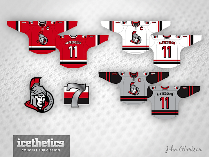
John read some of your notes and took another stab. What do you think of his revised Senators jerseys?
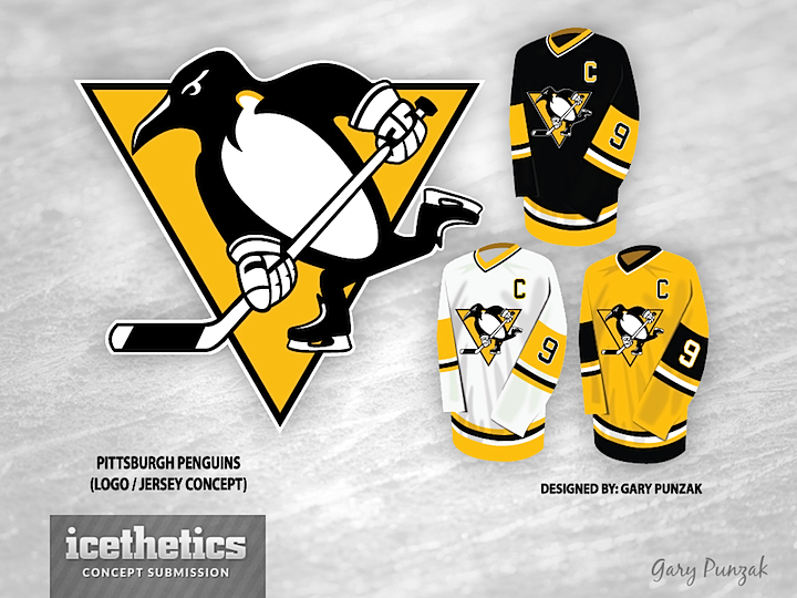
Gary Punzak tells me he started tweaking the Penguins logo to see what it would look like with modernized equipment. He ended up with a whole new concept that should please a lot of Pittsburgh fans. This comes on the heals of the disappointing revelation by a Pens beat writer who says the team will not have a new third next season. I think a lot of folks were hoping for something like this.
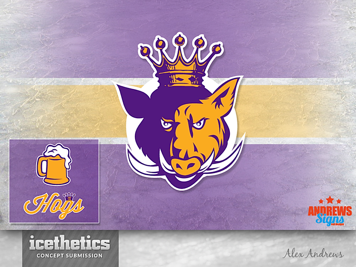
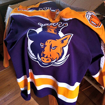
Got another fun entry to our Beer League Sunday series. Alex Andrews sent us a look he designed for his team, the Hogs. Below is a photo of the actual jersey itself.
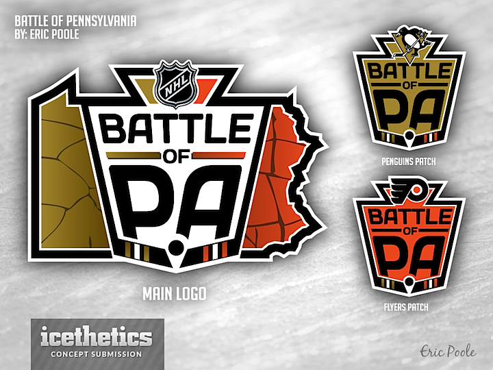
Eric Poole offers up his take on a future Winter Classic — otherwise known as the Battle of Pennsylvania — between the Pittsburgh Penguins and Philadelphia Flyers. Truthfully, it may work just as well outside the context of the outdoor event — just the regular season series between the two franchises. Neat logos either way.