The Islanders in the 21st Century

I like the New York Islanders' current uniforms the way they are. But that logo really needs an update. It needed an update way back in 1995, which is what prompted our friend, the infamous fisherman.

The problem 20 years ago is that they went too far. The concept doesn't need to change. Just the execution. Tony Berg has executed a perfect update to an aging logo here. Could be just the thing for a new hockey team in Brooklyn. Who's with me?

Future Americans

With the Sochi Olympics behind us, is it too soon to wonder what will Team USA wear in South Korea in 2018? Matt Marczel submitted this concept with a new futuristic crest.

Fixing the Stadium Series: New York Edition

Today, the Penguins and Blackhawks are taking it outside. But on this Outdoor Saturday, we're rolling the clock back to the big game in New York. Brendan Klein thinks a flashback to the '90s would've better suited the Rangers and Islanders. Do you?

Bay Area Freak Out

0228-brianbrideau-sjs.png

We wrap up February with a Freak Out Friday from Brian Brideau. He was inspired by a logo designed by Ross Taylor almost two years ago. It was meant to be a merging of the California Golden Seals and San Jose Sharks identities. This might be a neat idea for a potential Stadium Series or Winter Classic game featuring the Sharks.

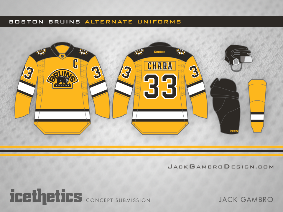
Boston Gold

0227-jackgambro-bos.png

I've long thought the Bruins could use a gold third jersey — not unlike their Winter Classic sweater from 2010. Jack Gambro seems to have had the same idea. I like almost everything about it. Only the crest feels out of place to me — being mostly gold itself.