
Inspired by Ohio State
/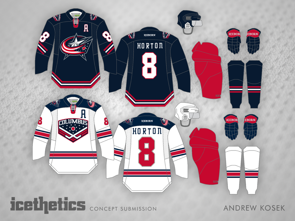
First-timer Andrew Kosek made a Blue Jackets remix. I'll let him explain:
I am living in Columbus, Ohio and have adopted the Blue Jackets as my second team. One thing that has bothered me about the Jackets is that they have a great hockey and sports history for uniforming and they don't take advantage of it. So I was trying to tie the concepts more to Columbus.
The home uniform is taking cues from the first professional team of Columbus, the Checkers. The Checkers used the Blackhawks jersey with a C on the front. I decided to add some flare to the look by using the the Blackhawks stadium series striping on the jersey.
The away uniform takes cues from Ohio State football uniform with the "Columbus Stripe" from OSU's helmet. The uni also features red numbers like OSU's football uniforms. The crest on this jersey is one of the concept logos tossed around by CBJ when they were designing there current third jersey — which would be kept in the uniform set I have made.
After Michigan hosted the Winter Classic in 2014, I thought Columbus could have quite a game at Ohio Stadium (over 100,000 fans too). The Jackets would have to take the field wearing a uniform similar to OSU's football team. So the Jackets will be sporting gray pants with the "Columbus Stripe" as well as a gray helmet.
The jersey will also feature a new crest that is very similar to a logo used by the Checkers. The crest features the cannon, union soldier hat, checkerboard (paying homage to the Checkers), and the "Columbus Stripe" with a Buckeye merit decal.
Clearly a lot of thought went into this design. Do you think it paid off?
