
Gold Freak Out
/The Panthers have worn red, navy blue and even an uncharacteristic sky blue — but never gold. I wonder why not. Actually, Ben Macdonald kind of demonstrates why not particularly well here.
The Panthers have worn red, navy blue and even an uncharacteristic sky blue — but never gold. I wonder why not. Actually, Ben Macdonald kind of demonstrates why not particularly well here.
Mark Morgan writes:
I know that it is hard to mess with an original six design, but I cannot understand why the "Toronto Maple Leafs" needs to be spelled out on their logo designs — especially because the maple leaf shape can stand alone (see Canadian flag).
Here is my leafs concept that drops the words and tweaks the logo just a touch, giving it a more "natural" leaf feel.
It's a risky proposition to redesign the classic sweaters of the New York Rangers, but Dylan Nowak may be on to something with this jersey. The shield isn't necessarily a deal breaker either.
This concept by Ryan Christensen is a pretty good example of why it may have been a mistake for the Lightning to drop black and silver from their sweaters.
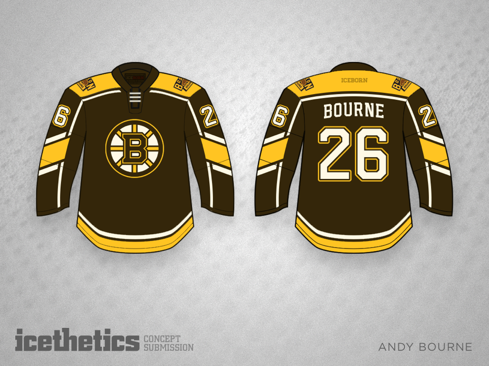
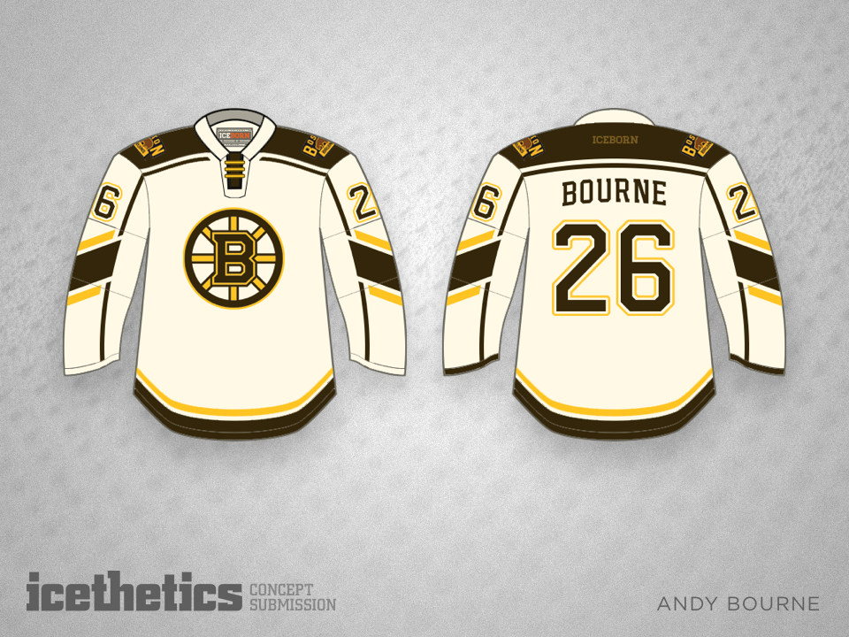
The Bruins have been black and gold for a long time, but shouldn't they return to their roots? Brown and gold would be a welcome sight, just as it is in this set by Andy Bourne.