Summer is ending and NHL training camps are about to get started. So it's time for the September edition of Icethetics' annual NHL JerseyWatch series. Everything you need to know about NHL logo and uniform changes planned for the 2013-14 season.
At this point in the calendar, we've seen most of what we're going to see for the new year. But there are still a few things up in the air, including a new Flames third jersey and special sweaters for all of the outdoor games. Read on to get caught up!

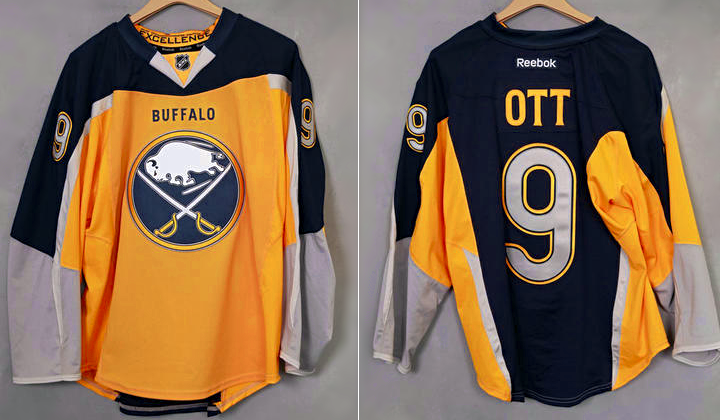
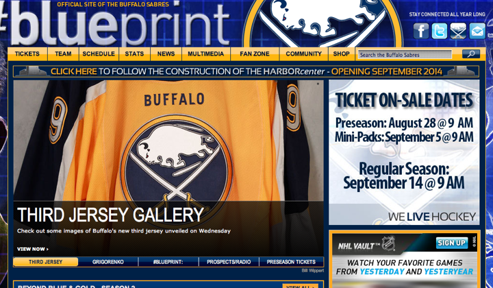
Sabres unveil new sweater with staged "leak"
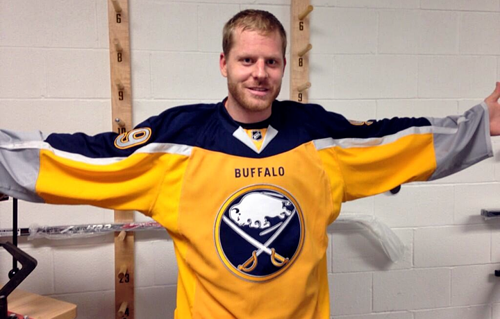
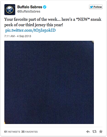
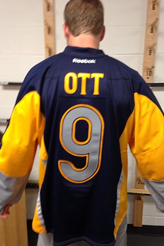
On Sept. 4, the Buffalo Sabres joined the gold jersey club when they unveiled their new alternate uniform. The unveiling happened as part of a staged "leak" via forward Steve Ott. After the team posted another teaser image, Ott "threatened" to tweet a photo of the entire jersey himself. Which he did.
Later in the day, official photos of the jersey appeared on the Sabres' website.
 Photos from Buffalo Sabres
News of the new jersey first broke last year when Sabres president Ted Black told Buffalo Business First writer James Fink that a new alternate uniform would be making its debut next fall. "Yes, it will be blue-and-gold and feature the team's beloved original logo," wrote Fink. "What else is on the jersey is still being determined."
In June, Black was on the radio — WGR 550 in Buffalo — fielding calls from listeners when someone brought up jersey designs. Black confirmed that it would not be a throwback. And it clearly wasn't.
Following the unveiling, reaction online has been widely negative. The jersey breaks with traditional hockey uniform design in a number of ways, including the front and back in different colors. There are also stripes down the sleeves possibly meant to evoke swords.
On the day of the jersey release, Black was asked by the Buffalo News about the reaction but declined to comment. In fact, apart from posting photos online, the Sabres organization hasn't really said anything about the design or what prompted it.

Reebok says Flames are swapping out retro third
According to Reebok's retailer catalog last winter, the Calgary Flames have a new third jersey in the works. And if true, they've done an outstanding job keeping it under wraps this summer.
What we know is that Reebok lists the Flames' alternate as "TBD." Strictly speaking, that doesn't always mean a new jersey is coming. Sometimes it just means the existing one is being retired. But ultimately, it means a final decision is still to be determined.
If they are changing, you have to ask, why? Why dump the brightly-colored retro third in the first place? Are fans complaining about it? Are they not buying them? Can't imagine either of those things are true. Or that a new Flames third jersey would be any color but black. Which will excite almost none of you.
For what it's worth, video game enthusiasts have reported that the Flames' third jersey in EA Sports' NHL 14 is locked. Typically, EA will lock jerseys scheduled for late unveilings and then release an update or unlock code after the fact.
In fairness, NHL 14 is also showing that the Wild are swapping their home and alternate jerseys for this season. I have it direct from the team that this is not the case. Which is why I've said repeatedly I don't trust video games as a source of information. If they can't be 100% accurate, I'm not interested.
If the Flames do add a new sweater this season, they may be waiting for a midseason unveiling. If they wait until late October or November, they'll have more eyes on them and it'll be fresher in everyone's mind when the holidays arrive.

Hurricanes introduce new home and road uniforms
The new sweaters from the Carolina Hurricanes might've caught us by surprise had we not heard from Reebok on the subject back in January. On May 23, the team announced the home and road uniforms would be changed for the 2013-14 season.
As part of their "New Storm" marketing campaign, the Canes teased us with sneak peek photos on Instagram every day for 11 days leading up to the unveiling at a special event on June 4 at PNC Arena. Inspired by hockey tradition, the new jersey designs were simpler in design and color palette.
 Photos from Carolina Hurricanes
The redesign got a mixed reaction as some lauded the more traditional style while others complained that the look was oversimplified and not unique to the Hurricanes. If you read my lengthy review, you know which category I fell into.
Carolina will not change any of its logos or its third jersey.

Stars unveil new logo, uniforms for 2013-14
The Dallas Stars had been contemplating new uniforms for a few years, but a recent ownership change delayed things a bit. However, almost as soon as new owner Tom Gaglardi took over, he got the ball rolling on a full reset of the Stars branding.
Two weeks ago, on the same day as the Hurricanes, the Stars introduced new logos and uniforms at a special event for fans and season ticket holders. They even invited Icethetics to cover the festivities — an opportunity which, for me, was an absolute thrill.

When I got back from my trip to Dallas, it took a full week and three separate posts to review everything I saw and experienced that night. I won't rehash it all here since we have a lot of teams to cover, but I'm happy to provide links.
Part 1 looked at the new set of logos that were introduced. Part 2 focused on the unveiling event itself. And Part 3 was the much-anticipated full review of the new uniforms. I hope you guys enjoyed those long reads as much as I enjoyed writing them. There was a lot of excitement in Dallas!
In previous editions of NHL JerseyWatch, I said the Stars' redesign was the one I was most excited about. Now having seen what they came up with, I'm still most excited about this team.

Wild road jersey revamped and unveiled
The Minnesota Wild unveiled their new road jersey on Sept. 1 at the at Minnesota State Fair — though it leaked the night before through the team's own website. After 10 years of slowly moving toward more traditional style home and third jerseys, the Wild finally completed the set with a new white number.
 Photos courtesy of Minnesota Wild
Following the unveiling, I talked with the Wild's creative services manager, who led the design of the new sweater. He went in depth about the process of creating a jersey.
By the way, if you're curious how the final design matches up to a report posted on Icethetics in the previous JerseyWatch post, check out what one reader said:
One was a white sweater with the large, Wild head crest on the front, vertical stripes are gone. Replaced with two horizontal green stripes on the arms. The "red was gone" from the shoulder yoke, but didn't specify whether the shoulders had any color left.
The other option was basically a reverse of the current alternates. Antique white base with the Minnesota Wild script and green accents.
He left out a few details, but otherwise he nailed it.
The Wild have confirmed there are no plans to make any further uniform or logo changes in the foreseeable future. And why would they need to?

Canadiens hop off the jersey change train
This is the one I get asked about the most. Are the Montreal Canadiens really changing their jerseys? After months clinging to the same Reebok report — that the Habs' home and roads were "TBD" — I finally have something new to talk about.
Everything is on hold. While I don't know what changes the Canadiens were considering, I have heard from multiple sources that the plans have been shelved for the time being. Whether that means the Habs will show up again in NHL JerseyWatch 2014, I can't say.
All I know is that for the 2013-14 season, it seems they'll be wearing exactly what they have been for years. No changes. For now.

Penguins to go without third jersey next season
Reebok listed the Pittsburgh Penguins in January as one of the team's mulling a third jersey change for 2013-14. Then about a month ago we got confirmation from Pittsburgh Tribune-Review writer Rob Rossi that the team will be skipping the alternate jersey for a season.
Rossi also said there may be a new one in the future. I have no doubt whatsoever that's true. And then something interesting happened last month.
The NHL officially confirmed its rumored Stadium Series with the announcement the Penguins would face the Chicago Blackhawks at Soldier Field on March 1, 2014. Since then, Islanders GM Garth Snow has confirmed that all teams involved in outdoor games next season will have specially designed sweaters for the occasion.
The good news is that the Penguins still have a lot of options in their historical closet. They've changed their uniforms numerous times over the years. But I know many fans would like to see them roll back the clock a couple of decades to sport something similar to what Lemieux and friends wore whilst leading the team to back-to-back Stanley Cups.
The Pens' previous alternate jerseys were born at their outdoor game appearances in 2008 and 2011 — with different blue jerseys each time. And then in seasons following each Winter Classic, the jerseys were adopted as alternates and used another dozen or so times per season. No reason not to think the same thing won't happen again in 2014 — right on schedule for a three-year cycle.

Sharks simplify, cut weight with new jerseys
The San Jose Sharks introduced new home and road uniforms on Aug. 20. Their goal was to meet the demands of the players, who wanted a lighter sweater similar to their black third jersey. Apparently, that meant wiping out the shoulder yokes and waist stripes — two elements that had put the Sharks' old jerseys among the best in the NHL.
 Photo from San Jose SharksThe new jerseys also seem to meet a fan demand in that they feature less orange. One stripe on the sleeves how instead of two. And the numbers are no longer outlined in it.
Unfortunately, the weight reduction efforts didn't include removing the numbers from the chest. But I suppose now with the lack of shoulder yokes and waist stripes, no one could ever accuse these jerseys of looking busy. But by the same token, they are looking a little more like the Lightning from 2007.

Winter Classic will open series of six outdoor games
On April 7, the NHL officially announced the next Winter Classic has been rescheduled for Jan. 1, 2014 at The Big House in Ann Arbor, Mich. The Detroit Red Wings will be hosting the Toronto Maple Leafs. The league also took the opportunity to unveil both jerseys.

It'll be the first time in a long time we've seen an NHL game without one of the teams wearing white. Can't wait! And even on their own these two jerseys look great. Hopefully the Red Wings and Maple Leafs get some use out of them after Jan. 1.

Stadium Series to follow Winter Classic
The NHL officially announced on May 1 that four more outdoor games will be played as part of the new Stadium Series in the three biggest markets in the U.S. — New York, Los Angeles and Chicago.
Here's schedule of games planned for this series:
- SAT., JAN. 25 — Kings vs. Ducks, Dodger Stadium
- SUN., JAN. 26 — Rangers vs. Devils, Yankee Stadium
- WED., JAN. 29 — Rangers vs. Islanders, Yankee Stadium
- SAT., MAR. 1 — Blackhawks vs. Penguins, Soldier Field
Islanders GM Garth Snow seemed to confirm that all of these teams will have special uniforms for their outdoor games. So it'll be neat to see what everyone comes up with — especially Anaheim and Los Angeles!

Heritage Classic in Vancouver to wrap up outdoor series
Announced July 10, the outdoor hockey action will wrap up on March 2, 2014 when the Vancouver Canucks host the Ottawa Senators in the third NHL Heritage Classic. This one will happen at B.C. Place. No jerseys have been released yet, but rumors suggest the Sens may wear a white/vintage white version of their black third jersey. That would allow the Canucks to wear the maroon Millionaires throwback they used last season.

No All-Star Game expected in 2014 due to Olympics
Normally, we don't get an NHL All-Star Game in the same year as the Winter Olympics. The league takes a break to allow its players to skate for their countries for a few weeks. In 2014, Sochi, Russia will host the games and NHL players will be participating.
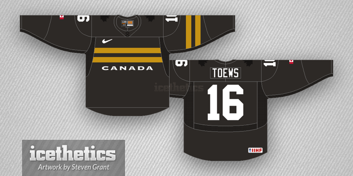
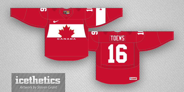
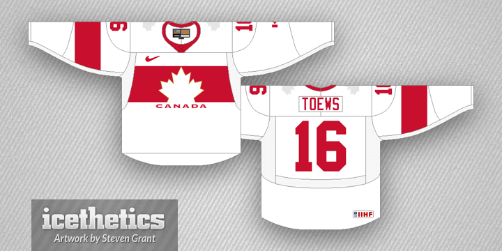
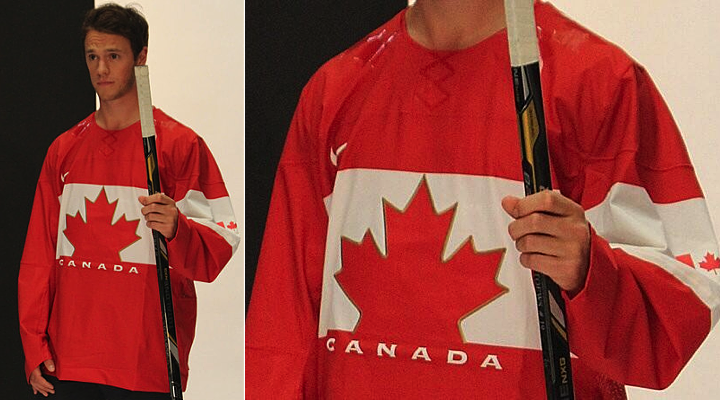
Speaking of the Olympics, the U.S. and Russia unveiled their new jerseys in late August while Canada's new red sweater leaked last week. They're also reported to have a black third in the works as well.
Anyway, the Olympic participation means Columbus will have to wait until 2015 at the earliest to get its hosting duties back — which it lost due to the lockout this season a year ago. Though the wait could be longer. During the last lockout, the 2005 All-Star Game was to be hosted by Atlanta. In 2006, Phoenix was slated to get the event — but it was canceled to make time for the Olympics.
Atlanta eventually did get the game in 2008. Phoenix is still waiting. We'll wait and see what happens in Columbus. But it's probably a safe bet that they'll get the next one — whenever that may be.
Hope you enjoyed what will likely be the final edition of NHL JerseyWatch 2013. Check back for regular updates on the blog as they're available. And don't miss the Icethetics Season Preview coming in early October.


 Photo from Anaheim Ducks Die Hards (via Twitter)