0022: A Cracked Bell in the Elements

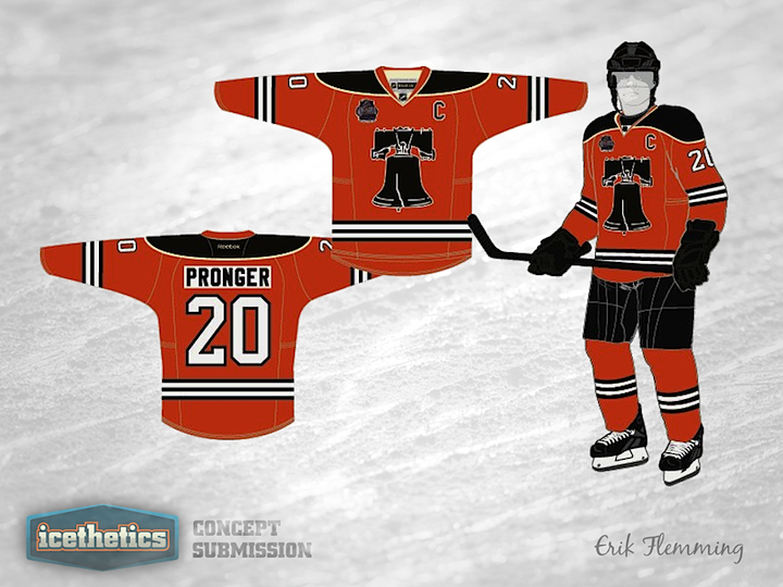
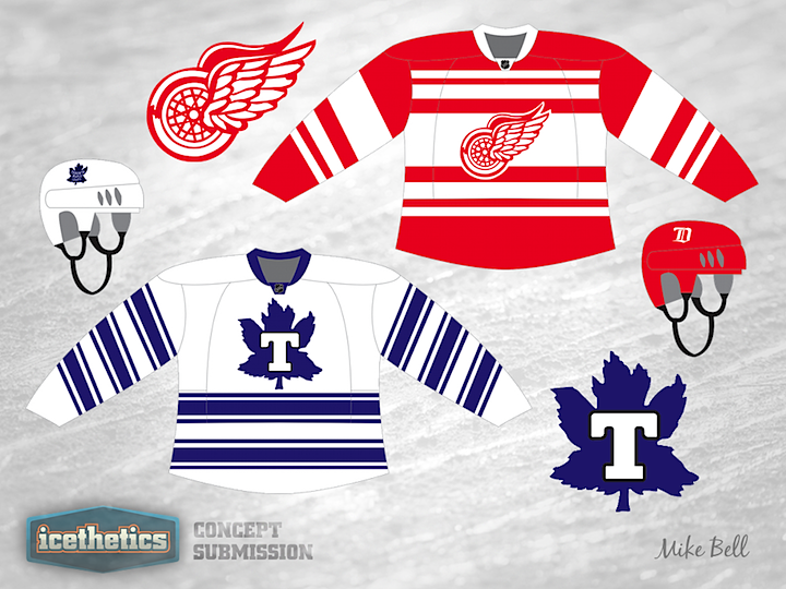
Like I said yesterday, it feels like we need a break from the Wings and Leafs this Winter Classic Weekend. So I'm digging deep into my inbox. This Philadelphia Flyers concept from Erik Flemming was emailed to me way back in November. The Liberty Bell has long been used by concept artists as a secondary emblem for the Flyers. Here, Erik explains his design choices:

Key design features:

  • Liberty Bell crest inspired by print image from 1966 contest to name the team
  • Three thin black stripes are borrowed from Philadelphia Quakers sweater
  • Two vintage white stripes represent the Philadelphia Flyers two Stanley Cup championships
  • Fonts are current uniform fonts which have remained largely unchanged since 1967-68 (numbers) and 1972-73 (names)
  • Shoulder design to be added (either current winged P logo or 45th anniversary logo)

0021: Four Dozen Classic Stripes

The weekend is here again. That brings new Winter Classic concepts. I count about 48 stripes combined in Mike Bell's throwback jerseys for the Maple Leafs and Red Wings. Might be a few too many. We'll take a quick break from Toronto and Detroit tomorrow.

0020: Florida Freak Out

Is it already Friday again? I'm fairly sure not much needs to be said about Dawson Elliott's revision to the Florida Panthers' third jersey. It's black and magenta. So I'll leave you all to it.

0019: The Jets Without Aviator Blue

What if the Winnipeg Jets had opted for a uniform design that only utilized colors in their primary logo? In other words, say we lose the light blue and add in some red. Matt Marczel put this concept together last fall and it demonstrates the idea very well. It's a unique look, but I'm not sure it beats the Jets' actual sweater design.

0018: A Unique All-Star Blend

Long time Icethetics concept artist Brian Brideau is always coming up with unique and inventive uniform designs. This one stuck out to me as one among his very best. He's proposing a new set of a NHL All-Star Game uniforms, probably for 2013 and I think they look simply phenomenal. They're a risky blend of the historical and ultra-contemporary. This set even gives a nice nod to the host, the Columbus Blue Jackets, from the red, blue and silver color scheme, right down to the stars on the jersey cuffs. If this were the real thing, I'd be in line for a Stamkos in a heartbeat.