0023: Green-a-thon, Part I

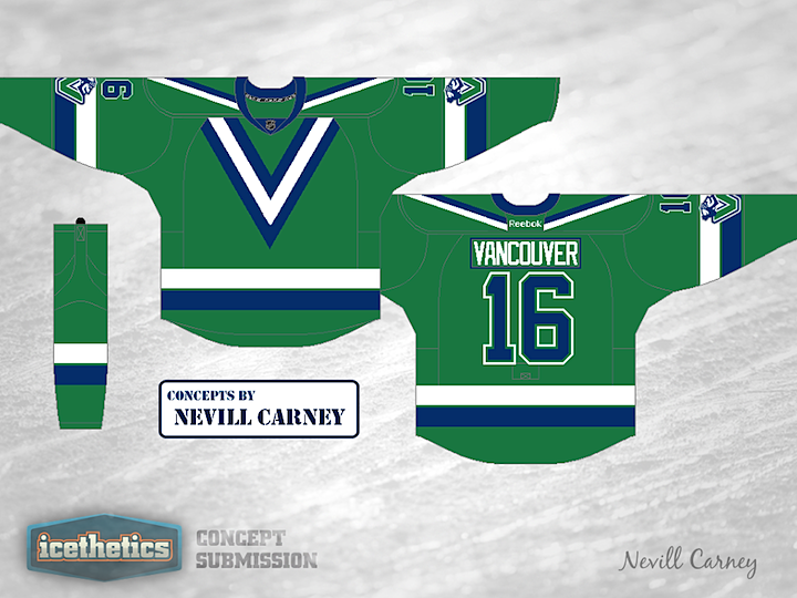
Green. It's the most undervalued and underused color in the National Hockey League. At least in my opinion. But thanks to our love of the Irish, there's a day on the calendar that's all about green. It's called Green Awareness Day. Or St. Patrick's Day, more likely. But I don't think one day is enough. (And no, I'm not talking about Earth Day.)

Welcome to Icethetics' Green-a-thon Week! Every day from now until Saturday, March 17 (St. Patty's Day), you'll find a new concept that emphasizes this most neglected of colors. To get things started, we head to Vancouver, B.C. — the natural spot to find a little green. While Nevill Carney's resurrection and recoloring of the Canucks' V sweater might be better saved for a Freak Out Friday, I can't ignore the special place held by this classic design in the hearts of many Icethetics readers.

Be sure to check back all week for new green concepts!
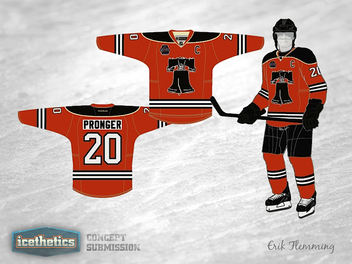
0022: A Cracked Bell in the Elements

Like I said yesterday, it feels like we need a break from the Wings and Leafs this Winter Classic Weekend. So I'm digging deep into my inbox. This Philadelphia Flyers concept from Erik Flemming was emailed to me way back in November. The Liberty Bell has long been used by concept artists as a secondary emblem for the Flyers. Here, Erik explains his design choices:

Key design features:

  • Liberty Bell crest inspired by print image from 1966 contest to name the team
  • Three thin black stripes are borrowed from Philadelphia Quakers sweater
  • Two vintage white stripes represent the Philadelphia Flyers two Stanley Cup championships
  • Fonts are current uniform fonts which have remained largely unchanged since 1967-68 (numbers) and 1972-73 (names)
  • Shoulder design to be added (either current winged P logo or 45th anniversary logo)

0021: Four Dozen Classic Stripes

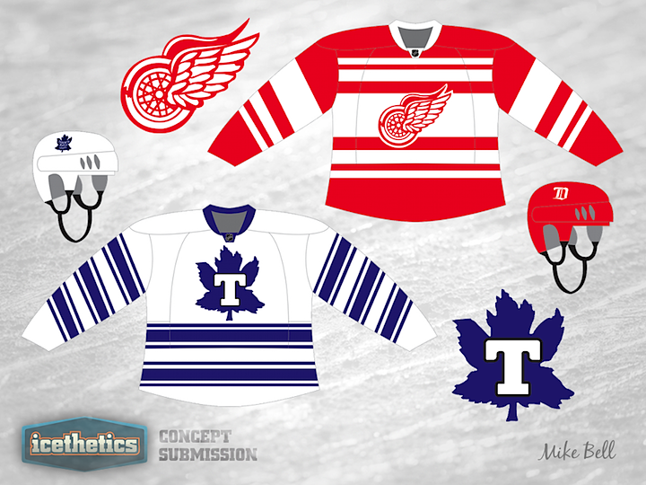
The weekend is here again. That brings new Winter Classic concepts. I count about 48 stripes combined in Mike Bell's throwback jerseys for the Maple Leafs and Red Wings. Might be a few too many. We'll take a quick break from Toronto and Detroit tomorrow.

0020: Florida Freak Out

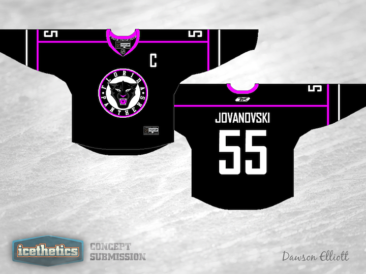
Is it already Friday again? I'm fairly sure not much needs to be said about Dawson Elliott's revision to the Florida Panthers' third jersey. It's black and magenta. So I'll leave you all to it.

0019: The Jets Without Aviator Blue

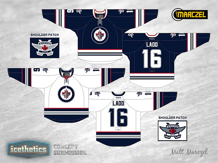
What if the Winnipeg Jets had opted for a uniform design that only utilized colors in their primary logo? In other words, say we lose the light blue and add in some red. Matt Marczel put this concept together last fall and it demonstrates the idea very well. It's a unique look, but I'm not sure it beats the Jets' actual sweater design.