0107: Using an Unused Logo

If this logo looks familiar, you've probably seen it before. It was registered with the U.S. Patent & Trademark Office back in 2001. In 2002, the Capitals swapped their primary and secondary logos as opposed to creating an entirely new identity. Still, the logo's been floating around out there over the years and Justin Cox has put it to use in this concept. I think it would make a great third!

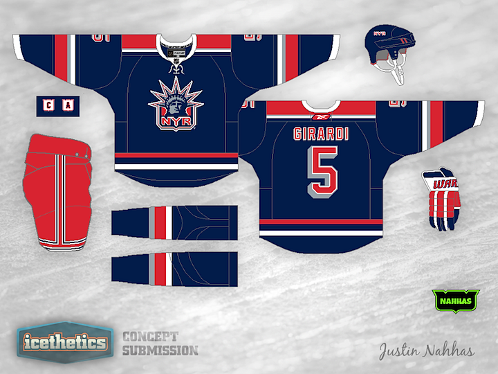
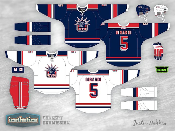
0106: Lady Liberty Liberated

Anyone else been missing the Rangers' Lady Liberty logo? Justin Nahhas created this look, which I think is even better than the original uniform from the mid-90s.

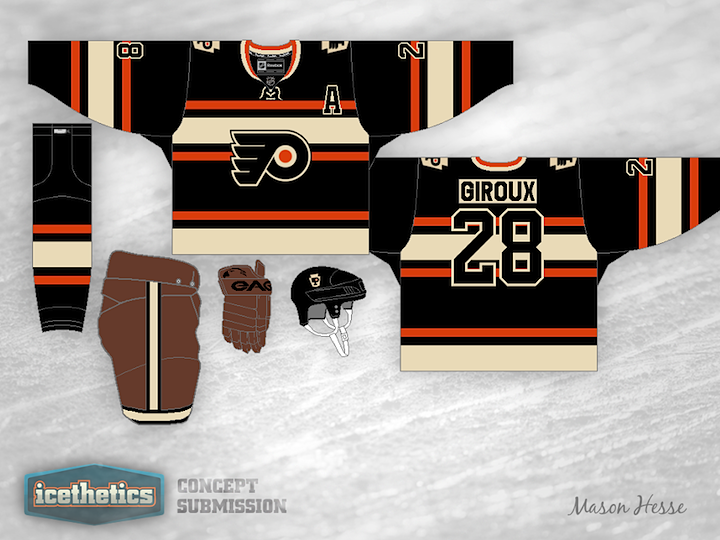
0105: Black for the Winter Classic

I'm not saying the Philadelphia Flyers should take part in their third Winter Classic in the near future, but if the time comes, this would be an excellent uniform option! Mason Hesse put together this design that, while completely new, feels very much like a throwback. What do you think? Is this one case where black might actually work?

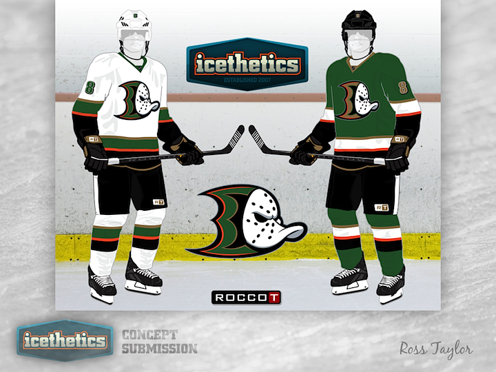
0104: The Brand-Blended Ducks

This week, Ross Taylor continues his brand-blending series by merging the new Ducks with the old Mighty Ducks — and throwing in a little green for good measure. I love the colors but I'm not sure the webbed D and the duck mask work all that well together.

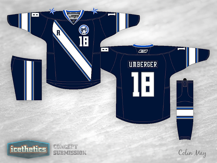
0103: A Novel Concept

Today we're looking to Colin May's rather untraditional look for the Columbus Blue Jackets. I kind of like the sash-style striping, but I wouldn't cut it off there, I'd go all the way over the top and around the back.