0102: Sabres with Swords

One of the gripes I hear a lot is about how the Buffalo Sabres logos tend to feature the animal for which the city is named as opposed to the weapon for which the club is. Jake Bartal's concept deals with that issue pretty well. But then I've never minded the Buffalo sports franchises allowing the symbol of their city to represent them. What's your take?

0101: Lighting the Way

According to the Islanders, their black third jersey is here to stay for a while. But the most common complaint I've heard, beyond the fact that it's black, is that it doesn't have a logo. And what could be a better logo for this team than a lighthouse? Kevin Dion set out to design a black alternate for the Isles with that in mind. And the best part is that the team already has a lighthouse logo in its history. But it's been overshadowed by the frozen seafood character that was placed on the front of the jersey. I'm guessing it won't be popular simply because it's black, but I think it actually works as a third color for the Islanders. How about you?

0100: A Hundred Concepts and Counting...

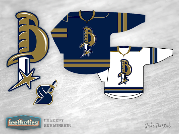
When I relaunched the Concepts page earlier this year, who really thought I'd be able to keep it going for 100 straight days? I know I've been flaky about this aspect of Icethetics in the past, but clearly you guys are enjoying it and I've finally found a way to keep it fresh.

That said, hitting triple digits seems like a special occasion we should mark. In honor of that and the 2012 Stanley Cup Final about to begin, how about this...

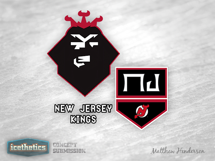
Following the overtime victory that sent the New Jersey Devils on to the final round of the playoffs to face the Los Angeles Kings, Matthew Henderson had an idea. He emailed me this pair of mutant logos in the vein of Ross Taylor's recent Freak Out Friday series.

Sure, this concept might be better suited to Friday, but sadly there are no Fridays between now and the start of the last playoff series of the season. Plus, I didn't want to make you guys wait to see this. I think they're pretty clever and pretty funny.

But since this is a special occasion — and so as to ground this post in reality a little bit — here are some more normal concepts for the NHL's conference champions.

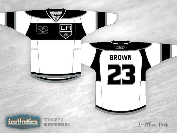
I've been hanging on to this concept from Matthew Beck for a while. It has a very cool soccer-y feel. I'd love to see an NHL team try an idea like this some time, but it is a little out there.

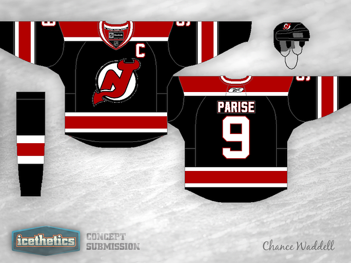
And from Chance Waddell we get a new iteration of a black alternate for the Devils that will probably never happen. I know, we're a bit put off by the lack of color in the Stanley Cup series this year and adding more black wouldn't exactly help the cause. Still, it is something I'd like to see New Jersey try in the future. You know, when black is cool again.

0099: Two Ways to Use the Tomahawks

Today we're looking at some alternate jersey alternatives for the Chicago Blackhawks — both centered around the club's tomahawk-laden secondary logo. Brian Brideau's design actually doesn't use that logo directly, but rather a modified version that features the year of the team's founding. It could work great for a future Winter Classic what with the abundance of old-timey stripes and all.

Justin Wiltron's attempt is much simpler and to the point. Make it black and put the actual tomahawk logo on the front. Why hasn't this been done yet? It doesn't look bad at all. In fact, as Blackhawks jerseys go, I kind of like this one.

0098: Every Color Except Green

It seems like green is the only jersey color that the Vancouver Canucks haven't used. They've had yellow, black, red, purple (let's be honest about that gradient-happy third from the 90s), and two different shades of blue. So seriously, why not green? Justin Cox has assembled a jersey with some historical elements and created what's actually a nice-looking uniform. I'm impressed. What do you think?