0377: Two Blue Freak Out

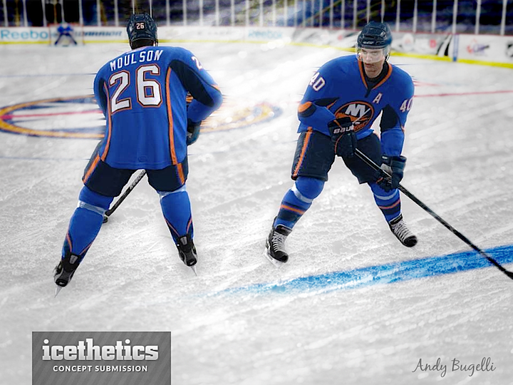
On Tuesday, I acknowledged the abundance of Isles concepts on these pages and offered up an example of a good one. Today, for Freak Out Friday, we hit the other end of the spectrum. Andy Bugelli seems to have a better handle on manipulating NHL video game software than designing hockey sweaters. Still, what do you think of the Islanders in a lighter blue?

0376: Becoming Generals

In today's concept, Avi Stein imagines a rebranding for the Columbus Blue Jackets as the Columbus Generals — you know, after a few military promotions. For a crest, he's opting for the unused logo seen in a video on the Blue Jackets' official website last year. For the shoulders, he's borrowing a logo originally designed by Tim E. O'Brien.

0375: A Blast of Burgundy

If the Avalanche ever opt for a more traditional jersey design, Bastian Schmülling has just what they need right here. I think this is a fantastic look.

0374: Long Live the Lighthouse

I know the Islanders get featured here an awful lot, but a good concept is a good concept. And this one by Matt McElroy is very good. I don't know why the Islanders have never tried to pursue a lighthouse logo again. Did the 1995 rebranding debacle leave such a bad taste in everyone's mouth that they dare not suggest anything good might have come of it? A third jersey would've been the perfect place to test the waters of a new secondary logo. Instead, we got text on a black jersey — the two biggest no-no's in the third jersey world.

0373: Grey Monday

You don't see a lot of grey jerseys in the NHL. Or any, really. So Nick Burton's Winnipeg Jets jersey would be one of a kind. What do you think?