0415: Modernizing Pittsburgh

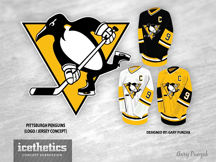
Gary Punzak tells me he started tweaking the Penguins logo to see what it would look like with modernized equipment. He ended up with a whole new concept that should please a lot of Pittsburgh fans. This comes on the heals of the disappointing revelation by a Pens beat writer who says the team will not have a new third next season. I think a lot of folks were hoping for something like this.
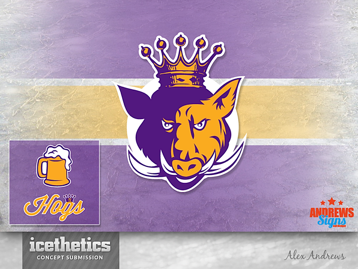
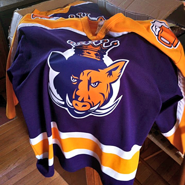
0414: The Hogs

Got another fun entry to our Beer League Sunday series. Alex Andrews sent us a look he designed for his team, the Hogs. Below is a photo of the actual jersey itself.

0413: The Battle of PA

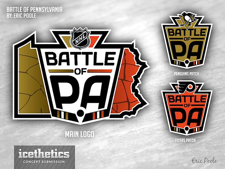
Eric Poole offers up his take on a future Winter Classic — otherwise known as the Battle of Pennsylvania — between the Pittsburgh Penguins and Philadelphia Flyers. Truthfully, it may work just as well outside the context of the outdoor event — just the regular season series between the two franchises. Neat logos either way.

0412: Another Brooklyn Freak Out

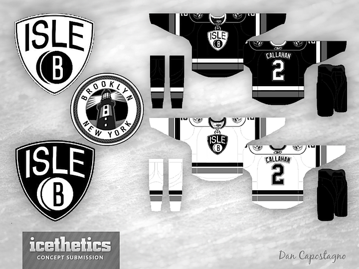
Ever since the announcement that the Isles will play in Brooklyn in a few years, the concepts haven't stopped. Black and white. Brooklyn. But almost every look — despite ending up in a Freak Out Friday post — has been very interesting, including this one by Dan Capostagno. I'm not a fan of the lack of color, but there's got to be something here. Maybe a new third jersey a few seasons from now?

0411: Vancouver Mash-Up

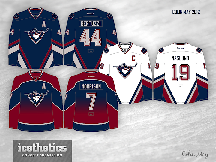
Today, Colin May has a jersey concept that merges the Canucks' late '90s look with that of Vancouver's WHL club — the Giants. It's not a bad look, but I can't say this was my favorite color scheme in Canucks history — and they have had more than a few.