
0474: Back to the Days of Mario
/
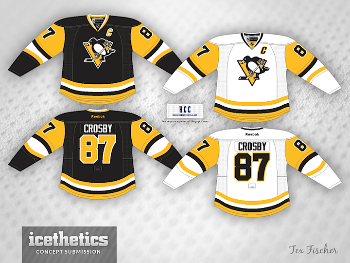
Why aren't the Penguins already wearing these? Tex Fischer has done a great job adapting those classic late '80s sweaters to Reebok's beloved Edge design. Let's see them on the ice already.
Why aren't the Penguins already wearing these? Tex Fischer has done a great job adapting those classic late '80s sweaters to Reebok's beloved Edge design. Let's see them on the ice already.
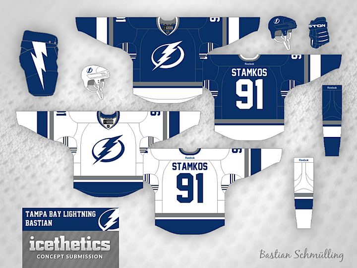
I like to celebrate my birthdays with Tampa Bay Lightning concepts. This year, I think Bastian Schmülling has hit the jackpot. If you're not a fan of those monochromatic Bolts sweaters, this is how you fix them. I love the inclusion of silver and the victory stripes under the arms. The one change I might suggest is contrasting shoulder yokes as a nod to the original uniforms.
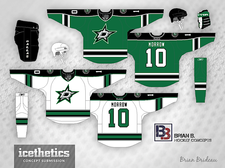
Brian says this green Stars jersey is his prediction for this evening based on everything he's heard and seen from the team. Stars owner Tom Gaglardi has talked a lot about the team's history when discussing the new uniform designs.
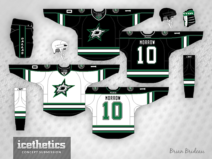
And this is another of the wishful-thinking variety. That logo sure looks good on black. Guess we'll see what happens tonight!
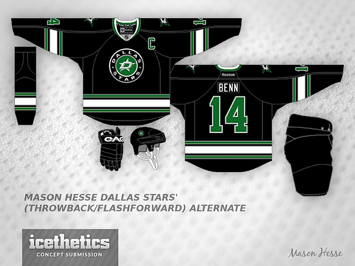
And finally, Mason Hesse puts forth a possible look for a future third jersey. Great looks all around.
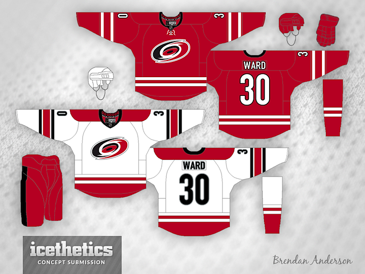
This day is a little unprecedented. Two NHL teams are unveiling new uniforms today. So in order to get some last-minute concepts out before the official reveals, I'm actually doing not one but two separate concept posts. Hurricanes are up first right now with the unveiling set for 12pm ET, then the Stars later this afternoon ahead of their unveiling, which will be around 6pm CT.
Up top, frequent contributor and GM of the IceHL's North Carolina Nighthawks (imagine that) Brendan Anderson takes a stab with his prediction for Carolina's new look. It's based on the bits and pieces we've seen over the last 12 days from the Canes' Instagram teaser photos.
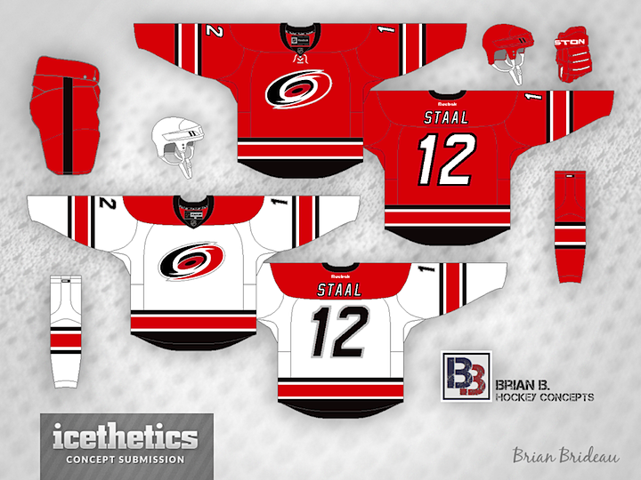
Next another regular, Brian Brideau, tries his hand. I think ultimately, we might see a mix of these two designs. Brian's paid attention to the template change, which shows the shoulder seam beneath the nameplate instead of above it. But he doesn't seem to have the dual striping pattern or the new font.
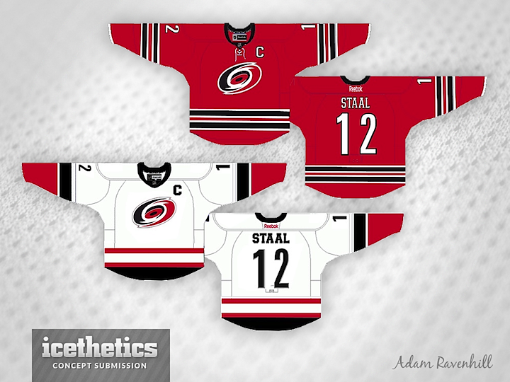
All signs point to the Hurricanes opting for non-matching home and road jerseys with this new set. That's what Adam Ravenhill had in mind when he made this concept. Not sure where the Jets-style striping comes from on the red jersey, but it's not a bad look. What do you think of the idea of non-matching jerseys?
Remember to come back this afternoon for one last set of Stars concepts ahead of tonight's unveiling.
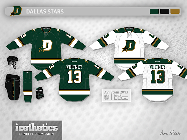
The big day is tomorrow in both Raleigh and Dallas. But since the Hurricanes aren't changing their logos or colors, they're not quite as fertile ground for concept artists as the Stars. So I've got one more Stars post featuring three unique attempts. Avi Stein leads off with the starry D.
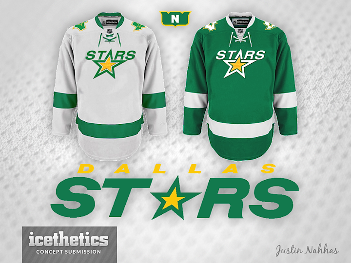
Icethetics regular Justin Nahhas did a little something in the style of the Lightning — in fact simply recolored actual Lightning jerseys to come up with this set. It's a solid color scheme.
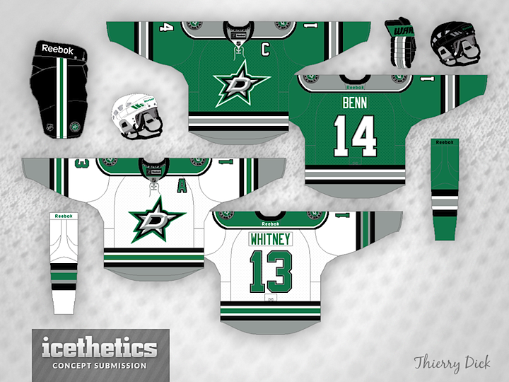
And finally, Thierry Dick squeezes in his second Stars concept in less than a week with this gorgeous kit. He's employed the logos that were leaked a couple weeks ago.
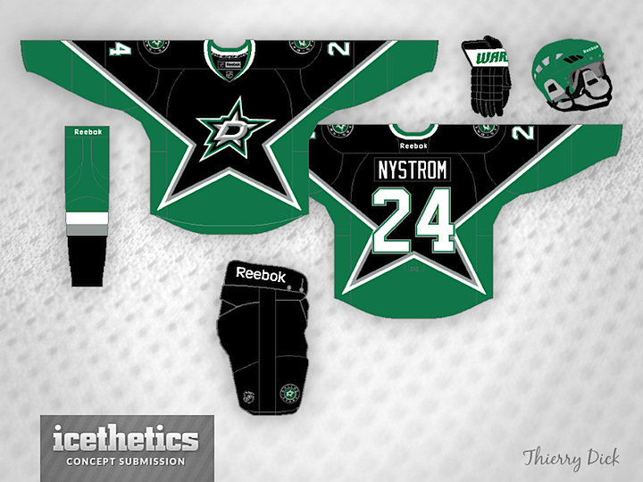
Which of these three styles is your favorite for Dallas? And how eager are you to see what the team actually has in store tomorrow?