0539: Frozen Ice & The L.A. Sun

Like many people, I'm eager to see how the NHL makes a sheet of frozen ice work outside in southern California. But until then, we have to wonder what the Kings and Ducks will wear when they take that Dodger Stadium ice (weird string of words right there). Alex Hackert presents a couple of throwback-inspired designs today.

0538: Blue and Gold and Out There

I'm fairly sure this is a good example of what not to do with an NHL uniform. I like the attempt at a white-free design, but I'm afraid Marshall Dunlap has created a patchwork quilt more than a hockey sweater. But I may be alone. What do you make of this Friday Freak Out?

0537: Classic Philly Stripes

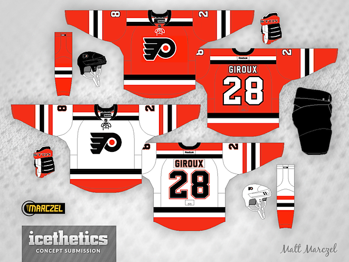
I can't quite put my finger on the reason why, but this is really what the Philadelphia Flyers should be wearing. I don't have many quarrels with their existing look, but Matt Marczel brings bold striping and and a shade of orange that combine to create an amazing kit. Really well done.

0536: Soldier On

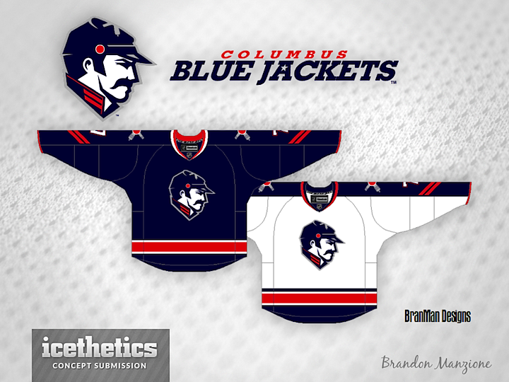
The Columbus Blue Jackets are named for the soldiers who fought for the North in the American Civil War. Maybe they should start looking like it. Brandon Manzione designed this brilliant logo along with a part of sharp sweaters. What do you think? Time to ditch the flag-wrapped star?

0535: Bringing Back Brooklyn

Today, Brian Brideau presents an alternate jersey for the New York Islanders — featuring the wordmark crest used during the 1941-42 season by the Brooklyn Americans.

And not for nothing, but it seems the NHL is already cashing in on that wordmark. The t-shirt above was spotted at the NHL Store in New York City by Brandon Holmes.