0595: Colorful Freak Out

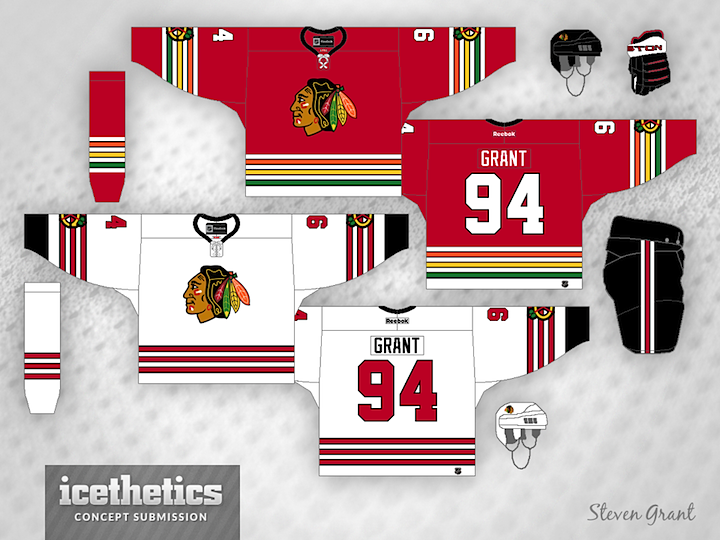
Steven Grant has been working on a series to "de-Edge" the NHL — returning the jerseys to the days before 2007 when Reebok changed some things. But I can't say I'm a huge fan.

Steven wrote, "I haven't seen many concepts for the Blackhawks that use the colours from the logo in the striping, so that's what I tried here."
0594: Dual Blue Avs

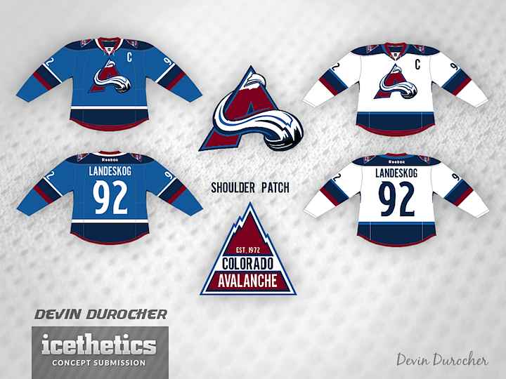
Devin Durocher made a handful of tweaks to the Avalanche's uniforms — and even the logo. But while I like the two-tone blue color scheme to an extent, the logo without the oval leaves it looking a little off-balanced. What do you think? Good idea for the Avs?

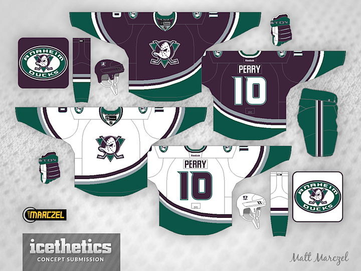
0593: That's Mighty Retro!

In less than two weeks, the Ducks bring back what once made the "Mighty." In the meantime, we have Matt Marczel's modernized take on an Anaheim classic.

0592: Bleu We Dare?

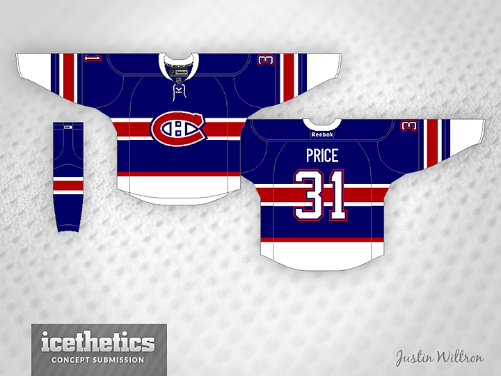
Justin Wiltron writes, "Do I dare try to add something to a historic Montreal arsenal? Yes."

Let the hockey season begin!

0591: The Stars by Hand

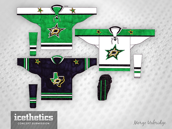
Everybody's favorite pen-and-marker concept artist is back with a revision for the Dallas Stars. Morgo Uxbridge has gone for more gold and a more traditional pattern, inspired by the Stars' own history. It's a really solid look, but I'm still not convinced gold is better than silver for Dallas.