0653: Canada in Sochi

As our International Sunday series returns, we're taking a look at a neat set of Olympic jerseys created by Eric Westhaver. Last week, we saw his take on the U.S. This week he tackles Canada. He writes:

Simple, traditional, yet bold. Kind of like Team Canada, right? There are eight gold maple leaves on the back hem of the home and away — and on the right cuff of all three jerseys — to represent eight gold medal wins, and the words, "TRUE NORTH STRONG AND FREE" written on the left cuff. The third is based off of the uniforms worn by the 1948 gold medal winning RCAF Flyers.

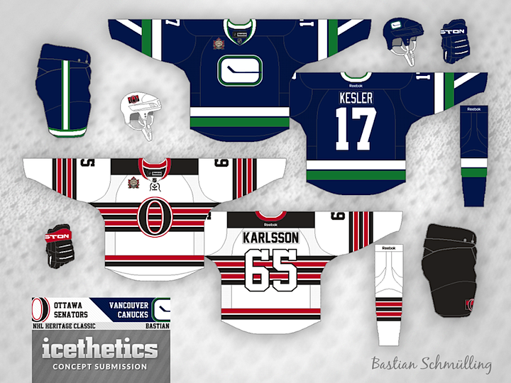
0652: Heritage Reimagined

We now know what the Canucks and Senators will wear when the hit the ice at B.C. Place in March, but how about a "what if?" Bastian Schmülling imagines the game looking something like this. Hard to say which I like better. This or reality? What's your take?

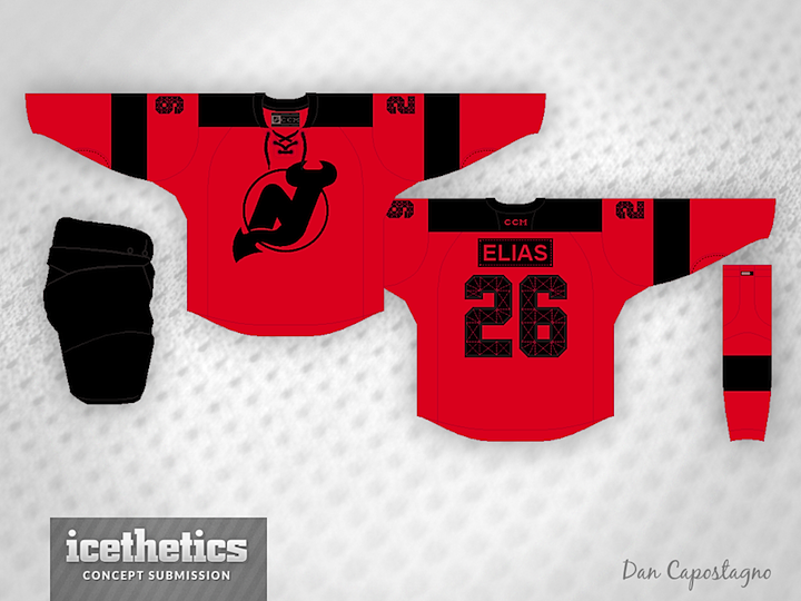
0651: Devil of a Freak Out

Freak Out Friday isn't about bad design — just stuff that's a little out there. I think it'll be a long time before we see a permanent third jersey for the New Jersey Devils. But when we do, Dan Capostagno imagines it without a shred of white. Always a fascinating choice to me.

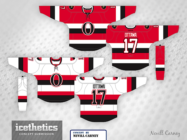
0650: Senator Stripes

In honor of the official unveiling of their Heritage Classic sweater, the Ottawa Senators are the subject of today's concept post. Nevill Carney likes the Sens' black third jersey from 2011 so he designed red and white ones to go with it.

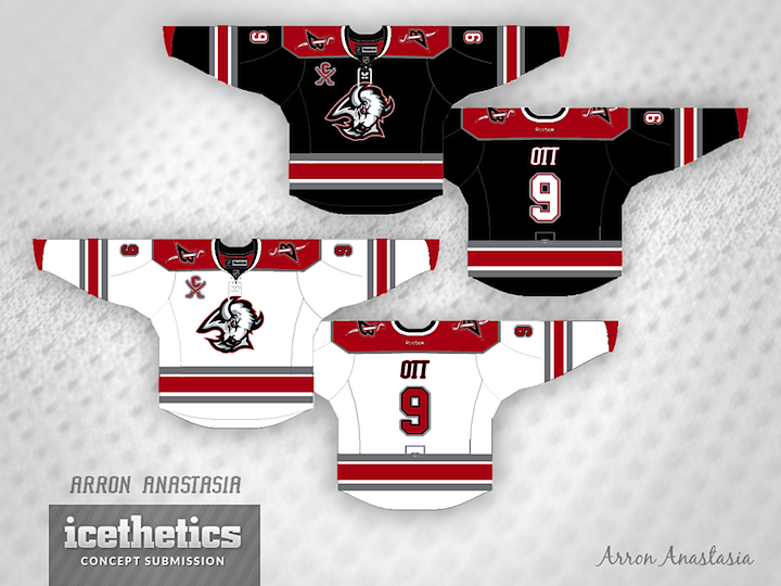
0649: Back to Black and Red

The Buffalo Sabres recently debuted their controversial new two-tone third jersey. That got Arron Anastasia thinking of a previous era for the club. Anyone interested in seeing the the Sabres return to a color palette like this?