Knights

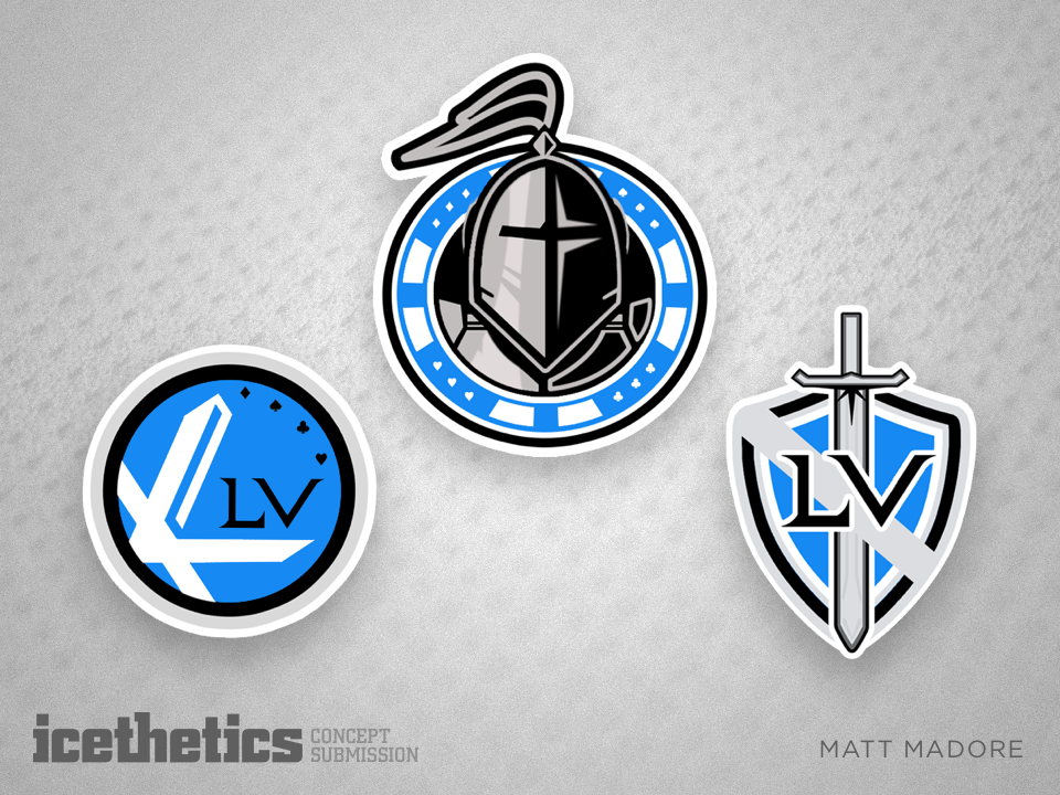
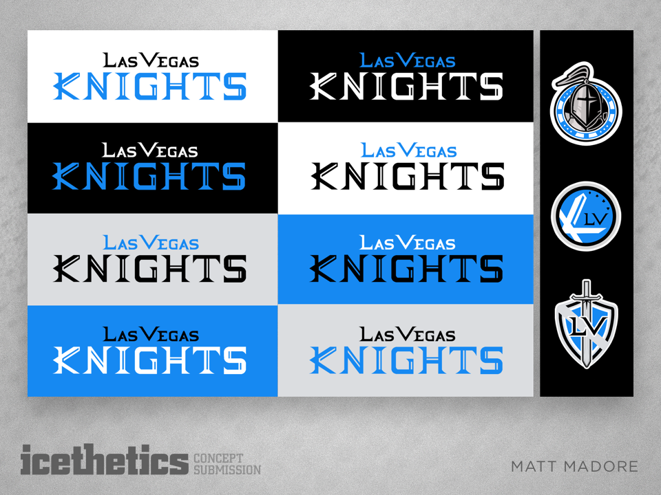
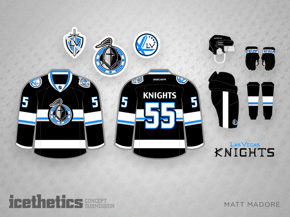
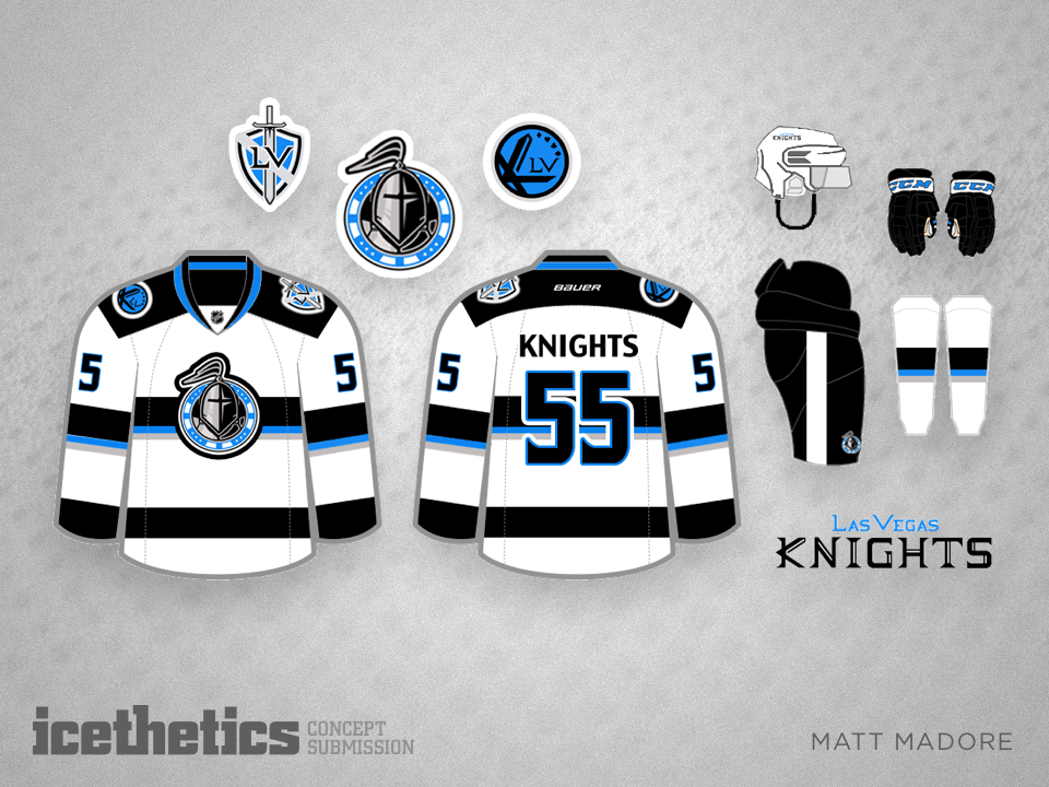
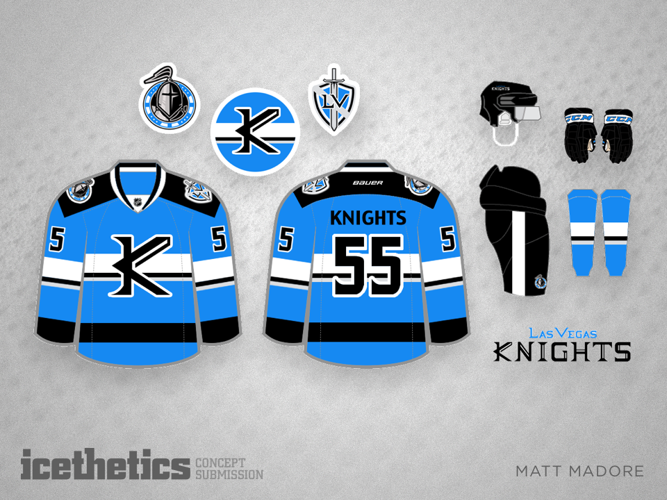
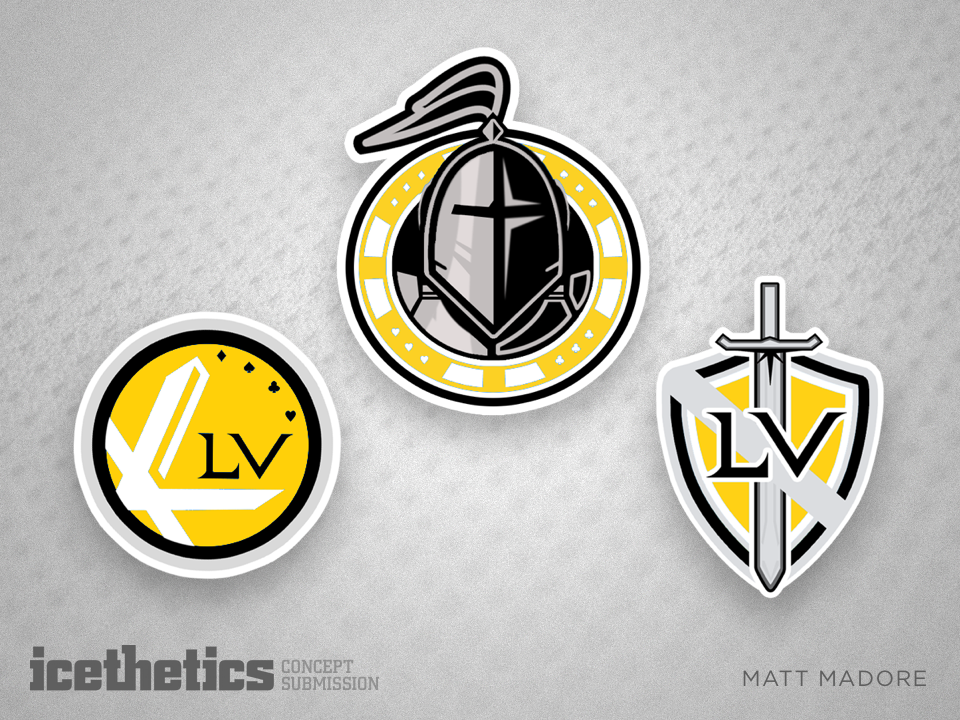
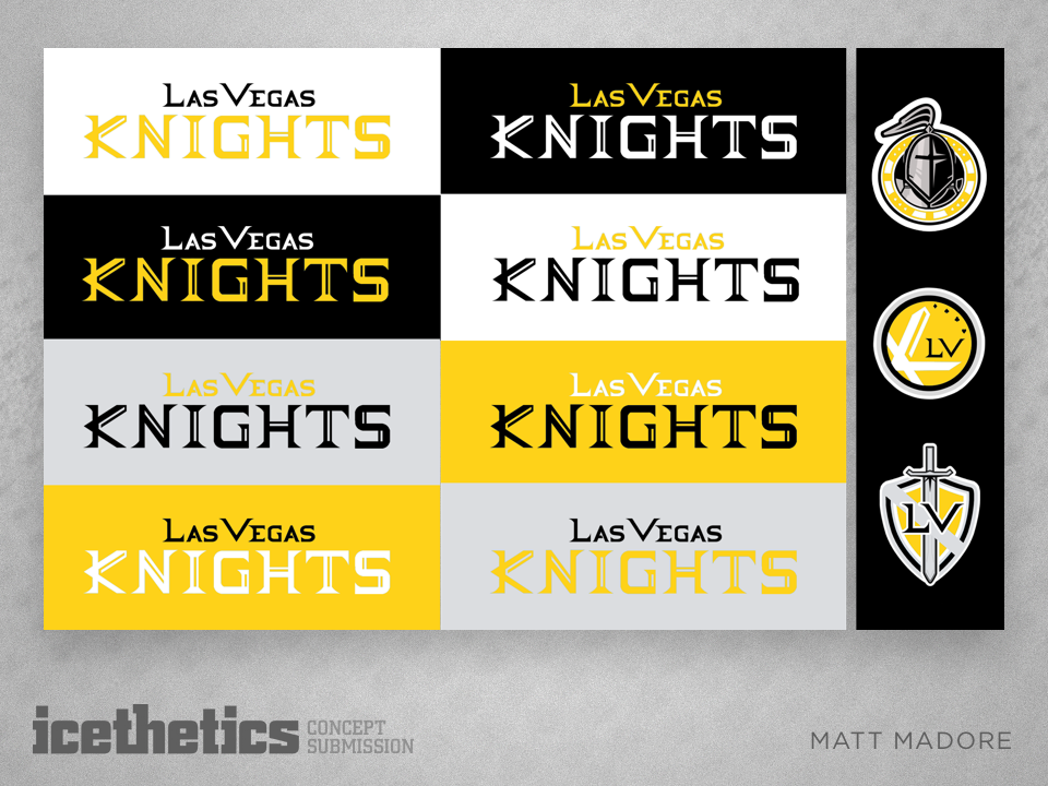
Today, Matt Madore brings us a full identity package for a future Las Vegas team called the Knights. Matt began his design with black, silver and electric blue as his color palette. But recently the potential owner of a Vegas NHL team revealed his club's colors would be black, grey and gold. So Matt made an adjustment.

What do you think of these logos and jerseys? And which color palette do you prefer?

Green

It's the most disappointingly underused color in the NHL. We need to get more green in the league and here Bastian Schmülling suggests a solid third jersey for the Canucks along with gorgeous upgrades to the home and road set.

Hot

The Stockton Heat have already decided to wear Calgary Flames jerseys when they take the ice next season, but that hasn't stopped Jake Miller from dreaming bigger.

Verticals

The Avalanche will host the Red Wings in 2016 NHL Stadium Series next season. As we wait for the jersey designs to be revealed, Steven Grant proposes some vertical striping options.

So Cool It's Freaky

Sometimes I need to remind myself that Freak Out Friday isn't only for designs that are so freaky they should never be used. Sometimes it's for jerseys that are so freaky they simply must be used! Caz Williams has the latter in this week's installment. Who doesn't think this would look amazing on the ice in Raleigh?