Teal and Black

Teal and black looks great. Add grey and you've got a fantastic look for the Sharks. It's been nice seeing San Jose bring back their original jerseys a few times this season. It might also be nice to see a similar new sweater like this one from Kevin Dion.

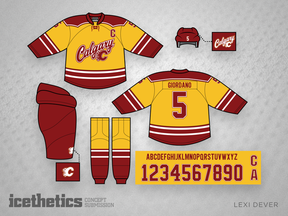
Blackless Flames

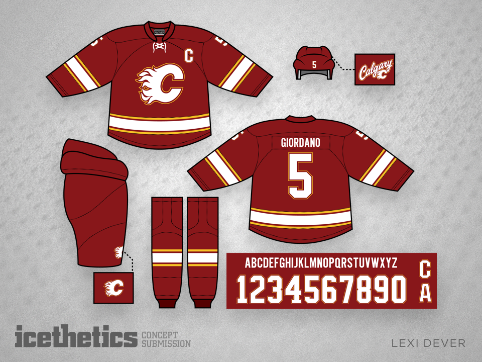
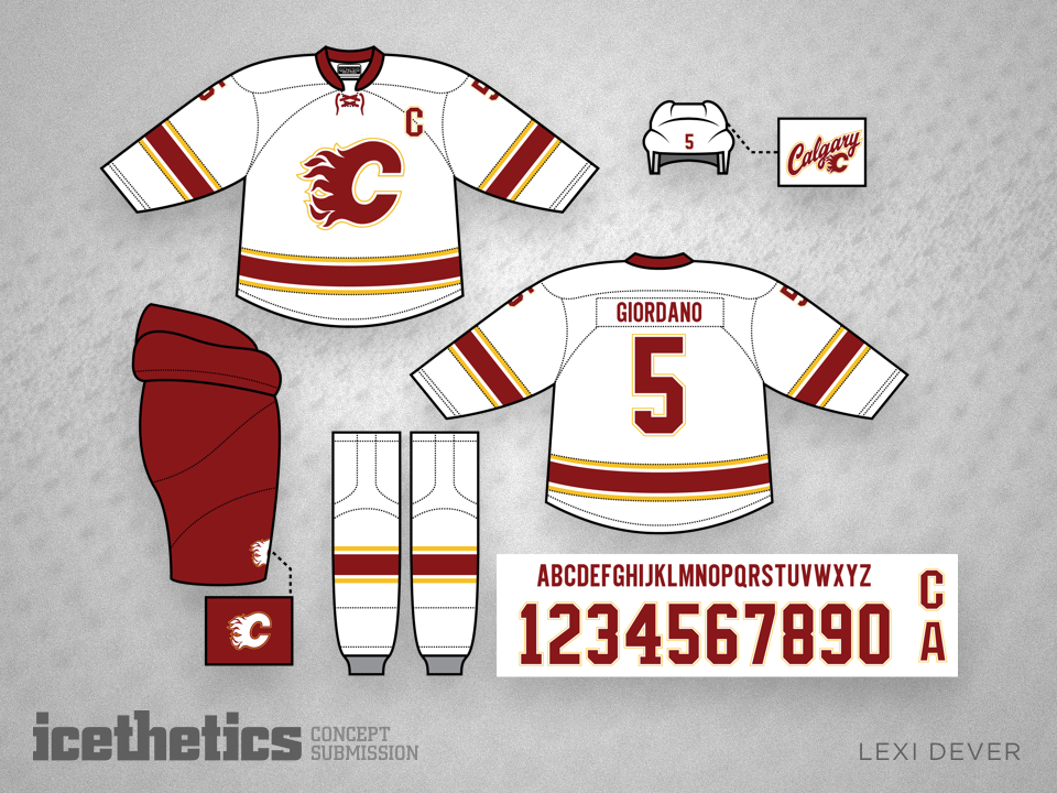
Another common theme among concept contributors is a Calgary Flames set free of black trim. Lexi Dever goes further by avoiding a simple rehash of the team's original sweaters.

Ring That Bell

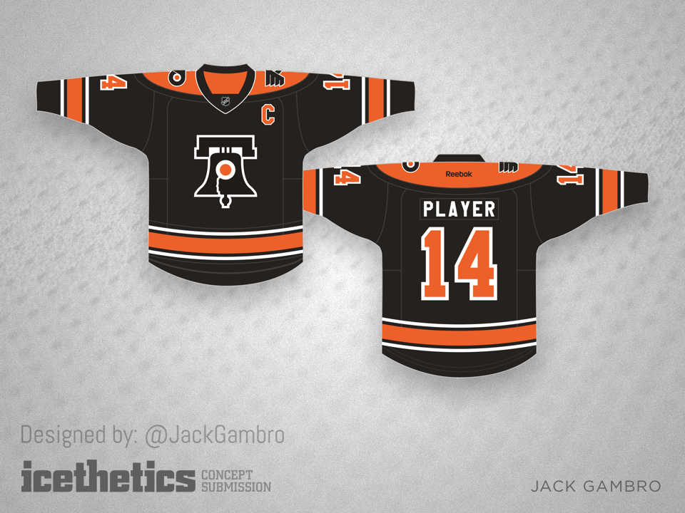
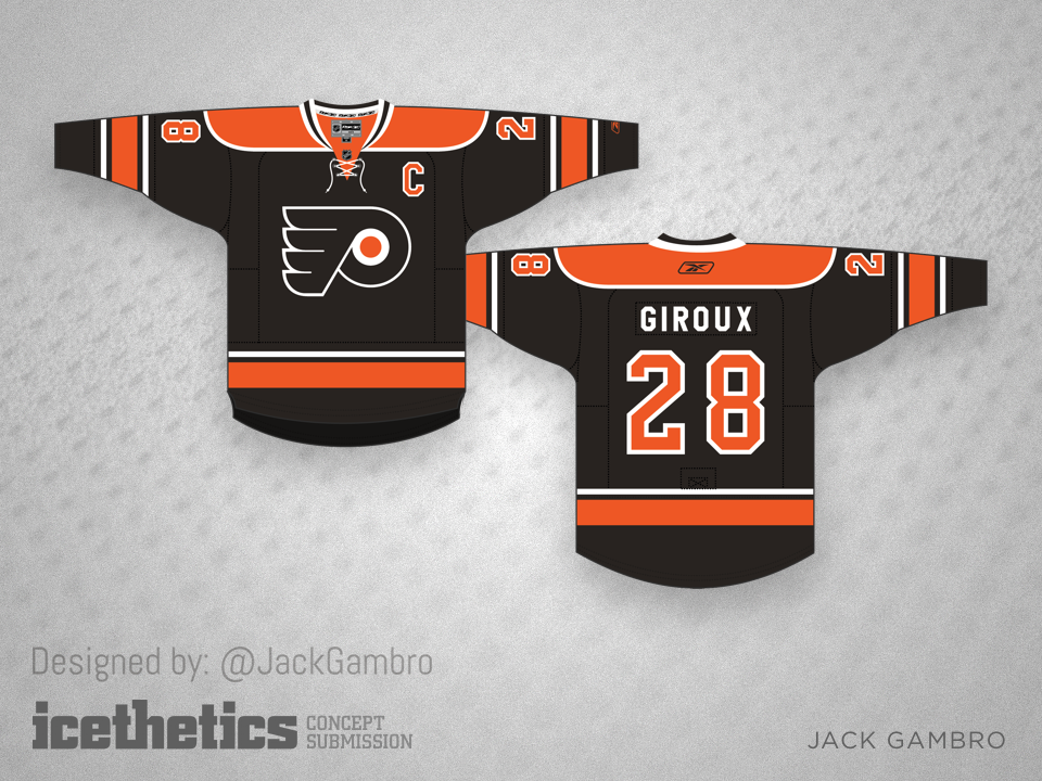
I see a lot of concepts implementing the Liberty Bell into a Flyers third jersey designs, but this one by Jack Gambro may be one of the best. He also created a similar jersey with the team's standard logo for those who may disagree.

Missing Pieces

Will Kozushko has spent a lot of time thinking about the Carolina Hurricanes' look so I'll spare you my thoughts and provide his words.

Like many others, I think Carolina's "new" uniform is a misguided "design by committee" result that displays too many compromises. My solution brings back the distinctive "hurricane" symbol by adding it to the stripes of their current home template — as done by other concept designers — but I also offer an additional update.
I've never cared for the 'Canes logo, but in studying it, I did notice that the outer "cyclone" shapes are actually rather cool. It's that middle "swirly puck" element that I am not at peace with. The old Hartford logo is recognized as a brilliant piece of design, so I pondered ways to pay homage to that distinctive negative space H shape by adding it to the center of the 'Canes logo, as in "H" for "Hurricanes".
(Some might argue that it looks a bit too much like the Habs logo, as in "CH", but I'd let the lawyers sort that out.)
 
The fact that the current white jersey doesn't even match or reflect the road uniform is particularly bothersome for me, so I submit an option that mirrors my dark set, but utilizes more black, complimented with enough red to retain the distinctive identity. (I felt that a white jersey with predominantly red stripes looked a bit weak, so to my eye, the black simply looks much more "bad @$$".)

San Diego Trio

Sundays are for the minor leagues around here and today features not one or two but three unique concepts for one team — the San Diego Gulls. First up from Tony Lieb is a design that would fit nicely in the 1970s even if it is a little over simplified.

This one from John Elbertson borrows the color palette of their NHL affiliate in Anaheim.

And this design from Tyler Kochan is a revision to the team's existing look.