Concept Collection 39

Today we go without a theme. Just a few random concepts I thought you might appreciate.

This is the final auto-published post of the week. I should be able to get the site back to normal in the next couple of days. Hope you've enjoyed these concept designs during my absence.

Collection 32: Gone But Not Forgotten

All the Winnipeg Jets talk of late is practically begging for a concept post in which we look at other defunct franchises. What have our talented artists envisioned? Let's see.

Above, you'll recognize the illustrious California Gold Seals of old — and below, the Montreal Maroons of even older.

There are no Jets concepts here but we've seen plenty of them recently and I'm certain there will be more to come in the near future. If you've got one, you know where to send it.

Collection 21: Calling On Quebec

Earlier this week I asked you guys for modern-day concepts for defunct NHL franchises. I received a lot of awesome work, but the Nordiques were the most popular.

In the next set, we'll visit some other former teams including those once in Cleveland and Kansas City, plus one you'll likely not recognize.

Quebec, Conceptually

Last week, fans rallied to bring the NHL back to Quebec City. So let's look at some Quebec Nordiques concept art this afternoon.


Brendan Anderson

Brendan kicks things off with a rather traditional blast from the past. That is, until you get to the alternate jersey. The Nordiques missed the NHL Third Jersey Program by a year but I'm not sure they would've gone with a number on the front. Still, I don't think anybody in Quebec would complain if it meant getting their team back.

Peter Debay

We get a completely new direction from Peter. Rather than the classic logo with its subtle NQ, we here's a lowercase q made out of a distorted hockey stick.

The one I really like, however, is the vintage design with its retro striping and crest design. That would be a nice looking hockey sweater — even with the red helmet and pants.

Scot McCormack

Scot also tried his hand at new Nordiques logos. The jersey remains mostly unchanged.

Personally, I'm not as big a fan of this set as the previous one and I think that's because of the difference in creativity levels. I think if fans had their pick, they'd go with more of a retro style to the uniforms.

Jack Martineau

And just for the heck of it, I thought we'd toss in an Avalanche concept. After all, they used to be the Nordiques.

With his design, Jack is bringing back the abstract mountain at the base of the jersey. Personally, I'd love to see the mountain range that used to be on the sleeves. I think more than any other team, the Avs were ruined by Reebok. This helps, but it's just not what it could be.

Email in your concept art and it may well find its way onto this very page.

Numerous Northeast Concepts

Settle in, folks. This is one of the biggest sets of concept art I've ever posted. Because I haven't had a lot of time to write new posts, obviously the artwork has been piling up. The Northeast Division seems to be the most popular for Icethetics artists, so I thought it'd be the best way to unload a dozen new designs. Here we go.


John Fusco

Had to start with this one. It's just phenomenal. You wouldn't think this type of design would make a good hockey sweater. Then you look at it. I'm waiting for an NHL team to jump onto an idea like this. Very sharp look. Well done, John!

Drew Krause

Another great Maple Leafs concept comes from Drew. He's made some updates to the traditional leaf logos, and they look great. Even the striping on the uniforms really works. Can't believe I haven't gotten around to posting some of these sooner.

Matt Marczel

By now we all know the Sabres will go back to their original uniforms next season — or at least something similar. Matt's put together a solid concept here with a nice modern flair.

Joni Oksanen

However, if you want more of a throwback feel, Joni's concept is the way to go. It's much simpler and features a royal blue just like the originals did in 1970. The only thing he's changed a bit is the striping on the dark jersey.

But either way you go would be a win for the Sabres and their fans, desperate for a return to the vintage uniforms. Sometimes you get it right the first time, don't you?

Jake Slavik

And sometimes we mix things that probably shouldn't mix. Jake's concept plays off of every era in Sabres history. And it's not ideal. Stare into those yellow eyes. Stare deep.

Frightening. Let's move onto another team.

Joshua Heckman Adam L'Italien

Joshua and Adam have both opted to experiment with brown jerseys for the Bruins — something I half expected to see at the Winter Classic earlier this year. Joshua's could even work as a third jersey this coming season if they were up for a change.

Adam's isn't bad either but doesn't lend itself well to Reebok Edge or television, for that matter. It's a very drab-looking jersey with the dark brown and the slight striping. However, I really do like the crest.

Dallas Hicks Ryan Haslett

Got a couple of new Senators concepts here. Dallas tries his hand at a Winter Classic-insipired concept... you know, in the event the NHL decides Canada should play an outdoor version of its own sport.

Ryan's isn't bad either — though without the stripes, the O just looks like a zero and nobody wants that associated with their team. Unless it's in the goals-against column, I guess. But if nothing else, this uniform has the best socks so far!

Ryan Haslett

That's right, it's all Ryan all the time for the rest of this post. This is his Canadiens throwback. Unfortunately, the numbers are rather illegible on the striped back of the jersey. Other than that, it's a nice-looking sweater with an old-time feel.

Ryan Haslett

Lastly, as a bonus, this concept is based off of a Quebec Nordiques logo that designed in 1995 but never implemented as the club was relocated Denver to become the Avalanche. And that is, in fact, where Ryan gets most of the elements of his design. I'll be honest. Makes more sense in the Rocky Mountains. Oh, what could have been.

And breathe. That was a lot to take in. Up next, it's Elliott Strauss' final rebranding set. That comes this weekend. After that, I'm implementing a new element into our concept posts. Details to come.

Concept Collection VI

That post featuring all the non-winning entries from the USF Ice Bulls logo contest is and probably will continue to stand as the LONGEST concept post in the history of Icethetics. Now it's time to get some new stuff posted.

One of my favorite artists, who I haven't heard from in a while, is Aaron Masik. He came up with these alternate logo designs for the Carolina Hurricanes.

Carolina Hurricanes concept logos by Aaron Masik

Ask any Southeasterner, myself included. That windblown palm tree is the classic hurricane image.

Ryan Haslett sent in a handful of jersey redesigns. He's put the Ducks in orange and managed to keep them from looking anything like the Flyers. How? No white and more modern striping.

Anaheim Ducks concept jersey by Ryan Haslett

He's also given the Coyotes a little something to improve their alternates. I think the lack of that brick color helps make it more different to the home and road sweaters.

Phoenix Coyotes concept jersey by Ryan Haslett

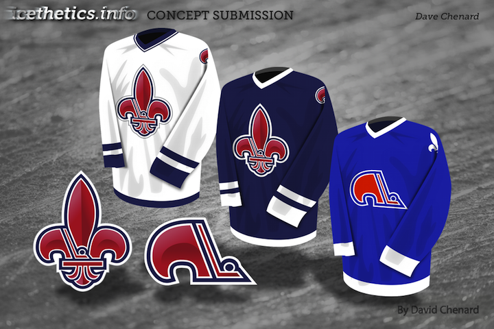
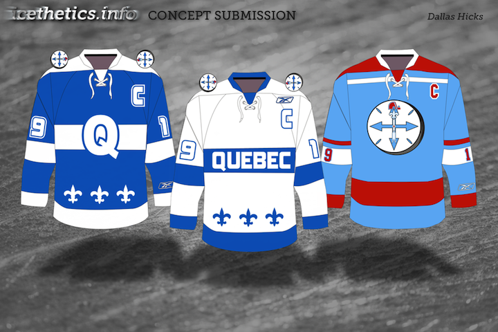
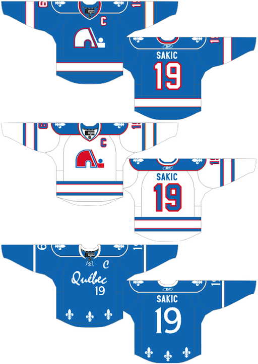
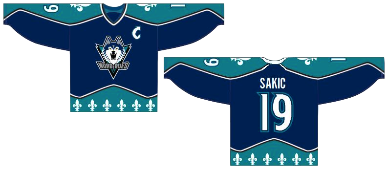
This next one starts taking us into the realm of the weird. Imagine the Nordiques lived to see the days of third jerseys. Could they have gone with red or would that simply have given the good folks in Quebec another reason to revolt?

Quebec Nordiques concept jersey by Ryan Haslett

Since we're here, we might as well go full on freak out. Jeff Kennedy considers a re-envisioning of that ridiculous bug from a decade ago.

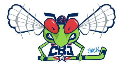
Columbus Blue Jackets concept logo by Jeff Kennedy

Keep the concept art coming in — even if especially if its freaky. I'd like to be able to offer up new concept posts every few days. Email your work in at icethetics@gmail.com and don't forget to include your name so you can be credited! (By the way, this is just for fun so you don't have to give up any rights or anything like that. Just a way to share interesting ideas with fellow design nuts.)