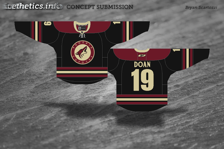
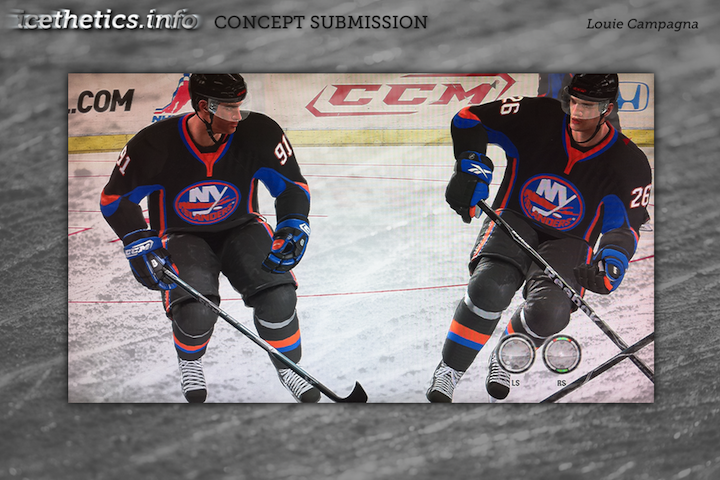
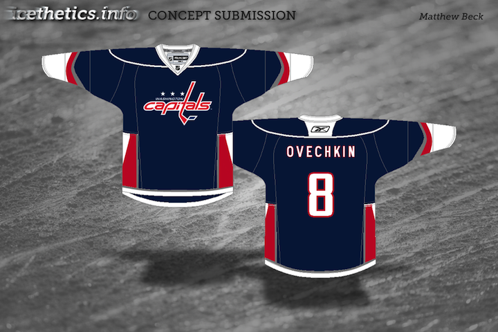
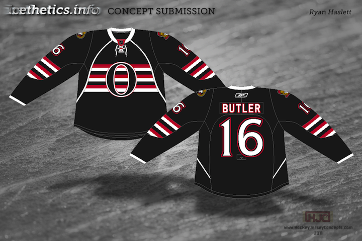
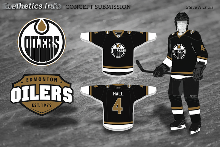
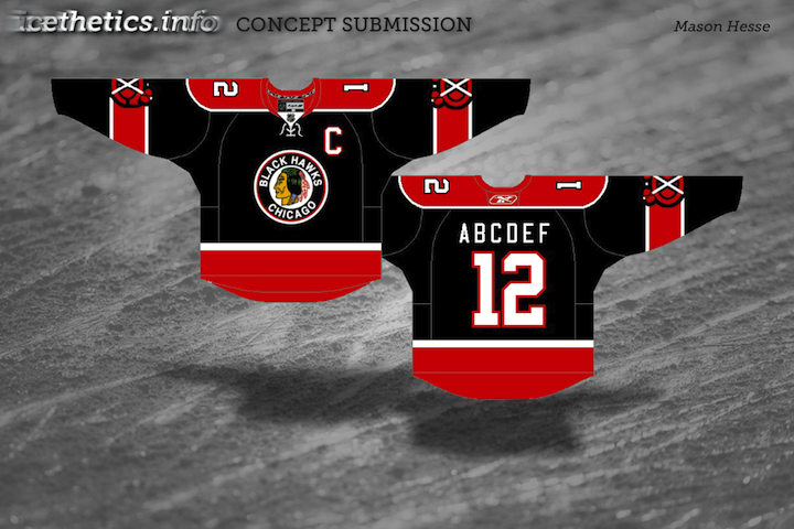
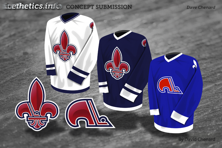
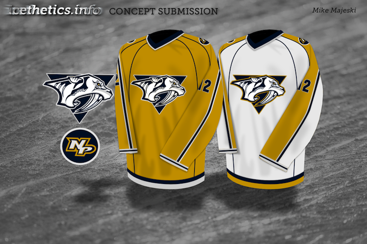
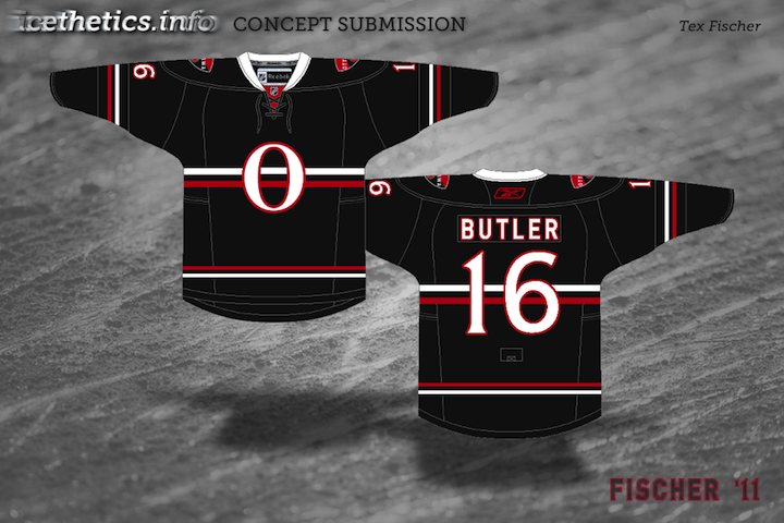
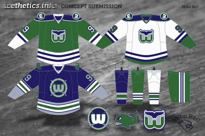
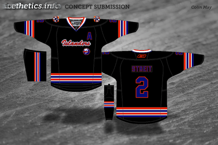
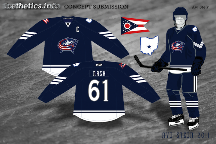
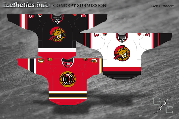
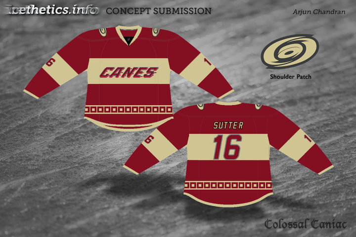
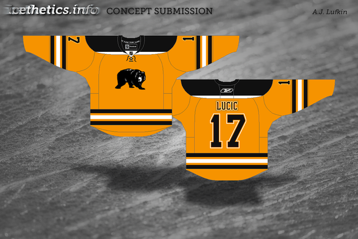
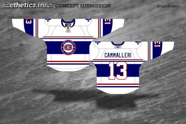
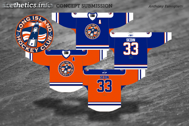
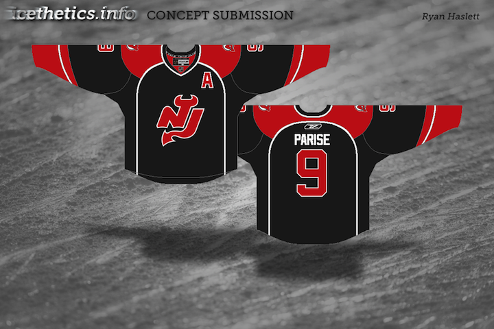
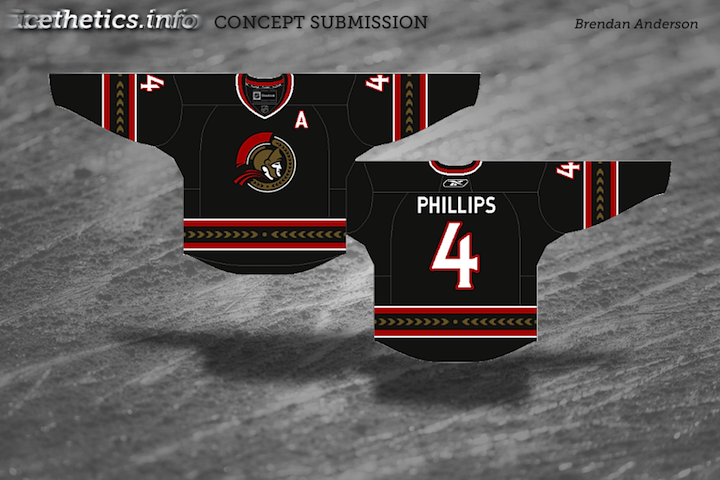
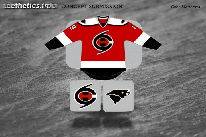
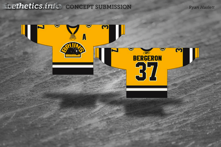
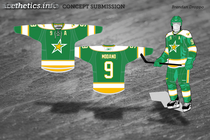
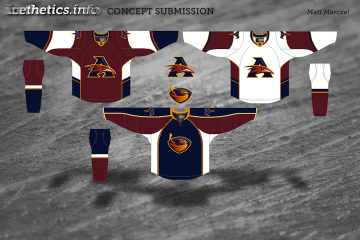
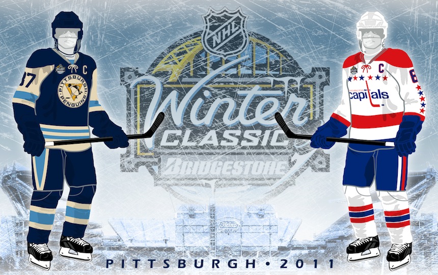
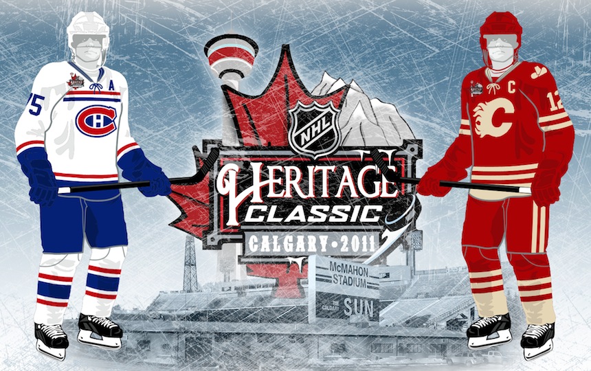
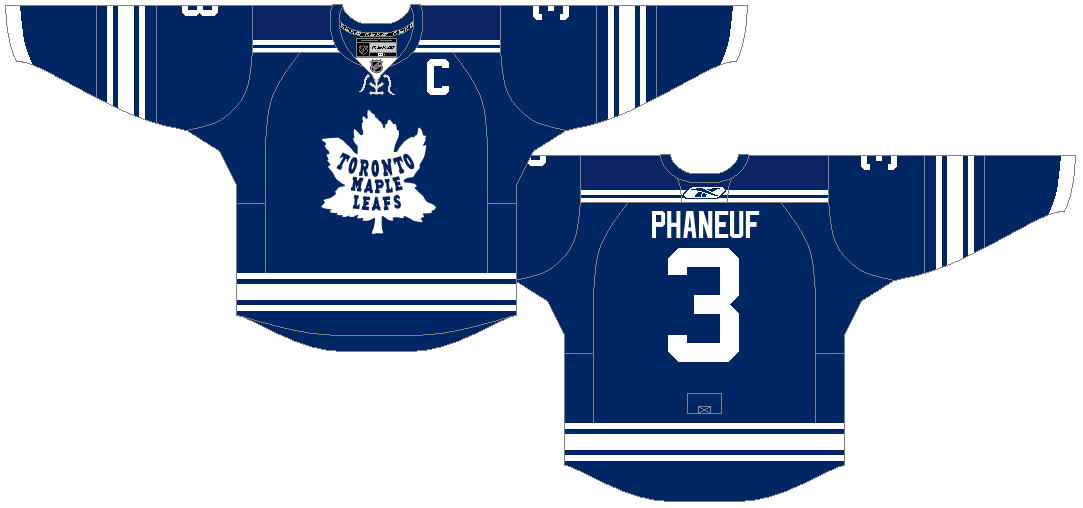
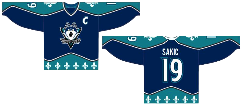
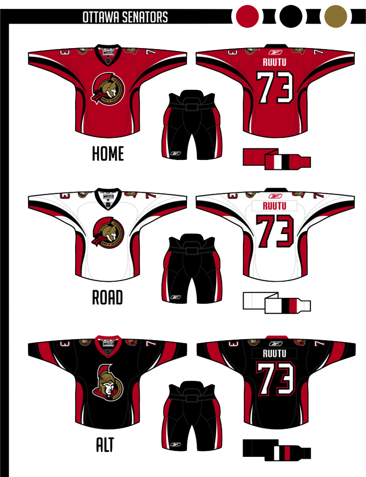
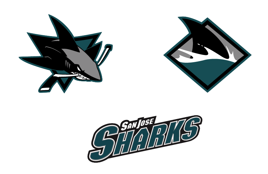
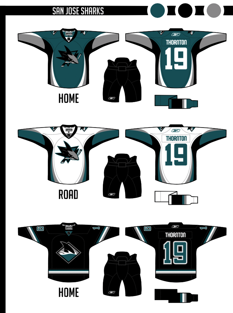
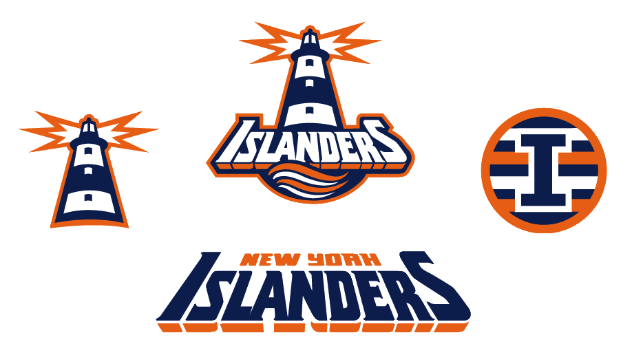
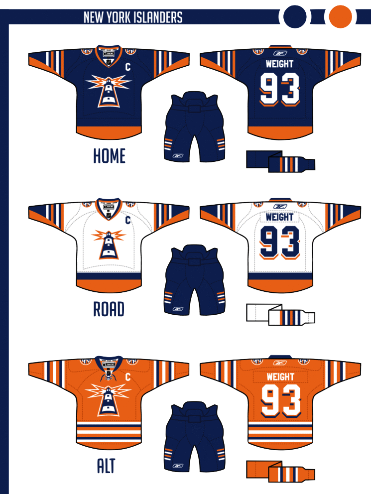
Concept Collection 51

Yes, it's been a while. But it's better now than never, right? I'm currently trying to develop a new system for posting concept art that makes things simpler for me. (That's always the unreachable goal.) In the meantime, I'll do my best to keep this page updated a little more often.

One last thing. Help me out here. I know some of you think I've been "making you wait" for new concepts, but that's not how it is. Having said that, if you perhaps don't care for the designs in this set and feel like commenting to say something like, "I've waited months for this?!", don't bother. It'll only tell me there's no point to updating the page in the future. Rate the designs, move on, and check back later. I can't please everybody, nor will I try to do so. Just know that I'm doing my best to keep all aspects of Icethetics updated.

Concept Collection 42

Got a handful of concept art to share. No theme on this one, just a mish-mash of some interesting ideas.

Been getting a lot of Panthers concepts, by the way. Thinking the next post may be Florida-themed.

Concept Collection 39

Today we go without a theme. Just a few random concepts I thought you might appreciate.

This is the final auto-published post of the week. I should be able to get the site back to normal in the next couple of days. Hope you've enjoyed these concept designs during my absence.

Concept Collection 34

Today is my birthday so I'm celebrating with this gift to you: New concept art! Since I didn't feel like coming up with a theme, here are five randomly selected concepts which have been submitted to Icethetics. Enjoy!

Obviously, the next set, which should be up this week, will feature the Winnipeg concepts that have come in.

Collection 28: Canadian White Out

It's weird. Last time I updated Concepts was only a week ago and the Lightning had just dispatched with the Pittsburgh Penguins in the first round of the playoffs. Now the Bolts are already moving on to the Conference Finals with a sweep of the Capitals! So much can happen in a week.

Now with a brief break in the action, I thought it might be time for a concept post that honors a playoff tradition — the white out. And it just so happens these are all Canadian teams.

If it seems my team's unlikely playoff run is resulting in fewer updates to the site, I won't argue with that. I fully expected to be enjoying the Stanley Cup playoffs from the sidelines. But with my team in the middle of it, I find it hard to spend my free time doing anything but cheering them on.

I'll do my best to keep the updates coming when I can.

Collection 23: Summer Comes Early

Over the next two months, most of the hockey world will forget that the NHL actually extends beyond 16 teams. So before the playoffs kick into gear, I thought I'd share some concepts for a handful of clubs that have already wrapped up their seasons and will start the summer early.

Perhaps next we'll look at some teams that did qualify to play for the Stanley Cup in 2011.

Concept Collection 19

No theme for this collection. Just a nice, varied assortment. But of course we have to start with the Senators' forthcoming Heritage Jersey — which we got a sneak peek of this week.

The way the jersey is folded in the photo the Sens provided leaves the design open to interpretation. It's not a bad attempt by Avi, but I think he may have strayed from the target. The shield he's put on the chest appears to be on the shoulder instead. And if it is in fact the "O" on the front, the photo does show that it doesn't have the double-stroke seen here. Otherwise, I'd bet it's pretty close. Anyone else want to take a crack at it?

Brendan's design is likely pretty close to the road uniform we'll see from the Kings next season. I'd bet on a black collar and maybe more black on the sleeves to add contrast. Now for the fun stuff...

So what do you think of that? I'm particularly fond of Colin's Canucks design!

Collection 18: To the Northeast

Today's batch of concept art brings us to the Northeast Division.

Last month, I re-posted some early sketches from the Sabres' 2006 rebranding on the blog. Here, Ross decided to spruce up one of the sketches and put it on the current uniforms. I get the feeling something like this would've gone over a lot better with fans than the "Buffaslug."

We've gotten Jets and Nordiques concepts on this page recently, and I didn't want to leave the Whalers out. They were part of the Northeast Division back in their day.

Benoit brings a unique set to the table. A bold choice with the red-free, two-tone blue jerseys for the Habs, but that's why it's interesting to look at.

New concepts are rolling in all the time. If you'd like to submit yours, just send a JPG or PNG file by email.

Collection 13: Changing Their Stripes

Tough crowd these days. You guys are getting hard to please. In any case, today's theme post features the Ottawa Senators, who recently announced their intentions to launch a new "heritage" third jersey to mark their 20th anniversary season. Our concept artists have shared some of their ideas.

Collection 10: The East Coast

As the title would indicate, with today's concept post on this the first Hockey Day in America, we're sticking to the Eastern Conference — but not excluding Canada. Been receiving a lot of really creative artwork lately that should garner some interesting feedback.

So let that ruminate a bit. Long Island Hockey Club... a more overt NJ... and so on. Then leave your feedback in the comments. One thing, though...

At the moment, comments on concept posts are unmoderated. I'm trusting you guys. Please remember that these artists spent time and creativity on the work above. If you don't like it, you're entitled to that opinion, but please be thoughtful when unleashing it on the world. Be constructive with your criticism or don't offer any. Especially if you've never submitted work yourself. Just some things to keep in mind.

Concept Collection 9

You guys weren't impressed with Sunday's crop of Ducks concepts, so let's try something a little different. These are all designs I think you might actually like.

Keep the artwork coming! My email address is in the Quick Links box at the top of the page.

Mike Ivall is Back!

Long time concept contributor and friend of Icethetics, Mike Ivall has caught the creativity bug, eager to express himself with jersey artwork. And I think that's something we're all happy to hear. Over the last few days he's immersed himself in the following designs.

After the St. Pete Times shared some new details on what the Lightning may be planning for their upcoming uniform redesign, Mike took a stab with some familiar elements. The lack of any black or silver does squarely put the look in Maple Leafs territory, which I'm not wild about. But you never know what Stevie Y has up his sleeve (i.e.: Dwayne Roloson).

I don't know what it is about this color combination but I absolutely love it. I saw Mike's concept and it's made me want to completely redesign Icethetics again — in these colors. The two-tone blue is all right if not overused these days, but add the red and suddenly it's completely unique. Anybody else with me on this?

How can Ottawa improve upon this? It's simple. They can't. Do this and the Senators will never need another jersey for the next century.

As usual, Mr. Ivall's work is outstanding and worthy of a post all to himself. And I can assure you there is more coming not only from Mike but many other talented artists as well.

There's Something About Retro

They say fashion is cyclical. Trends come and go and come around again. In the NHL, we seem to be re-entering a retro phase. Throwback jerseys have always been popular with fans, but it seems only in the last few years have teams started to take advantage of that. Classic designs that bring history back to life have started making their way back into the mainstream, in the form of alternate jerseys and special events such as the Winter Classic.

So "retro" is the theme of today's post. Let's see what our artists have come up with.


Jared LeBlanc

I'm a big fan of Jared's Winter Classic concept uniforms, especially what he's done for the Penguins. It's been suggested that the Pens might join the Bruins in borrowing elements from multiple past jerseys for a unique new look that still feels vintage.

Jared's also submitted some ideas for the Heritage Classic, details of which will be announced later today. Regarding the design, he writes, "The Canadians jersey is really the only vintage jersey left that they haven't worn already. ... For the Flames, I took a look at the Cowboys jerseys, which looked like a pretty solid design. I considered doing a carbon copy but I thought they might still want the Flames logo on it."

Both sets get a big thumbs up from me!

Connor Hanley

Another set of retros based in real life, come by way of Connor. Over the summer, it was announced that the Canucks would don a throwback jersey to celebrate their 40th anniversary. While this won't be the one, the Kings' vintage threads seen here are probably not far from what they'll be wearing on a few occasions this season.

The Kings did give their first round draft pick a gold jersey from the 1960s after all. We're still waiting on an official announcement from the team, however.

Connor Hanley

Connor also sent in this set which calls back to the 1920s and the NHL clubs that arrived long before the Penguins and Flyers — that's the Pirates and Quakers. Of course the design is a little dated now with Gagne's name on the back. (He plays for my team now!)

I suppose it might be a treat for centenarian hockey fans in Pennsylvania to see those two sweaters hit the ice again. But they shouldn't hold their breaths.

Jack Martineau

Canadian fans always like to see their teams don the retro duds. Jack digs back deep into Maple Leafs history with these St. Pats sweaters. The team actually wore that green jersey for a game or two back in the mid-90s. They should do it again!

Ryan Haslett

And while we're on the subject, here's another throwback for the Leafs from Ryan. Just like the St. Pats jersey, this one also saw life in the afterlife when it was dusted off for at least one game in the early '90s. Now that the Leafs seem to be taking an interest once again in looking like the storied hockey team they are, maybe more of these throwbacks are in the cards.

Matt Marczel

And to finish things off, one of our most prolific artists, Matt Marczel, offers up this throwback to the previous iteration of the Ottawa Senators club. He points out that it could be used if the Sens ever play in a Winter/Heritage Classic. Unfortunately, the first problem is legibility. The second is the Canadiens just wore a very similar stripe-y sweater last year.

By the way, I have lots of new concept art ready and waiting. Someone needs to stay on me about keeping this page updated. I'm very forgetful.

Numerous Northeast Concepts

Settle in, folks. This is one of the biggest sets of concept art I've ever posted. Because I haven't had a lot of time to write new posts, obviously the artwork has been piling up. The Northeast Division seems to be the most popular for Icethetics artists, so I thought it'd be the best way to unload a dozen new designs. Here we go.


John Fusco

Had to start with this one. It's just phenomenal. You wouldn't think this type of design would make a good hockey sweater. Then you look at it. I'm waiting for an NHL team to jump onto an idea like this. Very sharp look. Well done, John!

Drew Krause

Another great Maple Leafs concept comes from Drew. He's made some updates to the traditional leaf logos, and they look great. Even the striping on the uniforms really works. Can't believe I haven't gotten around to posting some of these sooner.

Matt Marczel

By now we all know the Sabres will go back to their original uniforms next season — or at least something similar. Matt's put together a solid concept here with a nice modern flair.

Joni Oksanen

However, if you want more of a throwback feel, Joni's concept is the way to go. It's much simpler and features a royal blue just like the originals did in 1970. The only thing he's changed a bit is the striping on the dark jersey.

But either way you go would be a win for the Sabres and their fans, desperate for a return to the vintage uniforms. Sometimes you get it right the first time, don't you?

Jake Slavik

And sometimes we mix things that probably shouldn't mix. Jake's concept plays off of every era in Sabres history. And it's not ideal. Stare into those yellow eyes. Stare deep.

Frightening. Let's move onto another team.

Joshua Heckman Adam L'Italien

Joshua and Adam have both opted to experiment with brown jerseys for the Bruins — something I half expected to see at the Winter Classic earlier this year. Joshua's could even work as a third jersey this coming season if they were up for a change.

Adam's isn't bad either but doesn't lend itself well to Reebok Edge or television, for that matter. It's a very drab-looking jersey with the dark brown and the slight striping. However, I really do like the crest.

Dallas Hicks Ryan Haslett

Got a couple of new Senators concepts here. Dallas tries his hand at a Winter Classic-insipired concept... you know, in the event the NHL decides Canada should play an outdoor version of its own sport.

Ryan's isn't bad either — though without the stripes, the O just looks like a zero and nobody wants that associated with their team. Unless it's in the goals-against column, I guess. But if nothing else, this uniform has the best socks so far!

Ryan Haslett

That's right, it's all Ryan all the time for the rest of this post. This is his Canadiens throwback. Unfortunately, the numbers are rather illegible on the striped back of the jersey. Other than that, it's a nice-looking sweater with an old-time feel.

Ryan Haslett

Lastly, as a bonus, this concept is based off of a Quebec Nordiques logo that designed in 1995 but never implemented as the club was relocated Denver to become the Avalanche. And that is, in fact, where Ryan gets most of the elements of his design. I'll be honest. Makes more sense in the Rocky Mountains. Oh, what could have been.

And breathe. That was a lot to take in. Up next, it's Elliott Strauss' final rebranding set. That comes this weekend. After that, I'm implementing a new element into our concept posts. Details to come.

Strauss NHL Rebrand VII

This is the Strauss NHL Rebrand series, Part 7 of 10, in which graphic designer and hockey fan Elliott Strauss gives a makeover to the National Hockey League. If you're new to this series, I highly recommend catching up on the first 18 teams to which he's given new looks.

Now we move on to his latest updates, which include the Senators, Sharks and Islanders. Elliott has provides commentary on his work in bold text.


Elliott Strauss

Not much change in the logos here, but the vegas gold returns in favor of yellow. This is one of my most modern uniforms designs. Number font is custom. The alternate keeps the same side/hem design as the home/away, but adds a new arm striping scheme to match, and the pants still match up on the sides.

Definitely looking at a unique uniform design here. The striping is unlike anything we've seen ever — in real life or in concept. I'm rather liberal when it comes to concept designs. I like things you don't often see. But personally this strikes me as a tad disjointed, mixing what I'd consider a classic-looking logo with a very non-classic sweater design.

That being said I'm a huge fan of this 2D Sens logo and I wish we could see it on a uniform one of these days. I'd even prefer it to the vintage "O" jersey that's been talked about. But that's just my opinion.

Elliott Strauss

The colors return to teal-black-silver, and orange is out. I modified both primary and secondary logos, simplifying in some places, dropping the fade on the patch logo.


The shark fin-based striping pattern on the sleeves is somewhat subtle. The uniforms are modern and busy, but I think they'd look decent on the ice. The alternate is based on the diagonal stripes they use on the black alternate currently.

Burnt orange has always been part of the Sharks' color scheme but was introduced as a uniform accent in 2007. While I like that look, Elliott has certainly taken the Sharks' identity to the next level by losing it. And the only the critique I have is that the crest could probably use a white stroke on the home sweater so as to add some contrast.

Otherwise, a great update to a team that's always had a distinctive identity.

Elliott Strauss

This might be my favorite of the series. I took the fisherman era wordmark and swooshy wave from the primary logo. The lighthouse is original and takes the perspective of the wordmark.

The four-stripe motif stays on the patch logo and on the arms of the home and away. The numbers continue the drop-shadow from the wordmark. Finally, an orange alternate uses a more classic stripe scheme.

In one of the biggest revamps of the series, Elliott digs into the Isles' past to find an incredible look hidden within one of the most despised designs in sports logo history.

He calls this his favorite of the series and I'm inclined to agree. And it's about time for the Isles to ditch their '70s-era logo anyway.

Working on more concept posts for this week. Tons of great artwork coming in that I can't wait to share with you guys!

Winter Winding Down

As the winter winds down, there's been a lot of talk about next year's Winter Classic. Rumor has it the Washington Capitals will get to host. And by far, the most popular opponent among Icethetics readers seems to be the Ottawa Senators. That's our theme for today's post.


Tyler Allen

There's no question in my mind that the Senators need to wear something like this when they eventually get selected for the outdoor game. Tyler's done a great job with this concept.

But his Capitals jersey is more of a Frankenstein creation than anything else. It seems he's literally taken element from every past Caps uniform and injected the Weagle. It's not terrible, but I think the stars are a bit distracting. Might be different on the ice.

Drew Krause

If it's simplicity the Sens would like in a Winter Classic sweater, Tyler's may be the right look. But if it's true vintage they want, look no further than Drew's concept. I didn't like the crazy stripes when Montreal did it, but that might've been because the blue threw it off. Maybe the Sens could do it better in black.

Drew also threw in a couple of logos, including a simplified version of the old primary mark along with a new heritage mark to go with that jersey.

Mike Bell

The Caps' owner may have recently nixed plans for an actual third jersey, but that doesn't mean concept versions can't live on here at Icethetics. Rather than incorporating the Weagle, which many have done (because of its awesomeness), Mike opted for a simple color reversal. Blue jersey, red logo. Not sure about the number being on the front though. We have enough to read there as it is.

Brad McPelican

Brad went the more traditional route with his third, but the key in this concept are the home and road jerseys. Check out the stars on the shoulders! That jersey belongs on a bit marquee sign, rather than a hockey player.

And if that logo looks familiar to you, it comes from the Capitals' old primary logo from the late '90s.

Ryan Haslett

And lest we leave Canada out of the Winter Classic one more time, Ryan Haslett has put together this 2011 concept for a match-up between the Flames and Canucks in Calgary. You don't get any more classic with a Flames jersey.

However, I'm not sure it's the best idea to go with a Canucks jersey from the era in which they wore the same colors as Calgary. For the Canucks, there'd be no choice but to go back to the 1970s and the classic stick-in-rink log.

By the way, I do have a few more Olympic concepts to share. I'll try to get those posted before the weekend.

Rebranding the East

I'm sure I'm enjoying Sin City right about now. And I'm sure you guys are enjoying these daily concept posts. This is the second of five auto-posts and today's theme is rebranding.

Rebranding has become a very popular topic among Icethetics concept artists — giving a complete uniform and logo overhaul to a given team. Sometimes the overhaul is drastic and sometimes it's subtle. But it usually results in something better than which actually exists.


Robert Giannone

We start with Robert Giannone's rebranding of the Philadelphia Flyers. Robert isn't looking to replace the classic P logo so much as give it a nice complement that could be used as a shoulder page, third jersey crest or merchandising mark.

He's created an F lettermark based on the P used on the team's old orange alternate sweater. And he's put an awful lot of work and thought into it. He's had patches embroidered and attached to an actual Flyers jersey as well as a cap. They don't look out of place at all.

So I'm completely with him — that is until we get to his wordmark. That's where you lose me. That does not say Flyers at all. To me, it says graffiti.

But aside from that, I like this logo, and although we've seen versions of it before — and by that I mean this Zephyr X-line hat — it's always nice to see someone putting some effort in.

You can see more of Robert's work on his web site.

Ryan Broda

Next, Ryan Broda offers the Atlanta Thrashers a newer look. He's kept the same color scheme and wordmark but has made some adjustments to the other logos — ridding them of the primary mark often ridiculed as looking like a bird stirring itself into a bowl of soup.

Ryan's kept the strongest element of that design — the bird head — and has added some additional details to the logos to make it look a little meaner. It's a very sharp concept.

Julian Kazmierczak

Julian offers us something a little different for the Ottawa Senators. He's decided to drop the gold completely and stick with the black and red which were most prominent when the Sens first existed in the early 20th century and were later revived in 1992.

The logo is back-to-basics but the striping may be a bit much. Overall, however, I think he may be on to something. It's simple and isn't that what we've been wanting ever since the beginning of the Age of Reebok?

Matt Marczel

I've got one more item to share today. This comes from the always prolific Matt Marczel. However, Matt hasn't so much rebranded the Capitals here as offered up a third jersey to die for.

Every time the topic comes up, we look for ways of getting the Caps into a blue third jersey with the Weagle heavily featured. This does that in the best way.

But better yet, I'd vote that this be the primary home jersey. And even if we can't have that, what about putting the Weagle on the front of the red jersey? The Capitals have a brilliant logo here and it seems to just be going to waste.

Excellent work by all of these artists. They should be proud. And you should come back tomorrow for more concept art.

Next Winter Classic: Revisited

The Winter Classic at Fenway Park was nothing short of classic. It's such an awesome tradition and there's no shortage of opinions on who should play in future outdoor games. Since the last concept post, a few other artists have submitted some interesting ideas. I have a pair here I thought worth sharing before we move on to a new concept topic.


Brad McPelican

Brad writes in with an idea for a New Year's Day game not in 2011 but in 2014. He calls it the Canadian Classic. It would feature the Ottawa Senators and Vancouver Canucks (playing as the Millionaires) at Frank Clair Stadium in Ontario.

It may seem a bit unusual, so I'll let him explain. He wrote a very long proposal which I have actually edited way down for your convenience. All the key details are intact.

There was a time when the Stanley Cup was a challenge cup exclusively for Canadian clubs and in the Canadian Classic, I would like to relive that era.

The contest I find would be the best is one between Ottawa and Vancouver. Both cities currently are home to NHL franchises who have never won the Stanley Cup but, in hockey's early days, had taken home the prize as two of the nation's finest teams.

What makes this game even more special is that — 100 years earlier, in 1914-15 — the Vancouver Millionaires played in a best-of-five series in Vancouver and won the Cup. It was the last time the Stanley Cup would be exclusive to the best Canadian team — with the Portland Rosebuds joining the PCHA. This series was the last truly Canadian challenge for the Stanley Cup, which I think is pretty special.

As for the jerseys and event logo, I tried to make them as classic and as true to their time as possible. The logo was designed to look like the old team championship pictures and features vintage colors. The jerseys, on the other hand, are almost exactly what they wore — refitted for Reebok Edge jerseys of course — with Ottawa wearing brown pants and Vancouver wearing white ones. You might notice as well that their are no names on the back of the jerseys. This is to be true to the times, not a mistake.

If that game doesn't satisfy traditionalists, nothing could. By the way, just wanted to point out (because I know someone will) that the nameplates on NHL jerseys are currently part of NHL regulations and would probably require an Act of Bettman to sidestep. And he hates Canada.

John B

Obviously this one is just meant to be for fun. You could call it Winter Classic Freak Out. While my little corner of Florida has been atypically cold the last couple of days, there's clearly no way it could sustain a sheet of ice outdoors.

But as a Lightning fan, this was a fun concept to look at and muse on. As long as the Winter Classic is around, I don't ever imagine the Bolts or Panthers getting a shot at it. It will forever be reserved for teams who play where outdoor ice is a viable option.

John does have some interesting artwork here but I'm just not sure these "classic" jersey designs really work. Tampa hockey club? An F with cat ears and a tail? I'll pass.

The icing on the cake probably has to be the Winter Classic-themed surfboard design.

Thanks to John for giving us a laugh.

Thanks to all the artists who sent in their ideas for future Winter Classics.