
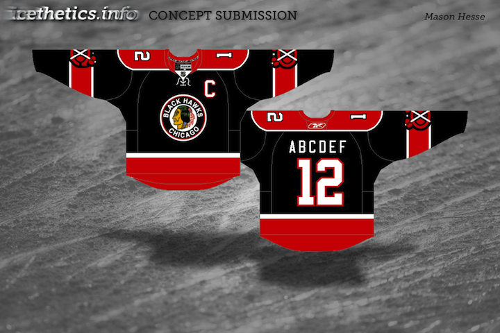
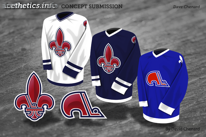
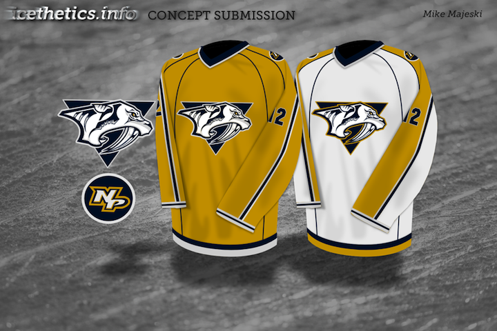
Concept Collection 42
/Got a handful of concept art to share. No theme on this one, just a mish-mash of some interesting ideas.
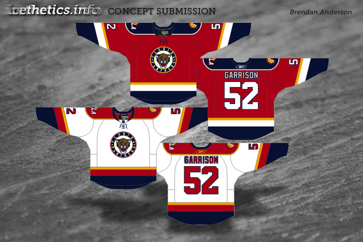
Been getting a lot of Panthers concepts, by the way. Thinking the next post may be Florida-themed.
Got a handful of concept art to share. No theme on this one, just a mish-mash of some interesting ideas.
Been getting a lot of Panthers concepts, by the way. Thinking the next post may be Florida-themed.
Today we go without a theme. Just a few random concepts I thought you might appreciate.
This is the final auto-published post of the week. I should be able to get the site back to normal in the next couple of days. Hope you've enjoyed these concept designs during my absence.
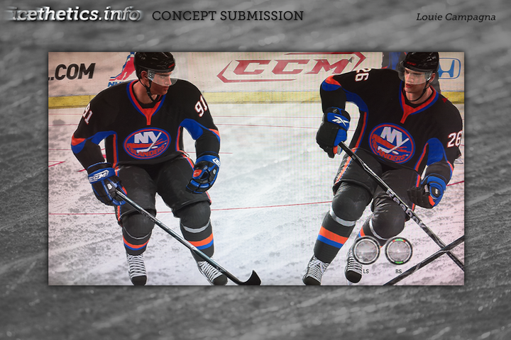
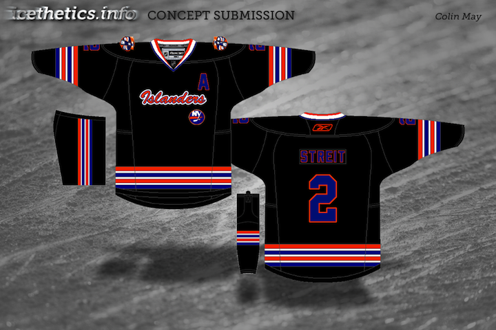
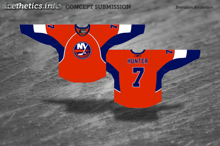
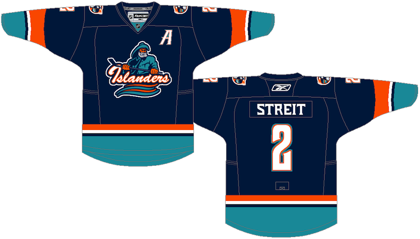
Reebok has told retailers to expect a new alternate jersey for the New York Islanders next season. The rumor mill has told us to expect it to be black. That's inspired our concept artists to designs some new looks for the Isles — some of which are, in fact, black.

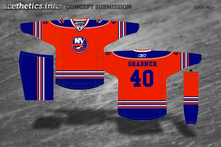
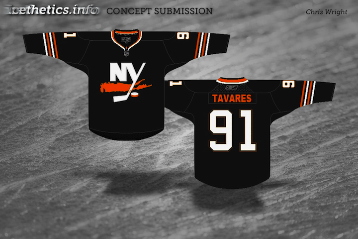
What do you think of these? And what do you think the Islanders should do with a new third jersey? Is black the right way to go? Orange? Will they add a new logo of some kind? Speculate away!
With all this rapture talk, I thought we might take a look at what the future holds (if there is one) for NHL uniforms next season. These are all based on rumors that have been reported around the web recently.
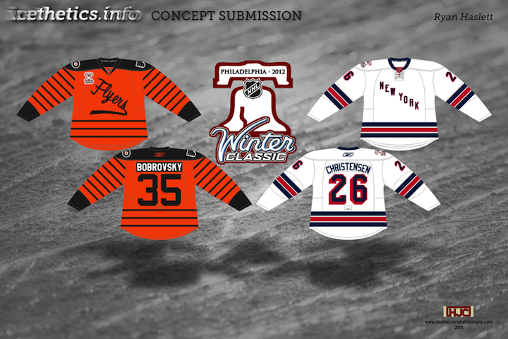
The first set is based on the rumor that the Flyers will host the Rangers for the 2012 Winter Classic. The inspiration for the Flyers' throwback jersey is the Philadelphia Quakers franchise — which has no relation to the Flyers. Still, I have yet to see a Flyers WC concept not based on that team's uniform design.
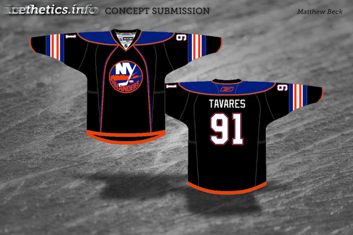
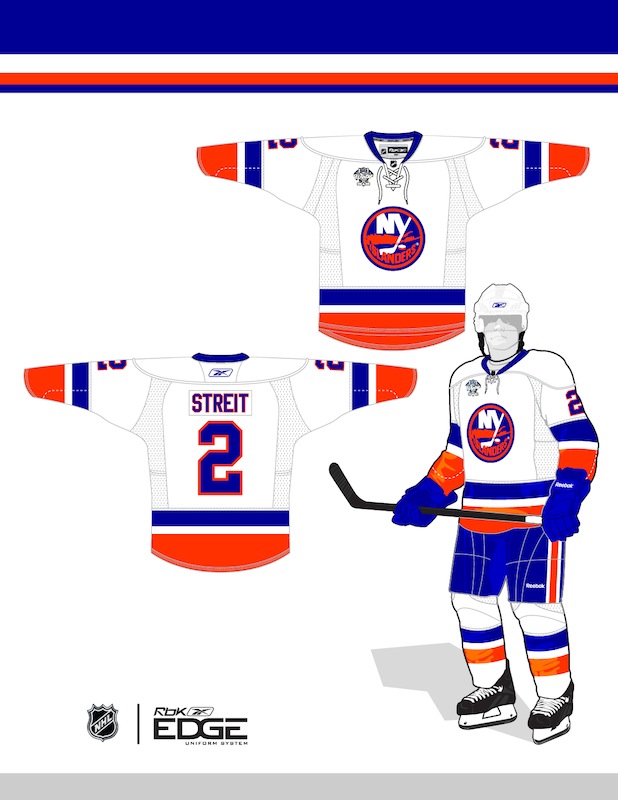
Another rumor spreading this spring calls for the Isles to launch a black alternate next season.
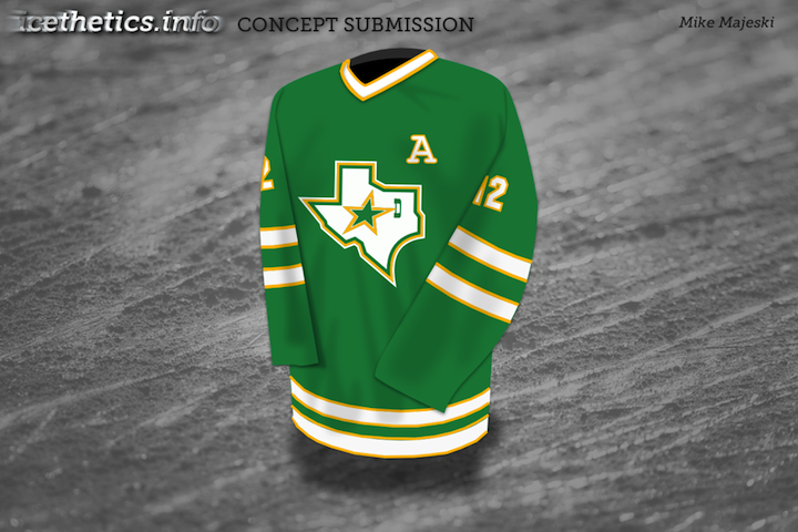
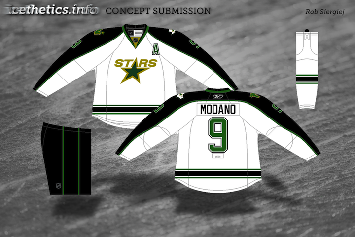
Whether or not it's wishful thinking, the prevailing rumors for the Stars is the debut of a green third jersey.
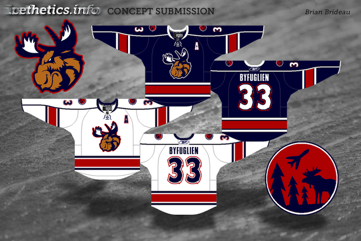
Now this one is a little more outside the box. It assumes the Thrashers are sold and moved to Winnipeg and that True North would retain the Moose branding to some extent while also paying tribute to the Jets.
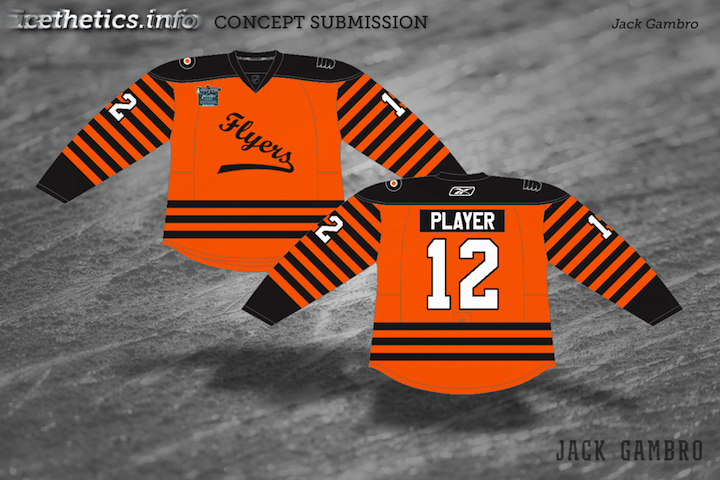
And last here is just one more example of a Quakers concept standing in as a Flyers jersey for the big outdoor game next year. Personally, I don't see it happening. But then the Flames revisited their city's hockey history at their outdoor game this year. I suppose Philly could do the same in 2012.
One group that's often overlooked on the Concept page are the minor leagues. Plenty of teams could use a bit of rebranding work. Here's what some of our talented designers have come up with.
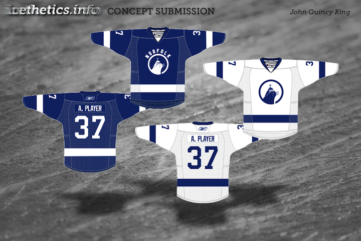
First up is my favorite. John's idea was to rebrand the AHL's Norfolk Admirals based on their NHL affiliate — the Tampa Bay Lightning. The color scheme has been cut down to blue and white and the logo has been simplified. And just like Tampa Bay's new uniforms, the road jersey bears the city's name. It's a brilliant concept and one I've been wanting to share for some time.
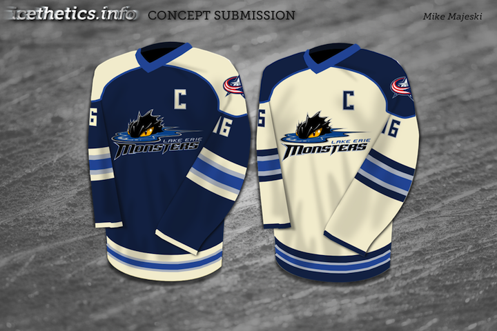
Mike was headed down a similar path, rebranding the Lake Erie Monsters to sync up with their fellow Ohio team, the Columbus Blue Jackets. Only Mike has used the Jackets' new alternate sweater as a base.
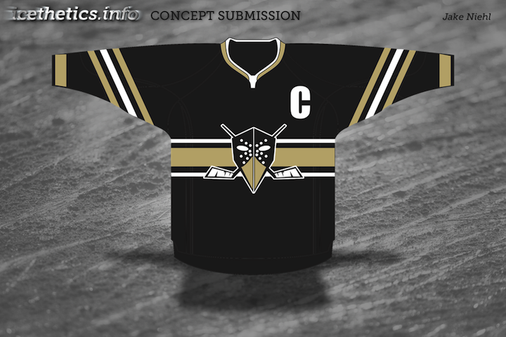
Jake's design is for the ECHL's Wheeling Nailers, an affiliate of the Pittsburgh Penguins — on which his design is obviously inspired. It's actually pretty clever.
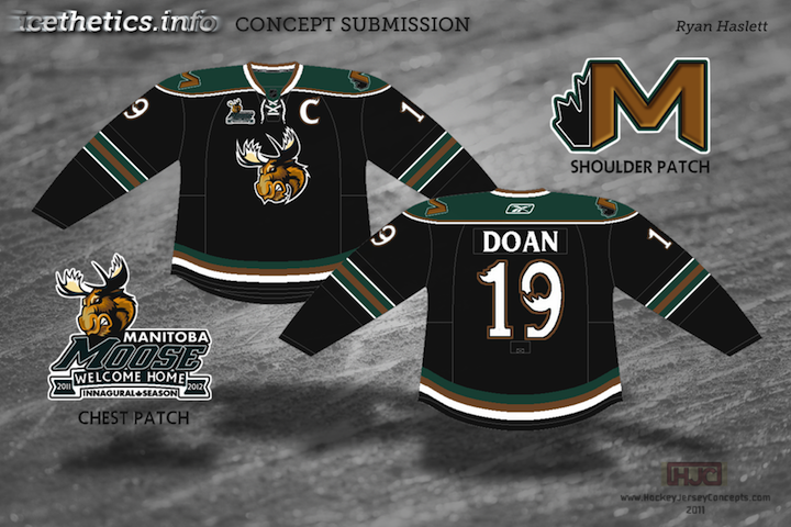
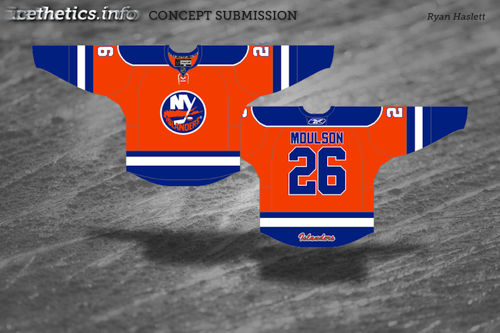
Ryan, here, hasn't rebranded the Manitoba Moose so much as he's applied the existing brand to the Phoenix Coyotes. We now know that the Coyotes aren't an option for Winnipeg anymore, at least not in 2011 — but also that if the Coyotes were to move back to Manitoba, they would likely retake the Winnipeg Jets name. Still, a nice effort anyway.
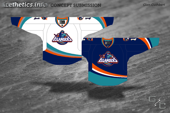
And yes, I know this isn't technically a minor league design. But let's be honest, it was such a minor league design. Glen has Edge-ified the much-maligned jerseys of the New York Islanders from the mid-1990s by adding the fisherman logo to the Ducks' Edge template.
Sorry you had to see that.
Over the next two months, most of the hockey world will forget that the NHL actually extends beyond 16 teams. So before the playoffs kick into gear, I thought I'd share some concepts for a handful of clubs that have already wrapped up their seasons and will start the summer early.

Perhaps next we'll look at some teams that did qualify to play for the Stanley Cup in 2011.
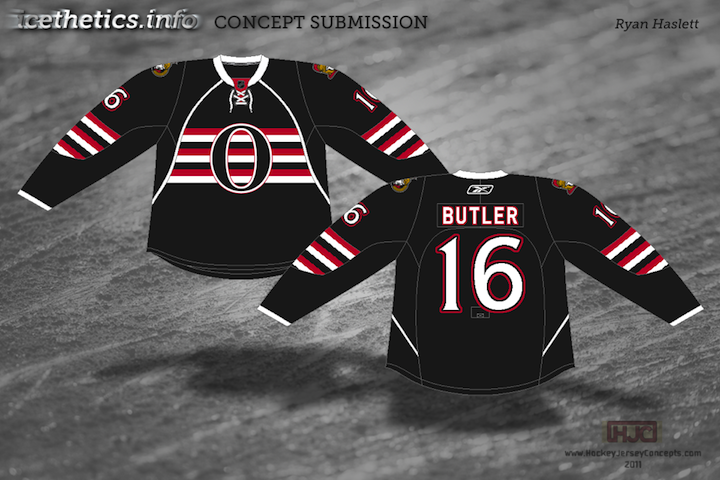
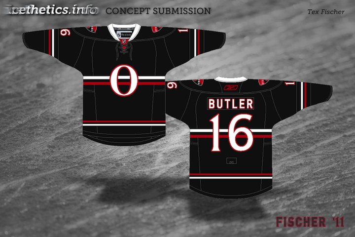
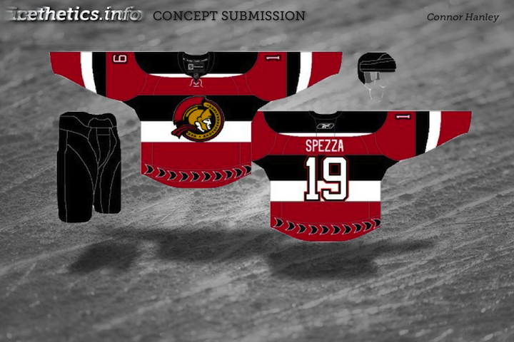
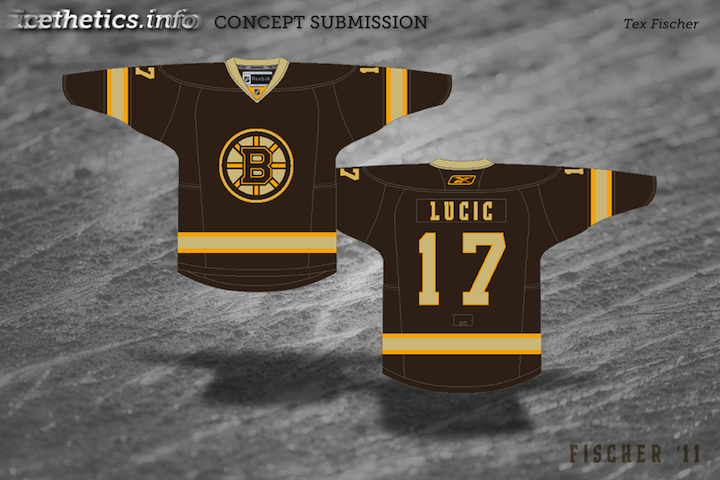
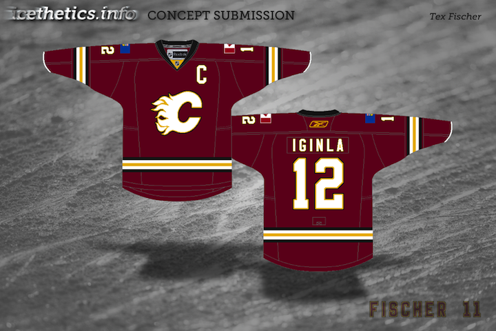
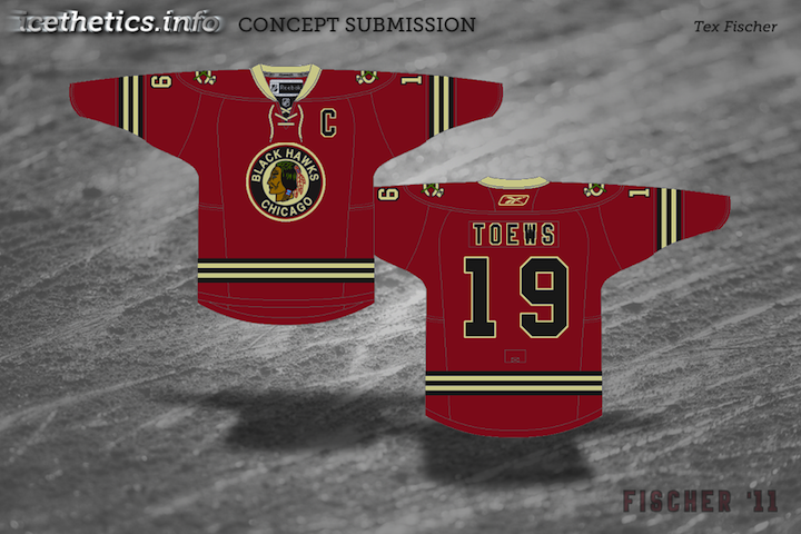
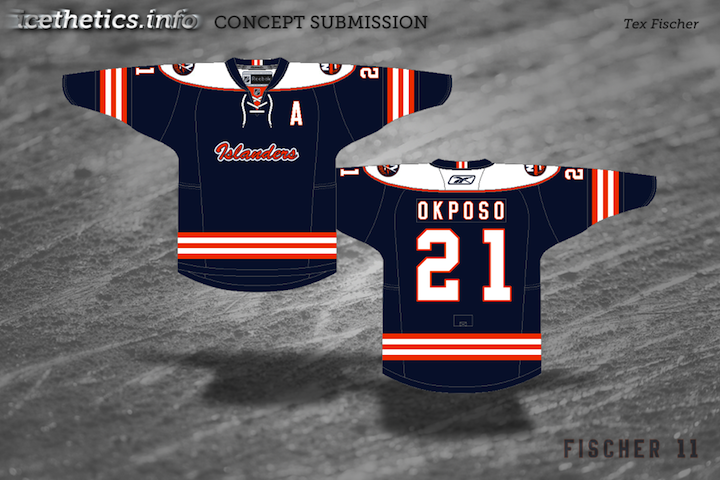
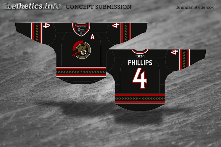
Thought this was a fun story. A lot of readers send in concept art and I love it when someone new comes along because it usually means a new perspective. Somewhat surprisingly, newcomer Tex Fischer was a huge hit with his Senators concept on Sunday. Not to offend, but I'm not sure why it was such a standout considering the entire group was made up of variations on a theme. Regardless, it was a hit. And Tex has been on a tear since. Today's post is dedicated to him.
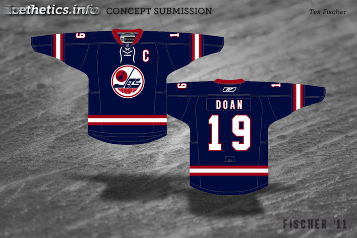
That last one should serve as the segue into our next set of concepts. I put out the word for Winnipeg Jets concepts this week and have already gotten a lot of excellent entries. Looking forward to sharing them.
New set of concept art for you this evening.
Keep them coming! Send in your work by email to have it included in a future post.
As the title would indicate, with today's concept post on this the first Hockey Day in America, we're sticking to the Eastern Conference — but not excluding Canada. Been receiving a lot of really creative artwork lately that should garner some interesting feedback.
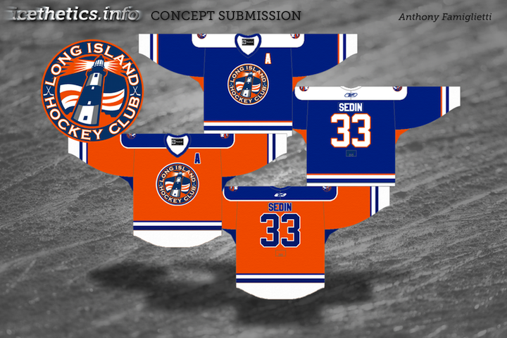
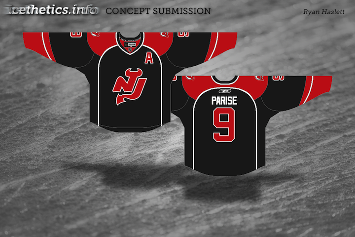
So let that ruminate a bit. Long Island Hockey Club... a more overt NJ... and so on. Then leave your feedback in the comments. One thing, though...
At the moment, comments on concept posts are unmoderated. I'm trusting you guys. Please remember that these artists spent time and creativity on the work above. If you don't like it, you're entitled to that opinion, but please be thoughtful when unleashing it on the world. Be constructive with your criticism or don't offer any. Especially if you've never submitted work yourself. Just some things to keep in mind.
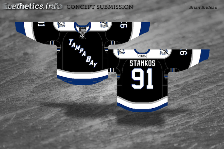
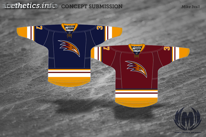
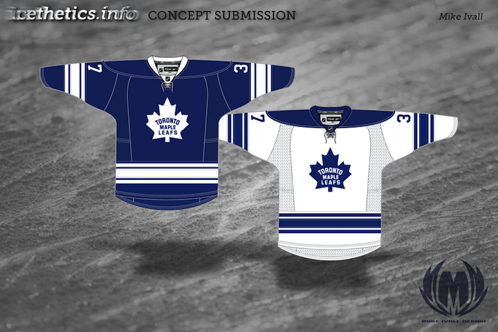
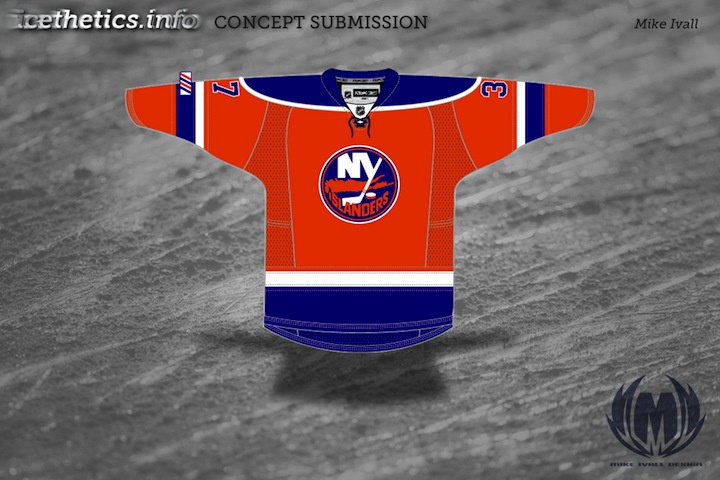
I've got a handful of new concepts to share from Mike Ivall. He's tackling Predators, Thrashers and Islanders as well as revisiting the Bolts and Leafs.
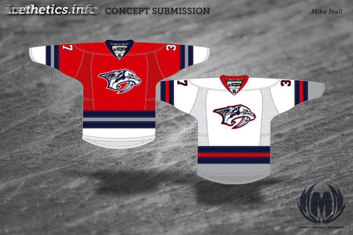
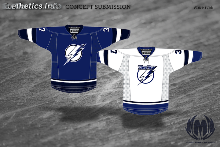
Knowing the Lightning are looking to ditch the black and silver and go with a blue/white color scheme, Mike thought perhaps they might try a two-tone blue. Personally, I'm a fan.
A lot of you have been asking about how to make your own concept art. Unfortunately, there's no simple or quick way to throw stuff together. Most of the designers who submit work are very talented graphic artists with knowledge of image editing software. If you want something free to get started, look up something like Gimp or Inkscape. I'd love to put together some kind of tutorial, but it's not really that simple. I will try to get together some templates at some point though. So keep an eye out for that.
Today's batch of concept art deals with a handful of teams with new sweater designs on the way. While we wait for official unveilings, our concept artists get to work on some predictions of their own.
  Alex Valvo Alex Valvo |
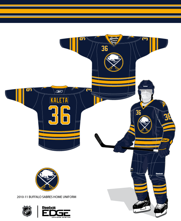
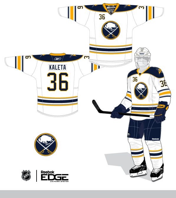
The Sabres will unveil their new third jersey on Sept. 18. All right, technically these aren't third jersey concepts, but the expectation is that the Sabres will promote their current third jersey to home status — while adding a white version for the road. That's the concept Alex is offering up today. |
 Jekabs Elerts Jekabs Elerts |
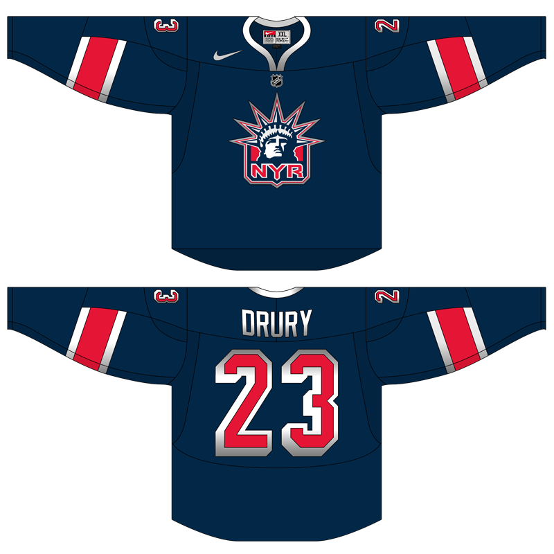
We keep hoping for the Lady Liberty logo to return when the Rangers unveil their new third jersey in November. That's what Jekabs has for us — though he likes to work with the Nike Swift jersey template, as opposed to the Reebok Edge standard. Regardless, it's a solid sweater design. |
 Jekabs Elerts Jekabs Elerts |
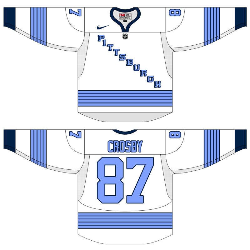
The Penguins will use the 2011 Winter Classic to launch their new third jersey. Jekabs's guess is that they're going with this 1967 replica. But since they're the home team, it probably won't be a white jersey — but you never know. The Sabres wore white when they hosted in 2008. |
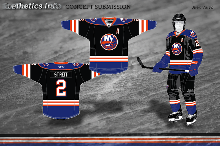
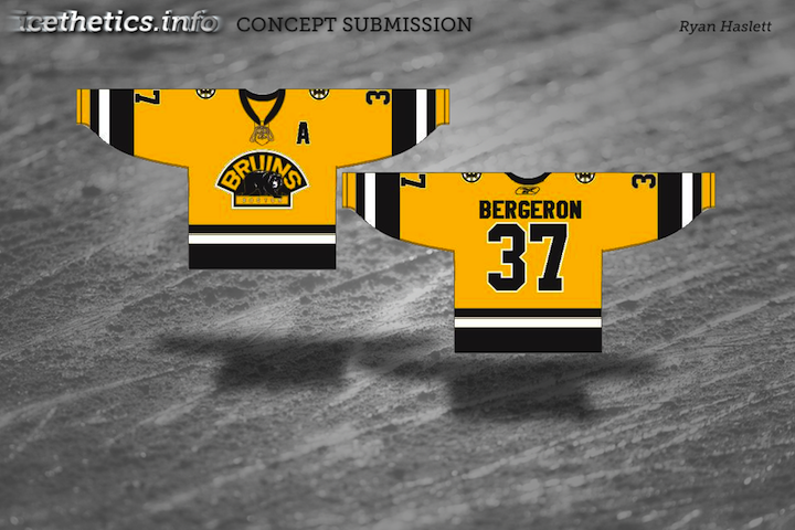
 Ryan Haslett Ryan Haslett |
I'm a big fan of this one. Ryan, a prolific concept artist, has put a unique spin the much-maligned Islanders jersey from the mid-90s. Not a bad treatment if you ask me. Perhaps if the Isles had done something a little less radical and a little more like this, fans wouldn't have rioted so much. I like that font, by the way! |
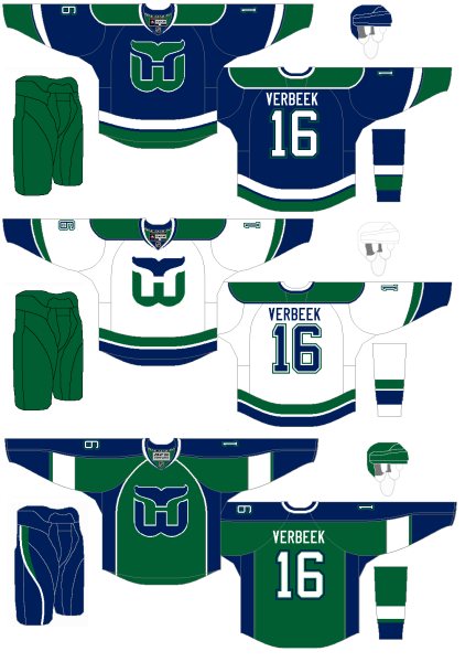 Connor Hanley Connor Hanley |
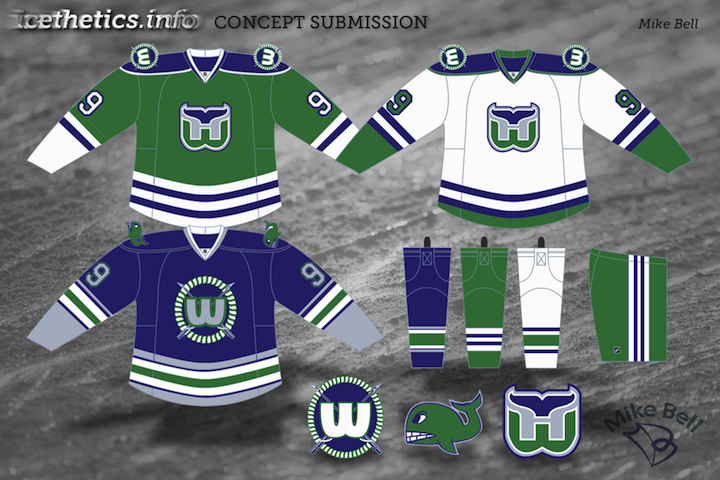
The Whaler talk these days has been intense. More on that in an upcoming blog post. In the meantime, Connor joins Howard Baldwin in hoping for the NHL's return to Hartford. Such a great logo. And solid uniforms all around. |
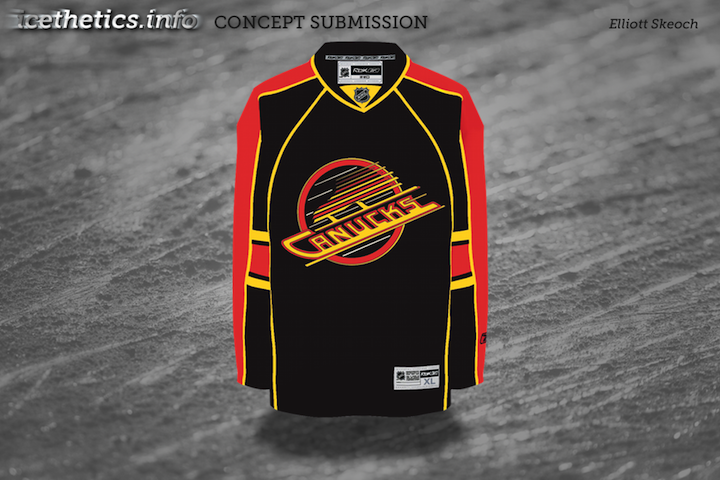
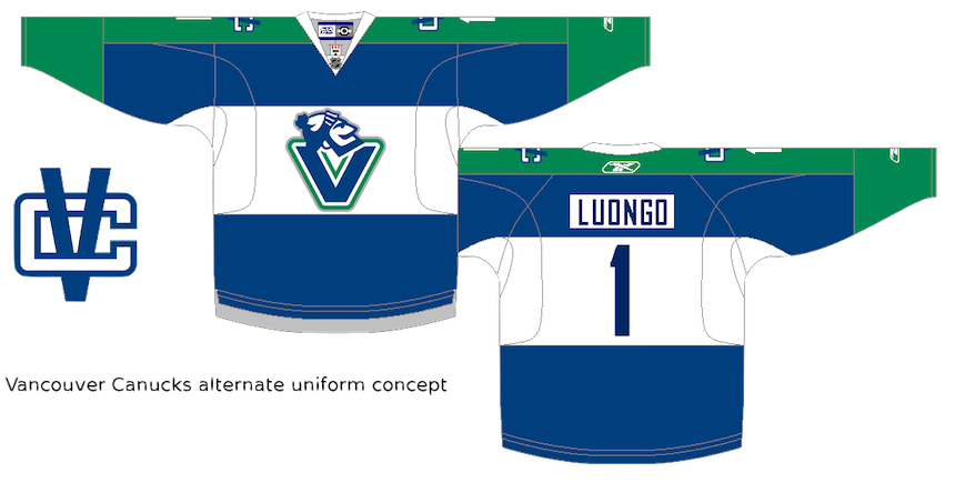 Jack Martineau Jack Martineau |
And finally, while the Canucks aren't actually planning a new third jersey — that we know of — I decided to toss Jacks' concept into this post as a bonus. The logo used on the jersey just won the NHL secondary logo tournament here on Icethetics. |
As always, feel free to email in concepts. I'm working on adding a bunch more to the Facebook page this weekend.
This is the Strauss NHL Rebrand series, Part 7 of 10, in which graphic designer and hockey fan Elliott Strauss gives a makeover to the National Hockey League. If you're new to this series, I highly recommend catching up on the first 18 teams to which he's given new looks.
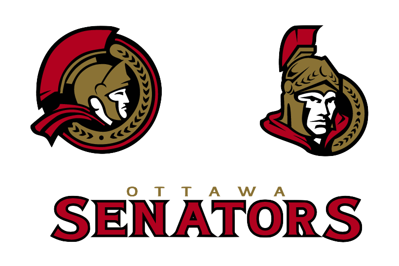
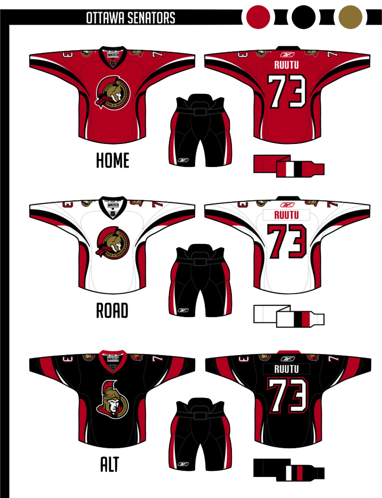
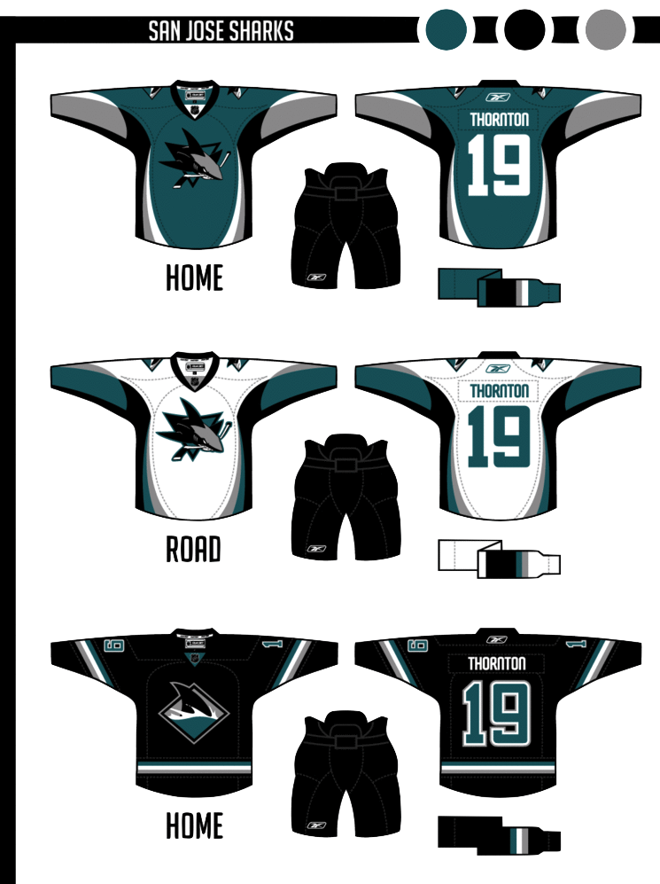
Now we move on to his latest updates, which include the Senators, Sharks and Islanders. Elliott has provides commentary on his work in bold text.
 Elliott Strauss Elliott Strauss |
Not much change in the logos here, but the vegas gold returns in favor of yellow. This is one of my most modern uniforms designs. Number font is custom. The alternate keeps the same side/hem design as the home/away, but adds a new arm striping scheme to match, and the pants still match up on the sides. Definitely looking at a unique uniform design here. The striping is unlike anything we've seen ever — in real life or in concept. I'm rather liberal when it comes to concept designs. I like things you don't often see. But personally this strikes me as a tad disjointed, mixing what I'd consider a classic-looking logo with a very non-classic sweater design. That being said I'm a huge fan of this 2D Sens logo and I wish we could see it on a uniform one of these days. I'd even prefer it to the vintage "O" jersey that's been talked about. But that's just my opinion. |
 Elliott Strauss Elliott Strauss |
The colors return to teal-black-silver, and orange is out. I modified both primary and secondary logos, simplifying in some places, dropping the fade on the patch logo. The shark fin-based striping pattern on the sleeves is somewhat subtle. The uniforms are modern and busy, but I think they'd look decent on the ice. The alternate is based on the diagonal stripes they use on the black alternate currently. Burnt orange has always been part of the Sharks' color scheme but was introduced as a uniform accent in 2007. While I like that look, Elliott has certainly taken the Sharks' identity to the next level by losing it. And the only the critique I have is that the crest could probably use a white stroke on the home sweater so as to add some contrast. Otherwise, a great update to a team that's always had a distinctive identity. |
 Elliott Strauss Elliott Strauss |
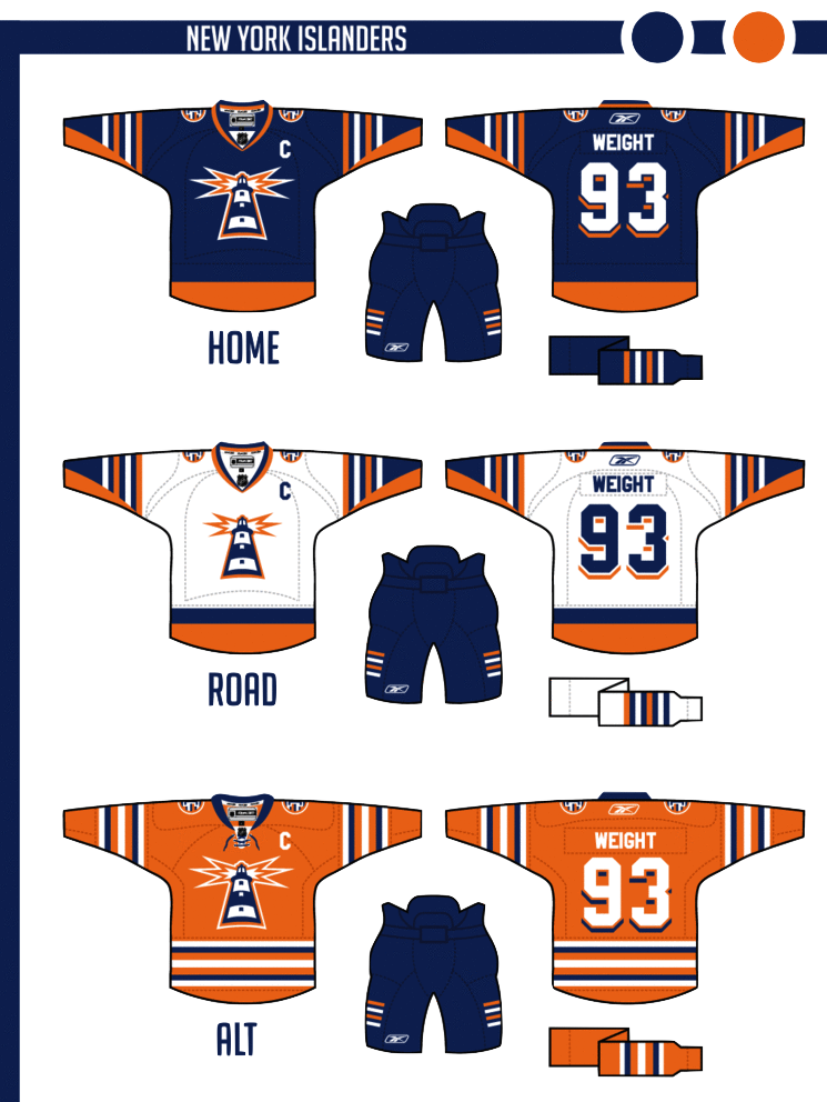
This might be my favorite of the series. I took the fisherman era wordmark and swooshy wave from the primary logo. The lighthouse is original and takes the perspective of the wordmark. The four-stripe motif stays on the patch logo and on the arms of the home and away. The numbers continue the drop-shadow from the wordmark. Finally, an orange alternate uses a more classic stripe scheme. In one of the biggest revamps of the series, Elliott digs into the Isles' past to find an incredible look hidden within one of the most despised designs in sports logo history. He calls this his favorite of the series and I'm inclined to agree. And it's about time for the Isles to ditch their '70s-era logo anyway. |
Working on more concept posts for this week. Tons of great artwork coming in that I can't wait to share with you guys!
 It's hard to believe 2010 is a mere four days away. That means the third annual Winter Classic is coming up at the end of the week.
And on the eve of the big event, a bunch of eager artists have started thinking about the next one. Or should I make that plural? A couple weeks ago, NHL commissioner Gary Bettman said he'd like to see a second outdoor game on New Year's Day 2011 — this one in Canada.
No decisions have been made at this point and any discussion on the topic is pure speculation. But that's what the Icethetics Concepts page is for. So as we prepare for the Philadelphia Flyers to face the Boston Bruins at Fenway Park, let's think about what we might like to see in 2011.
Rumors suggest Yankee Stadium will play host to at least one of the 2011 outdoor games. That puts the Rangers at home to face who? Islanders? Maple Leafs? Capitals? And regarding the Canada game, Bettman mentioned Calgary by name. Would the Flames face their province rivals, the Oilers? Perhaps the Canucks or even Avalanche?
Let's see what some talented people have come up with as suggestions for 2011.
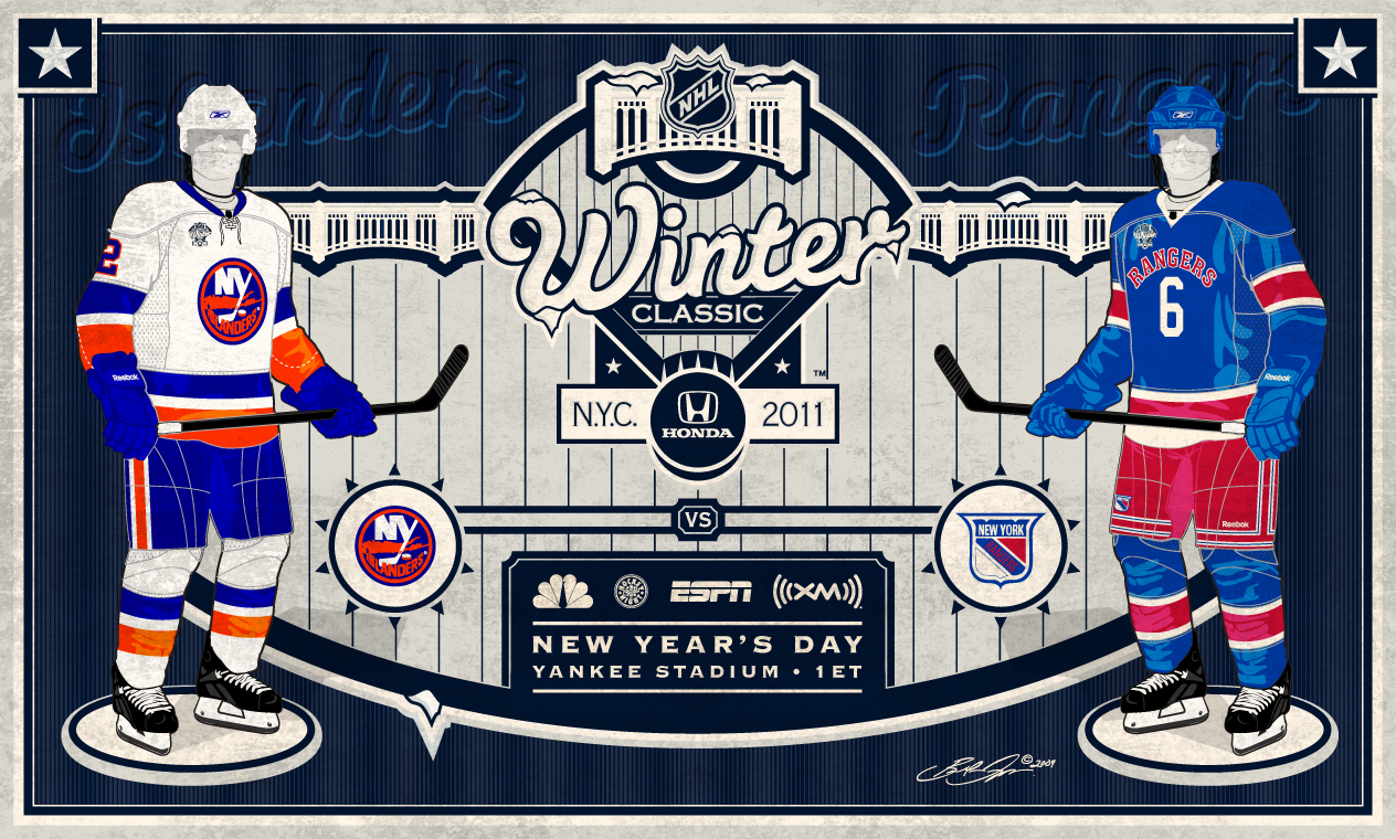 Brendan Droppo Brendan Droppo
 |
Yankee StadiumRangers vs IslandersThis may be the most well-designed Winter Classic 2011 concept I've received. Brendan Droppo is sticking with the New York City rumors and pairing the Rangers and Islanders at Yankee Stadium. Probably a safe bet. He's got a great logo that evokes the locale (as the past logos have done) and a pair of classic sweaters. Though I'm not sure you can call anything but their current jersey a classic. But then I thought that about the Red Wings too. And theirs worked out just fine last year. This is an awesome concept and I'm completely on board with it only if western Canada also gets their own Winter Classic. If they don't, I say out with the Isles. Canada deserves to get back into the outdoor games. Pit the Rangers against the Maple Leafs. If there is a Canadian game, I'd vote to leave it the way it is. Not sure the Rangers have another rival as big as the Isles. Plus we need to share the wealth. Everyone should get a shot at a Winter Classic game. |
 Cole Jones Cole Jones
 |
Target FieldWild vs StarsCole Jones of The Other 6 Seconds hockey blog emailed in to tell me about his idea. You can read the full proposal on his blog, but here are the bullet points. While I'm over here trying to get a Canadian team back into their own game, Cole, a Stars fan, is attempting to get a southern U.S. team into the mix — his own. He'd like to pit the Dallas Stars against the Minnesota Wild at Target Field, which is currently under construction in Minneapolis. It will serve as the home of the Minnesota Twins beginning in April 2010 — more than enough time to prepare it for a hockey match. It would be a huge day for Minnesota hockey fans, that's for sure. To see their current team after 10 years on the ice, facing a blast from the past in the form of North Stars jerseys would probably send some people into a tailspin. The only problem I see is this: Aside from Minnesotans, who cares? Part of the idea behind the Winter Classic is to appeal to new fans. To put the game in front of people who normally wouldn't watch. The past few seasons the NHL has been going for teams in big markets or with long histories. Yes, Dallas and Minneapolis are two huge markets, but the point is to go beyond them. A Rangers-Isles game would certainly do the trick. Everybody knows the Rangers, even if their not hockey fans. But this idea of getting the Stars back to Minnesota for a big event is a pretty popular one in hockey circles... |
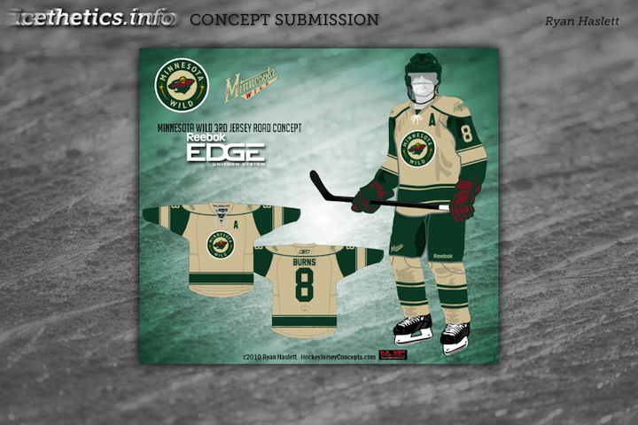
 Ryan Haslett Ryan Haslett |
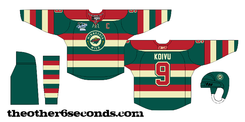
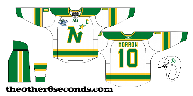
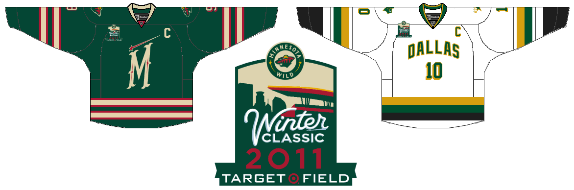
Target FieldWild vs StarsAnother regular Icethetics artist, Ryan Haslett, independently came up with the same idea. Wild and Stars at Target Field. But Ryan's idea for an event logo and game jerseys is a little different. They definitely feel like classic hockey, but both designs borrow from current sweaters. The "M" on the Wild jersey comes from the new green third while the Stars sweater is based off their current third, but infused with a little more gold. Either Cole's or Ryan's designs could work well if, indeed, one of the 2011 Winter Classics were to take place in Minnesota. |
 Ryan Haslett Ryan Haslett |
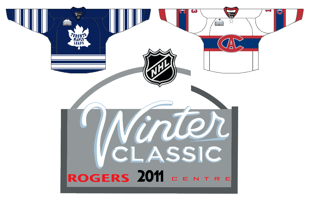
Rogers CentreMaple Leafs vs CanadiensSpeaking of Canada, Ryan did have a second Canadian option — going with one of the oldest rivalries in professional sports. He's got the Habs and Leafs at Rogers Centre in Toronto. Formerly called the SkyDome, the stadium plays home to the Toronto Blue Jays and Toronto Argonauts. As expected, he's got the teams in vintage sweaters, and surprisingly enough, one that the Canadiens have NOT worn in the past two seasons. The logo is a little weak but it plays off the simplicity of the Rogers Centre logo. Now to be fair, the Canadiens just took part in an outdoor game in 2003. Maybe they should sit on the bench a little while longer, you know? If you're going to put the game in Toronto, maybe have the Leafs face their province rival Ottawa Senators. As I said, spread the wealth. |
One thing I've noticed with these concepts is they're all set at baseball stadiums. Let's not forget the first two NHL outdoor games took place in football stadiums and were quite successful.
In wrapping things up, the one concept I don't have to share that I would really like to see is Calgary. I'm not familiar enough with the city to know where it should be played, but the Flames should host it and their opponent should NOT be the Oilers. (The Oilers faced the Habs in 2003 in Edmonton.) I think it comes down to the Maple Leafs, who play in a huge market and have a long history, or the Canucks, who are geographically closer and a more common foe during the regular season. But it's not up to me.
So what are your thoughts on the 2011 Winter Classic(s)? If you have have concept art to share, I'd be happy to add it to this post. If you just have another thought about a good match-up, drop a line in the comments.
By the way, happy new year!