Collection 40: Golden Jerseys

In honor of the Predators' forthcoming gold home jersey — a first in the NHL in decades — here are some yellowish uniforms designed by our Icethetics concept artists.

Still anticipating a Winnipeg Jets post before the team officially unveils their new logo and uniforms, but oddly, not a lot of concepts coming in at this point. You know how to reach me!

Concept Collection 39

Today we go without a theme. Just a few random concepts I thought you might appreciate.

This is the final auto-published post of the week. I should be able to get the site back to normal in the next couple of days. Hope you've enjoyed these concept designs during my absence.

Collection 25: Playing For It All

Enjoy these new concepts for a handful of teams competing in the 2011 playoffs. More to come, of course.

My personal favorites are Brian's Ducks and Glen's Rangers designs at the top. And I do think the Canucks shoulder start moving toward Colin's concept. But I don't see any of those things happening very soon.

Collection 24: The Blue & Gold

As I get to work on building the next jersey gallery, I thought it might be time to share some concept art. Perhaps theme of this post will clue you in on the next team being represented in the galleries.

I know last time I said we'd do some concepts focusing on playoff teams. That's still coming. In the meantime, send along whatever you've got and it'll surely find its way onto this page soon enough.

Collection 4: Ivall Redux

I've got a handful of new concepts to share from Mike Ivall. He's tackling Predators, Thrashers and Islanders as well as revisiting the Bolts and Leafs.

Knowing the Lightning are looking to ditch the black and silver and go with a blue/white color scheme, Mike thought perhaps they might try a two-tone blue. Personally, I'm a fan.

A lot of you have been asking about how to make your own concept art. Unfortunately, there's no simple or quick way to throw stuff together. Most of the designers who submit work are very talented graphic artists with knowledge of image editing software. If you want something free to get started, look up something like Gimp or Inkscape. I'd love to put together some kind of tutorial, but it's not really that simple. I will try to get together some templates at some point though. So keep an eye out for that.

Concept Collection 3

The newly reformatted concept art has been quite a popular feature lately. I can't remember the last time these posts have had so much feedback on a consistent basis. So let's keep it rolling. I've got another mish-mash to share this morning.

Paul had a similar idea to Mike Ivall's concept from the last post. Once again, there's just something about that color combination for me. The Cats can keep the light blue as a trim color so long as they keep the red. That's my decree.

Coming up this week: Mike Ivall has sent in enough new artwork fill another post. He's been working hard lately. He's covering the Preds, Isles and Thrashers among others.

Strauss NHL Rebrand IX

The NHL Rebrand series by Elliott Strauss is starting to wind down. This week he tackles the Devils, Wild and Predators. His own comments are in bold text.


Elliott Strauss

I thought that the old mustard alternate crest had potential to make an interesting primary logo, so I just cleaned it up. A simplified version of the current primary remains as a secondary. I came up with a custom font for the wordmark and numbers, and I'm happy with the way the numbers look on the jerseys.

The color scheme keeps navy and silver but adds an icy blue-gray in the place of yellow. The home jersey color of "steel blue" would make a unique addition to the NHL. The alternate slightly modifies the home/away template.

A strong entry here, to be sure. Personally, I never realized what a great logo the Predators' had on that old alternate until Elliott did some work to it. Certainly looks more like a hockey logo now. And overall, this is a really sharp uniform set. I'd by that home jersey in a heartbeat.

Elliott Strauss

I dropped the two-tone gold thing they have going, the darker yellow is gone, and wheat takes its place. Other than that, the logos stay the same, this is one of my favorite primaries of all time, so I got rid of the circle thing on the primary crest to focus on the awesomeness of this logo.

Pretty simple uniforms. No white in the homes, but I think the small amount of wheat really makes the red stand out. Then green has a prominent role in the roads as well. The alternate simplifies things even further. I do like how these uniforms turned out.

Great to see that primary logo back on the front of a green jersey. That's where it belongs. Only thing I don't like about this set is the alternate uniform. I understand what Elliott was going for but the style of that wordmark clashes with the simplicity of the sweater. At least the team got that right for real with the new thirds this year.

Elliott Strauss

I love what they wear now, but I wanted to try a modernization. I actually made the home jersey black, which is new, and then tried some devil-horn striping. I had to keep a lot of red, so the alternate brings back the red base, with a different take on a modern devil-horn stripe.

The striping on these jerseys is just flat-out cool. The shift back to classic style uniforms means we probably won't get to see anything like this in the NHL for another 15 to 20 years. I also like the secondary logo, borrowed from the AHL's Lowell Devils, but disappointed it didn't make an appearance on the uniforms, not even the shoulders of the alternate.

And if I'm being completely honest in my review, I'm also disappointed that we didn't get a modernization of the logo along with the updated jerseys. The Devils' logo is very clearly a product of the early '80s. That's not necessarily a bad thing, but it seems out of place on the "futuristic" jersey designs. However I do like the re-coloring on the home sweater.

One more edition of Elliott's NHL rebrands to come. And by process of elimination, I'm sure you've figured out that the Rangers, Canucks and Blue Jackets are on deck. Spoiler alert: Rangers get the best rebrand!

Midwest Modifications

It's Super Bowl Sunday so that means a super-sized concept post. (Also I haven't put up anything new since Wednesday, so I owe you.) Normally I'd make the big game the theme, but as there are no NHL franchises in Indiana or Louisiana, we'll have to settle for the Central Division.


Matt Marczel

Lately, I've been seeing a lot of great Blackhawks concept art. This one has to be one of my favorites. Matt has ditched white for "vintage white" and it's made all the difference. I love the color combination and the use of color in this uniform set.

He's got home/road/third jersey, in that order, and I have to say the third may be the best. If that was ever a real NHL sweater, I'd buy it in a heartbeat. No question. Very nice work here, Matt!

Brad McPelican

One thing you don't seen an awful lot of in hockey is striped shoulder yokes, the assumption being that it would look terrible. I think this design proves the opposite.

I think Brad's design is a winner right up until the third jersey. I just don't think that trumpet logo ever worked for the Blues. Just wasn't meant to be. I think the Blue Note represents the club much better than a literal logo.

So what about the third jersey then?

Mike Bell

Mike has this to offer and I think he hit the nail on the head. Throwbacks work for some teams and not others. For example, it was bad news for the Flyers at the Winter Classic but good news for the Blackhawks at the Winter Classic.

The Blues would look great in those vintage colors and stylings. All we need is that nameplate.

Ryan Haslett

But if your idea of a third jersey is something completely different, Ryan has the answer. I didn't think I'd like a gold Blues jersey. This has changed my mind. Great colors and striping. That is a hockey sweater.

Jeff Kennedy

One team that has struggled with their identity for the last decade — no, not the Canucks — is the Blue Jackets. I think they've finally settled on a good solid look. So that's a plus.

What they don't have yet is a third jersey, so Jeff has taken it upon himself to put forth a couple ideas. They're certainly unique, but I'm not sure I'm sold on these.

Josh Gagnon

So how about this one? Many of you will say you don't like the sweater number on the front, but it is presented in a unique way. However, I'm not sure the vintage white works with such bright shades of blue and red. Maybe something a bit muted.

To be sure, the last thing the Jackets need is to introduce yet another new jersey logo. So we'll just wait and see if 2010-11 is the year the alternate uniform returns to Ohio's capital.

Ryan Haslett

We can't leave out the winningest team in the Central Division. Ryan's made some minor changes to the Red Wings' unis. Not sure about the shoulder piping or the repetition of the winged wheel, but the rest of the striping works.

Matt McElroy

We'll finish off the division with the Predators. Actually, Matt has given us simplified jerseys and primary logos for both the Preds and the Wild. It sort of works for the Wild, but the saber-toothed tiger just looks washed out. And the jerseys may be a little too simple.

But let this final graphic today serve as a bit of foreshadowing to the next concept post.

I'll have new artwork up in a day or two featuring the self-proclaimed State of Hockey.

Your Sunday Concept Fix

I've been getting some great concept art submissions in the past couple weeks, but I wanted to keep Haiti at the top of the page for a little while. I just added a few new items to that post, by the way. But now I think it's time to start sharing some of the other great artwork that's been coming in.


Mark Komondor

We'll begin with the Penguins and a concept created by an artist brand new to Icethetics. These are his first submissions and he sure seems to know what Pens fans want. Imagine Crosby in the same uniforms that Lemieux and Jagr once wore when they lifted the Stanley Cup together.

Of the first one, he writes:

I was going for a throwback look by incorporating elements from the late 80s/early 90s sweaters the Pens wore when they won two stanley cups. I took that uniform and simplified it, using the Wild's red home sweater as a guide. I feel like this is a good mixture of the 90s elements, and the circle logo which has found popularity on the blue sweaters.

He says the other is simply a combination of the jerseys worn just prior to and since the Age of Reebok.

Adam L'Italien

Adam's Canucks concept makes some revisions to the new Johnny Canuck/V logo introduced on the third jersey last year. He says, why not use the full-body JC on the V?

But the most important thing about this jersey: it's green!

Brian Brideau

Rumors that the Predators plan to launch new home and road jerseys for 2010-11 could result in something like what Brian has come up with here. In fact, these should look familiar. I posted the first two jerseys two weeks ago.

What's new is the blue alternate sweater Brian has now added. For the most part, I like this one. The striping is unique but the Flyers-copycat nameplate is what I think needs to be revised. I truly hope differently-colored nameplates do not become a league-wide fad.

More concepts coming during the week.

What's in a Third?

Monday is here again. But while you guys are headed back to work or school, I'm probably in a casino wondering what time it is or something like that. Not to rub it in or anything.

Here we are at the fourth of five auto-posts featuring all new concept art from talented Icethetics artists. Today's theme is another fan favorite — third jerseys. Several of you have come up with ideas for alternate sweaters based on what's actually being worn in the league right now. Let's get started.


Ryan Haslett

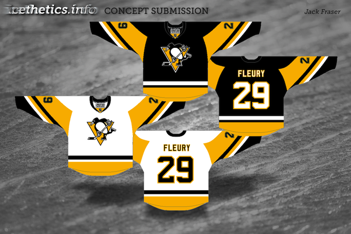
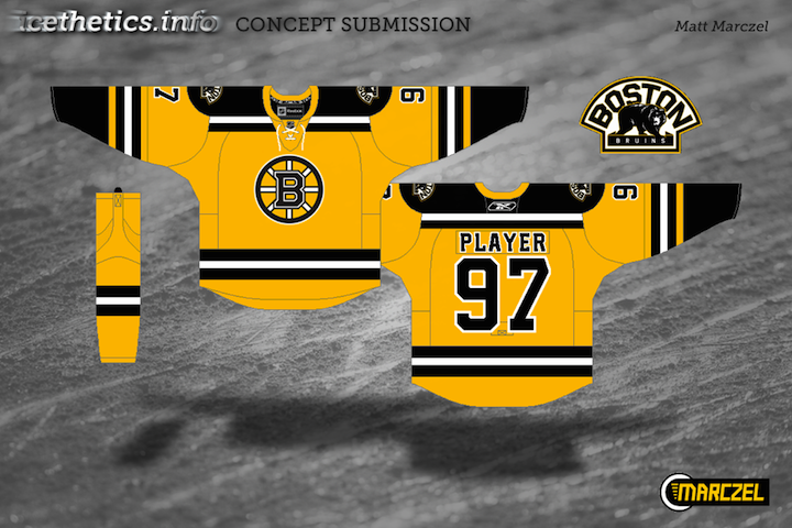
The Pittsburgh Penguins are up first because we're pretty sure they're actually getting a new third jersey next fall. Folks keep saying the powder blue sweater is on its way out. Personally, I think that paves the way for an '80s style third reminiscent of the Mario Lemieux/Jaromir Jagr days, but I digress.

Ryan's got a whole new set of jerseys here which includes a black third loosely based on the team's earliest NHL days — sans the blue, of course. But it might suffer from the same problem that Bruins currently have. That being both the home and alternate sweaters are black.

One of them needs to be gold (I'm speaking both about the Bruins and Penguins). Gold will solve all their problems.

Charles Cadieux

Also in the east, the Canadiens introduced — or should I say re-introduced — a handful of vintage sweaters to celebrate their 100th anniversary. They started last season and continued into this one.

One of the favorites was the blue one with the big white C. I believe Charles' attempt was to turn it into a third jersey but putting the classic CH we've all come to know and love, front and center.

I'm torn. Part of me likes it because it means this jersey could stick around. But the other part of me says it's just wrong.

Brian Brideau

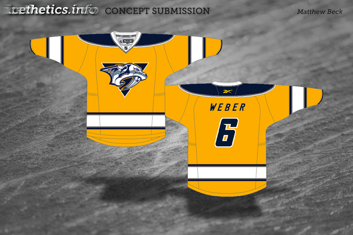
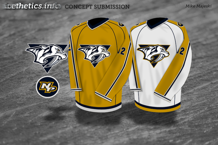
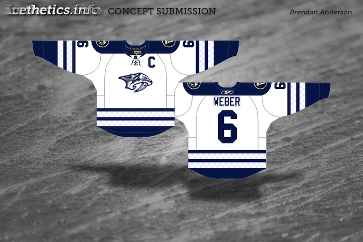
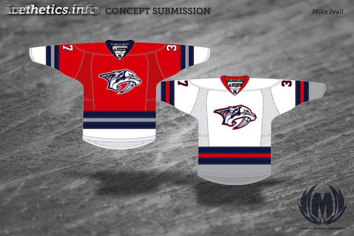
Moving ever westward, we now land in Nashville. The Predators have discussed making wholesale uniform changes to just simplify. Brian, here, thinks they'd be wise to just make a light version of the new third jersey and go with it.

He's saved them the extra steps by having already designed it. This is hard not to like and the Preds are in need of some jersey overhauls. This could just be the ticket.

The only thing I'm not sure about is the triangle on the white jersey. It's not necessary to making the logo stand out and it actually takes away from the simplicity effort. That aside, these are top notch.

Chris Fraterrigo

Sticking to the direction of the sunset, Chris Fraterrigo thinks the Avalanche could use a uni redo. And ever since the Age of Reebok was ushered in, I can't say I disagree with him.

In this new set, the "modern" striping elements are gone. Instead, the simple striping from the new third jersey is carried over to the home and road shirts. And the alternate here is simplified losing all striping — which actually doesn't hurt it.

I'm a big fan of incorporating the black into the burgundy sweater. However it's not done as well on the white one here. Overall, though, a solid look. The only thing I might add is some striping around the bottom — just so it doesn't look like a t-shirt.

Uncleben

At last we find ourselves as close to the west coast we're going to get today. I think the Coyotes have a pretty decent third as it is and this one may be a little cluttered. Still I'm a big fan of that paw logo and traditional jersey striping.

It has its pros and cons. But the largest con is probably the use of the Maple Leafs' lettering and numbering. Huge no-no. But we won't crucify anyone for it. We just don't want to see it on a real Phoenix jersey is all.

One more auto-post to go! You'll see right here tomorrow morning at 9. But at this point, my concept art reserves are beginning to dwindle. If you've thought at all about dipping your toe into the artistic pool, email your designs to me at icethetics@gmail.com.

Heading Out West

This is the last new concept post until I head out west so I'm making the Western Conference today's theme.


Mike Ivall

We begin with Mike Ivall, a longtime Icethetics concept contributor. Today we're flashing back to his roots. That first image you see there is, I believe, his first ever concept submission. It was first posted on July 8, 2008 — a year and a half ago.

Now he's sharing the fruits of his labor with us. You see that logo embroidered onto a red Blackhawks jersey, proof that perhaps it should one day take its place on an NHL uniform.

And if you were wondering what the entire sweater looks like — including its new shoulder patches, just click here.

It's really quite something to see an old Icethetics concept come to life that way. As always, great job Mike!

Ryan Haslett

Sticking with the Blackhawks for a moment. If Mike's red jersey is too drastic a change, then maybe Ryan Haslett's is right on the money. I don't know what it is about the red, black and beige that screams old time Blackhawks hockey to me.

I love this design and if it ever became a reality, I might be the first in line to get one — and I don't even like Chicago. Sometimes a jersey design just does something to you, though.

Ryan Haslett

If you hadn't already noticed, the rest of this post belongs to Ryan. Knowing that the Predators are planning sweeping uniform changes for 2010, he's come up with a simplified uniform design for the Hawks' Central Division rivals.

My only concern is that the gold used here may be a little too light. There's not enough contrast for it to be a standout uniform design. Fix that and you may just have a winner on your hands.

I'd also consider reverting to the dark blue triangle on the white jersey. I just think it makes for a stronger design.

Ryan Haslett

Ryan will get us finished up this afternoon way out west in Anaheim. His third jersey concept for the Ducks goes with the beige that slowly seems to be gaining popularity in the NHL as a vintage color — actually called Vintage White by the Boston Bruins.

I like the beige and the orange. But I still think the Ducks need to drop the black in favor of a dark forest green. That would really give their identity a complete and unique feel.

The one thing I'm not sure about is the use of a wordmark on the front. I think an alternate sweater in Anaheim would provide the ideal opportunity for an alternate logo that actually resembles a duck. An intimidating duck to be sure, but a duck all the same.

That's it. The next time you see concept art on this page, it will appear as if by magic as I will be far, far away from my computer — and Florida! (Really though, don't forget. New auto-posts every morning at 9 from Friday until Tuesday. I've worked really hard all week to make sure that happens for you guys.)